Why you can trust TechRadar
I've never been the biggest fan of Samsung's approach to Android, finding it to be weighed down with unnecessary features and more than a little gaudy. But the software found on the Samsung Galaxy Note Pro 12.2 represents a notable improvement.
It's running the latest iteration of Android, version 4.4.2 KitKat, but that's not the important part. Far more noteworthy are the changes Samsung has made to its overlying TouchWiz UI.
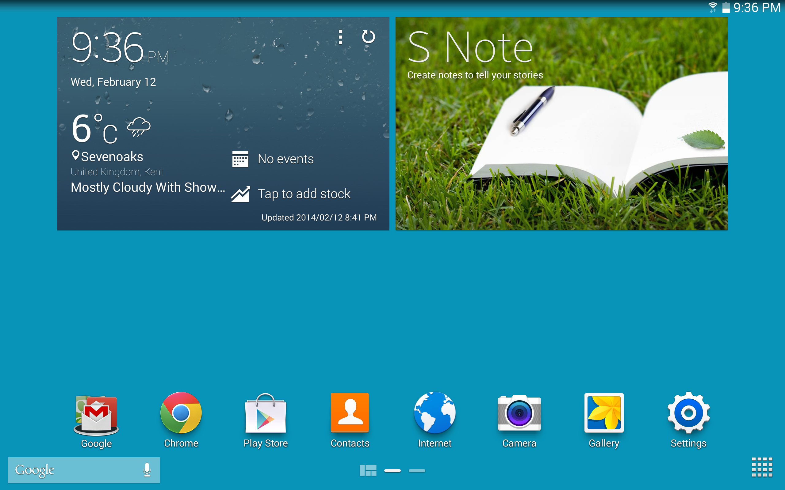
While I still prefer good old stock Android, Samsung's modified effort is more streamlined and pleasant to use than that of previous devices such as the Samsung Galaxy Note 10.1. There are just two standard home screens, containing a couple of the usual Samsung widgets (which can, of course, be removed).
Meanwhile, Google Search and the app tray commands have been situated in bottom left and bottom right hand corners of the two main home screens respectively, providing quick thumb access without taking up too much space.
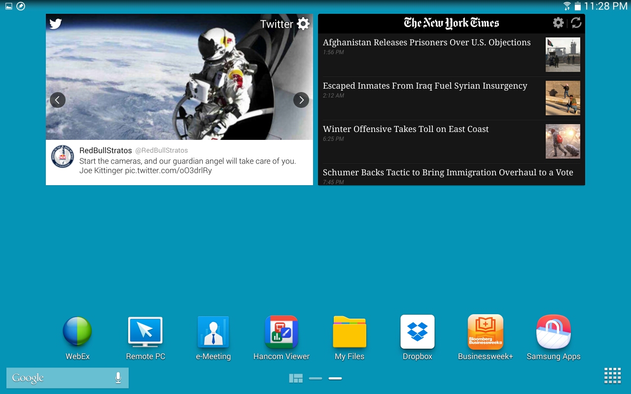
More interesting here is the fact that Samsung has also developed the My Magazine section from the previous version of TouchWiz into a more integrated element. This means that it can be accessed with a lateral swipe, like an additional home screen (or two), rather than the counter-intuitive and tacked-on upwards swipe of before.
It sounds like a minor thing, but with this simple streamlining effort I found myself 'running into' the Magazine UX feature far more, which led to it being adopted into my daily usage.
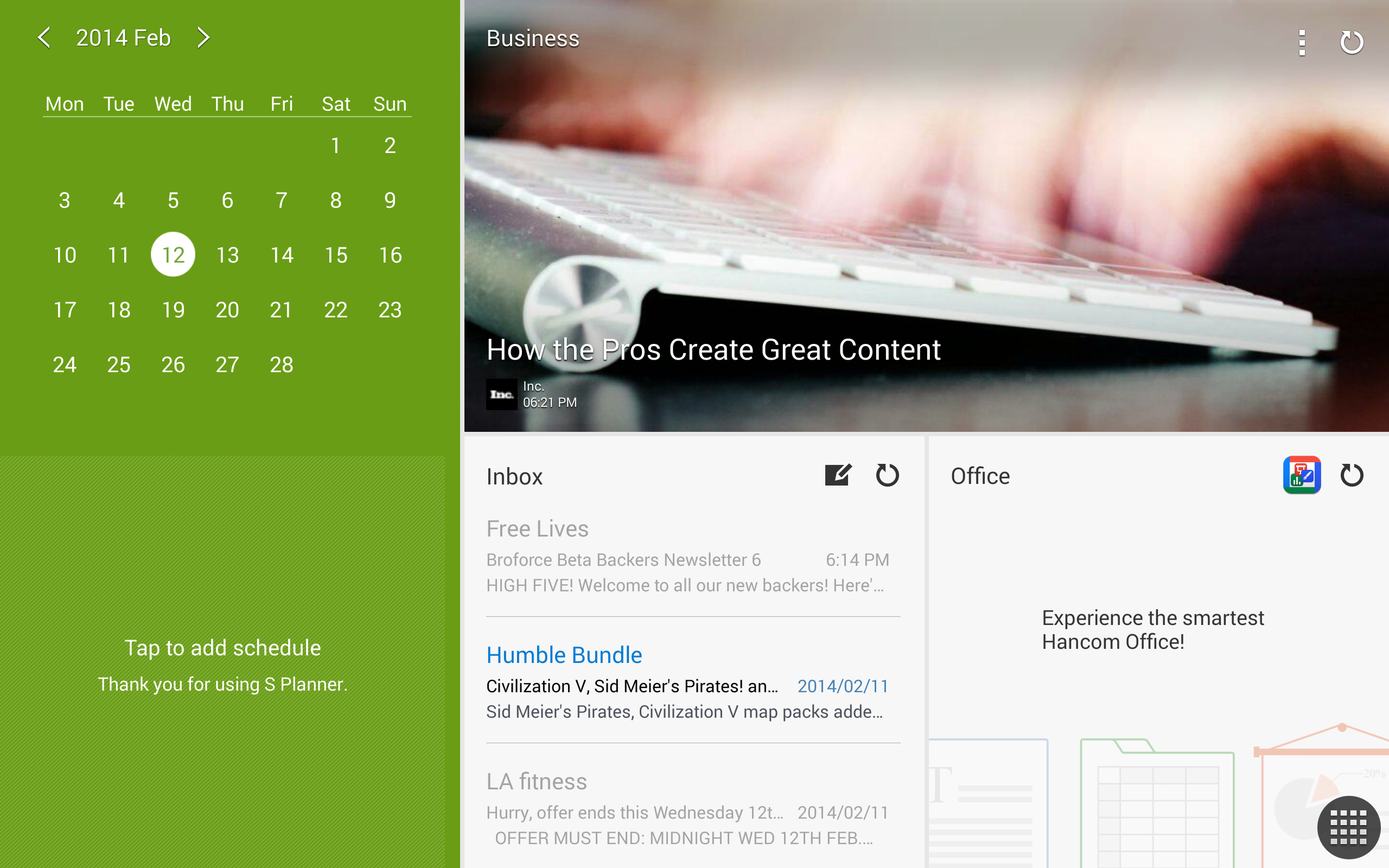
Magazine UX is a Flipboard-like aggregator that pulls together news stories, social network updates, and commonly used applications into an image-heavy magazine format.
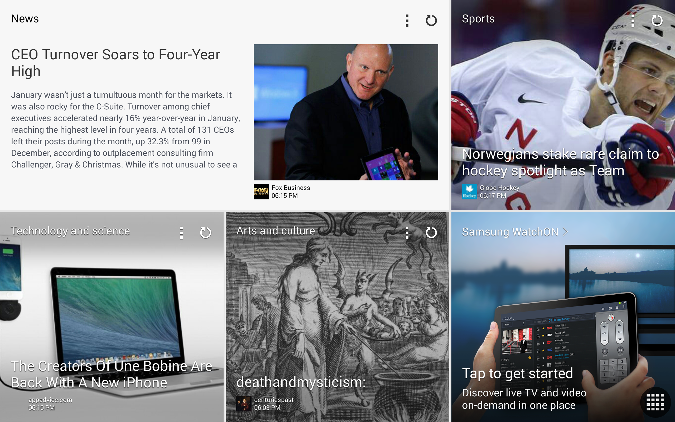
One of these pages, by default, pulls together your latest emails, offers a calendar view, and allows you to make quick additions to the S Planner schedule organiser app.
There's also a business-oriented news story pane and one for Hancom Office – an included office document application.
Tapping on any of these elements opens an expanded version, whether that's the Flipboard app, your email, or whatever the source is.
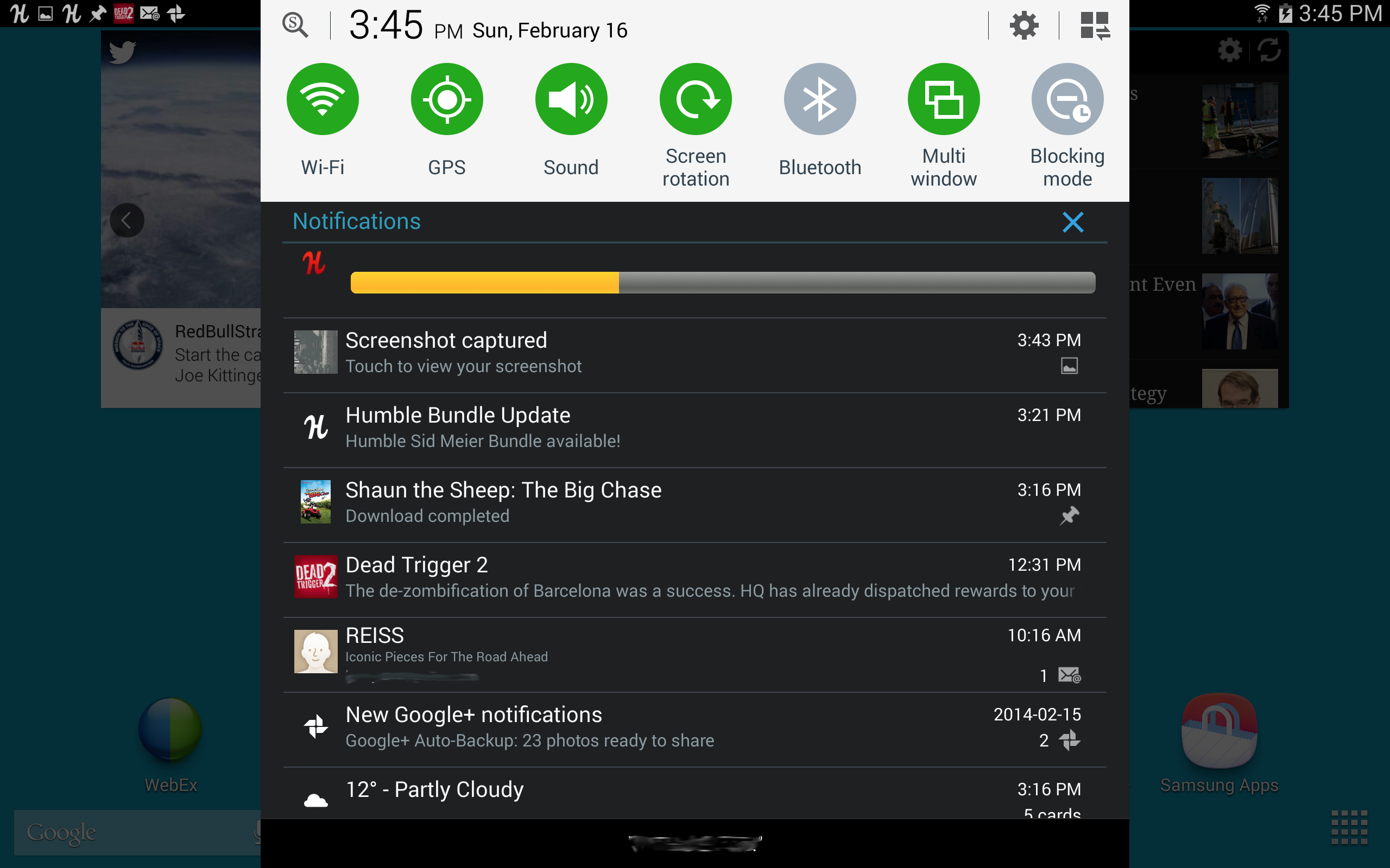
Back to the main interface, and Samsung has also significantly improved the notification menu. Gone are the ugly and excessive control shortcuts and the needlessly screen-width notifications.
In their place is a neat, centrally situated drop-down menu with clearly demarcated settings controls for Wi-Fi, screen brightness and the like, as well as the latest sensibly proportioned notifications.
It's worth noting again that Android handles notifications better than any other mobile OS. Emails offer a preview of the message and the ability to reply, images feature instant sharing and edit options, and Google Now notifications keep you abreast of everything from football scores to flight times.
Of course, this is all present in other Android devices, but Samsung should be commended for restraining its usual urge to over-elaborate, and for letting Android's solid core shine through a little more.
Like I said, I'd still prefer the fully customisable, stripped-back interface of stock Android over this, but Samsung has made some commendable strides forward with its latest round of UI pimping.
General performance when navigating through these home screens on the Samsung Galaxy Note Pro 12.2 is strong, if nothing especially impressive.
I still detected the odd stutter and pause from time to time when transitioning between menus, but this has long been established as a software matter rather than a hardware one. No mainstream custom UI runs as smoothly as stock Android, and even Google's fine OS has its moments (though far fewer than it used to).
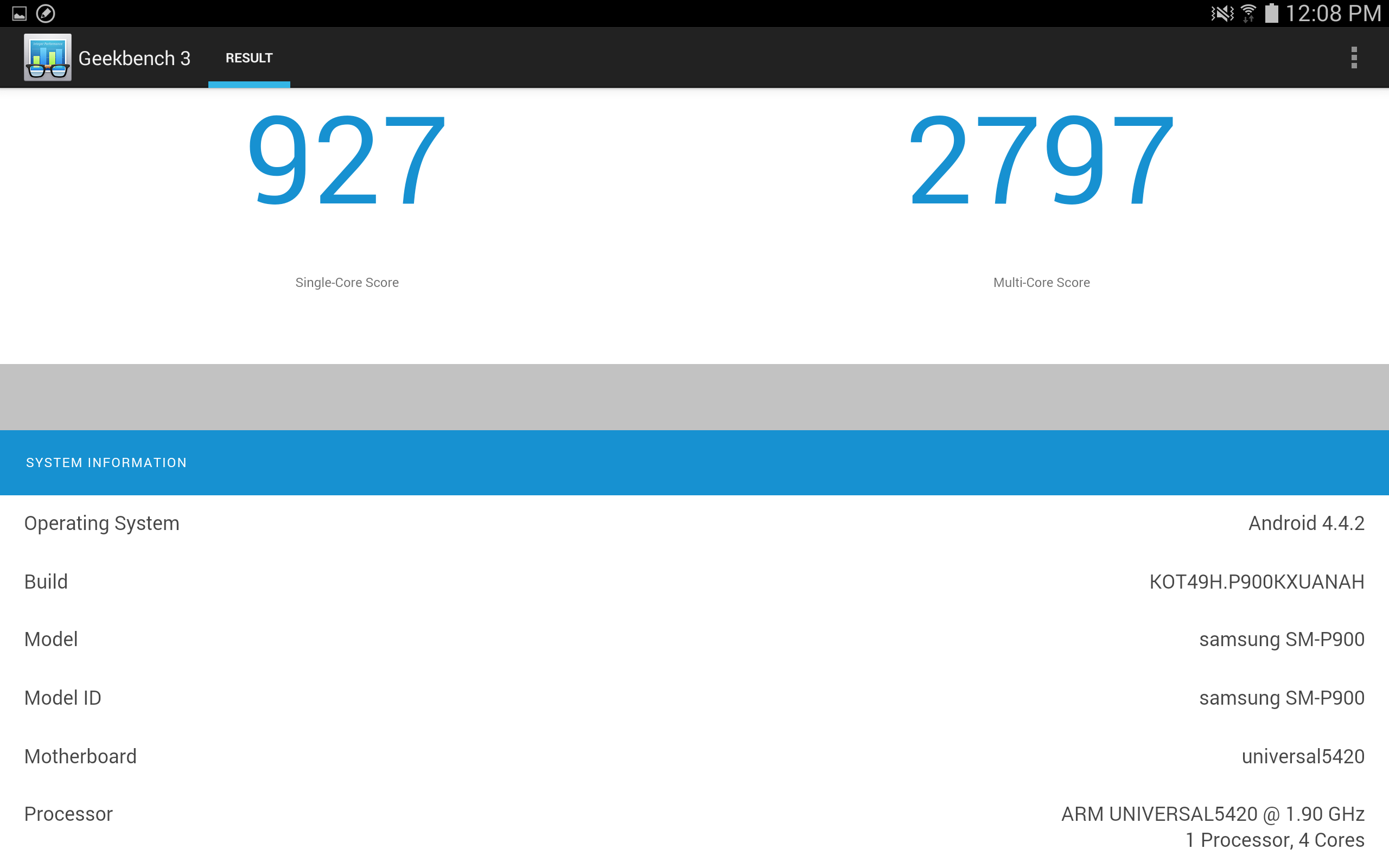
On the matter of hardware, my GeekBench 3 tests revealed single and multi-core performance that was near the top of the Android tree, alongside its brothers the Samsung Galaxy Note 3 and the Samsung Galaxy Note 10.1. Which, when you consider that it's running on the same Exynos 5 chip, is unsurprising.
The extra headroom afforded by the Galaxy Note Pro 12.2's 3GB of RAM doesn't manifest itself here, perhaps, but it does make the process of opening multiple app windows feel slick.
By dragging from the right of the screen, you open a menu containing all of the apps with window support. Touch the app icons and they'll open up in a small window, each around a quarter to a third of the size of the screen.
You can open up to five apps simultaneously in this way and switch between them with a touch – much like you would on a computer.
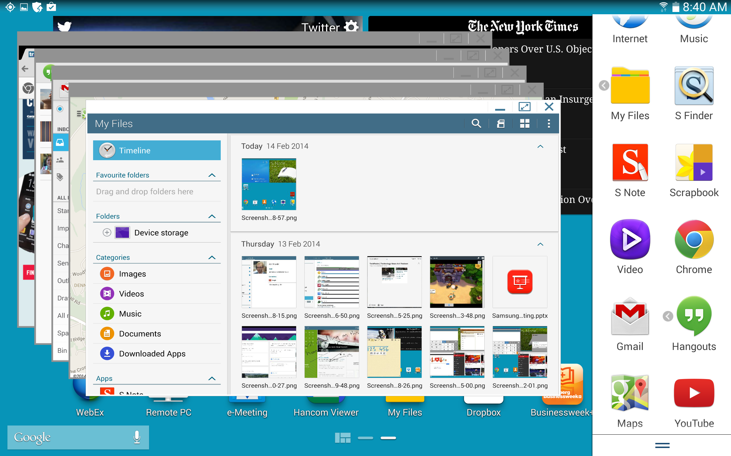
Except, it's not nearly as intuitive as on a computer. These windows sit awkwardly with regular tablet functionality, obstructing your view more often than not.
Touching on the full-screen application or home screen in the background doesn't snap it to the fore, as you might expect, meaning you have to minimise or clear each windowed task individually.
Much handier is the multi-window view, which Samsung has neatly pulled into this same menu. By dragging the app icons onto the main screen, you'll open them up in a fixed sector of the screen.
You can have up to four apps running simultaneously, each with their own dedicated (and fully resizable) quarter.
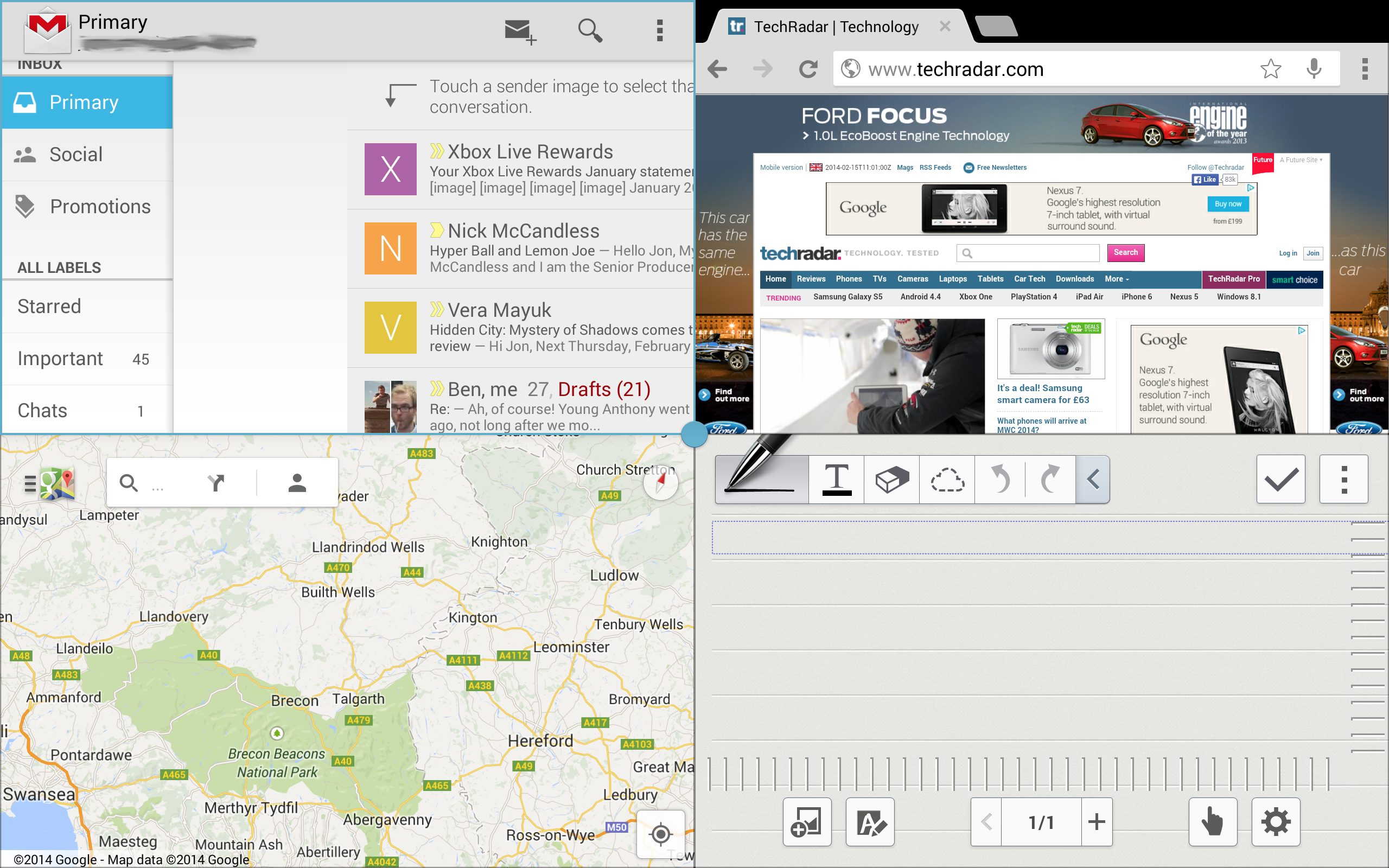
This was a neat feature in previous Samsung devices, but again it finds a new level of usefulness here on the 12.2-inch display. Each app quarter is about the size of a large (if somewhat squarer-than-usual) Android phone, making each eminently usable.
Performance is excellent here – I was able to scroll around the country in Google Maps whilst loading the TechRadar home page and playing a YouTube video, with only a slight degradation of performance.
To the casual user this will no doubt be a nice but seldom-used gimmick, but the ability to have S Note, Gmail, a calculator and a web page (for example) open and within view simultaneously has undoubted benefits for power users. And that's precisely who the Samsung Galaxy Note Pro 12.2 is aimed at.
Current page: Interface and performance
Prev Page Key features Next Page Battery life and the essentials