Why you can trust TechRadar
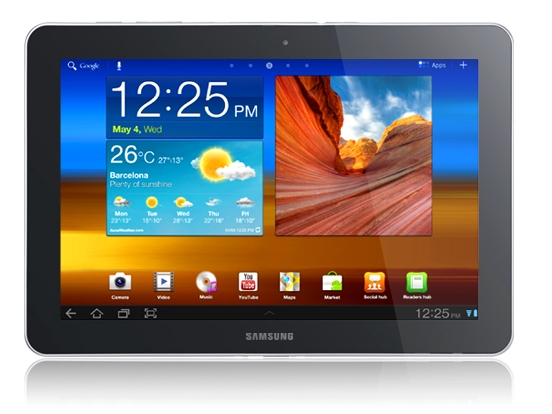
The Samsung Galaxy Tab 10.1 uses more or less the same interface as the other Android 3.0 tablets.
There's a Home button on the lower-left, app icons fill the centre of the screen and alerts and settings are on the lower-left.
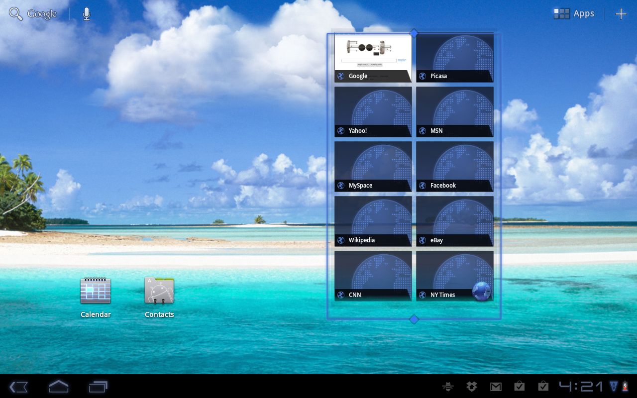
That may be an adjustment for those used to the pull-down menu on Android smartphones, but the Android 3.0 interface provides intuitive control over the device that rivals and in some ways surpasses the Apple iPad 2.
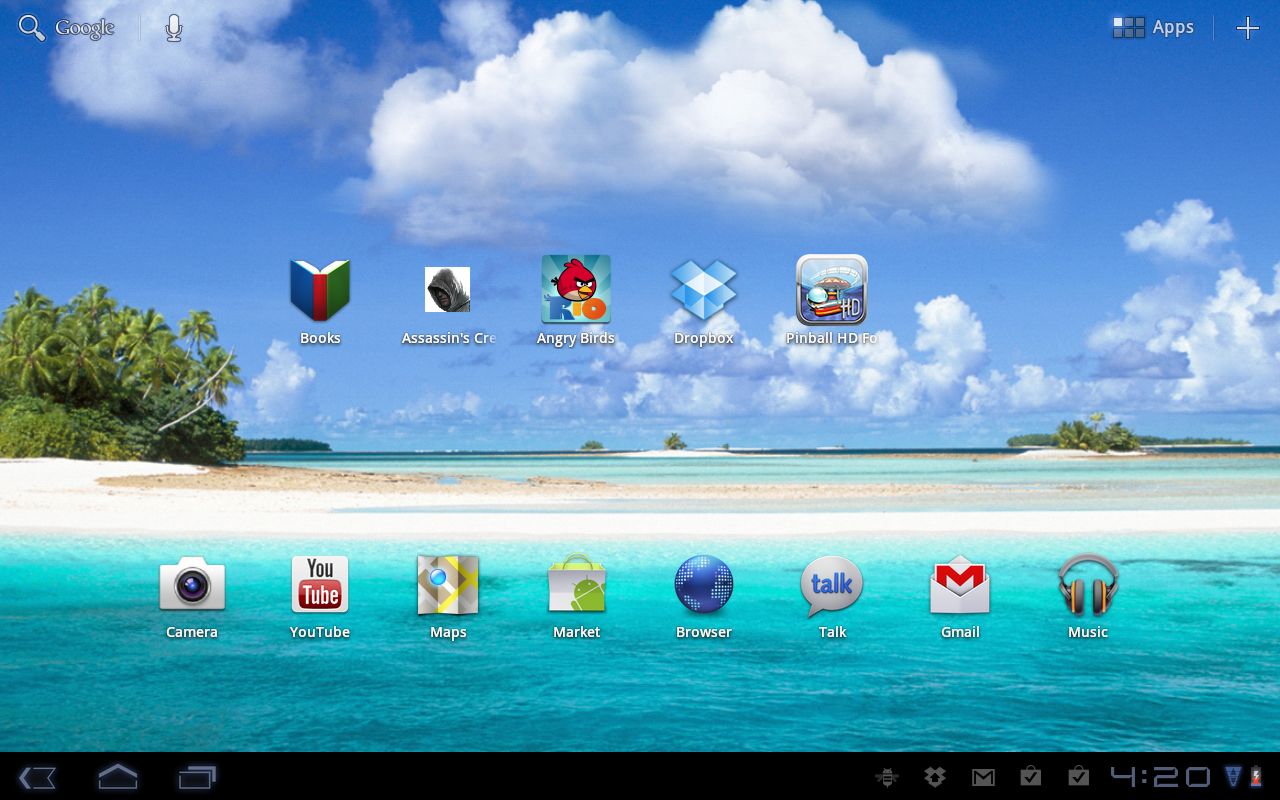
That said, we still prefer the BlackBerry PlayBook UI over Android 3.1 in terms of swiping quickly through open apps. And, from early demos of the HP TouchPad, the card interface for Palm webOS 3.0 may be worth the wait since cards can be grouped together even when one is from an email and another is from a web page.
We like the way the TouchPad and PlayBook move well past the iPad paradigm of selecting an app icon and not really having a good way to glide easily between open apps.
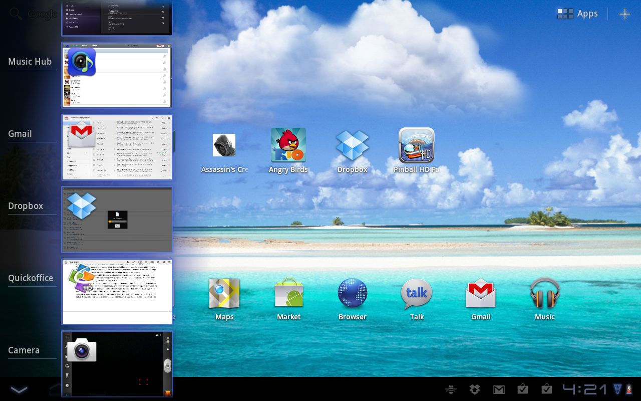
Most of the interface enhancements on the Samsung Galaxy Tab 10.1 have to do with Android 3.1, although none of them are radical improvements over Android 3.0. When you drop a widget onto a home screen, you can now grab a handle and resize it.
A pop-up menu on the lower left of the screen next to the Home button shows all open apps. You can now scroll up and down to view them and pick the one you want, which is more helpful than having just a few open apps.
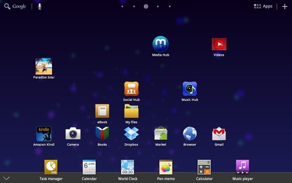
TouchWiz update
Samsung released the TouchWhiz UI add-on in August 2011, which essentially adds widgets below the main screen. You click an arrow in the center bottom menu, and can then add widgets for a Calculator, a notepad, and a music player. These additions help add value to the device beyond the basic Android 3.1 release, but they might not change how you use the device that much, and did not influence our overall score too much because they should have been available from the start.
Current page: Samsung Galaxy Tab 10.1: Interface
Prev Page Samsung Galaxy Tab 10.1: Features Next Page Samsung Galaxy Tab 10.1: Market and appsJohn Brandon has covered gadgets and cars for the past 12 years having published over 12,000 articles and tested nearly 8,000 products. He's nothing if not prolific. Before starting his writing career, he led an Information Design practice at a large consumer electronics retailer in the US. His hobbies include deep sea exploration, complaining about the weather, and engineering a vast multiverse conspiracy.

