Why you can trust TechRadar
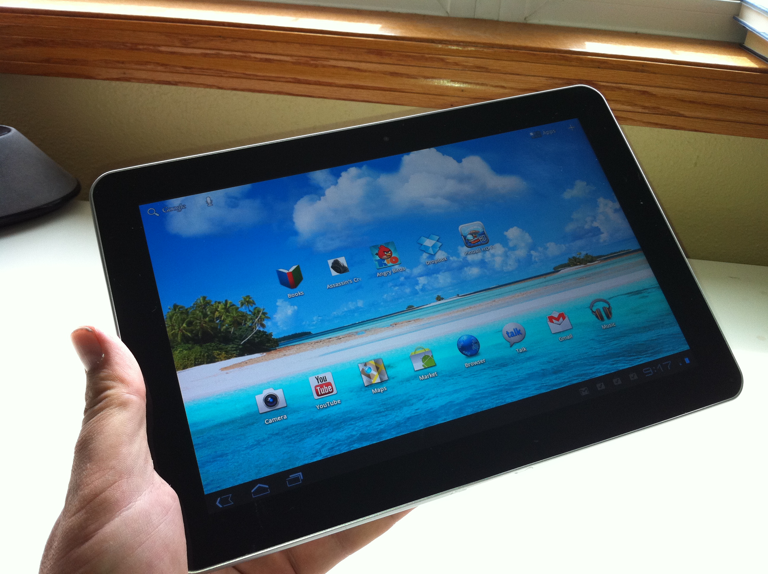
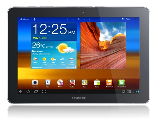
Overall, the Samsung Galaxy Tab 10.1 is easier to use than any other tablet except the iPad 2. We had no trouble finding the power button on the top left. (With the Motorola Xoom, the power button is located behind the device, which is OK but not where you'd expect to find it.)
Volume buttons on the Samsung Galaxy Tab 10.1 were also easy to find. Samsung went the Apple route of "less is more" in offering only three buttons. There is no hardware switch to lock screen rotation and no other buttons.
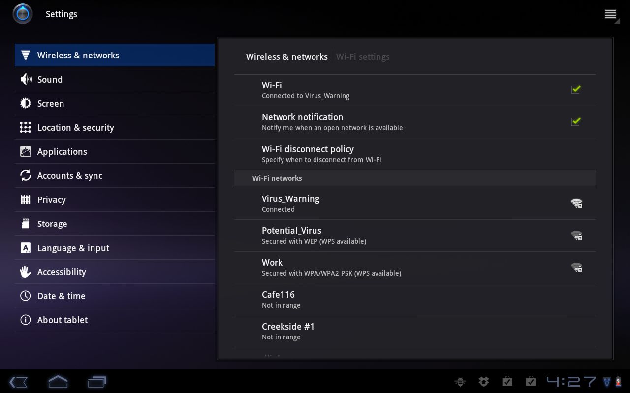
This means all of the usability of the Samsung Galaxy Tab 10.1 rests on Android 3.1. In general, this means the tablet isn't that different from other Android models. It's easy to select icons, swipe left and right on the home screen, access the Home button and the button to access open apps and to find settings.
Android 3.1 was supposed to include an enhancement to the browser app where you can use a pop-up menu wheel to go forward and back, bookmark sites and control other options. Samsung may have hidden this feature, at least on our Samsung Galaxy Tab 10.1 model, because it wasn't available.
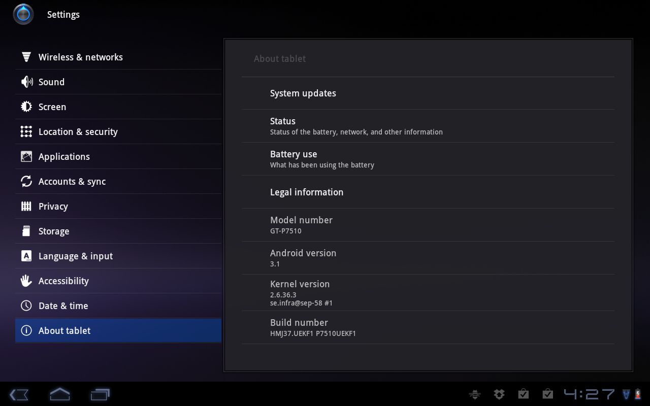
Importantly, the Android 3.1 release is also intended to address delays in swiping between home screens – it's supposed to run faster. However, other than the motion sensor working better for games, we didn't notice any major differences in swiping between the Samsung Galaxy Tab 10.1 and other Android tablets.
Screen
Cranked up to the highest brightness level, the Samsung Galaxy Tab 10.1 outshines every other tablet. It is exceptionally bright and clear, especially for movies we loaded onto the device.
The screen resolution runs at 1280 x 800 WXGA, which provides a few more pixels than the Apple iPad 2, at 1024 x 768. The Samsung Galaxy Tab 10.1's screen runs at 149 pixels per inch and is highly viewable from a side angle. In several tests – games, checking Twitter feeds and browsing the web – the screen refreshed quickly.
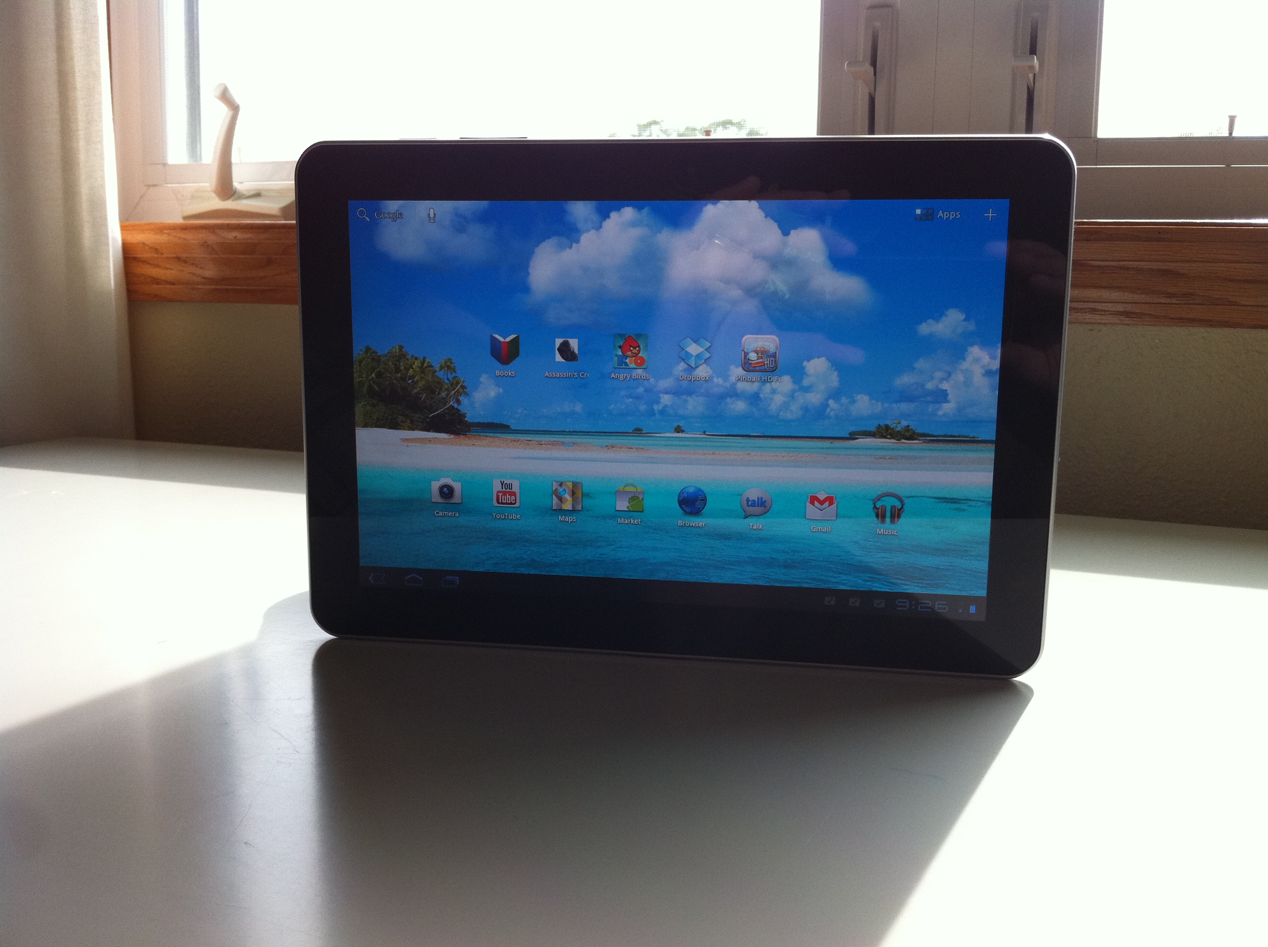
Like every other tablet except the Apple iPad and iPad 2, the Samsung Galaxy Tab 10.1 tends to accumulate fingerprints and grime faster than a glass door at a kindergarten classroom. The bright screen offsets this problem somewhat because you might not even notice the grime in daily use, but dark movies and photos will show the grime more than brightly coloured images.
The side bezel also collects dust and grime, but no worse or better than any other Android tablet. Give us a tablet that has the same grime-reducing agents as the iPad without any bezel (as with the rumoured iPad 3) and we'll be much happier.
One complaint with the Samsung Galaxy Tab 10.1 is that the touchscreen tends to chug a bit at times. We noticed this when typing emails but even more so in the browser, especially when visiting content-rich sites.
In several cases, the Samsung Galaxy Tab 10.1 would cause delays between what we typed and what appeared on screen. Also, when we tried to position the cursor by pressing the screen to make an edit, the cursor icon would appear in the wrong part of a sentence.
Current page: Samsung Galaxy Tab 10.1: Usability and screen
Prev Page Samsung Galaxy Tab 10.1: Market and apps Next Page Samsung Galaxy Tab 10.1: MediaJohn Brandon has covered gadgets and cars for the past 12 years having published over 12,000 articles and tested nearly 8,000 products. He's nothing if not prolific. Before starting his writing career, he led an Information Design practice at a large consumer electronics retailer in the US. His hobbies include deep sea exploration, complaining about the weather, and engineering a vast multiverse conspiracy.
