Why you can trust TechRadar

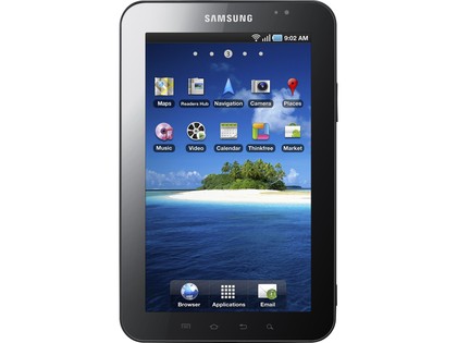
The interface on the Galaxy Tab is basically Android 2.2 with a few minor tweaks here and there.
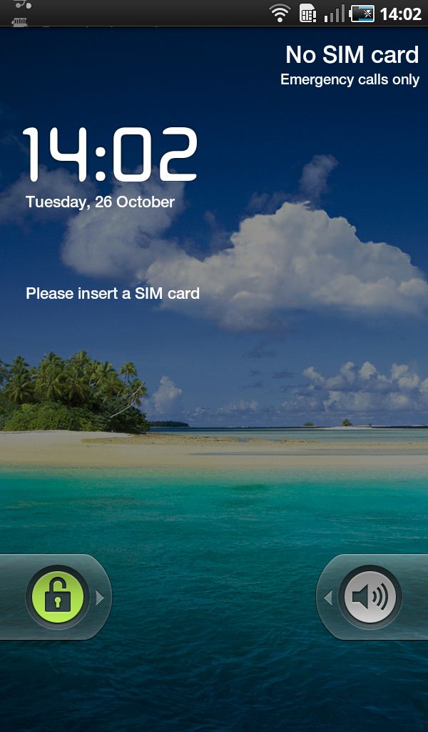
You start at the lock screen which you move past with a quick finger-swipe to the left. You can customise this by adding either password protection, a PIN or a pattern lock.
Once you've unlocked the device, you're through to the five homescreens which you can load up with as many or as few icons as you desire.

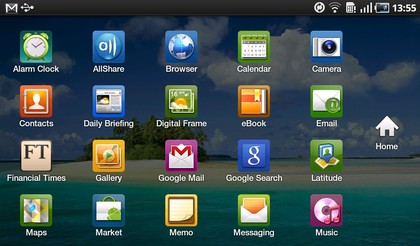
As with most Android phones, you can move an App onto the homescreen by pressing and holding its icon. The device will instantly take you and the chosen icon back to the homescreen where there is ample space for you to pile up your favourite Apps while leaving the others to lounge around inside the Applications menu.
Software not optimised?
In general, Android 2.2 works well enough, although Google itself admits that the OS is not optimised for tablets yet. You can read Google's full confession elsewhere on TechRadar, but the main quote from Hugo Barra, Google's director of products for mobile, goes like this:
"…the way Android Market works is it's not going to be available on devices that don't allow applications to run correctly.
"Which devices do, and which don't will be unit specific, but Froyo is not optimised for use on tablets.
"If you want Android market on that platform, the apps just wouldn't run, [Froyo] is just not designed for that form factor."
So there you have it from the horse's mouth, despite the Samsung shipping the Galaxy Tab with Android 2.2, it's just not a finished piece of software in terms of tablet optimisation.

This is blatantly clear when using the device, as most apps and even the Android Market refer to the Tab as a phone instead of a tablet.
What this ultimately amounts to is that most applications you download from the Android Market are intended for use on smaller, often lower-resolution screens.
And that means a lot of the graphics and text within them can look a bit blurry on the Galaxy Tab's 7-inch display. It's not a massive problem, but it certainly doesn't have the polish of the iPad, which has its own section on the Apple App Store.
This could also certainly explain the laggy nature of the device's performance when browsing the web, for example.
And talking of Apps, there's more confusion to be found in the form of three separate places to download them on the Tab.
There's the standard Android Market option, along with separate stores for Samsung's own apps and games. It's a bit of a hassle, if you ask us, but the promise of Galaxy Tab-specific Apps to download in future does appeal.
It would be easier if it was all done via the Android Store, but you can see why Samsung might want to bypass that particular avenue for some of its content.
Current page: Samsung Galaxy Tab: Interface
Prev Page Samsung Galaxy Tab: Performance and battery life Next Page Samsung Galaxy Tab: ScreenJames was part of the TechRadar editorial team for eight years up until 2015 and now works in a senior position for TR's parent company Future. An experienced Content Director with a demonstrated history of working in the media production industry. Skilled in Search Engine Optimization (SEO), E-commerce Optimization, Journalism, Digital Marketing, and Social Media. James can do it all.

