Why you can trust TechRadar
With all that power behind the Galaxy Tab Pro 10.1, it should be no surprise that it performs really rather well. Any concerns surrounding the lack of a 64-bit chip such as the one found in the iPad Air are quickly allayed.
Geekbench 3 results gave an average score of 2722 putting the Galaxy Tab Pro 10.1 at the highest end of scores, as well as being the highest scoring tablet on the Geekbench site - unsurprising really given the wealth of power on offer.
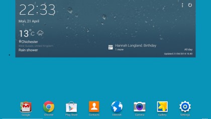
Some of the touches to the UX that are found on the larger Galaxy Tab Pro 12.2 seem to be missing on the Tab Pro 10.1. Instead the Tab Pro 10.1 follows the far more traditional Samsung layout that has been seen before.

That said there is still a dedicated screen for Flipboard as well as a business page occupied with a calendar, large email, office and business magazine widgets.
The inclusion of Flipboard with its own home screen is a nice touch, adding an almost BlinkFeed feel that is found on the HTC One M8 and its predecessor, the HTC One.
I did find myself ignoring it a fair bit though, as it is the page to the left of the default home screen. This was a little disappointing as I think it would have been a far more useful feature had it been baked in slightly tighter to the overall experience.
That brings me to a big issue, the same as seen on the Samsung Galaxy S5: with a large portion of the home screen, the most pivotal part of a tablet or phone's experience, being dedicated to a redundant feature, Samsung has missed the chance to make a simple, fluid interface.
It's a smorgasbord of information on news, calendar and email info, when these are all available as dedicated apps within the tablet itself. You can rearrange as you see fit, but this is something of a confusion when all are activated, combined with sporadically updating news.
I know that these things show an attempt at differentiation, but when they're not implemented well then it becomes a millstone for tablet that's one of the more powerful out there with a great screen - and that should be its USP, not this.

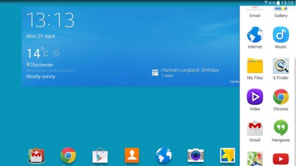
Another area that Samsung has excelled at has been its use of multiple windows. As a feature that I have come to use on Windows 8.1 devices, this was something that I was really looking forward to using. Unfortunately I found that it was a little more convoluted than the Windows equivalent.
Side by side viewing was possible when loading documents or videos, and apps could be launched as pop ups via a side-swipe in from the right side of the screen.
These pop ups can also be minimised, appearing in much the same manner as Chat heads from Facebook messenger; little floating icons. I would have liked a way of implementing snapping these pop ups to the side though, something that Windows definitely excels at.

It is a little disappointing that a keyboard dock doesn't come bundled as it does with the Asus Transformer Pad. There did seem to be a similar problem on both tablets however: the Android software.
The Tab Pro 10.1 has come on in leaps and bounds in terms of tablet performance. However, when it comes to productivity I still feel that Windows 8.1 has both Android and iOS beaten hands down as the multi app view I mentioned is more impressive and better implemented on Windows.
Current page: Interface and performance
Prev Page Key Features Next Page Battery life and the essentials