Why you can trust TechRadar
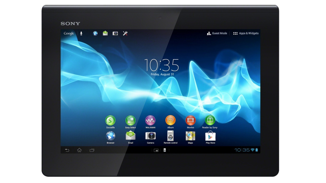
The Sony Xperia Tablet S runs Android Ice Cream Sandwich, but Sony has skinned it a little, so there are some differences.
Booting the tablet up takes a fairly lengthy 36 seconds, meaning it's not that convenient if you just want to quickly check your email or look something up. Once it does boot up, you land on the lock screen, and this at least is pretty standard Ice Cream Sandwich.
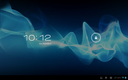
There's the time and date in white writing at the top, and a lock icon at the bottom. Swiping the lock to the right will take you to your home screens, while swiping it left will launch the camera.
Sony has used an abstract wallpaper for the background - the same one it uses on just about all of its phones and tablets, but of course you can change this to anything you want.
The home screens are a little different from what you might have seen on other devices running Ice Cream Sandwich, but they still function in much the same way.
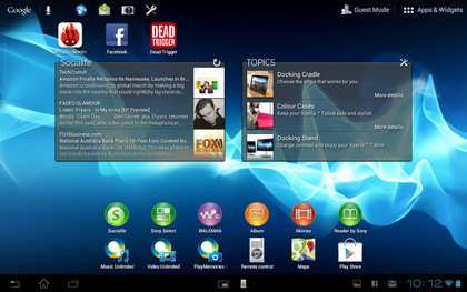
You swipe across the screen to move between pages, of which you're limited to five in this case. That's not very many, especially if you plan to use many widgets, but there are other launchers available from Google Play that can extend that number if need be.
Moving between the screens produces a slightly 3D effect, because they rotate a little like a carousel. Gliding across the home screens is slick and responsive with no slow down, and as with any other Android device, each home screen can be filled with apps, folders and widgets.
Tapping an app or folder will open it, and tapping a widget will do, well, whatever the widget does.
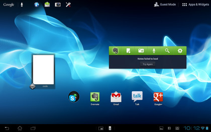
The Sony Xperia Tablet S comes with a few widgets already set up. There's one that displays recent documents, one with social network feeds, one that displays notes from Evernote, one that shows recently read books, one with weather forecasts and a few that try to get you to buy things.
Aside from the ones that just advertise stuff, it's a pretty good selection, but there's no requirement to keep any of them if you don't find them useful.
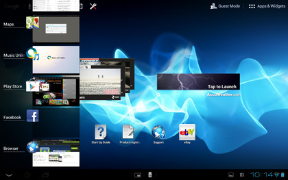
At the bottom left of each screen you get the three main software buttons - back, home and recent apps.
These will probably be familiar from other Android devices, but the back button takes you back to the previous screen, the home button dumps you on the home screens and the recent apps button brings up a display of any apps you've used recently and enables you to tap on one to open it (often taking you straight back to where you were in it). Alternatively you can swipe across an app to remove it from the list.
Having these buttons on the left of the screen rather than in the centre takes a bit of getting used to, but once you do it doesn't pose a problem.
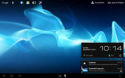
At the bottom-right of each screen, the time, battery level and any active connections are displayed. Just to the left of them you can see thumbnails for any recent notifications, so for example if you've got a Facebook message an 'f' symbol will be displayed.
Tapping anywhere in this area brings up the notifications screen, which shows your notifications in detail and enables you to tap on them to open them when applicable. It also displays the date and has an icon that takes you to the main settings screen.
Where things really start to differ from the norm is in the bottom centre of the screen. Here you'll find two more icons. The first one launches a remote control for use with other Sony devices, such as TVs and Blu-ray players.
Unfortunately it only works with Sony devices, and even then not all of them - for example the Playstation 3 is incompatible - so its usefulness is limited.
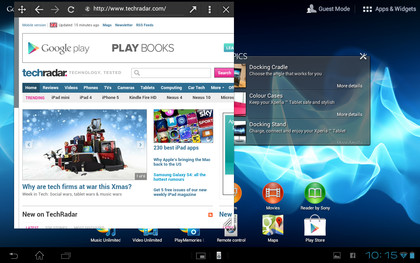
Next to that there's a mini-apps icon, which brings up a small selection of apps that launch in a little box on top of whatever you've currently got open. The selection includes things such as a calculator, note pad, timer and - most usefully of all - a web browser.
This is a really great idea that we'd love to see on more tablets. Being able to look something up online without leaving the app you're in is a simple but important feature.
Unfortunately, although these mini apps can be repositioned, they can't be resized, meaning you can't really use them at the same time as doing other things. For example, you can't watch a video while browsing the web because the web browser is large enough to obscure part of the video.
That's a shame, and is obviously the next step, but it still adds an extra level of convenience to using your tablet.
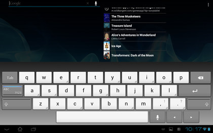
At the top-left of each home screen there's a Google search bar, which can be used to perform text and voice searches of the internet or the tablet itself. These work reasonably well, but in terms of searching the tablet, it's generally easier just to look through the applications list for what you want.
To the right of that there are icons to launch the web browser, email, camera and settings. We suppose this is the Sony Xperia Tablet S's take on a dock, but it's not as convenient as docked apps on other Android tablets.
The icons are small, the positioning is different and you can't change what icons it lists. So for example even if you have no interest in using the camera on your tablet, it will still have pride of place on every home screen.
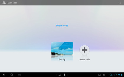
At the top-right of each home screen there's another new addition - Guest Mode. This enables you to set up multiple user profiles and even limit access to specific apps on them. It's a useful feature, though it's worth noting that any tablet running Android 4.2 has a very similar feature built in anyway.
It's actually more useful than this too, since you can select a user from the lock screen, whereas on the Sony Xperia Tablet S it always defaults to the main user and you then switch it to another user from the home screen, giving you less privacy if you just want to use the tablet as a shared device.
It also doesn't set up apps differently for each user; for example if a secondary user is granted access to the email app it will still be logged in to the main user's account. It didn't always work very well either. Sometimes trying to launch a different user area just brought up a message asking us to try again later.
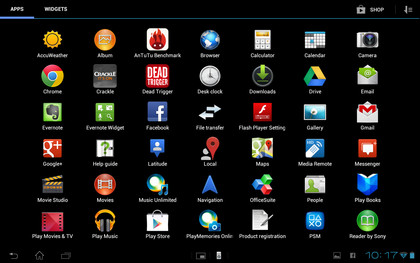
Finally at the far-right there's a button to launch the app drawer, and nothing has been changed here at all. You swipe horizontally across the screen to scroll through your apps and widgets, while icons at the top-right enable you to configure how you want to sort them (either alphabetically or by newest first). You can also get to Google Play from here.
You long-press an app or widget to place it on a home screen, and in the case of apps you can also delete them by long-pressing and then dragging them to the bin icon.
Once on a home screen, apps can be dragged and dropped on top of each other to create folders, while long-pressing a home screen enables you to change the wallpaper.
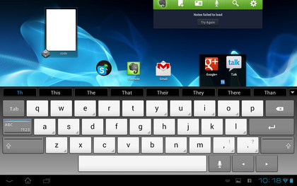
Part of the general operation of the Sony Xperia Tablet S is of course using the keyboard, and Sony has put its own one on the device, rather than using the standard Android one. It's not too different, though.
It's well sized both in portrait and landscape, it seems very accurate and there's no lag on button presses so mistakes are minimal, though we did notice that it occasionally missed the first letter in words.
It brings up word suggestions as you type, and tapping on any of them will complete the word, but it doesn't auto-correct mistakes, and although it makes a tapping sound when you press a button there isn't any haptic feedback, so it's a little limited.
There is a voice option if you prefer, and that generally proved pretty accurate, but it would often take a few seconds to interpret and input your words, so it's not really any faster. All in all it's a mediocre keyboard, adequate certainly but nothing special.
However, there are dozens of alternative keyboards available on Google Play if you don't get on with it, and with the exception of haptic feedback (which is a hardware feature) they should be able to add everything that's missing from this.
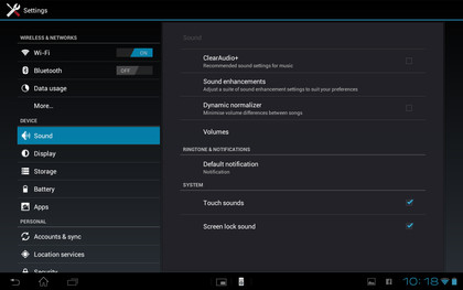
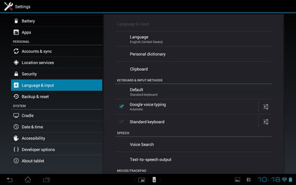
The only part of the interface left to look at is the settings screen, and there's not a lot to say about that because it's the normal Android one.
There are various sound, display, storage and security options, such as brightness, whether or not to auto-rotate the screen, and activating a pin or password on the lock screen.
Additionally, you can view details on the battery performance, set up and sync email accounts and more. It's all clearly labelled and well organised, so it's easy to navigate even if this is your first Android device.
All in all the Sony Xperia Tablet S is pretty easy to get around. The changes Sony has made to the Android interface give it a bit of a learning curve for anyone who already knows Android, since certain icons aren't where you'd expect. But once you get used to it, it's fine.
It performs well on home screens too, gliding around them with ease, and even when multitasking it doesn't seem to struggle.
The new features are a mixed bag - not being able to change the dock icons is a shame, and the keyboard isn't the best we've seen, but mini apps is a great idea, the guest user mode is a bit glitchy but potentially useful, and if you've got a Sony TV the remote could come in handy.
James is a freelance phones, tablets and wearables writer and sub-editor at TechRadar. He has a love for everything ‘smart’, from watches to lights, and can often be found arguing with AI assistants or drowning in the latest apps. James also contributes to 3G.co.uk, 4G.co.uk and 5G.co.uk and has written for T3, Digital Camera World, Clarity Media and others, with work on the web, in print and on TV.
