Why you can trust TechRadar
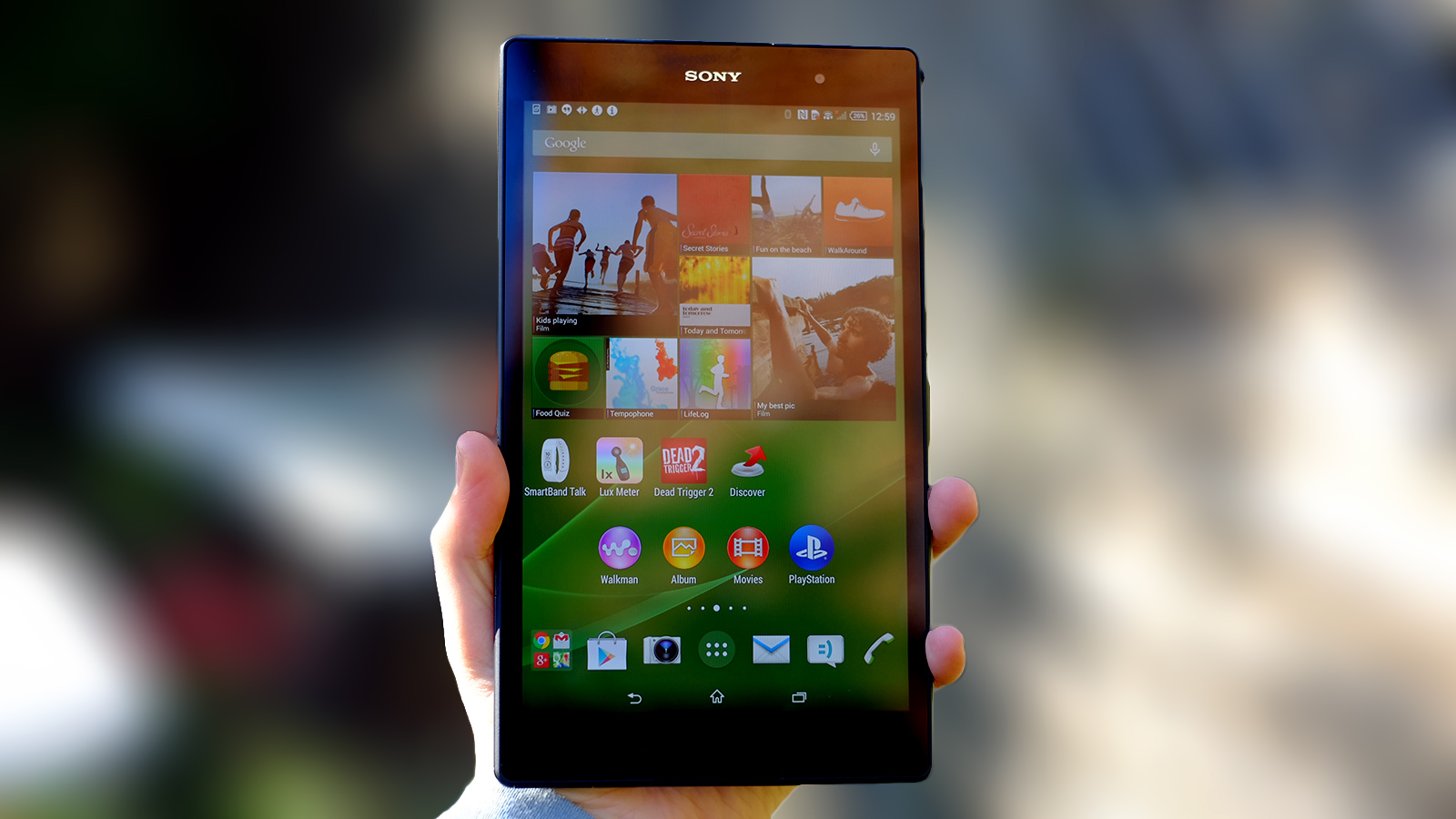
Phone makers often care a bit too much about making their devices slim, but tablets like the Sony Xperia Z3 Tablet Compact can often seriously benefit from being a lot lighter and thinner than the rest. They take up less space in your bag, and are much more comfortable to use in a single hand than chunkier tabs.
Size and weight are key. I found the Sony Xperia Z3 Tablet Compact narrow enough to hold in one hand, and easily light enough to do so for a while without ending up with aching arms.
Looking at the dimensions, it's not hard to see why. The Sony Xperia Z3 Tablet Compact weighs just 270g and the widescreen-aspect 16:10 display lets the tablet stay a good deal narrower than an iPad mini 3 — 124mm to the iPad's 134.7mm.
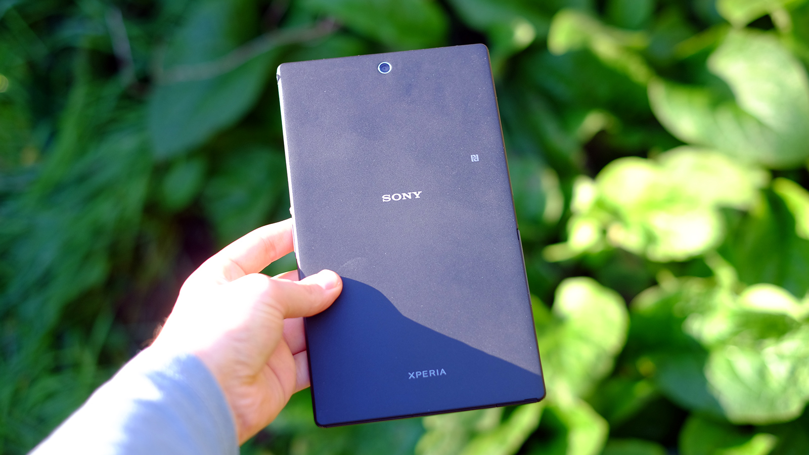
Like several of the Sony Xperia phones, the Sony Xperia Z3 Tablet Compact is water resistant too. To this end it uses rubber seals on all its ports, bar the headphone jack, which is specially treated and so doesn't need seals.
There are two of these flaps. The one that covers the microUSB charge socket is on the bottom, while a larger one that keeps the microSD and nano SIM (in the mobile internet version) slots safe is on the left side. I'd love the waterproofing even more if, like the Samsung Galaxy S5 Mini, it didn't need a flap for the charging socket.
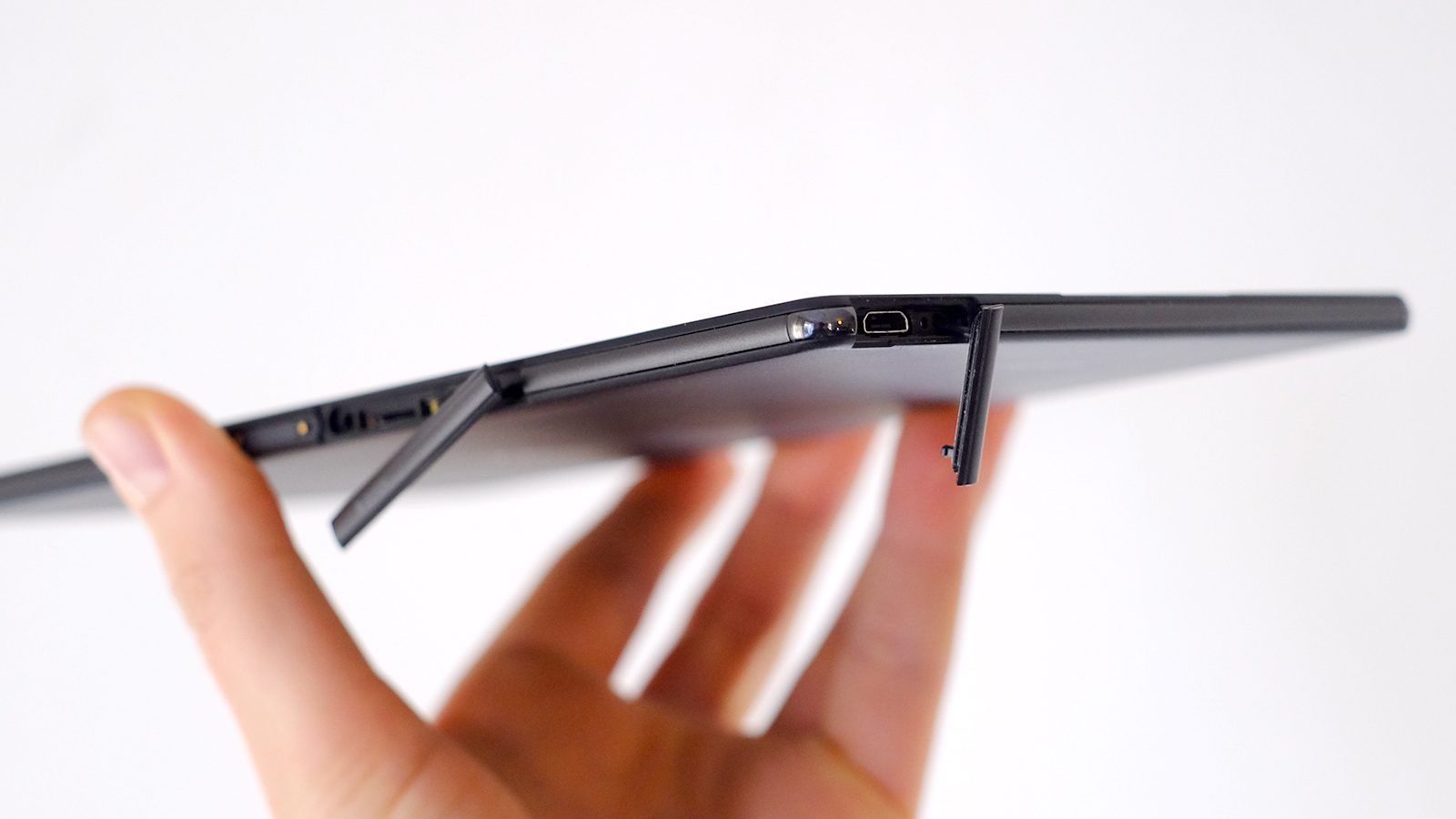
After all, heavy users will need to unseal and reseal it every other day or so, which will inevitably lead to wear.
The Sony Xperia Z3 Tablet Compact is certified to the IP65 and IP68 standards, meaning it's impervious to dust and can be dunked in water at depths of up to 1.5m for 30 minutes. As waterproof as you probably need, in other words.
The tablet also shares its design style with other high-end Xperia devices. Just like the Sony Xperia Z2 Tablet, its back is plastic and it has clear, defined sides rather than trying to sweep the sides and rear into one coherent curve.
It's not quite as flash-feeling as an aluminium iPad mini 3, but feels better than the new Nexus 9, despite being made of plastic. For a tablet that's 6.4mm thick, the Sony Xperia Z3 Tablet Compact is commendably rigid.
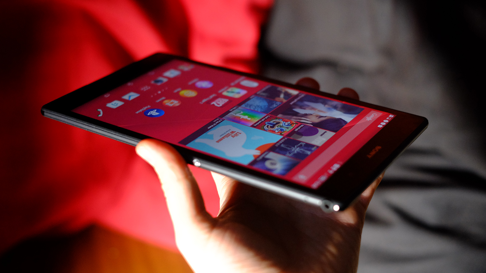
This is not a 100% plastic production, though. There are little metal bits on each corner, presumably part of an internal structure designed to avoid catastrophic damage should the Sony Xperia Z3 Tablet Compact be dropped. I didn't try this. Sorry.
There is one element I'm not entirely sold on. Sony has plonked a dock port on the left side and volume/power controls right in the middle of the right. This is typical of the Xperia-staple Omnibalance design, but it doesn't do the Sony Xperia Z3 Tablet Compact any ergonomic favours.
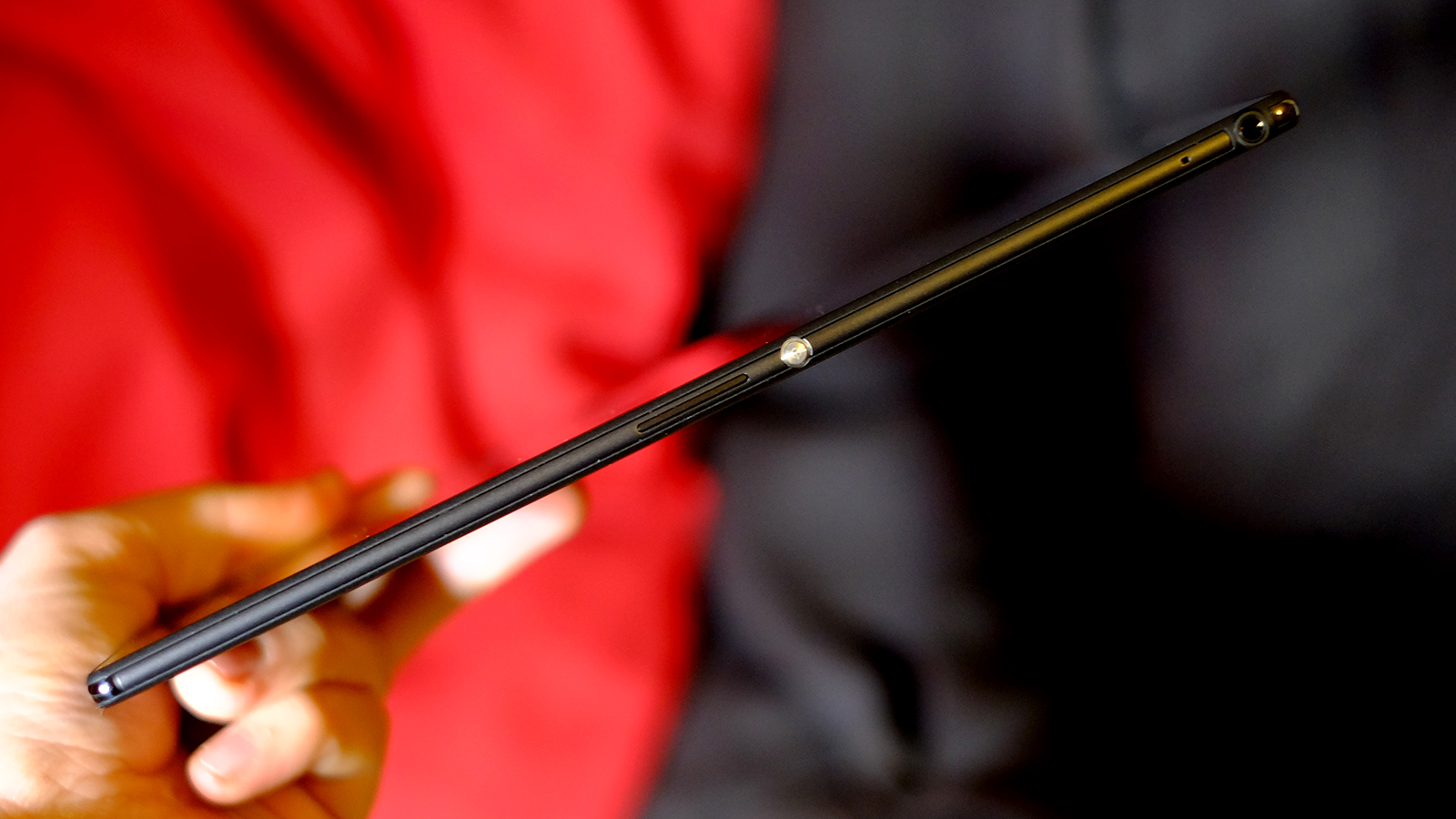
When holding the tablet in portrait aspect, your hand naturally rests over these bits, and it just doesn't feel as great as a smooth surface would. Design consistency is good, but not when it works to the detriment of the product's use. It's almost as if your hand is an inconvenience to the Sony Xperia Z3 Tablet Compact.
Despite this, I still find the Sony Xperia Z3 Tablet Compact one of the most convenient 8-inch tablets, if not the most. You can't win 'em all.
While the back of the tablet is firmly locked in place, the microSD card slot gives you flexibility that I value over being able to switch out the battery. You get 16GB storage fresh out of the box, but that's not really enough if you want real video jukebox-style flexibility: but you're just a microSD card away from that.
Screen
The Sony Xperia Z3 Tablet Compact has an 8-inch screen, large enough to offer a much better video and gaming experience than something like the Nexus 7. It's a good size, and this sort of 7.9-8.4 inch category is becoming hugely popular, brought into the mainstream by dropping prices and new tech allowing tablets to get thinner and lighter.
This is a mostly-satisfying screen, with the vivid colour and reasonably good contrast we've come to expect from Sony's higher-end LCD devices. Those who like a neutral-toned screen may find the Sony Xperia Z3 Tablet Compact a bit oversaturated, but the effect is minor. I think the colour saturation and tone are well-judged given that most people like vivid colour, much like people tend to prefer extra bass in their headphones.
There are issues though. Resolution does not match up to most rivals at the price. Both the iPad mini 2/3 and Samsung Galaxy Tab S 8.4 offer many more pixels than the Xperia Z3 Tablet Compact's 1,920 x 1,200 resolution display.
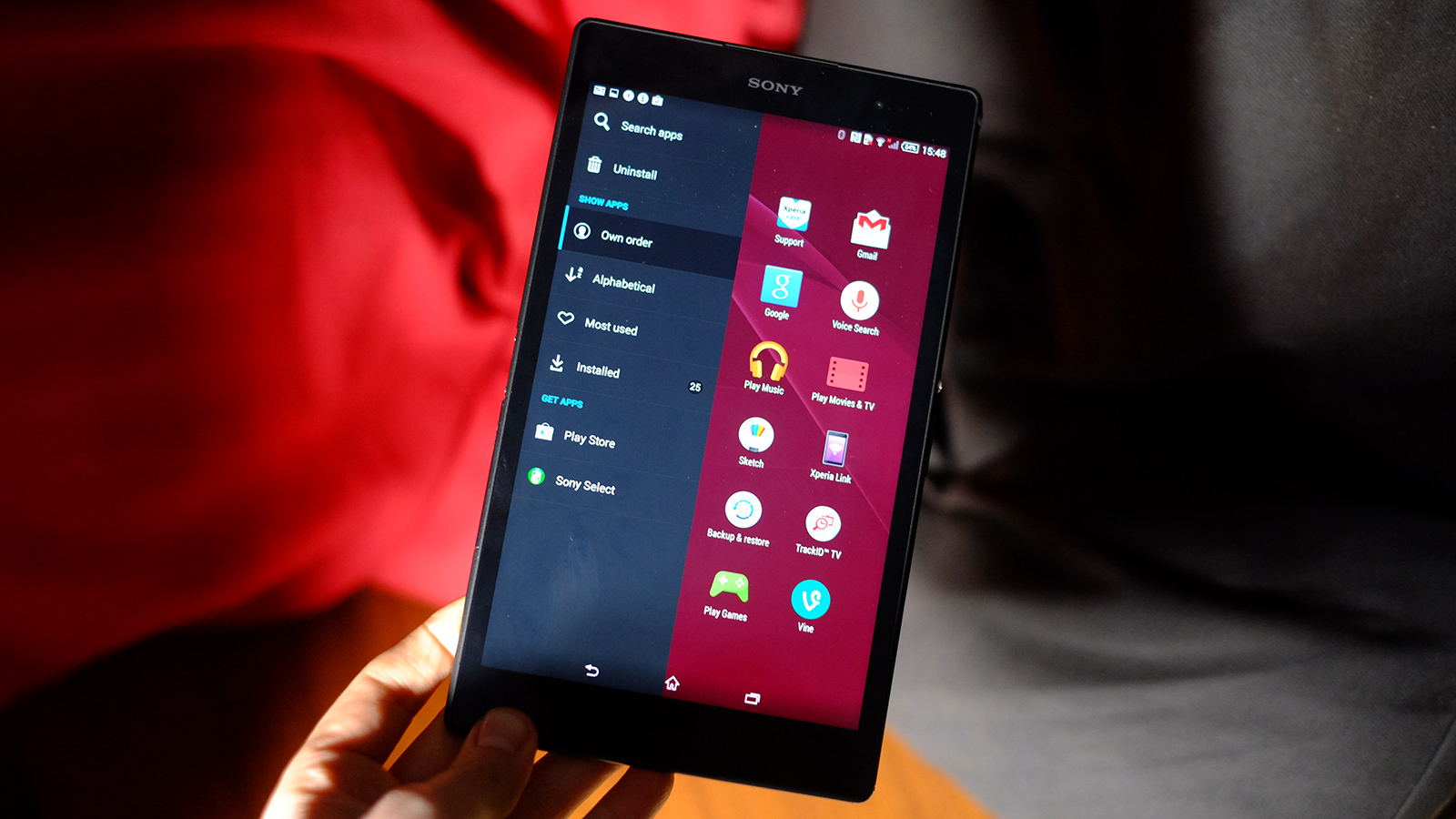
That's the same resolution used by the Nexus 7, a now-aged 7-inch tablet. If you haven't yet experienced an ultra-high dpi tablet screen I think you'll probably be satisfied, but text in particular looks significantly softer than it does on the Samsung and Apple tablets.
This isn't the highest-grade LCD screen in other respects either. At an angle, the Sony Xperia Z3 Tablet Compact's backlight leakage becomes a little obvious. We saw this sort of viewing angle limitation in the first Sony Xperia Z phone, and it's a shame to see a similar (but less severe) effect here. However, there's none of the ugly contrast shift that truly basic LCD screens suffer from.
General contrast and black level are also worse than the Samsung Galaxy Tab S 8.4, which uses a Super AMOLED screen. All OLED screens offer better black level than all LCD screens (bar completely botched OLEDs) and the Samsung is the clear leader of the pack at this point.
As a retort, the Sony Xperia Z3 Tablet supplies quite excellent top brightness, making even its pretty reflective display quite easy to use outdoors.
You also get some customisation options over how the screen looks. To start, you can fiddle with the white balance using RGB sliders. This offers loads of tweakability, but I think the awkwardness of this makes it a bit less useful than a simpler warm/cool colour temperature slider used by other manufacturers, such as Nokia.
There are also image enhancement options. X-Reality aims to increase contrast and colour saturation in images to give them more pop while the Super-Vivid mode jacks up saturation throughout. I preferred the display with all the extras turned off, but this may be a result of spending years analysing displays looking for things to complain about.
Those less picky may love the jazzier modes, and even the super-vivid setting is less offensive than the higher-saturation screen modes on offer in the OLED Samsung Galaxy Tab S 8.4.
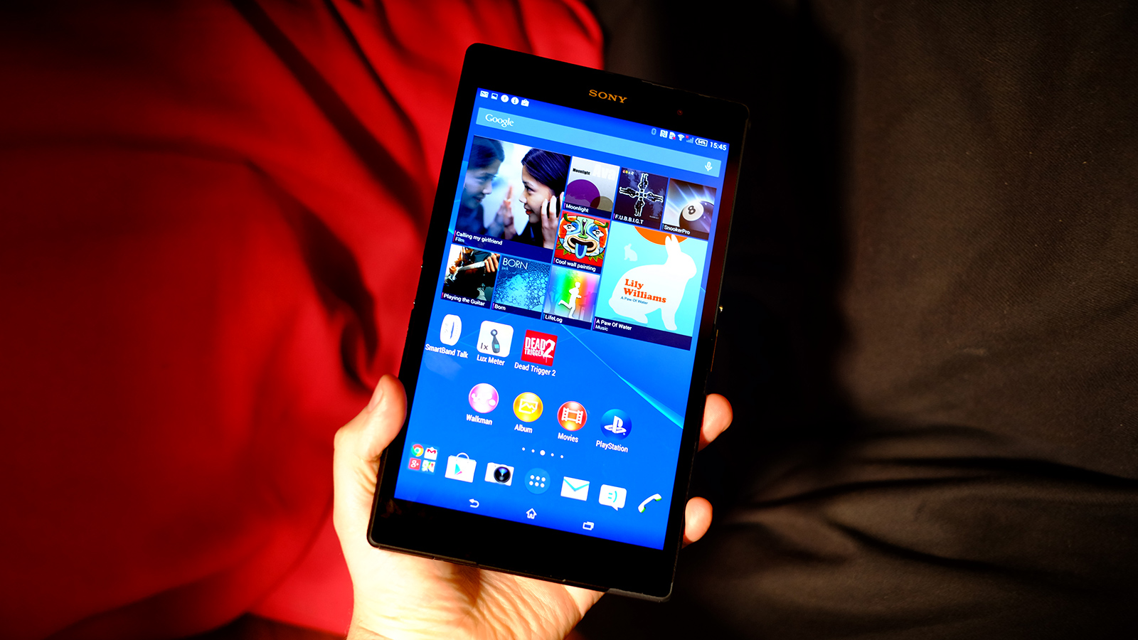
The only lingering question: do you really want a widescreen display rather than a 4:3 one like the iPad? I find the 4:3 style a natural fit for larger tablets, and next to an iPad mini the Xperia Z3 Tablet Compact can seem a bit overly long.
However, with a 4:3 8-inch screen it wouldn't be as easy to handle one-handed, so it's a personal choice rather than a one-sided victory for iPad-shape screens.
Andrew is a freelance journalist and has been writing and editing for some of the UK's top tech and lifestyle publications including TrustedReviews, Stuff, T3, TechRadar, Lifehacker and others.
