Why you can trust TechRadar
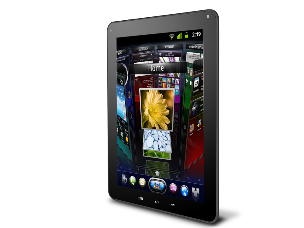
Having replicated the iPad's 9.7-inch form factor, ViewSonic has taken further design hints from Apple's tablet when crafting the plastic-backed ViewSonic ViewPad 10e.
Lining up at just 9.1mm thick, the ViewSonic ViewPad 10e is a mere 0.3mm thicker than the iPad 2, a difference barely noticeable when the devices are viewed individually, but one that keeps the ViewSonic tablet's near-perfect replication of the iPad 2 dimensions safely on the correct side of complete patent infringement.
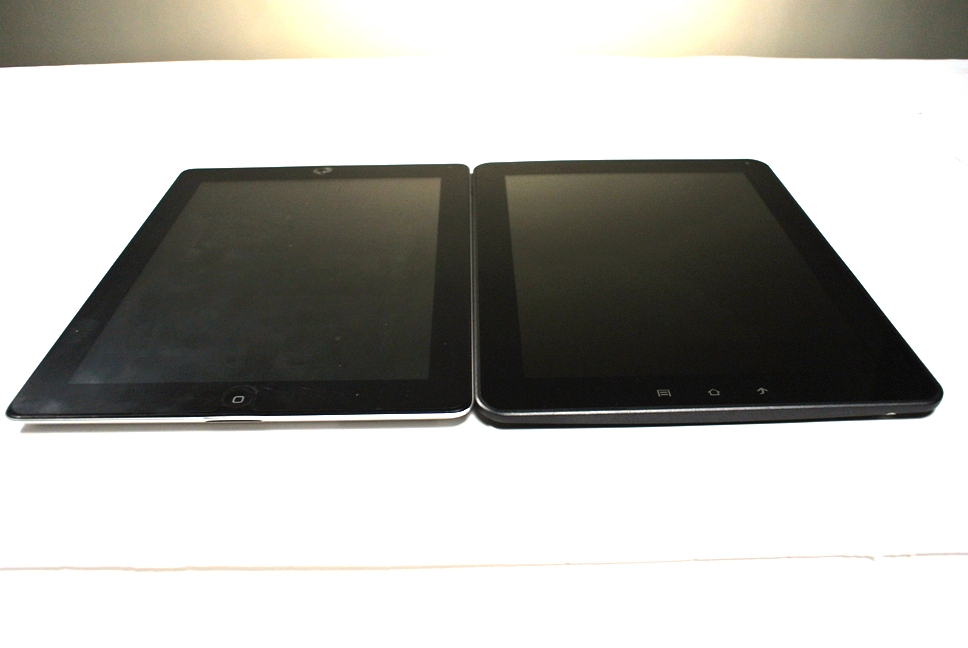
While its form factor might be quite similar to that of the iPad, the build quality of the two devices is a world apart. Although some plastic-backed Android devices have come in for criticism due to their lack of structural rigidity compared with the aluminium hewn iPad, the ViewSonic ViewPad 10e takes this to new, painfully low levels.
Despite a good feel in the hand with the 620g weight well balanced throughout the device, the ViewSonic ViewPad 10e is let down by a number of large design and construction faults.
The join between the locked plastic back plate and plastic outer frame leaves a sharp and uncomfortable join where the two meet that repeatedly catches your fingers. But with very little pressure the frame pulls away from the side of the LCD display, leaving edges of the 9.7-inch screen unveiled.
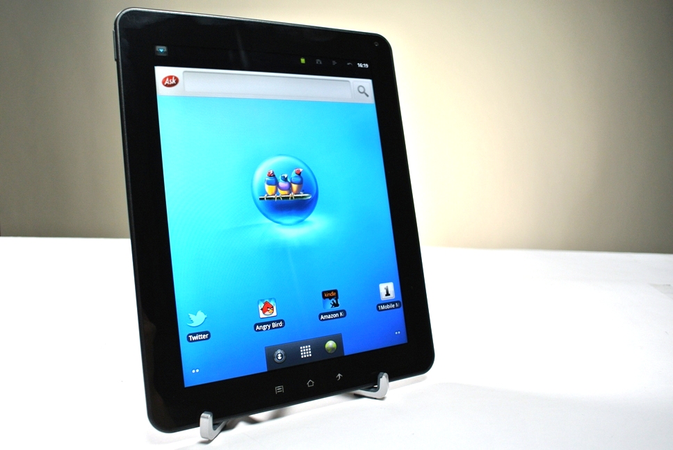
Although the ViewSonic ViewPad 10e's 9.7-inch XGA LCD screen is touted as sporting an impressive 1024 x 768p resolution, boot the device up to the home screen and this seems a farcical overestimation.
Images appear grainy, with dull colours and a frankly ridiculous Ask search bar that looks likely to have been plucked as an unmodified afterthought from a browser from the last decade.
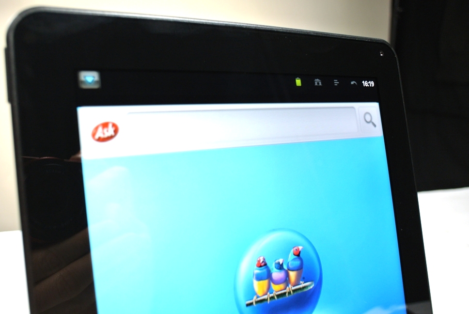
In truth, however, under further inspection the XGA offering does provide strong image quality that is let down by the poorly-constructed faux Android home screen. When viewing images and streaming videos, colours are crisp, with a wide viewing angle enabling users to work around the direct line of sight limitations of some devices.
Where the ViewSonic ViewPad 10e's display struggles, however, is in changeable light conditions. With no light sensor offering auto dimming options, on-screen content can become drowned out by bright artificial light or become difficult to make out in darker settings.
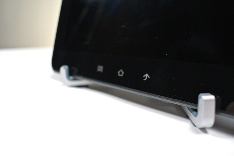
Moving on to the processor: a 1GHz Cortex A8 CPU paired with 512MB of DDR3 RAM shows its age, with commands taking some time to be acknowledged, often causing quite a stuttering fuss when they finally kick into life.
With just 4GB of internal storage, the incorporated microSD slot is key to this budget tablet's success. With the expandable storage enabling you to fully use the device's music and multimedia players, the option to upgrade to an increased capacity via a cheap memory card helps make the hardware hampering entry-level price tag appear even better value.
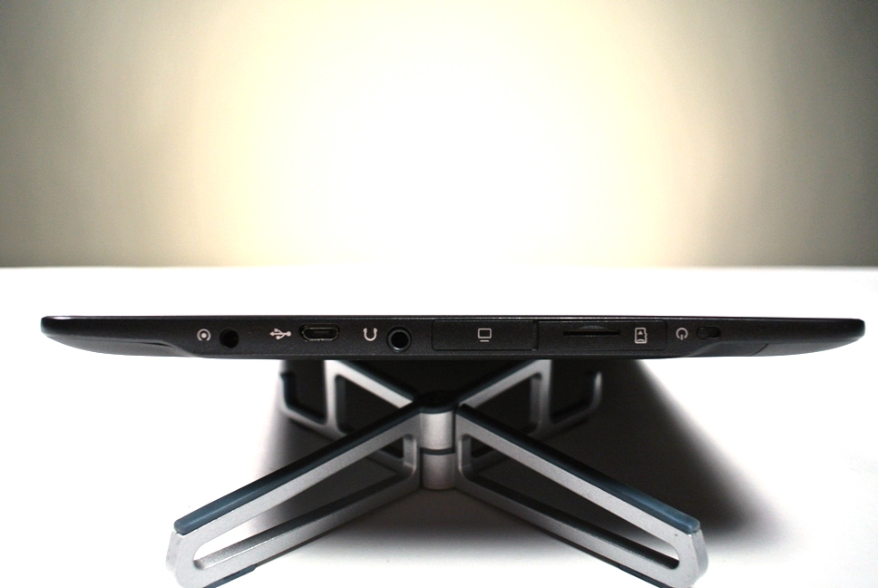
Featuring few physical buttons, the tablet's edge is well-used, with a micro USB connector and 3.5mm audio jack featuring on the top of the device, enabling easy file transfers and music playback.
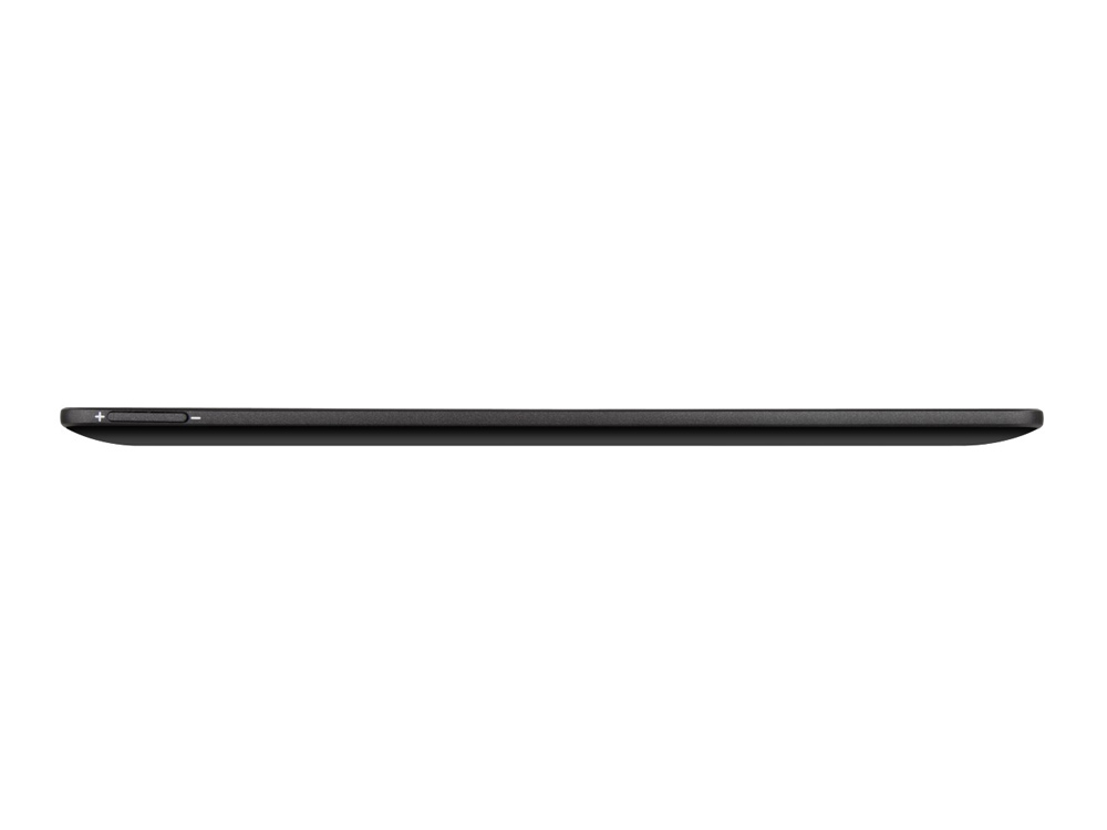
With physical volume controls neatly nestled atop the ViewSonic ViewPad 10e's left side, the only other physical button, the power and unlock switch, is poorly designed and infuriatingly difficult to use.
Farcically small and fiddly, the power button is represented by a small plastic nubbin that needs to be slid and released to lock or unlock the tablet. Removing any ease of use, the button sits almost flush with the frame, resulting in perhaps the device's most important button creating more frustration and irritation with every use.
The TechRadar hive mind. The Megazord. The Voltron. When our powers combine, we become 'TECHRADAR TEAM'. You'll usually see this author name when the entire team has collaborated on a project or an article, whether that's a run-down ranking of our favorite Marvel films, or a round-up of all the coolest things we've collectively seen at annual tech shows like CES and MWC. We are one.
