TechRadar Verdict
The BT Granite is a decent step-up compared with other BT phones we've 'enjoyed'. But even with its compact, minimalist design, it still falls someway short of the best
Pros
- +
Smart, compact, elegant design
- +
Ability to support up to five different handsets
- +
Digital answering machine
- +
Minimalist base stations holds the handset snugly and securely
Cons
- -
Build quality is creaky
- -
Basic, white-on-black UI won't please everyone
- -
Other sub-£100 DECT phones deliver better value for the money
Why you can trust TechRadar
This is more like it. While the BT Stratus 1500 is a horrible DECT phones for all kinds of reasons, the BT Granite is something of a coup. True, it has the same white text on a black background UI, but this time it makes more sense. You'll find out why in a bit.
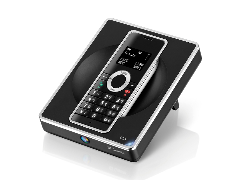
First to the handset and base station itself. The BT Granite eschews the elongated, bulky design of its sibling in favour of something a good deal more compact. The handset is a rectangular slip of a thing, not as slim as the Philips ID555 certainly, but it almost feels mobile phone-like in your hand.
It looks the part too, thanks to a gloss black fascia with white text keypad, a tasty chrome oval that gives you access to various phone functions. The back is finished in silver-coloured plastic, and it also has a chrome bezel that enhances the rest of its minimalist looks. Designed to fit in with other high tech chrome gadgets, you can easily see it sitting alongside a Sony Bravia TV, for example. Just what the tech doctor ordered then.
A better base station
Its accompanying base station is something of a novelty. Its shallow, square shape leans back almost towards the horizontal, enabling the handset to drop easily and securely into a hollowed out section in the middle, which is also scooped to enable you to easily pick the handset up again.
Delve into the white-on-black UI, and you'll find all of the features of its unloved Stratus 1500 sibling. You get the same mixture of spindly text and splodgy icons that give you access to various phone functions. But the execution feels more accomplished this time around: the small LCD actually fits the BT Granite handset's dimensions much better, while the chrome oval ring is actually a 4-way cursor type that enables you navigate around the otherwise uninspiring UI with ease.
Functionally, the BT Granite has a 100 name-and-number address book, a 12-minute digital answer phone and gives you the opportunity to send and receive text messages (provided you sign up to the appropriate BT services). Plus you can also run up to five handsets from the same base station. The base station and handset both have 15 ringtones - chances are you won't be enamoured with any of them.
Build quality
Unfortunately the BT Granite doesn't only share the same UI as its BT Stratus 1500 sibling, it also suffers from the same creaky build. Tapping the nicely spaced keypad buttons is fine, but push the whole keypad as a whole and that galleon of goths start being tossed about on the stormy seas again.
Luckily, the BT Granite also offers reasonable speech quality, while messages left on the digital answering machine are clear - you won't struggle to understand what's being said that's for sure.
All-in-all then a decent result for the BT Granite. It's not the best DECT phone we've ever played with, but after the BT Stratus 1500, it's arguably better than we had any right to expect.
