Why you can trust TechRadar
Nexus 6 sets new standards for both interface and performance among Androids with few exceptions. It's once again Google's standard bearer for other manufacturers to follow.
It's colorful and bright on the outside thanks to the debut of Android Lollipop, and it's a beast on the inside due to top-of-the-line internal specs.
Of course, even Google's new champion for the better part of 2015 has its challengers. The once fragmented competition is coming together to raise the stakes, and of course the new Nexus 6 2015 device is just around the corner.
Interface
Stock Android remains one of the best reasons to own a Nexus device. Its software is void of the often unnecessary third-party overlays and pre-installed apps that simply get in my way.

Sure, skins like Samsung TouchWiz, LG Optimus and HTC Sense look and run better today than they did two years ago, but pure Android is the way to go.
There's no getting around the fact that Nexus devices, like all Google Play Edition devices, receive future Android updates almost immediately without carrier intervention. That matters as much this year as it does next year.
We're gearing up for Google's successor to Android Lollipop, Android 6.0 Marshmallow, which will be released later this year.
While it probably won't be as big a leap as Android Lollipop was compared to Android KitKat, it's still set to come with some exciting new features, and it's a good bet that the Nexus 6 will be one of the first handsets to get the update.
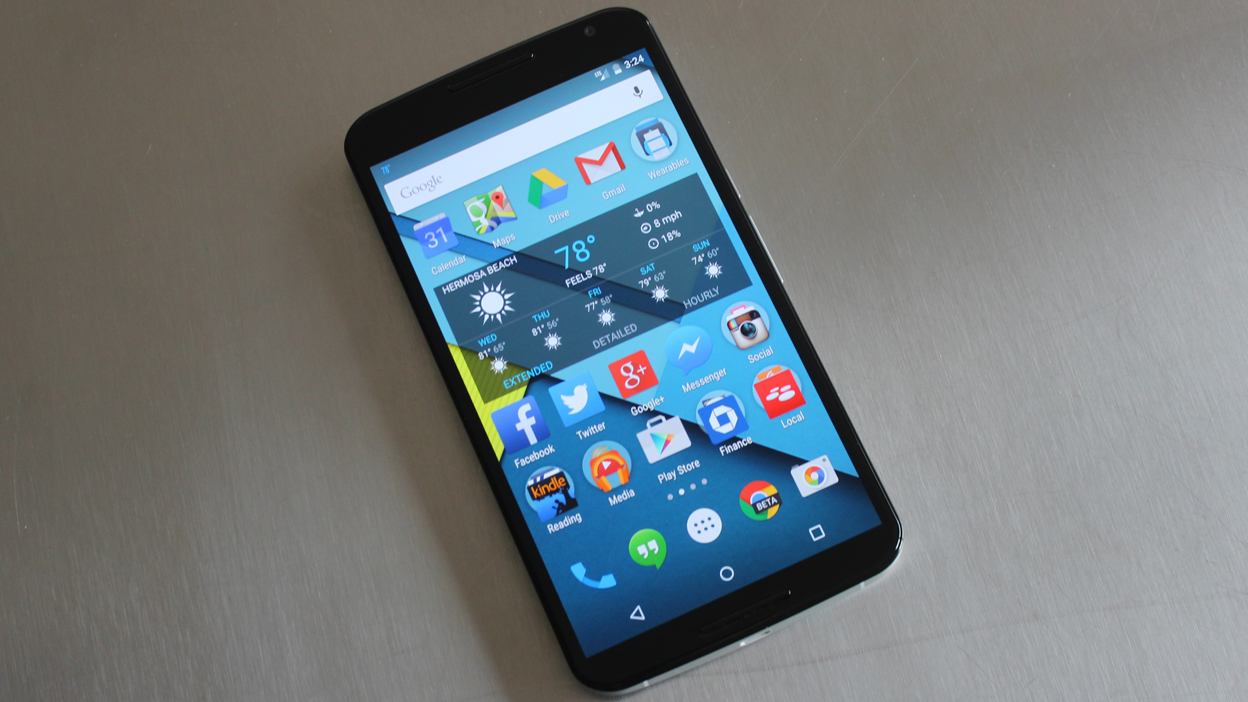
Right now though it's all about Android 5.0 Lollipop, last fall's pre-installed version of the operating system. It sports a flat, yet layered theme among its menus and apps.
Google calls this "Material Design," and it sort of lifts 2D layers to the third dimension with a combination of shadows cast by key and ambient lights.
The new look also dials back the visual non-essentials, but punches up the color. Menus aren't as dark as they were on Android 4.4 KitKat, and apps share in this same geometry-focused design and splash of color.
So far this applies to Google's slate of apps like Gmail, Google Play Movies & TV and Google Maps. The company is driving a simplified, unified layout throughout its ecosystem.
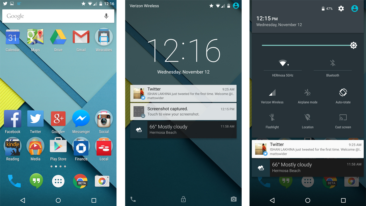
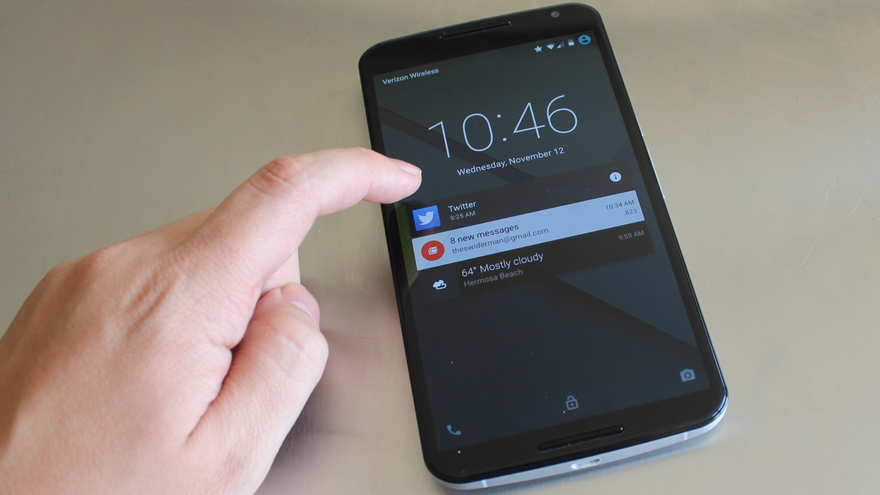
There's also a big difference to how Android 5.0 Lollipop functions, and I didn't even have to unlock my Nexus 6 to see the very first change - it was right there on the lockscreen.

Lockscreen notifications bring the hidden notification panel to the forefront with email alerts, text messages exchanges, app updates and so forth. It's all easily glanceable like on iOS 8.
Such a move would normally introduce a privacy problem. Google, however, nipped that issue in the bud within the "Sound & Notifications" settings menu.
With nothing to hide, I can "Show all notification content," keep certain items confidential via "Hide sensitive notification content," or turn everything off with "Don't show notifications at all." Better yet, I can block notifications on an app-by-app basis through this same handy menu.
Priority Mode is Google's more advanced take on Apple's Do Not Disturb feature. It silences the Nexus 6 indefinitely or in intervals ranging from 15 minutes to 8 hours.
Like the lockscreen notifications, certain apps and callers can be allowed or disallowed via whitelisting, and I've since ditched my third-party Silence app for this new, system-wide feature.
Priority Mode isn't part of Quick Settings like I had expected. It's activated by pressing the volume key in either direction and following the on-screen toggles.
Quick Settings does have some new additions, however. The pulldown menu doesn't require two fingers simultaneously. That still works, but now you can do one swipe for notifications, then another swipe to reveal this hidden quick settings menu. It's a lot less awkward.
It's still impossible to add to or rearrange the quick settings. What you see is what you get. Thankfully, new buttons alongside Wi-Fi, Bluetooth and Airplane Mode include Flashlight and the Chromecast "Cast Screen" button.
A brightness slider, while not necessarily new, is no longer hidden behind its own submenu. One less step is what quick settings is all about.
New features are already on the way too, with Android 5.1 set to roll out any moment at time of writing. That brings support for multiple SIM cards and high definition voice calls to the Nexus 6, as well as a new Device Protection mode, which keeps a lost or stolen handset locked until you sign in with your Google account.
Performance
Nexus 6 running Android 5.0 Lollipop clears all but one rival smartphone when it comes to benchmarks: the Samsung Galaxy Note 4.
It's awful close, and that's no surprise. Google's specs mirror it chip-for-chip with a 2.7GHz Qualcomm Snapdragon 805 quad-core processor, Adreno 420 GPU and 3GB of RAM.
Nexus 6 aces Geekbench 3 benchmarking tests with an average multi-core score of 3294. It's significantly faster than the smaller iPhone 6 Plus (2911) and Samsung Galaxy S5 (2905).
Alas, the Galaxy Note 4 eeks out a win with a benchmarking score of 3,352. A real overachieving nerd with a pocket-protected S-Pen in its frame, if that's what you want. The recently released Samsung Galaxy S6 and HTC One M9 also upstage the Nexus 6, with scores of 4,846 and 3,803, respectively.
Despite the newer handsets scoring higher, these numbers translate into stellar performance from the Nexus 6. Google's phablet is venturing into tablet territory, and the recent Nexus 9 slate averaged 3,492 in the same tests.
It's pushing the boundaries of more than just physical size. The one and only slowdown I saw was during the boot-up process. It took 1 minute 33 seconds to start this thing up.
At first slow start times seemed more like a glitch that can be addressed in a post-launch firmware update, however a year after launch and the Nexus 6 still takes its sweet time when booting up. Right now, streaming movies and playing CPU-intensive games hasn't slowed this phone down one bit.
That's a good sign if you're going to hold onto this smartphone for two whole years.

