TechRadar Verdict
Pros
- +
Headphones slot
- +
Full-text Twitter and Facebook messages
- +
Easy to use
Cons
- -
Bulky design
- -
No text message integration
- -
Unresponsive touchscreen
- -
Cumbersome OS
Why you can trust TechRadar
Whether or not Apple, Samsung and Google actually produce a smart watch this year or next, they'll have no doubt taken a good look at i'm Watch, one of the first touchscreen watches that connects to the web.
They won't exactly be quaking, because i'm Watch - as well as using questionable grammar in its name - is packed full of bad decisions that make it far more of a faff to use than any existing watch. In fact, we had a hard time using it even to tell the time.
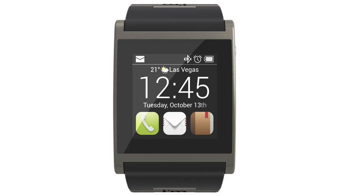
Our major complaint is the touchscreen, a 1.5-inch, 240 x 240 pixel affair that doesn't respond quickly, though the user interface's reliance on side-swipes and slight touches to tiny areas of the screen would test even the most sensitive systems out there.
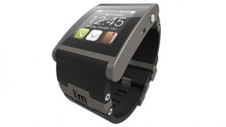
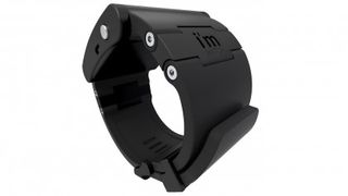
This Italian-designed watch - with a full price of £299 / US$399 / AU$369 - and its accompanying ecosystem of apps initially seems impressive. Though rather heavy at 90g (3.17oz), it looks something akin to an older iPod nano, though it connects to a smartphone to access its own hub website called i'm Cloud.

It's compatible with the iPhone 4S, iPhone 5, or any phone powered by Android 4.0 or BlackBerry 10 and above. The i'm Watch itself runs a customised version of the Android operating system, called i'm Droid 2.
The i'm Cloud connection is a big difference to most other smart watches, which are generally commanded by smartphone apps. Piggy-backing on your smartphone's web connection, here it's necessary to configure everything on i'm Watch not on a smartphone app but by visiting, and logging into, i'm Cloud. To initially set it up you need the i'm Watch's serial number to begin the sync.
At i'm Cloud there are several apps on a section called i'market. Select which ones you want to appear on the watch and they'll appear on i'm Watch as long as it stays connected to your smartphone via Bluetooth (though you do have to wait for the next scheduled sync, which could be 15 minutes later).
We chose to install email and Twitter, and entered our account details. The full text of Tweets and emails - though not images - are shown on the tiny screen, and are just about readable.

Other apps include home-baked apps for Google Calendar, email, a calculator and an alarm clock.
However, that's where the smart stuff ends. The next cloud-powered app we tried was i'music, which unexpectedly offered us not individual tracks, but only playlists themed around a particular artist, that it physically - and very cumbersomely - wanted to download to the watch track-by-track.
It's a bit like a very slow Last.fm, but sadly it's not controllable from the watch itself. Plus, 12 months' access to this questionable service costs €9.99 (around £8.50 / US$13 / AU$14).
That's a shame because i'm Watch is otherwise reasonably well equipped for music. Not so much its two tiny speakers - one on each side - but by dint of the headphones jack on the left-hand side, through which music sounds pretty good.

We do, however, recommend that you use that jack to hook up to a PC or Mac - such a cable is included (and needed to recharge i'm Watch every day) - to drag and drop your own tunes onto its 4GB innards.
Meanwhile, receive an incoming call and i'm Watch intelligently displays the caller's name, though while it is possible to answer the call without the phone, call quality is dubious; neither the built-in speakers nor microphone are up to much.
The lack of working text message alerts further reduces the attractiveness of i'm Watch, so that as a so-called smart watch, it's sadly lacking.
Verdict
The i'm Watch is nothing if not ambitious, and though we like the Android/iOS/BlackBerry neutrality, its own OS and ecosystem of apps is pretty basic.
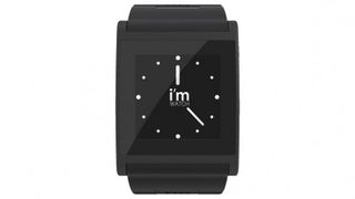
Bulky and needing a daily recharge (count on about 10 hours of use), i'm Watch's touchscreen display goes to sleep just as a smartphone's does after a few seconds of inactivity. The upshot is that a quick glance to tell the time is impossible - you'll need to wake it up first. So it's not much of a watch.
We're also concerned about its lack of text message alerts, while hands-free call quality is poor.
What we did like was the chance to read Twitter and Facebook updates in full on the watch, while listening to music when plugged in to the headphones jack on the side of the watch was a nice change - and a tad easier than having to frequently fetch a phone from a pocket.
However, i'm Watch is a faff to use - not least because you keep having to visit a website to configure it when an app seems so, so much more relevant for a smartphone accessory. The rumoured Apple iWatch, Samsung Galaxy Watch and Google Watch don't need to worry too much about the i'm Watch being a threat.
Jamie is a freelance tech, travel and space journalist based in the UK. He’s been writing regularly for Techradar since it was launched in 2008 and also writes regularly for Forbes, The Telegraph, the South China Morning Post, Sky & Telescope and the Sky At Night magazine as well as other Future titles T3, Digital Camera World, All About Space and Space.com. He also edits two of his own websites, TravGear.com and WhenIsTheNextEclipse.com that reflect his obsession with travel gear and solar eclipse travel. He is the author of A Stargazing Program For Beginners (Springer, 2015),

