Why you can trust TechRadar
Acer has come up with a name for its Android skin – Breeze. We aren't sure you'll think it's a breeze to use, though. You'll either love it or loathe it. If the latter is the case, you can switch it off and revert to vanilla Android.
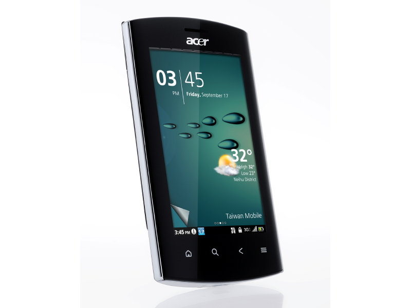
Breeze relies on a two-tier approach to getting about. When you switch the Acer Liquid Metal on, the Home screen shows the time and date, missed calls, notifications and the weather.
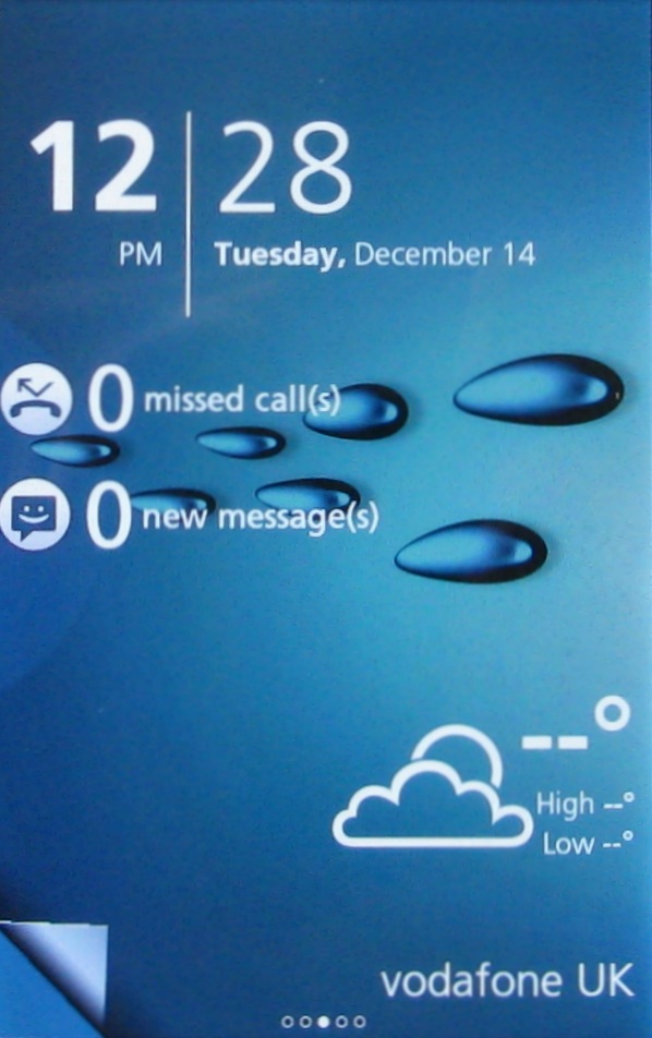
You can flick left and right to move through five Home screens, each of which can contain widgets. Nothing odd there. But you can't put shortcuts onto any of these screens with a tap and hold. You have to be in what we think of as 'layer two' of Breeze to do this.
You get to this by dragging a curled up corner of the screen on the bottom left.
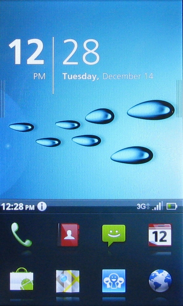
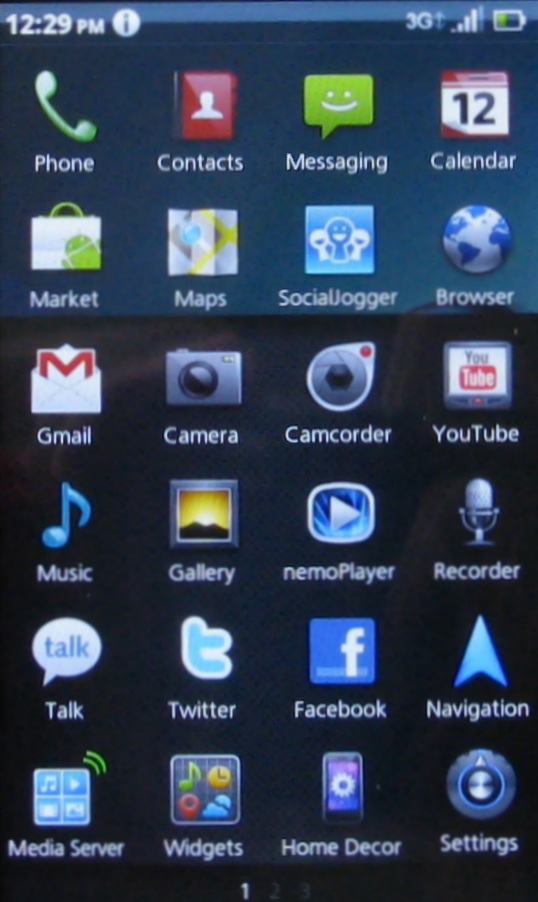
You can long press the home button to get to the add widgets area, or you can drag upwards on the row of four application shortcut icons at the bottom of the screen to see a full apps list, and tap the Widgets app at the bottom of the screen.
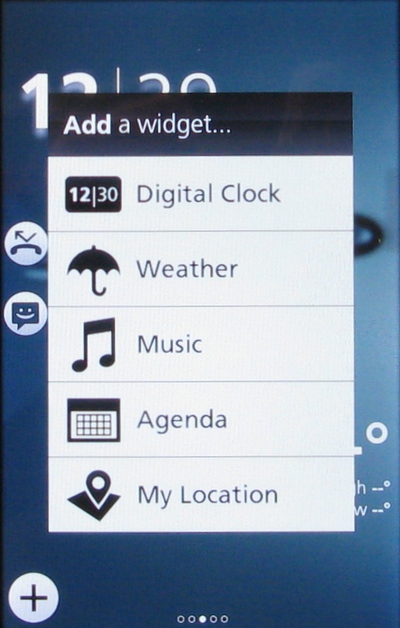
It is a bit of a round the houses way of fiddling with widgets, and it seems to us that it takes some of the spontaneity out of personalising your Android device. If you're keen on ever-changing widgets, it might be a step too far.
That 'layer two' Home screen has a few tricks on offer, too. It comprises three separately controllable elements. We've already seen that you can drag the four shortcuts upwards to reveal the full apps menu.
Sign up for breaking news, reviews, opinion, top tech deals, and more.
When you do this, the four app shortcuts that were at the bottom of the screen move to the top. The full range of additional apps are set across horizontally scrolling screens. Any you want to be in the set of eight that are always available can be dragged into position where they'll swap with the app that was previously present. A quick tap on the back button takes back you to the 'layer two' Home screen.
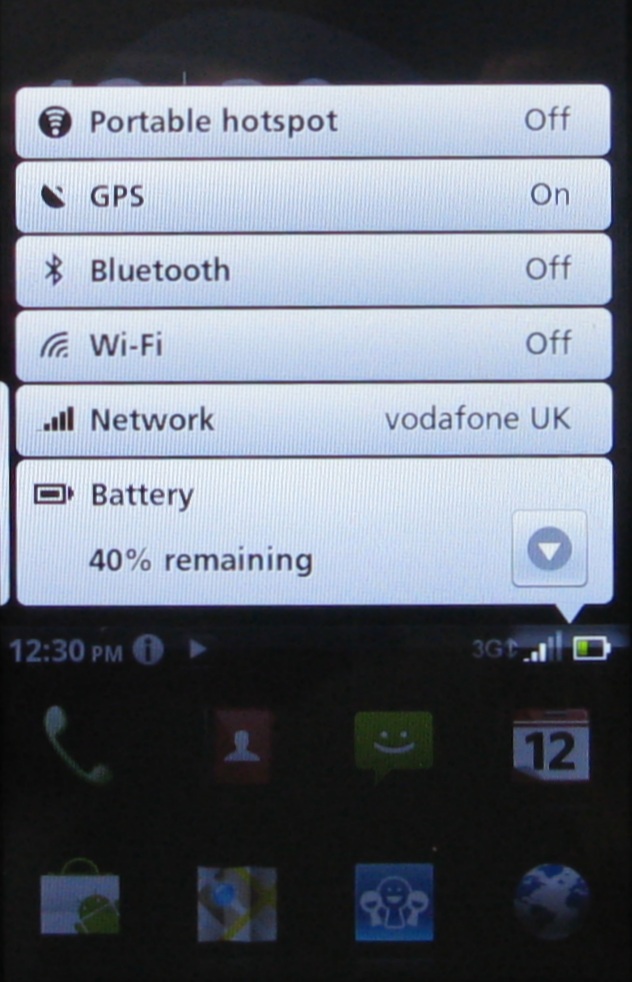
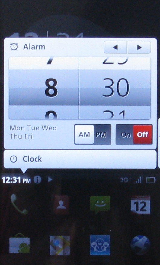
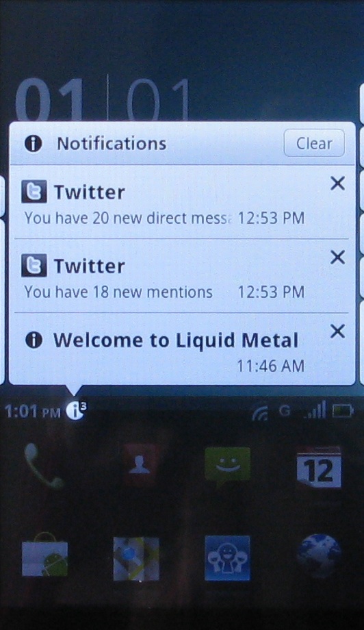
Just above the four apps shortcuts is the Android status and notifications bar, which is more usually at the top of the screen. Tapping it brings up a host of scrolling menus and options. The bar is narrow, so you have to be careful to tap it accurately. You can do things like fiddle with connection status, see notifications and set alarms.
If you've got music playing, there's even a small playback controller.
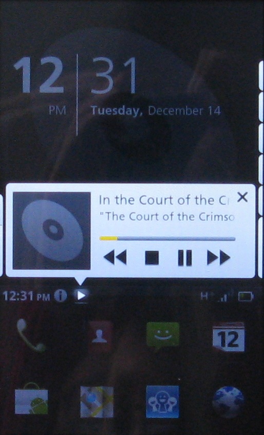
Quite oddly, this notifications bar often moves to the very bottom of the screen when you're in an app. This feels strange if you're used to other Android devices where it sits at the top of the screen.
The greatest bulk of the 'layer two' main screen is given over to the upper two thirds of the screen. This initially shows just the date and time, but sweep left and you can see a carousel of recently used apps, sweep right and you can see carousels of music, movies and video on the device.
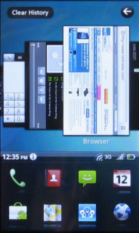
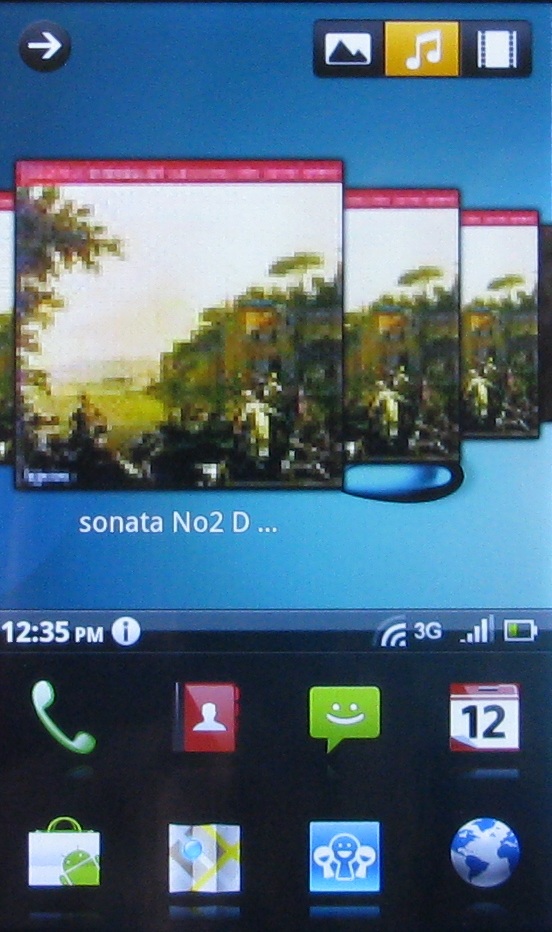
You can't personalise what these carousels show, but they do give you quick access to history and media, so are till quite handy. But the whole thing feels like an overly complicated way of getting round the Acer Liquid Metal.
Current page: Acer Liquid Metal review: Interface
Prev Page Acer Liquid Metal review: Overview Next Page Acer Liquid Metal review: Contacts and calling