Why you can trust TechRadar
Acer Liquid Mini review: Interface
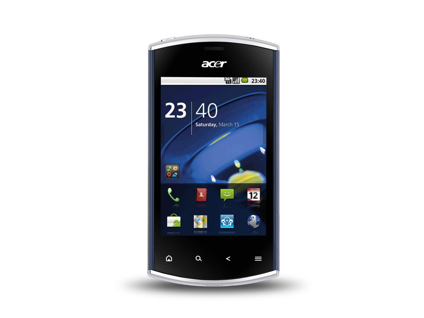
Acer uses a skin for Android that we've seen before, called Breeze, though it has been slightly tweaked this time round. It's a little convoluted, but if you like the concept you'll certainly be able to fly with it.
Switch the handset on and you'll be in the Lock screen, which presents missed call and message notifications, and tells you the date and time. Bottom right of the screen is the name of your network operator, and bottom left is what looks like a curled over corner.
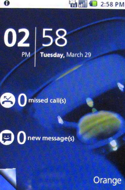
Tap a notification and you can slide the box that appears to go immediately to missed calls or to messages.
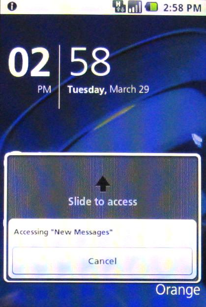
Alternatively sweep that folded corner at the bottom left and you are taken straight to the main screen.
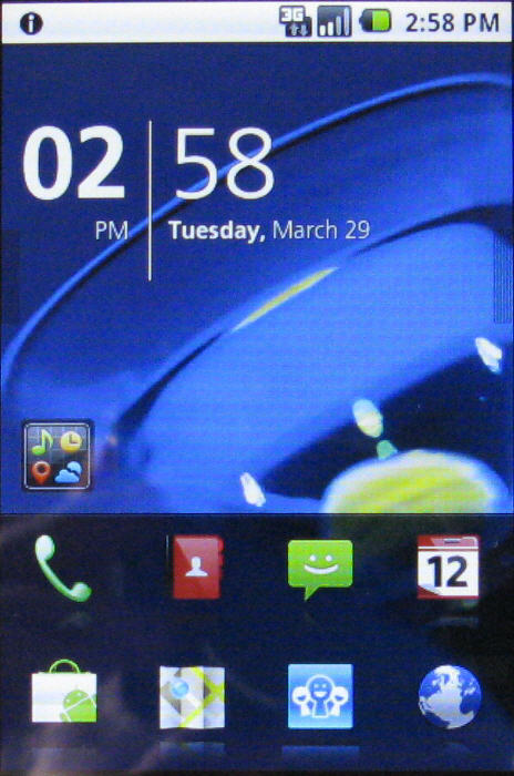
This is where things get interesting. The screen is divided into three sections. At the bottom there are two rows of quick shortcuts to apps. Sweep this area upwards and you're into the main apps listing, ranged across three screens, through which you horizontally sweep.
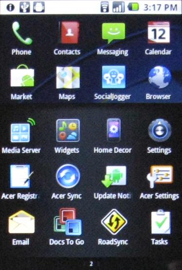
At the very top of the screen is the notifications bar. Acer had toyed with putting this above the shortcuts area in the Liquid Metal, but it's back where you expect it to be now. But the nifty alert bubbles remain.
Tap the notifications bar and up pop bubbles offering access to additional features. Sweep with a finger to move between them. You can set alarms, make connection settings, and see recent notifications. And more bubbles appear as you use some apps, such as during media playback.
Sign up for breaking news, reviews, opinion, top tech deals, and more.
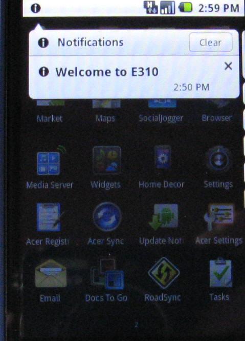
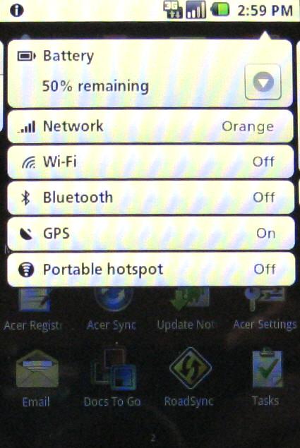
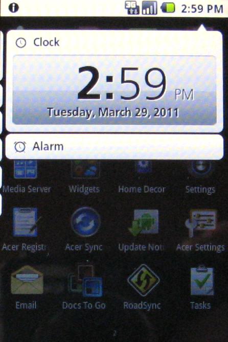
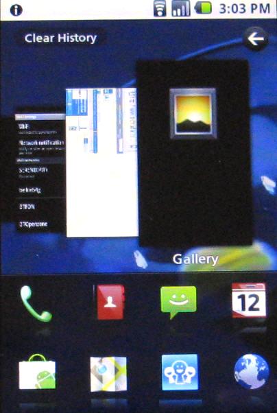
Now, that middle section has a hidden secret. Sweep a finger to reveal a new window on the left where you can see your recent usage history as a carousel of thumbnails. Moving through these to get to recently used apps is a delight. Sweep to reveal a new window on the right and you're into the media browser, where you can access photos, videos and music.
You want to know about widgets, right?
Well, you can set up five screens of them. There's a small widgets icon on the main screen, or you can tap and hold the Home button when you're on the main screen to get into the widgets screens.

Now you can scroll left and right to see widgets, and use the plus button at the bottom left of the screen to choose new widgets from a list.
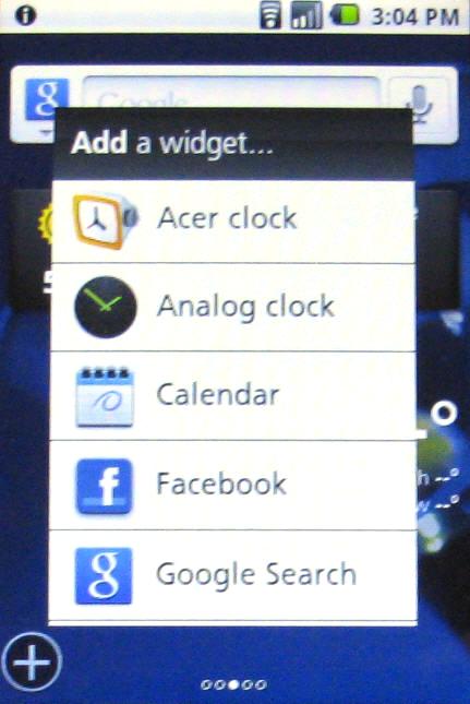
Just as we've found before with Acer's use of these widgets, it's a bit of a round-the-houses system, but it does work, and if you look on the bright side you get five widgets screens plus a flexible Home screen and an interactive Lock screen - all of which work pretty well, if a bit fiddly at times.
Current page: Acer Liquid Mini review: Interface
Prev Page Acer Liquid Mini review: Overview, design and feel Next Page Acer Liquid Mini review: Contacts and calling