Why you can trust TechRadar

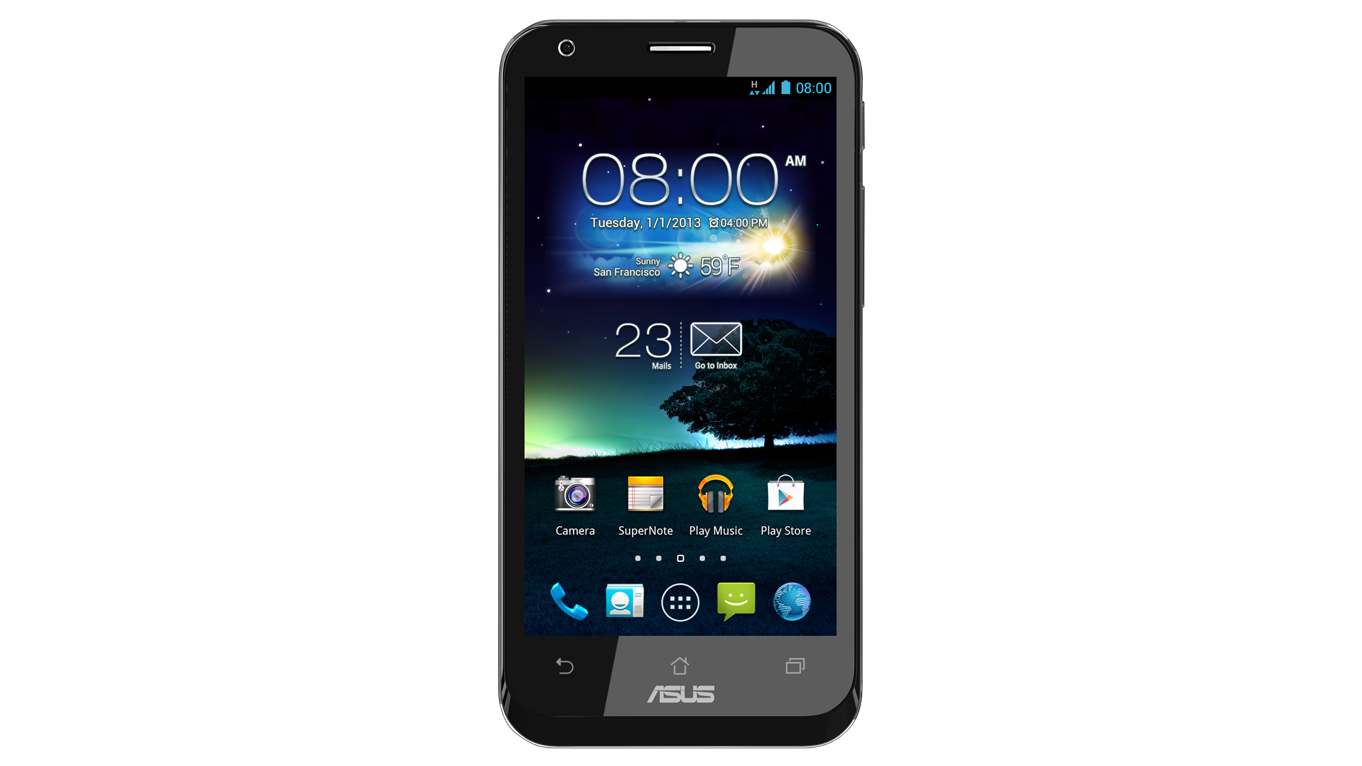
The Asus Padfone 2 is powered by Android 4.1.1 Jelly Bean, but what sets it apart from many of the major third-party Android manufacturers is that it's a relatively pure, almost stock version of the celebrated Google OS.
This is a significant plus point for the device, particularly when compared to the heavily customised user interfaces employed in the Sony Xperia Z, the Samsung Galaxy S3, the HTC One X, and pretty much any major Android device not belonging to the Nexus series.
By default there's a non-stock weather and time widget on the main home page, but this is simply a standard AccuWeather widget that can be removed at will.
Other than this, everything from the app icons and the drag-and-drop app folder system to the settings menus and the main app tray is classic Android Jelly Bean.
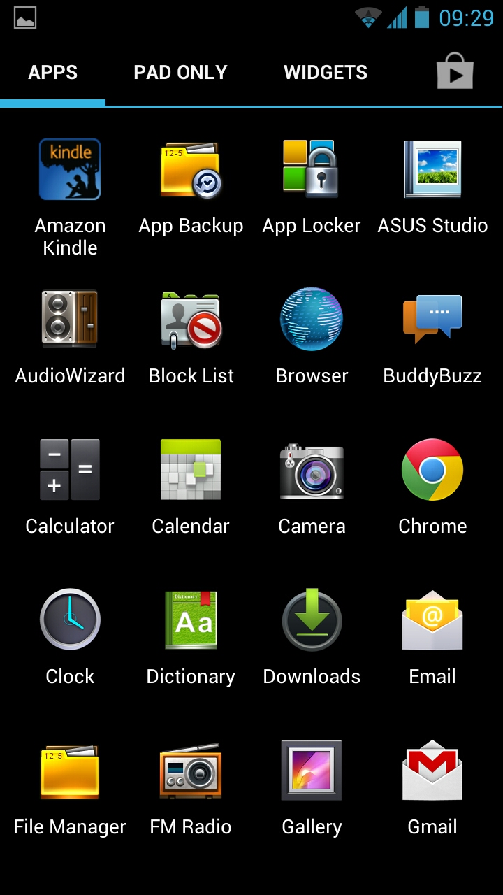
Drag your finger down to the end of a menu and you get that familiar blue glow to inform you that you've scrolled as far as you can go.
It sounds minor, but these little design flourishes have been pored over and refined by Google - one of the biggest software companies in the world, lest we forget - over a period of years and several major iterations.
We can scarcely believe that more hardware manufacturers don't capitalise on this expertise and make the ready-made stock Android experience at least an option for their handsets.
Asus is to be commended for doing just that.
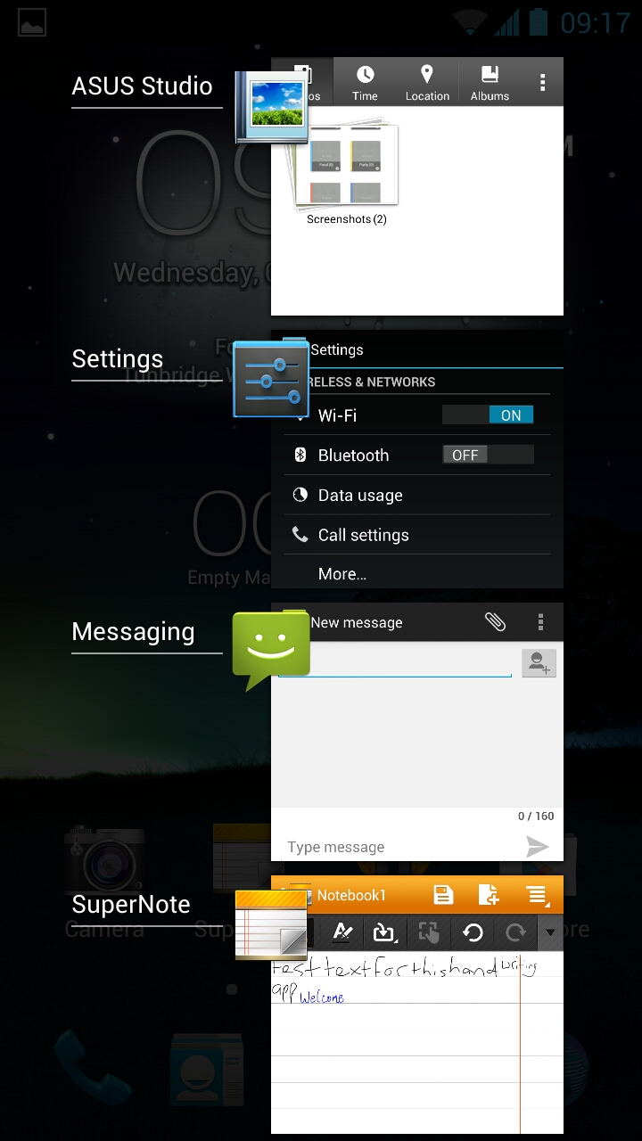
Unlike the Google Nexus 4, the dedicated capacitive multitasking key on the Asus PadPhone 2 brings up an overlay containing thumbnails of your recently accessed apps at the point at which you exited them.
You can jump straight back in with a touch, or close them completely with a swipe.
Touching and holding the home key of the Asus PadPhone 2 starts up Google Now - arguably the most exciting feature introduced in Android Jelly Bean, and fully intact here.
This advanced Google search picks up on your general Google ecosystem activity and lets you know what your route home is like, how the weather is in your locality, the status of any booked flights you have and more.
Of course, the company can't quite resist tinkering a little with this winning format, and predictably such alterations form the Asus Padfone 2 interface's weak spots.
Our main gripe here lies with the drop-down notification bar which, as always, is accessed by swiping down from the top of the screen when in one of the home screens.
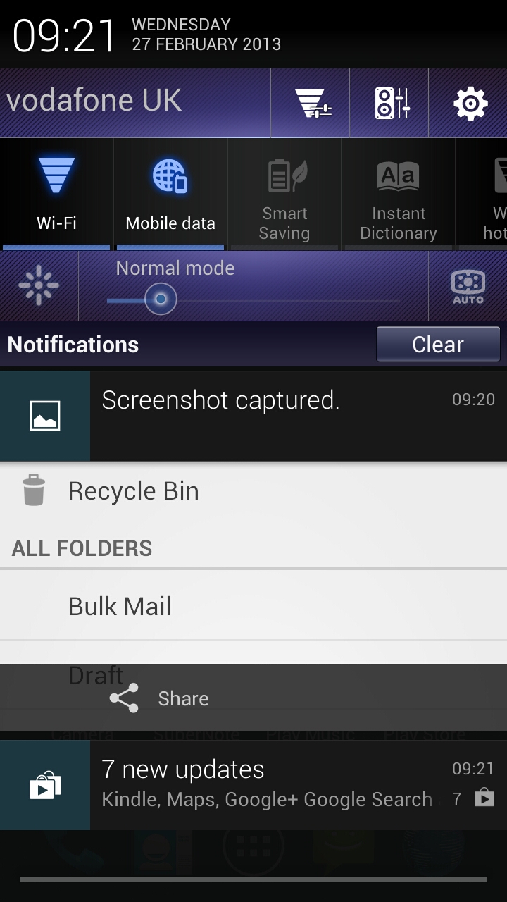
Put simply, Asus has gone to a lot of effort to spoil what is a beautifully clear and intuitive tool on the Google Nexus range.
The core functionality remains the same - you get a list of recent notifications, including missed calls, messages, emails, uploaded images and updated apps, which can be accessed with a touch or dismissed with a swipe.
But Asus has fleshed out the minimalistic settings shortcuts to form a somewhat ugly and obtrusive alternative.
On the Asus PadPhone 2 you'll find garish purple bars containing oversized brightness settings, Wi-Fi menu shortcuts and the like.
You also get a chunky revamp of the Wi-Fi on and off button, as well as equivalents for mobile data, a Smart Saving battery-saver mode, an Instant Dictionary function, a Wi-Fi hotspot function and more.
While arguably more functional, it's just too busy, and it takes up a good third of the screen space, leaving too little room for actual notifications while distracting your attention from those that do manage to squeeze in.
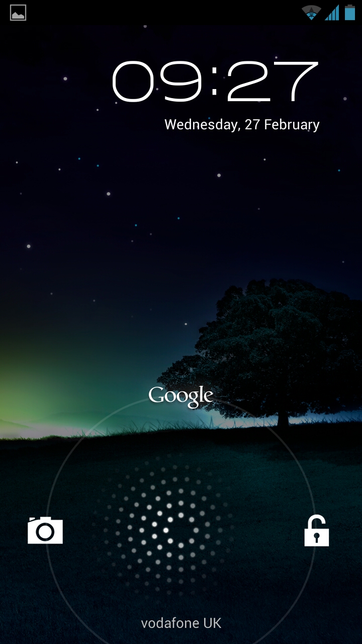
What Asus should really have spent its time tweaking is the Android lock screen.
Version 4.2 of the OS (which should come to the Asus Padfone 2 in time) has fleshed out the lock screen functionality considerably, but version 4.1 is a little too basic.
While intuitive enough, all you can do here is touch the screen and swipe right to unlock or left to jump straight to the camera.
You're told when you have a new message here, but you can't then access your messages directly from this central notification, which feels counter-intuitive compared to some rival provisions.
Tablet
Plug the phone in to the tablet and the view switches to the familiar Android tablet interface, which looks much the same as it has since Android 3.0 Honeycomb was released in 2011.
You have the usual array of home key, multitasking key, and back - this time in the bottom left of the screen - as well as a tool for Asus's widget-like app bar.
The latter includes stripped-back widgets for calculator, calendar, email, dictionary, BuddyBuzz (Asus's obligatory social network tool for Facebook, Twitter and Plurk, bizarrely), and AudioWizard.

Selecting one of these overlays the tool on the screen until dismissed - even if you scroll to a different home screen or even open an app they remain in place. This is extremely useful for multitasking or productivity tasks.
At the bottom-right of the tablet home screen you have the usual settings shortcuts and any incoming notifications. At the top-right you have the apps menu key.
While there's a Google search shortcut at the top-left of the screen, holding the home key brings up a lock screen-like dial for jumping straight to a Google Now search.
