Why you can trust TechRadar
BlackBerry Torch review: Interface
If you've owned a BlackBerry before, the first thing you'll notice about OS 6 is how much glossier it is.
It's nowhere near as cluttered as the old OS 4 found on models like the popular Curve 8310 and looks like the more recent OS 5 first found on the Bold 9000 with a little personality and colour injected into it.
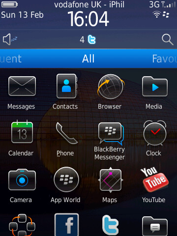
One of the big gripes younger users had with OS 5 was that, although the Home screen and menu had been given a bit of a polish, when you got into the phonebook and the inner menus, it was same old BlackBerry. Black text, white background and little imagination – a look that suited the boardroom users, but not the younger crowd RIM has increasingly been chasing.
Now, you notice that it has been given a significant update. The phonebook has thumbnails next to entries in the list, which seems to bring it alive. But it can look a bit untidy – especially if you only have photos for certain callers, since what you are left with is a series of nice photos mixed in with the stock icon the Torch provides.
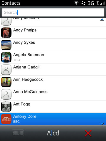
Another addition RIM's put time into developing on OS 6 is multiple Home screens, enabling users to swipe between different app categories, such as All, Favourites, Media, Downloads and Frequent.
It looks good but, in practice, can be a hindrance, and in many cases, we found ourselves simply using the All menu option simply because we knew where everything was.
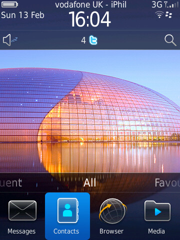
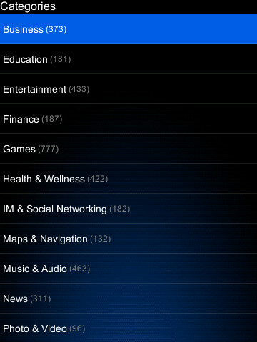
Blackberry's App World comes as standard and it's proving to be a steadily growing market. It's still nowhere near Apple's App Store or Android's Market in terms of volume, though – you don't get the same sense of imagination from developers in this store and it's hard to feel immersed in it like you can with Apple or Google.
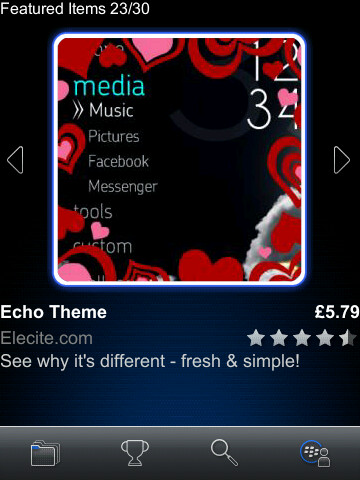
To be fair to Blackberry, this is as much the fault of developers who don't have the same financial incentives to write BB software – and as such, the apps that you do come across can be fairly costly because they're written with power users in mind, rather than people who may take a punt and spend £1.99 on a game to pass time.
A YouTube app was preloaded on our device but close inspection revealed it to be merely a link to the mobile site.
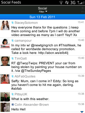
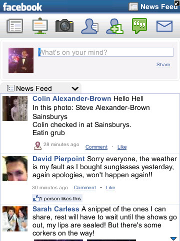
There are also various social media options in the form of custom-made Twitter and Facebook apps, as well as a new Social Feeds app.
Twitter works well, but Facebook feels like it's getting a bit old now. Little has changed since it was first launched and though it does the job well, it now seems to lack imagination in its layout.
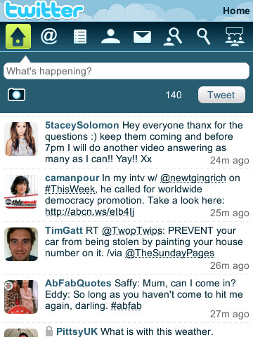
The Social Feeds app is more of an aggregator that lists all of your streams together in the same was that Tweetdeck does on a Mac or FriendStream does on HTC devices. It can be useful, but for those who like to keep their feeds separate, it can be too cluttered. However, it's good that RIM has given users more options than none.
BlackBerry Maps comes preloaded as standard with a shiny new icon, but when you open it, you realise it's the same old app that just is not up to the job.
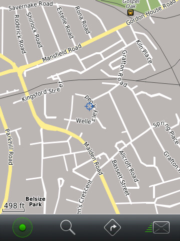
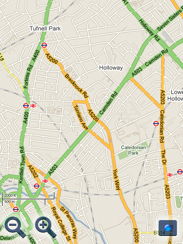
We quickly found ourselves replacing it with Google Maps – a free app that completely shows up BlackBerry's effort and makes you wonder why RIM doesn't just drop Maps from the OS altogether.
Current page: BlackBerry Torch: Interface
Prev Page BlackBerry Torch: Overview and design Next Page BlackBerry Torch: Contacts and calling