Why you can trust TechRadar
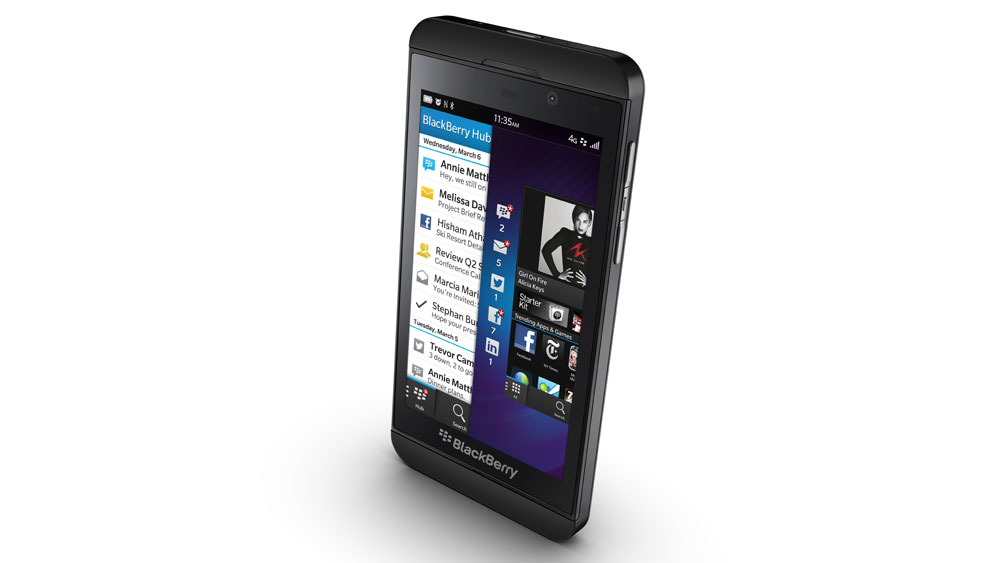
The key selling point of the BlackBerry Z10 is the BlackBerry 10 operating system, which may go some way to explaining the handset's unassuming design, with the manufacturer focused more on the software inside.
BB10 was launched alongside the BlackBerry Z10 and signals a new era for a company which hasn't had the best of times recently.
The aim of BB 10 is to drag BlackBerry into the here and now of the mobile world and offer up a system which is capable of challenging the likes of Android Jelly Bean, iOS 6 and Windows Phone 8.
This has resulted in a platform which is very different to the one found on previous BlackBerry handsets running BB OS7, which means a steep learning curve is required for both new and current BlackBerry users.
BlackBerry decided to move away from the physical buttons found on iOS and many Android devices, instead opting for a gesture-based system as the main form of navigation.
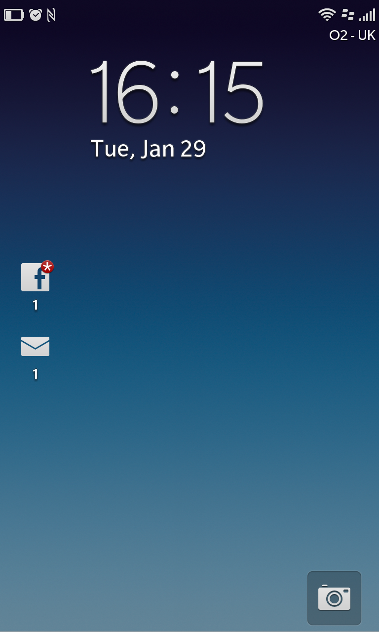
Press the power/lock key at the top of the device and the 4.2-inch HD display comes to life greeting you with the BB 10 lock screen.
You get the date and time on the screen along with notifications of any new emails, messages, BBMs and missed calls.
There's a shortcut to the camera app in the bottom right corner, while the general unlock function requires you to slide up from the bottom of the screen, which uncovers the homescreen below as your finger moves up.
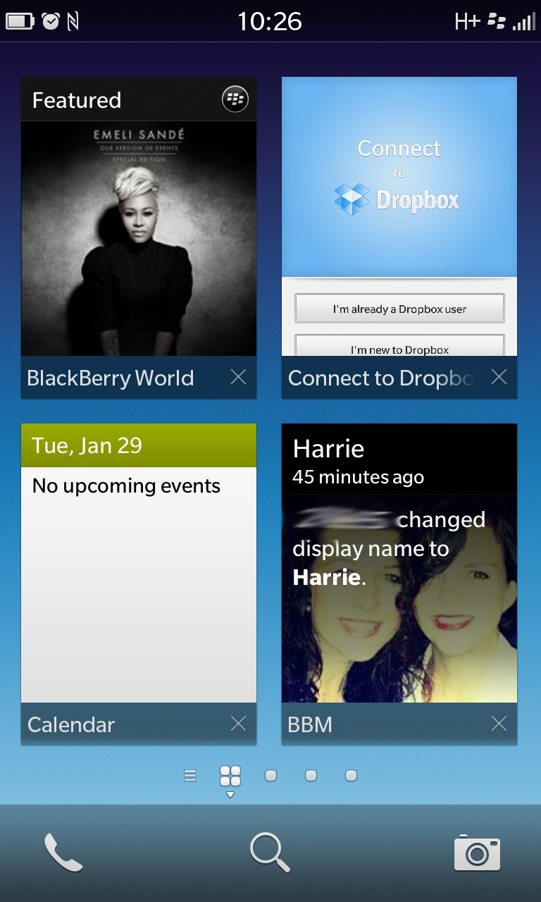
Complete the unlock sweep to access your homescreen – which is some kind of odd mashup between Android widgets and Windows Phone Live tiles.
What you get is large thumbnails of your most recently opened applications. Only four can fit on the screen at once and you can have a total of eight applications in this list – you'll need to slide down to view the rest.
This is basically the multi-tasking function in BlackBerry 10 and you can choose to close apps in this list by hitting the cross in the bottom right of the preview.
During our extended time with the Z10 we found that we hardly ever slide down to see the other four apps hidden below, instead sliding sideways into the app draw if the program we wanted wasn't one of the last four recently used options.
We'd also preferred it if you could pin particular apps to this homescreen, as we'd have liked Facebook, Twitter and the web browser to be permanently on display and easy to reach - or you know, just the first page of your apps and get rid of the whole active screens completely.
For those of you who are fans of quick settings, you'll be glad to know that BlackBerry has catered for you on BB 10 – just swipe down from the notification bar on the BlackBerry Z10 and you'll get a small drop-down with toggles for Bluetooth, Wi-Fi, alarm, rotation lock and notifications.
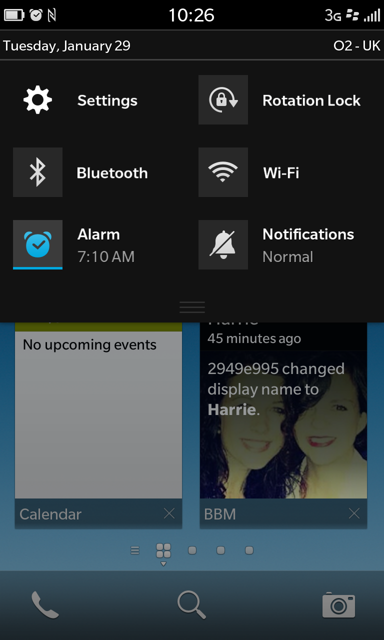
There's also a short cut to the settings menu if you need to toggle the 4G mobile hotspot or NFC on the Z10.
Frustratingly you can only set one alarm on the Z10 - come on guys what year are we living in these days - surely the ability to have multiple alarms on your handset isn't an overly taxing implementation.
Sliding to the right from the homescreen will take you to the app list, while going left will take you into the BlackBerry Hub – something we'll cover in more detail in the messaging section of this review.
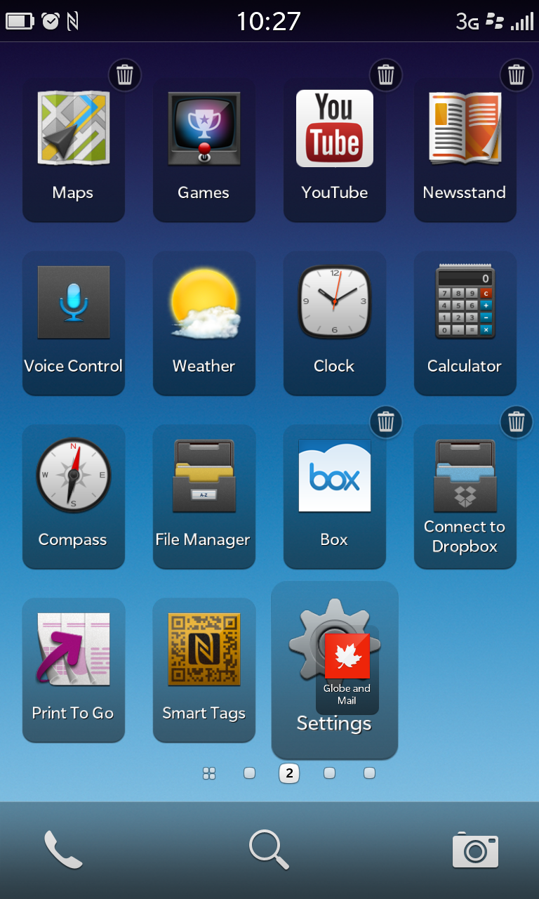
The app list is far more familiar territory for anyone with smartphone experience, with the icons lined up in the usual grid formation, plus the ability to create folders by simply dropping one app onto another – now where have we seen that before?
Holding down on an app icon will make them all start to pulsate, with the option to drag them around and reposition them in an order which suits you, or you can hit the bin icon to delete a particular app.
The 1.5GHz dual-core processor and 2GB of RAM housed into the BlackBerry Z10 means it has more than enough power to glide through the BB10 system, and we got a generally smooth user experience.
A software update has pushed out to the Z10 since our initial review and since installing the latest version of BB 10 we haven't experienced the lag and blank screens we sometimes noticed originally.
The fancy fade in/out animations as you skip between pages of apps is a nice touch, and applications open swiftly.
A responsive touchscreen aids navigation, and once we'd got to grips with the BlackBerry 10 way of doing things, the Z10 was pleasing to use.
Some gestures and layouts still seem a little confused, but the longer we spent with the handset the easier it became.
As there's no physical back button below the display it wasn't always clear how to get back to the previous screen, which left us feverously scrabbling around for a way to return to the start of an app without returning to the homescreen from time to time.
The way you exit applications is also new, with the Z10 requiring you to slide up from the BlackBerry logo below the screen to the centre of the device, which sees the app you're currently in minimised and upon release popped into the top left position on the homescreen.
It look a while for us to get used to this, instead of just hitting a menu key below the screen and we found it didn't always work particularly well - especially in the camera app and game World of Goo.
The BlackBerrry 10 platform succeeds at bringing BlackBerry into line with the other smartphone operating systems and the BlackBerry Z10 has no trouble running it, but it doesn't seem to have a clear advantage over its rivals.

TechRadar's former Global Managing Editor, John has been a technology journalist for more than a decade, and over the years has built up a vast knowledge of the tech industry. He’s interviewed CEOs from some of the world’s biggest tech firms, visited their HQs, and appeared on live TV and radio, including Sky News, BBC News, BBC World News, Al Jazeera, LBC, and BBC Radio 4.
