TechRadar Verdict
EE has managed to squeeze a surprising amount into this £200 smartphone, and the Harrier doesn't have any major downfalls as a result.
Pros
- +
Big, full HD display
- +
Affordable 4G
- +
Almost stock Android Lollipop
- +
Octa-core processor
Cons
- -
Noticeably cheap build
- -
Average camera quality
- -
Poor speaker
Why you can trust TechRadar
EE launched its first own-brand smartphone last year named the EE Kestrel. Also bearing an avian name, this handset was a rebrand of the Huawei Ascend G6, and was very much a contender at the low end of the market, baring little other than 4G connectivity.
This year, EE has debuted two new handsets that keep the bird-theme alive: the Harrier and Harrier Mini. I've been having a look at the larger of the two handsets to see whether it can find a foothold in the middle market.
The Harrier from EE may not be perceived as a rival to top flight handsets such as the Samsung Galaxy S6, but don't let the lack of familiar branding fool you.
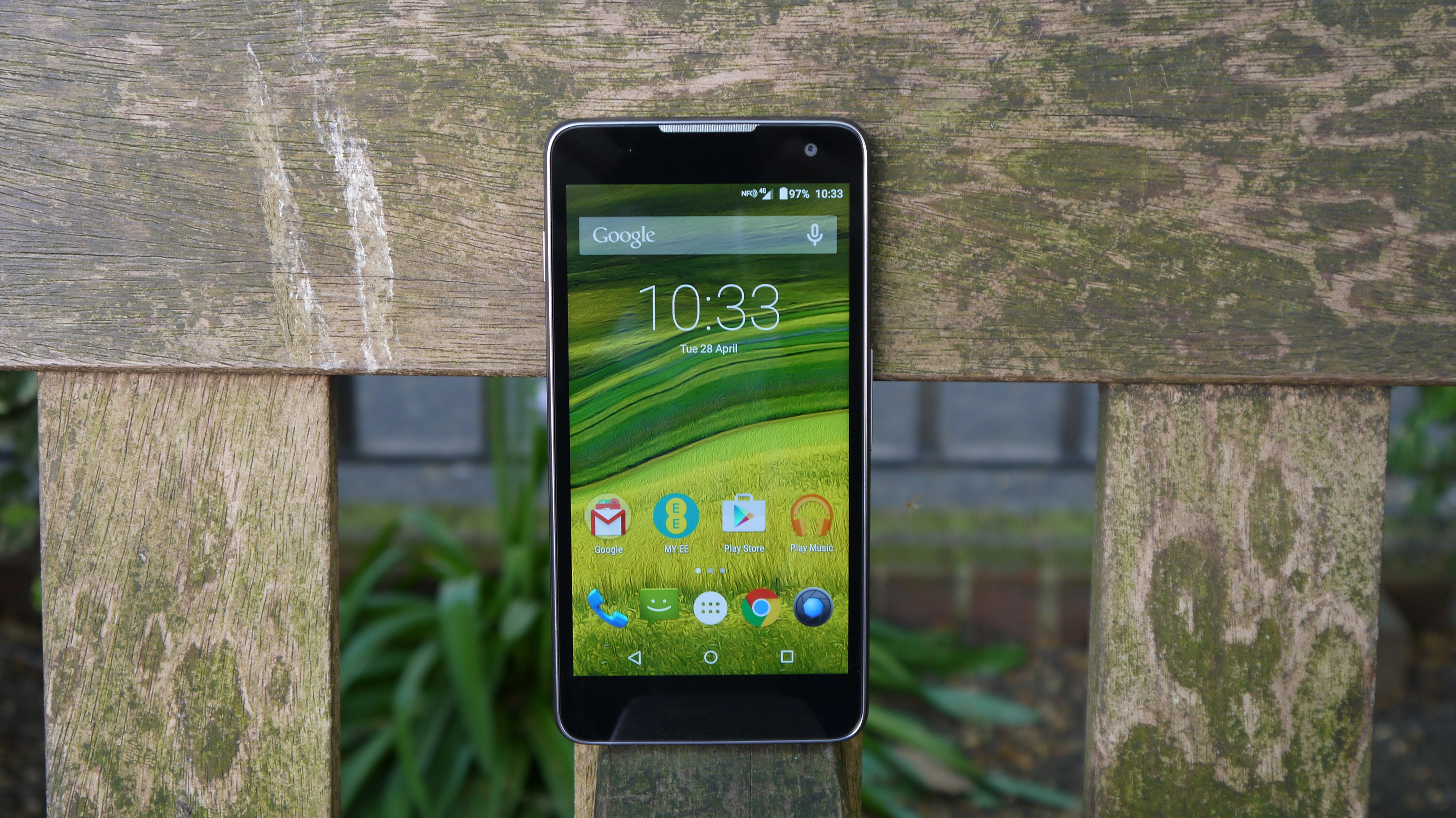
Pegged at the pay-as-you-go price of £199, the Harrier packs a pin-sharp 5.2-inch full HD screen, 16GB of storage (10.3GB of which is usable), a 1.5GHz octa-core Qualcomm processor backed by 2GB of RAM, 13MP rear camera and Android 5.0 Lollipop, which thankfully is not spoilt by any unnecessary third-party launchers.
Design
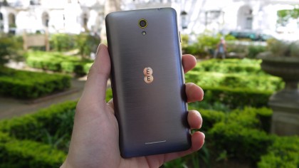
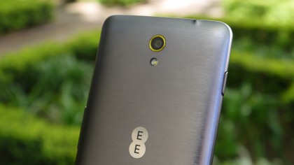
On first inspection of the EE Harrier, you might be fooled into thinking that this handset shares some of the same aluminium construction as pricier phones such as the HTC One M9, but take a closer look and you'll realise that as nice as the brushed metal effect rear looks, it is just that – an effect.
Overall build quality isn't class-leading, but the phone feels reasonably solid and is devoid of some of the worrying plasticky creaks found on other budget phones.
Measuring 138 x 67.9 x 9.5mm, it's a little chunkier than the Sony Xperia Z3, but is not quite as tall or wide, making it slightly easier to operate one-handed.
The smoothed edges also make it feel good in the hand, and give the impression that it's slimmer than the 9.5mm thickness might suggest. Weighing in at 145g, it's a little heavier than the low-end Huawei Honor 3C.
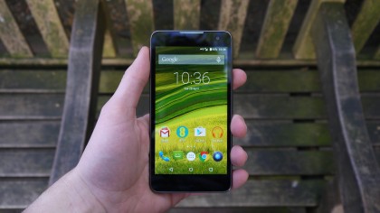
The Harrier's screen is a surprisingly good 5.2-inch, 1,920 x 1,080 resolution screen – that equates to 435ppi. IPS technology means colours are punchy, although the standard brightness setting feels a little conservative compared to other handsets I've used.
It's not as good as the AMOLED panel on the Moto X 2014, but is far superior to any other sub-£200 smartphone I've used.
Apart from the screen there's little else to report upfront, with only the 2MP front-facing camera, thin earpiece grille and an inconspicuous set of auto brightness and presence sensors all positioned above the screen.
EE has chosen to ditch the capacitive buttons of the Kestrel in favour of Android Lollipop's stock on-screen icons, which does use up some real estate in some apps, but ultimately means they are much more versatile and can rotate with the screen when necessary.
Returning to the rear of the phone, there's a 13MP camera centred near the top of the handset, with LED flash directly beneath it. Smack-bang in the middle is a shiny EE logo, and towards the bottom of the handset is a thin grille hiding the diminutive speaker, unfortunately placed exactly where it's most likely to get covered.
Almost half way down the right edge of the Harrier is the volume bar, which to me felt a little bit low to be comfortable when held in the right hand, but almost perfectly positioned for left-handed use.
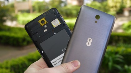
The power/wake button is located a quarter of the way down the left edge, and is easily accessible, no matter which hand you hold it in.
Up top there's a 3.5mm headphone socket, whilst the micro USB charging socket is centred on the bottom edge.
Unlike many new handsets, the insides of the Harrier are accessible once you remove the plastic back plate. This affords access to a micro-SD card slot as well as the micro-SIM slot, but curiously the 2,500mAh battery has been covered in a sticker that stops it being easily removed.
