Why you can trust TechRadar
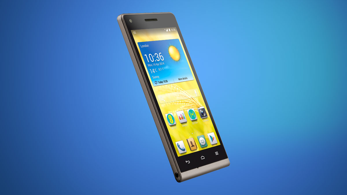
Given that the EE Kestrel is based heavily off the Huawei Ascend G6 it should be no surprise that the Kestrel runs Huawei's Emotion UI.

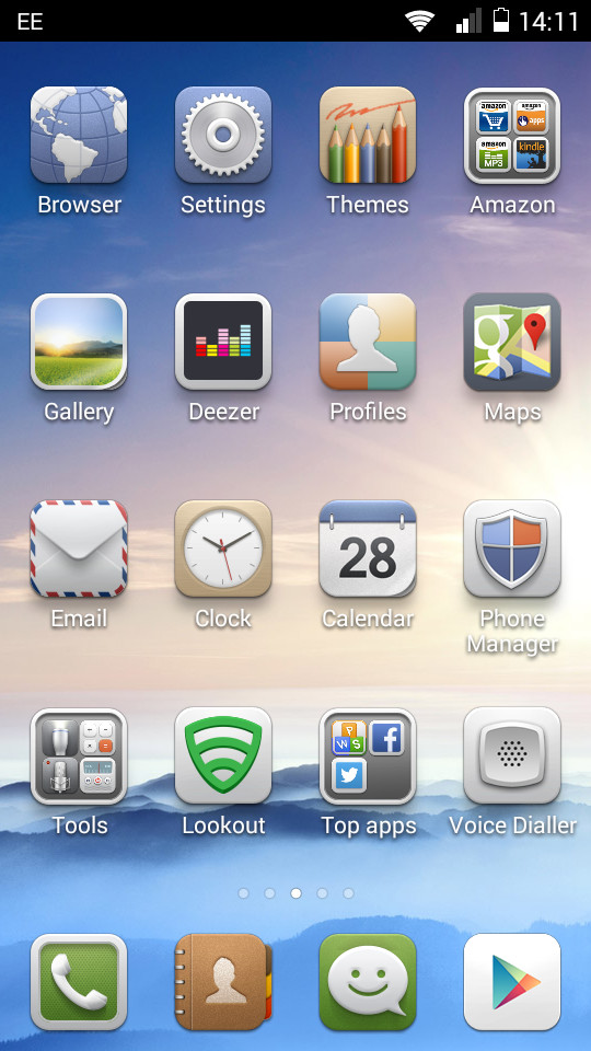
User interfaces can be very divisive when it comes to Android handsets, and the Emotion UI is no different. This can be attributed to a lack of app drawer that nigh on every Android user will have grown accustomed to.
Having used a variety of UIs on multiple handsets I initially found it very difficult to switch over to Huawei's way of doing things, despite its many similarities to iOS.
The temptation to install a custom UI from the Google Play Store was nagging at the back of my mind and heavy users will find themselves succumbing to such a desire.
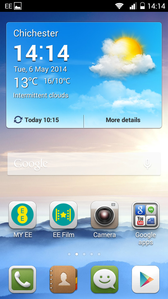
However there is a certain amount of sense to the way the Chinese firm has done things. Taking away the app drawer and placing all the icons on home screens removes that extra step needed to locate the app you're after. Organised users can also create folders to make things even easier.

There is a certain level of a "my first smartphone" feel to the Emotion UI, something that is also reflected in the icon styles.
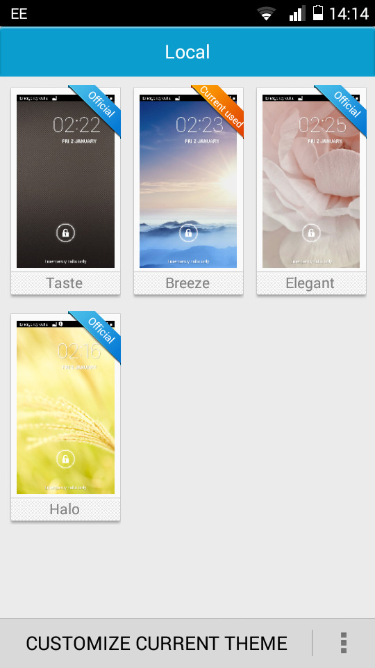
This is somewhat alleviated thanks to the ability to choose from a different theme, although I could only find four on offer with no way of choosing any others.
I was pleased to find that there was a Samsung-esque variety of quick toggles in the notifications bar which let you toggle key features such as Wi-Fi, GPS or mobile data on and off.
It seems like such a little feature but it is something that I have come to rely on as it makes life a lot easier, and can really help stretch out your battery life.
Interestingly, if you decide that you don't like the way that Huawei has laid out its UI, there is another on offer called 'Simple Home'. I found this to be much more pleasing, and will appeal heavily to those that like the Windows Phone live tiles.

Unfortunately these 'tiles' don't offer up widget-style information in the same way as the Windows Phone 8.1, something that I hope Huawei might be able to change in the future. Moving around the Kestrel seemed a lot easier in this mode, with key features a lot easier to locate.
This simpler home screen will appeal even more to those that are unfamiliar with smartphones, as well as being a lot easier for older people that might have problems trying to navigate screens populated with umpteen small icons.
In terms of operation, the EE Kestrel felt rather slow. Despite the four cores and the 1GB RAM I felt disappointed with general movement amongst home screens.
This was replicated whilst trying to load the camera from the lock screen, done by swiping in from the right hand side.
GeekBench 3 scores of 1190 put the Kestrel in the same range as the Moto G, as well as the Sony Xperia SP which has just two cores.
