TechRadar Verdict
Old-hat screen technology, poor speaker and camera aside, there certainly are positives to be found in the Rook, and (with help from ZTE), EE has crammed in as much tech as is feasible for a tiny price.
Pros
- +
Nippy processor
- +
Reasonable screen resolution
- +
Latest stock Android
Cons
- -
Awful camera quality
- -
Poor inbuilt speaker
- -
Terrible viewing angles
Why you can trust TechRadar
The introduction of the BenQ-manufactured EE Harrier and EE Harrier Mini was the start of a new breed of own-branded handsets from Britain's largest network, continuing the ornithological theme that started with the EE Kestrel, built by Huawei.
The EE Rook is the latest addition to the flock. This time made by ZTE, it's a smartphone that fills the ultra-budget end of the spectrum, and yet still features stock Android Lollipop 5.1, 4G connectivity and a quad-core processor for less than the price of a meal for two.
This is clearly somewhat of a my first smartphone. But even casual users is search of a no-frills experience expect a phone that never lets them down – and is that really possible at this price?
There isn't much competition for the Rook. The Smart First 6 from Vodafone is underwhelming, and Three's Acer Go is very similarly specced. Microsoft is offering perhaps the most compelling alternative in the form of the Lumia 435 – though none of these can connect to 4G networks.
Retailing at just £39 for existing EE pay-as-you-go customers (or £49 for everyone else) the EE Rook is a tenth of the price of the Samsung Galaxy S6, yet still packs in a 64-bit quad-core 1GHZ processor, 1GB of RAM, 8GB of internal storage, 5-megapixel camera, and a 800 x 480 resolution 4-inch screen.
Design
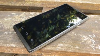
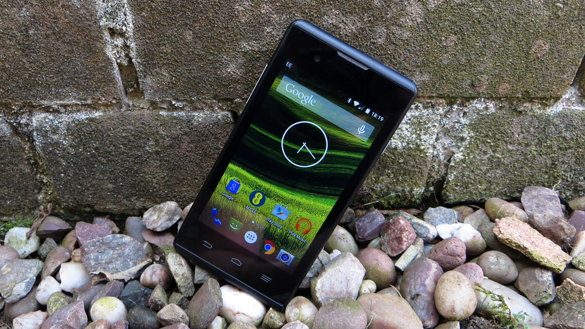
Not a great deal of design inspiration was required when ZTE put together the Rook for EE. It's a rather nondescript slab of black plastic, although it does manage to avoid looking either tacky or childish. Build quality is what you would expect for this price, although to give it credit, I have tested more expensive phones that flexed and creaked more than the Rook does.

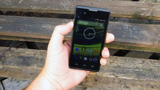
The Rook measures 126 x 64 x 10.3mm and weighs 130g, meaning it doesn't feel awfully chunky in the hand, and weighs just enough to stop it feeling like a toy. Up front there's a front-facing camera, proximity sensor and notification LED above the 4-inch WVGA screen, and three capacitive buttons below.
On the left edge there's a volume rocker that rests just under your thumb or forefinger, while on the right side there's a dinky little power / wake key. Both feel perfectly responsive, and protrude enough to be easily found at a fumble.

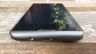
A 3.5mm headphone socket sits on the top edge, and so (less orthodoxly) does the micro USB port. This makes the handset a little uncomfortable to use when charging, and is certainly more restrictive when trying to make a call whilst plugged in.
On the back of the Rook there's little to report: a speaker resides in the bottom left, while the fixed-focus 5-megapixel camera is centred near the top – but there's no flash. Unsurprisingly, there's also a rather large silver EE logo, but no nod to ZTE, the actual manufacturer.

The rear panel is easily removed, exposing a microSDHC card slot, microSIM slot and a replaceable 1500mAh lithium-ion battery – over 800mAh lower in capacity than the Motorola Moto E, which despite being around twice the price, is about the best 4G capable alternative.
Key features
Like every other carrier-branded smartphone, the EE Rook has little to make it stand out. The speaker is tinny and quiet, the camera and video capabilities are incredibly basic, and there's no HD screen like you'll find on the (albeit it slightly more expensive) Honor Holly.
It feels best to address the screen now, rather than dwelling on it. The colour is OK, and brightness is passable. Even the 800 x 480 resolution isn't terrible, and would have been considered pretty nice before iPhones with retina screens came along. The biggest problem? Viewing angles.

Look at the Rook's screen from any direction other head-on and the contrast disappears, making it almost impossible to share a video or photo with friends. It's almost as if ZTE rooted through the cupboards for an old screen that would fit and went "that'll do." It makes the inclusion of the Miravision enhancement an almost laughable addition, and is clearly where most of the budget was cut.
The real stand-out here is the inclusion of 4G connectivity, which means super-fast serving of videos, music and other media, but with no HD screen, limited power and lacklustre audio credentials, there's little to truly take advantage of the EE's 150mb/s maximum quoted speeds.
Call quality was passable, though the earpiece was as treble-heavy as the loudspeaker, which would suffer considerably in a busy environment.
Interface
One area where the EE Harrier did impress was with EE's decision not to screw around with Android Lollipop. And with the latest 5.1 software onboard, the same is pleasingly true of the Rook.
There are a few pre-installed applications from Amazon, as well as Deezer, Lookout security and EE's own account-checking app, but other than these (non-removable) apps, Lollipop has been left as Google intended.

Despite the super-cheap price, this latest version of Google's OS means that the Rook is compatible with the latest features and accessories, including Android Wear, Google Fit and the rest of Mountain View's app suite.
The app drawer works just as you'd expect, and appears with no delay. The notifications pane and quick settings pull down smoothly, and with the aesthetically pleasing animations you'll find on more powerful and much pricier handsets.

Delve into the settings menu, and there are two little inclusions worth mentioning. Firstly, the display menu has the addition of an option called MiraVision – a picture quality enhancement setting that attempts to improve the screen settings, or set them to the user's preference. It's similar to the Bravia settings found on Sony smartphones, but makes very little difference on the Rook in practice, because the screen is of such low resolution and quality to begin with.
The second addition is a set of sound enhancement equaliser modes found at the foot of the audio settings menu. The BesAudEnh mode creates a more dynamic sound through headphones, while the BesLoudness toggle boosts the volume of the inbuilt speaker (from pathetic to weak).
BesSurround claims to give an impression of more enveloping sound from the built-in speaker, but the effect was virtually indistinguishable through the Rook's diminutive speaker. Lastly, a Lossless BT mode allows for high quality music streaming to Bluetooth headphones.
Current page: Design, features and interface
Next Page Performance, battery, essentials and camera
Say hello to HaLow: Wi-Fi routers that can send 250Mbps across 10 miles (yes, 10 miles) have been demoed at CES 2025 and I'm very excited

Reviews Recap: the week’s 5 biggest reviews, from the robust, rapid-snapping OnePlus 13 to Technics’ ergonomic, expressive-sounding earbuds

I can't wait to test the world's first 8TB PCIe 5.0 SSD, and I'm sure this one won't be too expensive
