Why you can trust TechRadar
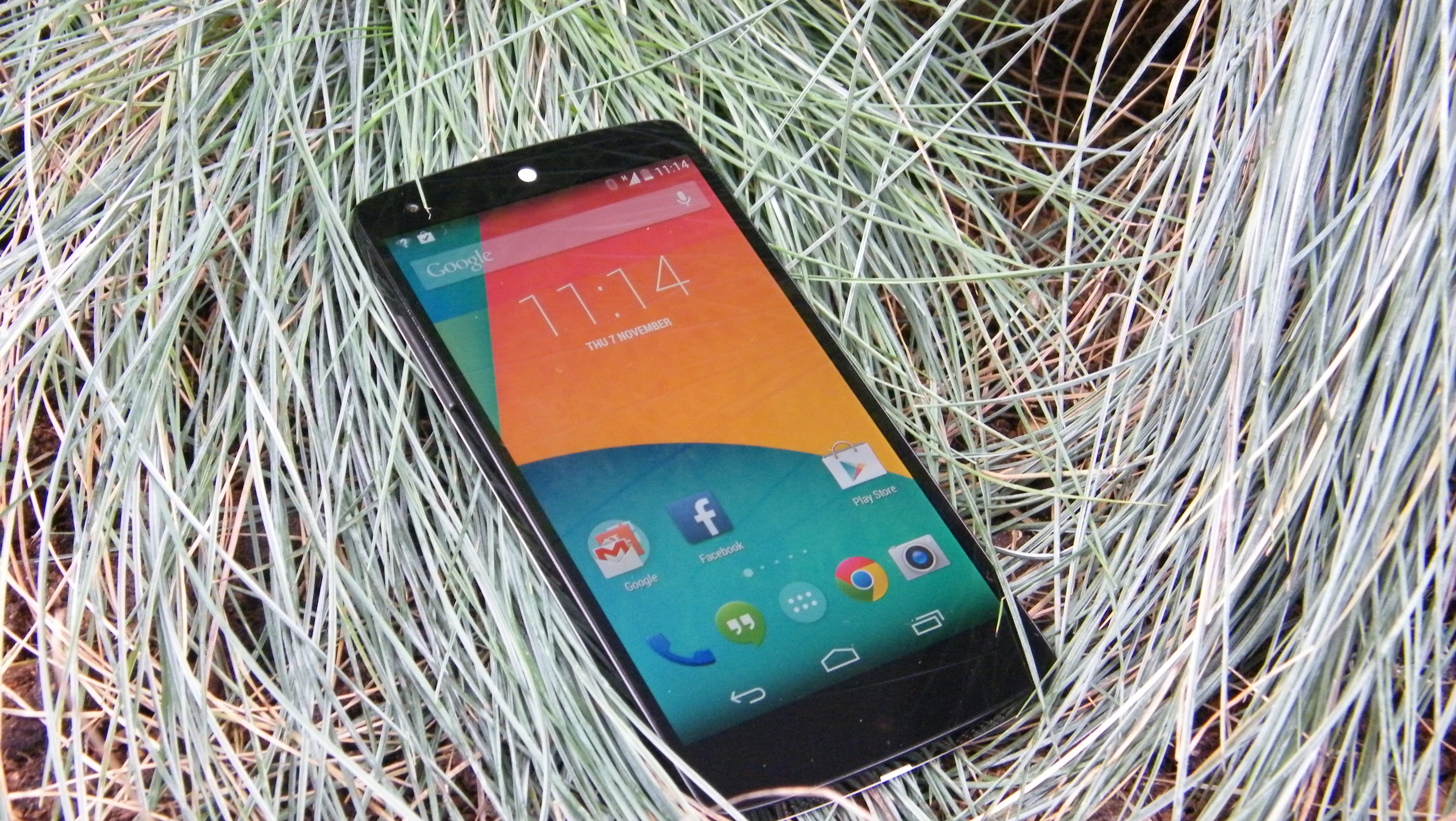
The display on the Nexus 5 is excellent, which makes this a great device for consuming entertainment.
LG's mature IPS LCD technology really delivers. The colours look accurate and the 1920 x 1080 pixel resolution on the 4.95-inch screen translates to a solid 445ppi (pixels per inch).
To put that in context, the iPhone 6 has 326ppi, the Galaxy S5 is on 432ppi and the HTC One M8 can only boast 441ppi. Though the LG G3 and Samsung Galaxy Note 4 both outmatch it with 534ppi and 515ppi screens respectively. Not to mention the 493ppi screen on the new Nexus 6.
Put it side-by-side with an iPhone 5S or Galaxy S5 and you might detect a yellow tint. The display on the Nexus 5 is also not as bright as its competitors, which has a slight impact on legibility, particularly in direct sunlight.
On the whole, Google's compelling proposition is a premium smartphone that doesn't have to feel uncomfortable in flagship company. It has achieved a winning price without compromising on quality.

The Nexus 5 shows off the latest version of Android 5.0 Lollipop beautifully. It's also set to get Android 5.1 soon and should be near the front of the queue when Android M (Malteser? M&M? Marshmallow?) comes, though as Google only promises to support Nexus devices for 18 months, that's not guaranteed.
If you're coming from an earlier version of Android, which you most likely are as few devices are running Lollipop, then there are lots of little improvements to enjoy.
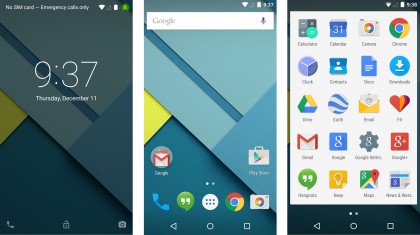
The interface has been completely redesigned, with new icons, animations and colours giving it a much needed freshen up. Speaking of animations, they're beautiful. I found myself swiping around, opening up the app drawer and diving into the calculator just to see how the operating system moves.
'Material Design', Google's new design language, has impacted every corner of Lollipop. It's lighter, gone is the dark 'Holo' style settings app and everything feels fresh and vibrant. Many of Google's own apps have been redesigned to match these guidelines and they too, especially GMail and Google Maps, look stunning.
You'll find the touch sensitive trio of back, home, and multitasking at the bottom, though these now resemble a Playstation-esque threesome of the circle, triangle and square, but the functionality is the same.

The app dock sits above them with an app drawer icon in the centre which will take to you full app list. The rest of the dock is customisable so you can add your favourites and have them accessible on every home screen.
Swipe right to left and you'll access additional home screens. White dots at the bottom of the screen indicate how many home screens you have and which one you're on, although sadly you can't tap on them to shortcut to another screen.
Drag an icon to the right and you can create a new home screen. There doesn't seem to be a limit, and if you empty a home screen it simply disappears.
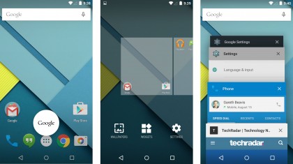
Long press on any home screen and you'll see your full scrollable list and get access to wallpapers, widgets, and settings. By dumping widgets from the app drawer and making the app icons bigger, there are now four across a screen instead of five, the interface is easier to navigate and clearer.
Swipe left to right on the home screen and you'll find Google Now, which can also be brought to life by the magic words "okay Google" uttered on any screen home screen.

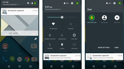
Android had the best notification system around when it was on 4.4, but the jump 5.0 has pushed it further into the lead. iOS and Windows Phone 8.1 could really learn a lot about handling notifications from Lollipop.
Notifications are easily accessed by pulling down the shade from the top of the screen, keep on pulling and you'll find the new quick settings menu. Notifications now appear on the lockscreen, can be prioritised based on importance and pop-up at the top of screen when they come in.
It's a lot less obtrusive than iOS and I struggle to keep a track of notifications when I'm using any other platform apart from Android.
Part of the reason that the interface is so accessible is the speed. The Nexus 5 is a top performer. It has a 2.3GHz Snapdragon 800 with an Adreno 330 GPU and 2GB of RAM.
When I ran Geekbench 3 on the Android 5.0 the multi-core average was 2307, which is actually down from the 2832 score I averaged on 4.4.4. It's still higher than last year's Galaxy S4 and HTC One and only just behind the Galaxy S5 and One M8, though.
By combining that processing power with the carefully optimized Android 5.0 platform Google has delivered a completely lag-free and highly responsive experience. The Nexus 5 is a dream to use. The only downside I have found is that with the extended animations in 5.0, opening folders and the app drawer does take marginally longer, but that's only because the movements are designed that way.
You can skip in and out of apps and games without any stuttering. Even with more than 20 entries in the new Overview menu and there's no hint of a pause.
You can snag the Nexus 5 in 16GB or 32GB versions. The actual capacity is always less; in this case you get 26.7GB on the 32GB version and around 12GB on the 16GB version. If you consider that it's not unusual for graphically impressive games to be over 1GB in size, you'll see the sense in opting for the 32GB version.
Remember that you can get an extra 15GB of free cloud storage by using Google Drive, and it's worth automatically backing up photos and videos, so you never lose them.
Current page: Interface and performance
Prev Page Key features Next Page Battery life and the essentials