Why you can trust TechRadar
- Chamfered back makes the device look striking, but feel chunky
- Fingerprint scanner is comfortable and accurate
- Heavy at 161g, but feels premium
- USB-C connection means your old charging leads will be useless
- Ice View case needs refining to stick down better
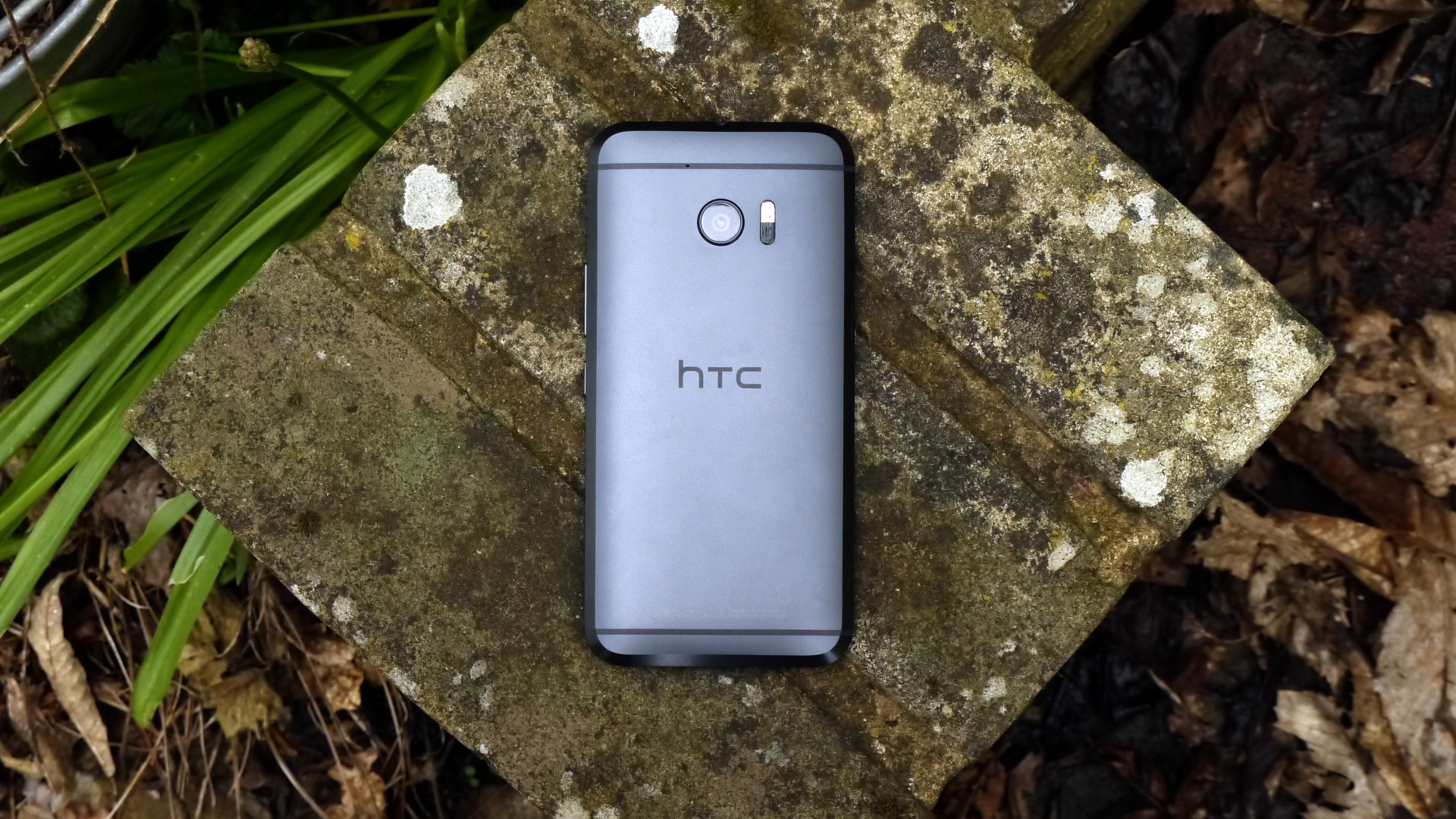
The way a new flagship phone looks and feels in the hand is probably one of the most important things for a brand that's built its heritage on creating beautiful objects, and you can see the moment you clap eyes on the HTC 10 that it's a well-crafted piece of smartphone pie.
The rear of the phone isn't as rounded as in previous years, so it's not as quite as nice to hold in the palm, with the chamfered edges offering play without being as comfortable as smooth metal. However, it's got a well-balanced construction, so you don't constantly feel like you're going to flip it onto the floor.
The edges are both polished and bead-blasted to make sure they have a distinctive shine when placed face-down on the table and again, it certainly looks different.
The design of the HTC 10 is one of the better out there - but it's not the best out there at the moment, which is surprising to say for an HTC device. It's chunkier than you'd expect and the metal will scuff badly with a drop - so you'll want a case if you want to keep this pristine.
It feels too thick, too many different textures on the rear - but there are times when the light will catch one of the angled edges and it looks striking.
The buttons on the side are, as ever for HTC, well placed. The smooth volume key and the ridged power button are nicely defined and easy to find without looking thanks to the different textures, and they have a comfortable click when pressed.
The balance of the handset also makes it very easy to use the home button / fingerprint scanner to open the phone. Though it'll take you a huge amount of time to get used to the fact that the button doesn't have a click to it - especially if you're coming from a Samsung phone.
But the fingerprint scanner is as good as anything out there at the moment - it's ever, ever so slightly slower than the one on the Galaxy S7 perhaps, but it's not something that's going to bug most people day to day - and more importantly, it's accurate and lets you in more than it doesn't.
You can add in a number of fingers - meaning you can share the phone with others if you wanted to and handily you can also use your fingerprint to secure apps, through HTC's Boost+ feature - which is designed to help improve your phone's performance but oddly also lets you secure some sections of your phone from prying eyes.
The HTC 10 is superbly crafted, there's no doubt about that - with a fellow journalist aptly describing it as a fusion of 'a Batmobile and a Motorola'. That's a little harsh, but there's definitely something of the Dark Knight going on here in terms of the lines used.
Is it iconic enough to be a new direction for HTC? To some people, yes - the chamfered edges are definitely something different to look at.
However, it's still too chunky-feeling in the hand and doesn't really seem to offer much of a reason as to why it's got so much heft - 161g isn't a light phone at all.
It's also using the USB-Type C connection that brands are starting to get their heads around. The LG G5 and newest Nexus phones use it, where the Samsung and Sony phones still don't, but it means you will no longer need to fiddle around in the dark to work out which way to plug the cable in - plus speedier data transfer and faster charging is enabled too.
Ice View Case
Let's give some props to HTC for making some cool accessories though. The Ice View case is the next evolution of the Dot View - which brought 8-bit design to the front of the HTC One range.
I loved that case, as it looked great, it harked back to a simpler gaming era and it really protected the phone - plus it actually added some functionality to the phone as you could interact with the screen through it.
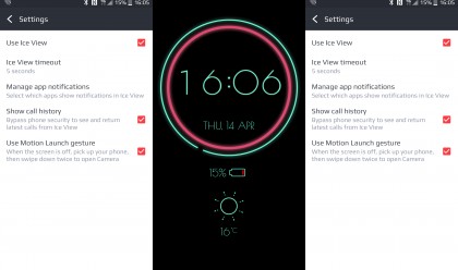
The same has happened with the Ice View case, with the ability to take calls, skip tracks on the music player and even fire up the camera by swiping down twice on the frosted plastic front.
The neon blue and pink colors are great too, giving it a really futuristic and clean feel. I'm not sold on the camera abilities as it's very hard to see what's going on through the cover, but then again you'll only use that feature in an emergency.
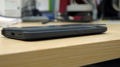
One of the big problems that dogged the Dot View case is back with Ice View though: for some reason it always flaps open a little bit at the side so the cover is never flush with the screen.
This makes seeing what's being shown a little fuzzy and tapping the case not always accurate. I was promised at the time of being given the review sample that this wouldn't happen (I was quite vociferous in my disdain for the flappiness of the old one) but it seems I must put my phones into covers incorrectly or something - as it's back again.
If only the magnet that let the phone know it's in the case and covered was on the right hand side instead of the left - a small magnetic pull keeping it closed would solve this problem. Sigh… first world problems, eh?
Current page: Design
Prev Page Introduction and key features Next Page Screen, movies, music and gaming
Gareth has been part of the consumer technology world in a career spanning three decades. He started life as a staff writer on the fledgling TechRadar, and has grew with the site (primarily as phones, tablets and wearables editor) until becoming Global Editor in Chief in 2018. Gareth has written over 4,000 articles for TechRadar, has contributed expert insight to a number of other publications, chaired panels on zeitgeist technologies, presented at the Gadget Show Live as well as representing the brand on TV and radio for multiple channels including Sky, BBC, ITV and Al-Jazeera. Passionate about fitness, he can bore anyone rigid about stress management, sleep tracking, heart rate variance as well as bemoaning something about the latest iPhone, Galaxy or OLED TV.
