Why you can trust TechRadar
Some people hear the word 'phone' in association with 'Windows' and a shudder of fear and disgust runs through them.
These people probably owned a Windows Mobile device at some point in their lives, and may be relieved to hear that Windows Phone 7 couldn't be more different.
Gone are the PC-alike text menus and pixellated fonts, the HTC 7 Mozart features a brave new world of images, tiles, one-step processes and snazzy typography.
It's clear that a lot of work has gone into all aspects of Windows Phone 7, from the panoramic design to the thoughtful integration of Facebook into the core functions of the operating system. It really is a pleasure to use.
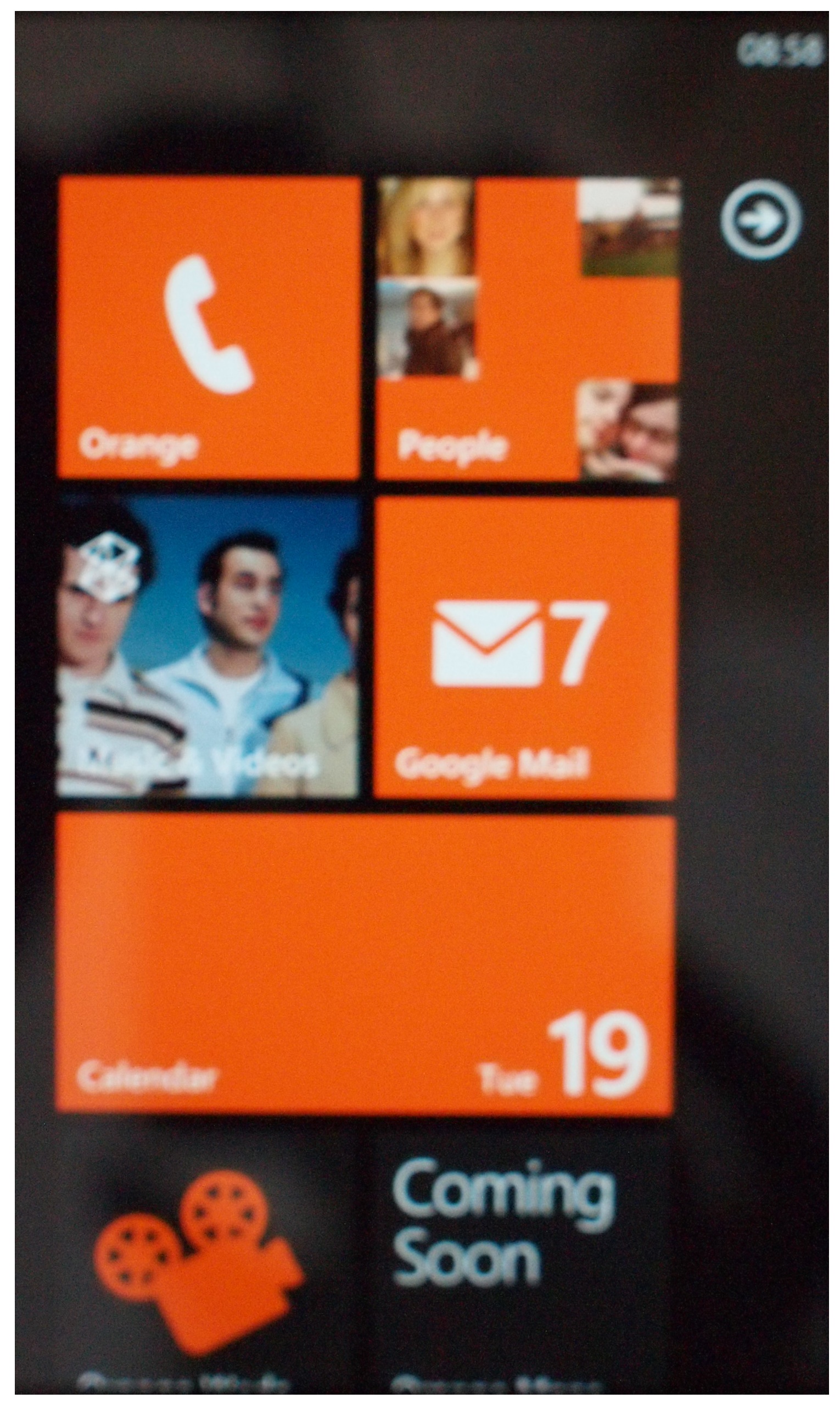
The Start screen is composed of an array of live tiles, most of which update with useful information or recent images as appropriate.
This means your Home screen is always changing – it's a nice touch but does mean the tiles that don't have any live information (eg Internet Explorer) are a bit dull and staid.

You can pin as many applications, favourite contacts, web shortcuts and music tracks as you like to the HTC 7 Mozart's start screen, although there's no universal handset search function, so you may want to keep it easy to navigate.
These tiles can be arranged however you like by simply long-tapping then dragging to their new destination – one pain point here, though, is that tiles don't automatically realign themselves so we often end up with a gap and have to spend more time dragging others into place.
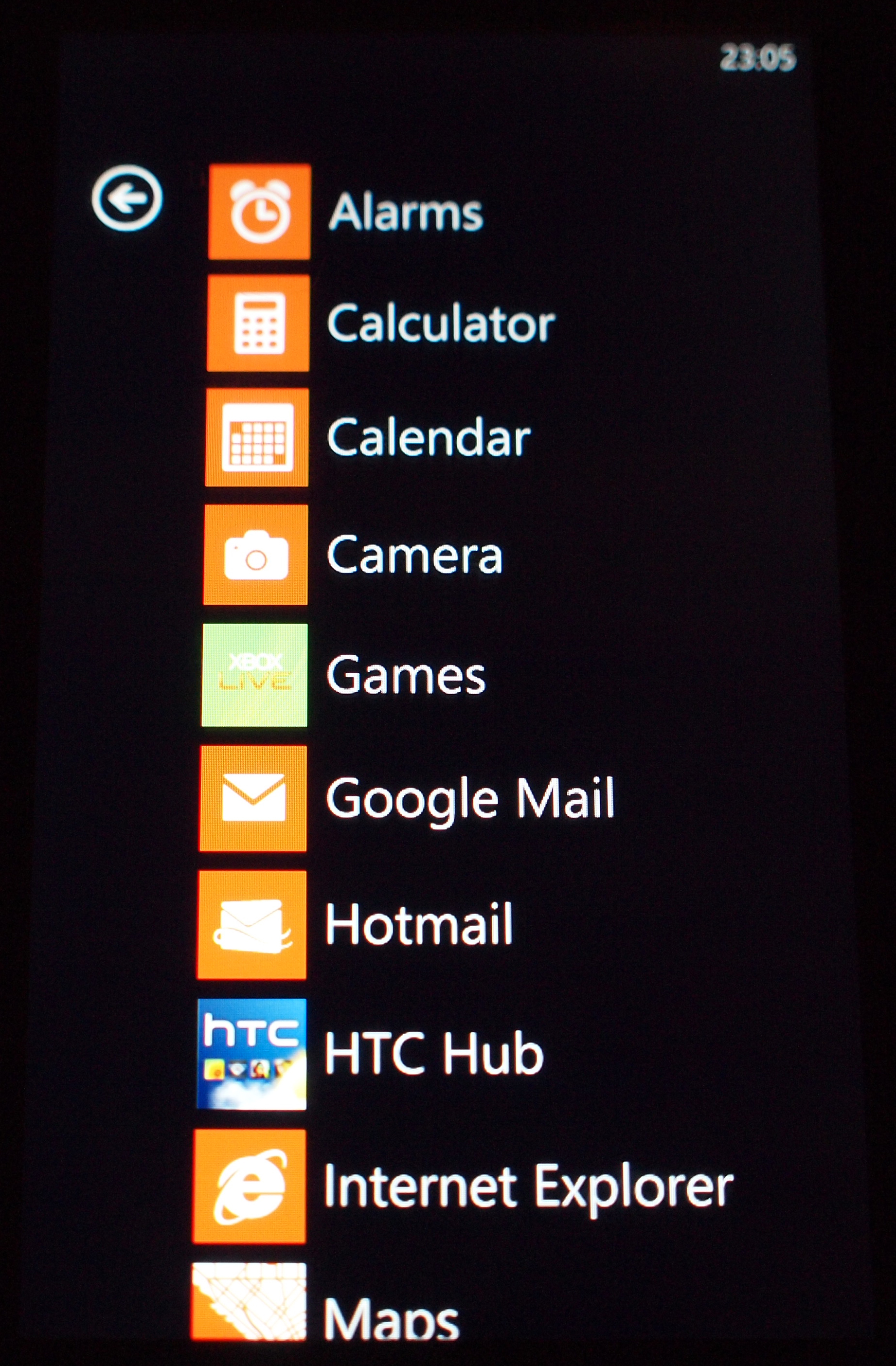
Any applications not pinned to the start screen are stored in a separate screen on the right. The list is alphabetical and accompanied by small icons for each item, making it easy to spot what you're after.

The Windows Marketplace is the place to go to download apps on the HTC 7 Mozart, for which you'll need a Windows Live account (you probably have one still hanging around from the '90s).
Once you've logged in and set up your own Marketplace account by accepting Microsoft's terms and conditions, you can quickly and easily download apps. Once installation is complete, they'll appear in your full application list just off the Home screen.
Paid-for apps are available in a range of prices – from 79p to upwards of £5 but it already looks like there's something to suit every budget.
Fans of HTC's Android line-up, including the HTC Legend and HTC Desire Z, will have been disappointed to hear that Microsoft will not allow any user interface skins over its operating system, so there's no full lovely HTC Sense here, except in the form of a hub.
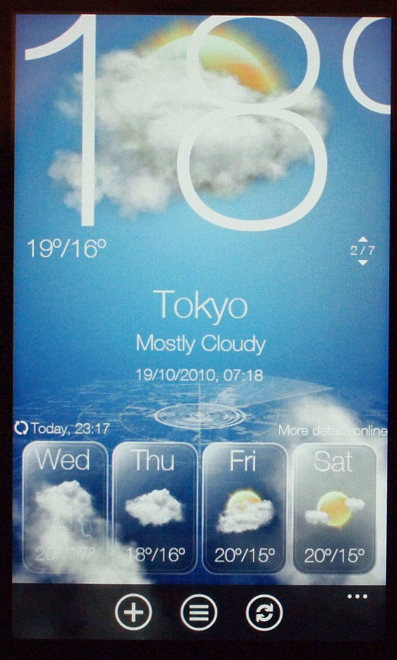
This is a little Sense-like haven where you can enjoy the animated weather we're so fond of on handsets like the HTC Desire, as well as giving quick access to HTC's other bespoke apps, like Sound Enhancer.
The HTC 7 Mozart doesn't seem to like loading the animation-heavy hub when battery is getting a little bit low, which isn't ideal.

Alongside the HTC Hub, there's also a bunch of Orange-branded apps auto-loaded to your Home screen. The illustrious Orange Wednesday app will no doubt go down well, giving you two-for-one cinema tickets on a Wednesday as well as film reviews and details of your nearest cinema.
There's also Orange Maps which is 'coming soon', so we haven't been able to try it out just yet. Your Orange gives you quick access to your mobile bill details while Orange Daily offers a news round-up for the day.
Again, we found these reluctant to load when battery was running low.
Core phone functions like calling and text messaging are accessed from the Home screen, as long as you keep the relevant icons pinned to the main page.
The interface is by no means perfect; there's a lot going on here but at the same time so many steps have been removed that we can't help but feel a little limited by the operating system.
Users coming to the HTC 7 Mozart from an open OS such as Android on the Google Nexus One will feel this in particular.
While Microsoft made a big song and dance about each Windows Phone handset being "wonderfully mine", the customisation is incredibly controlled. You can't change the menu background other than from black to white, nor can you control what information or images pop up in your tiles. Similarly, it's impossible to stop your tiles auto-updating if you don't want your whole life available to whoever happens to glance at your phone.
Call us pedantic, but when you don't get to control any of the customising, it's doesn't make the handset feel truly personal.
The software isn't perfect yet either; although the review sample we were testing is retail-ready, we did experience a couple of bugs.
We had both the HTC hub and Marketplace repeatedly wing us back to the start screen without asking – usually when the battery was getting a bit low on juice.
As a brand new OS, though, we can cut Windows Phone 7 a bit of slack. Really, it's no less controlling than the Apple iPhone 4, which offers you even less personal information on your Home screen.
The design makes a nice change from the rows and rows of app icons we've become accustomed to on other smartphones, and the slick design makes Android look scrappy and unkempt in comparison.
On the whole, the Windows Phone 7 interface is fast and easy to use, effortlessly swinging between applications and hardly ever keeping us waiting.
Current page: HTC 7 Mozart review: Interface
Prev Page HTC 7 Mozart review: Overview, design and feel Next Page HTC 7 Mozart review: Contacts and calling