Why you can trust TechRadar
HTC Pro review: Interface
Windows Phone 7 is very heavily controlled by Microsoft, so that no third parties are allowed to skin it. That means every Windows Phone 7 handset looks and feels substantially similar to every other.
Network operators and manufacturers can add their own influence, but the scope is minimal and comes in the shape of apps and services rather than massive user interface changes.
So it will come as no surprise if you've seen any of our other Windows Phone 7 reviews to know that the Home screen here is based on 'tiles'.
These are vast square and sometimes rectangular icons that link you to apps, show you data and can take you to web links or other discrete bits of information.
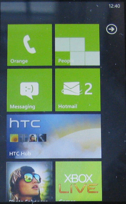
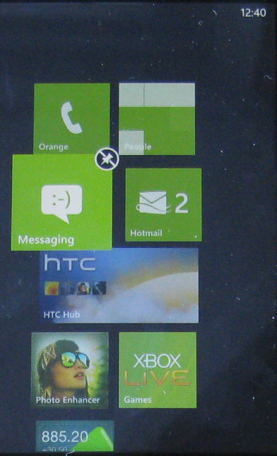
You can move these tiles around with a long press and drag so that your most used shortcuts are at the top of the list when you flip into this Home screen. Any tiles you don't need are removed by hitting the small pin icon that appears when you long press.
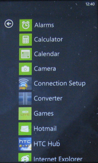
Sweep a finger from right to left when on the Home screen and you'll see a complete list of all the apps on the device. Long press any of these and you can pin them to the Home screen.
The Home screen can get very long if you like lots of shortcuts, and this single vertical list arrangement is nowhere near as hospitable to those who like a lot of shortcuts as Android's multiple Home screened arrangement.
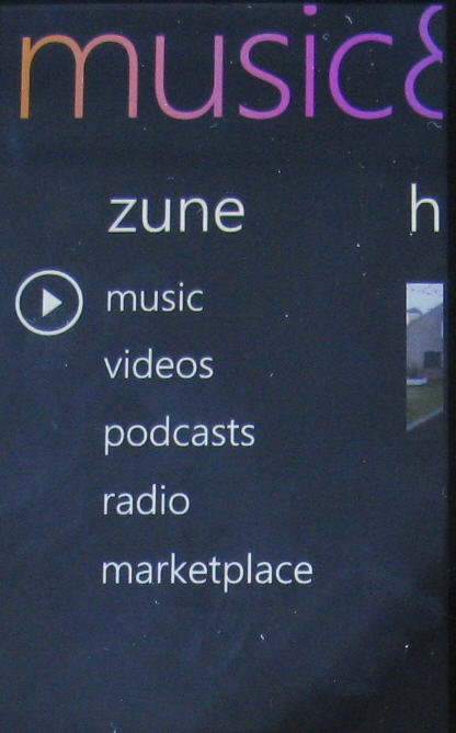
Windows Phone 7 arranges its data around 'hubs'. There's a Music and Videos hub, an Office hub, a People hub and so on. The idea is that stuff is grouped together logically so that you don't have to do much hunting around for it.
The system is unlike anything on any other smartphone, and it is something of an acquired taste. We aren't entirely sure we like the long horizontally scrolling screens that bleed into each other, but if you aren't too bothered about a preconfigured order being placed on your stuff, then it is easy to get around.
There are some neat touches. For example, if you set up an alarm and pin it to the Home screen, the tile tells you what time the alarm is set for and that it is on. That's a bit timesaver if you don't use an alarm every day and are constantly needing to check whether it is set or not.
Overall though, the touchscreen experience is very slick, and rarely falls apart under the finger. For instance, the slide under the finger is nearly always exact and predicatable. We don't like to say it too much, but it feels a lot like experience on the iPhone, for example.
One annoying factor with a phone that has a slide out landscape keyboard - the home screen OS doesn't rotate, so you have to use it long-ways even though you've just flicked back to the main display in the middle of typing.
Current page: HTC 7 Pro: Interface
Prev Page HTC 7 Pro: Overview Next Page HTC 7 Pro: Contacts and calling