Why you can trust TechRadar
Ever since Microsoft's OS got a much needed overhaul a couple of years ago we've been a big fan of the interface. That's even more the case since the latest update to Windows Phone 8.
It's glossier and arguably simpler than even iOS. Customisation fans might not be happy, but if you just want an intuitive, elegant OS then Windows Phone is the place for you.
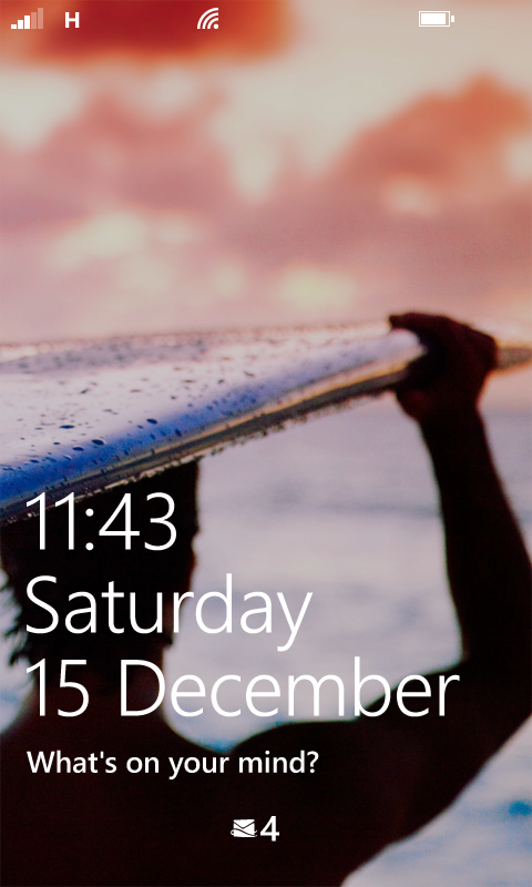
When you turn the HTC 8S on you're greeted with a fairly conventional lock screen. It displays a photo of your choice in the background and is overlaid with the time, day and date along with information from one of a handful of apps, such as your calendar or Facebook.
You swipe up to clear it and get to the start screen, a screen which is very different from the homescreens of Android and iOS. There are a few key differences, firstly there's only really one screen, rather than multiple homescreens.
You still need to scroll to see everything, but you scroll up and down rather than left and right, and there's no transition between screens' it's just a continuous stream of tiles.
Then there's the tiles themselves. Rather than being a mishmash of styles they all more or less match, following a consistent colour scheme. This means that your Windows Phone will never look a mess, it will always be effortlessly stylish.
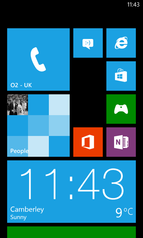
The downside of course is that it will also look like every other Windows Phone interface. You can change the colour scheme of the tiles and give it a light or dark background, but there are no options for custom wallpapers or widgets.
But in truth as much as we love widgets we don't really miss them here, as most tiles kind of act like a widget anyway, thanks to Microsoft's inspired decision to bring live updates to the tiles.
So for example rather having a static image of a calendar that you have to click on to see anything, the shortcut to the calendar on Windows Phone displays the current date and any calendar entries for that day and time.
The people app meanwhile shows a mini slideshow of contact images and the gallery app does the same for photos. Not all apps have live tiles, but a lot do and it almost seems backwards that other OS's aren't doing this, as it's such a simple and useful feature.
Beyond changing the colour scheme the only other real customisation options come in the form of choosing which apps to display as tiles, where you want the tile and how big you want it to be.
It gives you a fair bit of control over the usability of the phone, as not only can you put frequently used tiles at the top of the list, you can also make them a lot bigger than other tiles.
Tapping a tile opens the associated app while long pressing it lets you move it, resize it or delete it, and when placing or moving a tile everything else will move around it to make space for it.
There's a status bar at the top of every screen and this permanently displays the time in the top right corner. However to get any more information than that you have to tap on it, at which point it will briefly display the battery level, mobile signal level and the like.
This isn't a problem, but it's also not that intuitive for new users, who may take a while to realise you can even do that.
Beyond swiping around, the main controls come in the form of the three soft touch buttons on the coloured stripe just below the screen. Their basic uses are all fairly self explanatory, though two of them have secondary functions if you long press them.
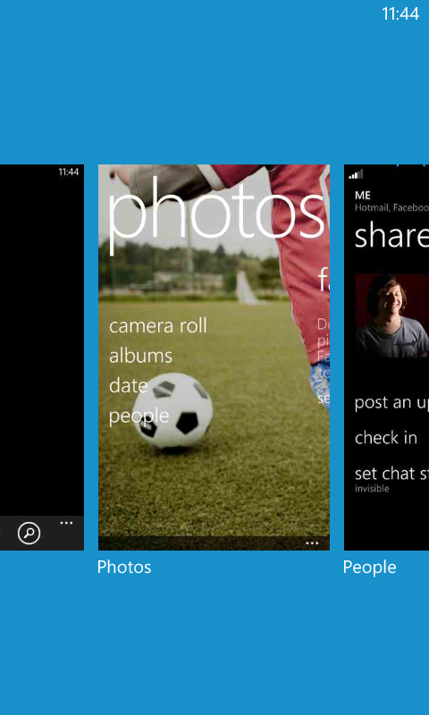
The left-most button is a 'back' button, which simply returns you to the previous screen you were on. Long pressing it brings up a display of all the recent pages and apps you've been on and lets you choose which one to return to.
The middle button is the 'start' button, which takes you to the start screen. Long pressing this one brings up a voice commands screen, which lets you open apps and perform basic actions on your phone, such as calling someone.
It worked pretty well too, rarely making a mistake. You can also take screenshots if you hold both the start button and the power button.
The button on the right is a web search button which takes you to Bing search. Unfortunately you can't change the search engine, but it gets the job done.
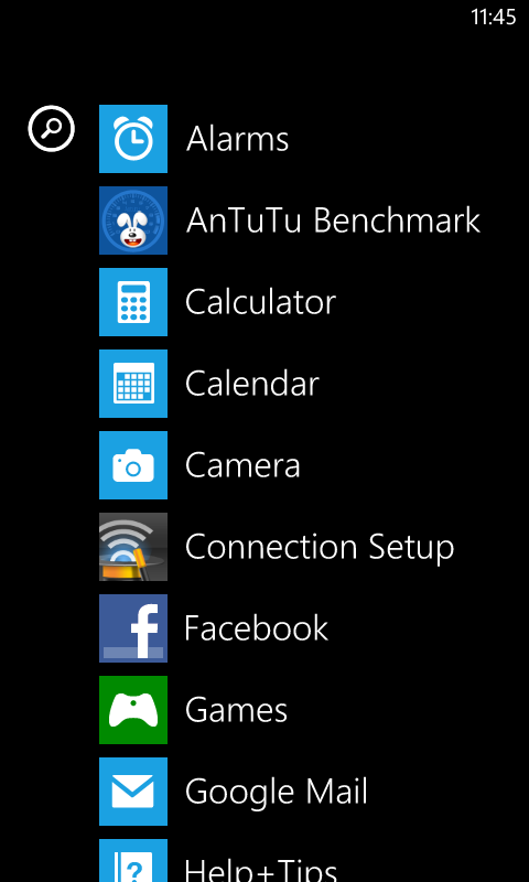
Swiping right from the start screen brings you to a list of all your apps, both those with tiles and those without. It's just a long, scrolling list, so if you have a lot of apps it could take a second to find things, but they're sorted alphabetically so it's not too much of an issue.
As well as launching things by tapping on them you can also pin them to the start screen by long pressing them.
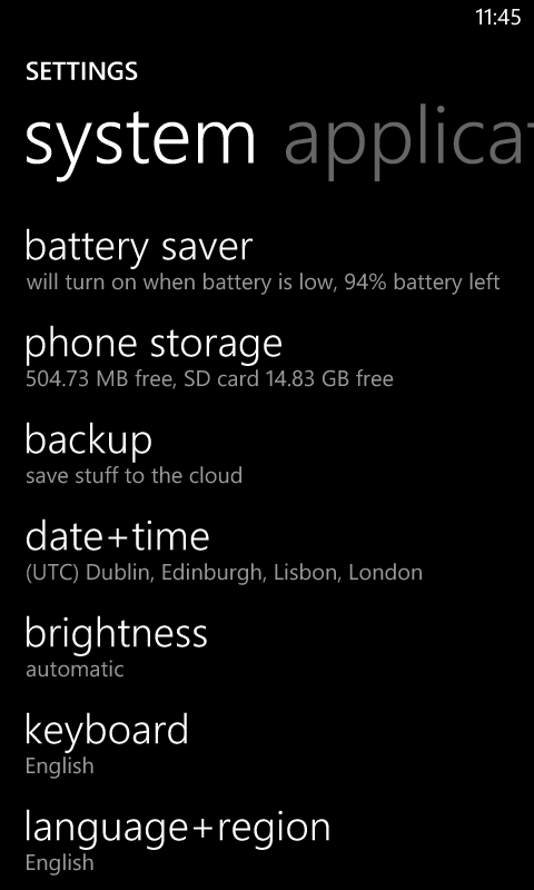
You'll find the settings menu here (though of course you can also pin it to the start screen). There are quite a few settings and options to get to grips with here. You can set up Wi-Fi, Bluetooth and the like, as well as changing the brightness and the theme and customising ringtones and sounds.
Most of it is pretty much what you'd expect to find, but there are a few more interesting options, such as 'attentive phone', which has options for turning the ringer volume up when the phone is in a pocket or purse, lowering the ringer volume when you pick the phone up and muting it if you turn the handset over.
You can also choose which apps are allowed to run in the background and setup 'Kid's Corner', which allows you to make a custom start screen with access only to apps, music and videos that you've pre-selected.
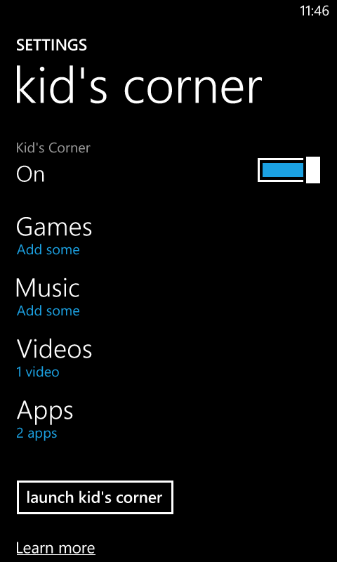
It's a great way to let a child play with your phone without fear of them causing any harm or encountering inappropriate content, though it's still some way removed from the multiple users feature offered by Android 4.2 - although that's tablet only for now.
The whole interface is very slick, attractive and intuitive. It's let down slightly by the lack of any help or prompts when you first start using it, but most things are very simple to work out.
Actually navigating the HTC Windows Phone 8S is impressively smooth too. We didn't encounter any slow down or judder when moving around the start screen and menus.
It didn't feel discernibly any less slick or powerful than a top end handset, which, given the mid range price and specs, is impressive.
James is a freelance phones, tablets and wearables writer and sub-editor at TechRadar. He has a love for everything ‘smart’, from watches to lights, and can often be found arguing with AI assistants or drowning in the latest apps. James also contributes to 3G.co.uk, 4G.co.uk and 5G.co.uk and has written for T3, Digital Camera World, Clarity Media and others, with work on the web, in print and on TV.
