Why you can trust TechRadar
Anybody who is familiar with the HTC One will know that HTC handsets now ship with Sense 5.0 on board.
This is by no means a bad thing, as we have found Sense 5.0 to be a very well designed UI, providing a far different experience to vanilla Android, or even the customization seen on Samsung Galaxy devices.
Unfortunately, there is Sense 5.5 (now shipping on the HTC One Max, and provided as an update on the One) doesn't make an appearance here. The Desire 500 also only comes with Android 4.1.2 Jelly Bean, disappointing considering we're now on version 4.3 of the software and version 4.4 KitKat has recently made it out the door over at Google.

Sense 5.0 is by no means a perfect UI. There are doubtless many users who will find the need to install a custom UI. Nevertheless, the more we played with Sense, the more we enjoyed it.
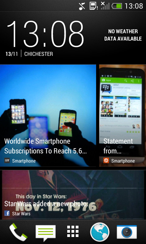
BlinkFeed is a great addition, bringing a customized news list to your home page. This is based on your interests, as well as integrating with your Facebook and Twitter feeds to provide a unique experience.
Gone are the days when Sense was seen as a sluggish, resource hogging feature: with the 1.2GHz quad-core Snapdragon 200 processor moving things along nicely.
A real niggle we found with the Sense software was the persistence of the Power Saver mode in the notifications pane. This could be removed, but only by force closing the app.
This was disappointing as it means that the expandable notifications of Jelly Bean aren't used to their full effect. It was remedied in an update to the HTC One, so maybe we'll see it hit the Desire 500, but don't hold your breath.
We were also disappointed with the lack of quick settings. Samsung's Touchwiz handles this a lot better, providing quick toggles at the top of the notification pane. Instead, there is a button to take you to the settings page, so not even a dedicated quick settings pane.

There are widgets on the Play Store that will sit in the notifications pane, although HTC does provide two different widgets that do the same job, but on a home screen.
These are the Power Dashboard and Data dashboard widgets, which both include Wi-Fi and AutoSync toggles. There are individual toggle widgets, as well as Androids standard power control widget, though.
Going back to BlinkFeed, we found that it was a very interesting, innovative, useful and fun feature to have. The range of feeds that you can select can seem a little minimal, but we found that it provided us with a decent selection of articles to read.
It does mean that the primary home screen is to the far left, which we found a tiny bit annoying, if only because we're used to having it in the middle, and there is no infinite scrolling either.
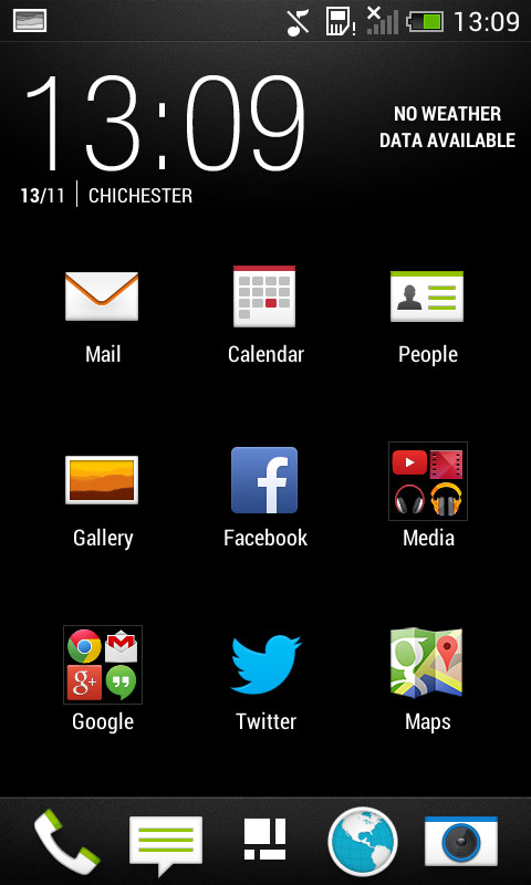
The app drawer is well designed, providing a very different experience to the one found in stock Android. There is no widgets tab, for instance.
These are placed onto the home screens by long pressing empty space, or by pinching out. Widgets are then moved by long pressing, dragging and dropping, if you have space. Unfortunately there is only the option of five home screens, including the BlinkFeed page.

The HTC Desire 500's app drawer is rather well organised too, with HTC pre-organising many apps into folders. Creating your own folders is as easy as long pressing, and dragging apps onto one another.
Moving apps to the home screen is a little more convoluted, as you have to drag and drop an app onto the shortcut area (in the top left), and then onto the desired screen.
You can choose to organise apps in a custom manner, alphabetically or by date of installation. You can also increase the amount of apps displayed from a 3 x 4 to a 4 x 4 grid, as well as hiding apps that you can't uninstall.
These are both useful features, especially as we find that there are many apps that we always hide. We won't tell you which ones though.
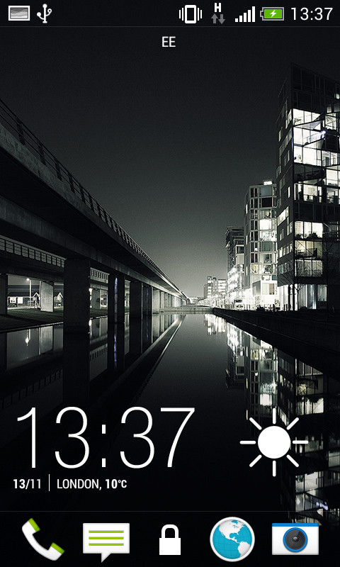
On the lock screen, many might find that the lack of widgets is disappointing, especially as it is something that we have seen on the likes of the Samsung Galaxy S4 Mini, and the newer versions of Sense.
In all, we weren't too disappointed given that HTC Desire 500 caters to the majority of needs, such as having quick access to music controls whilst listening to tunes, and a weather clock.
You can also choose to launch into any app that is sat in your home screen dock, just by dragging upwards.
This made launching into the camera app a lot quicker and easier, and we were glad to see that we didn't have to input our pin when loading it. You'll need to enter it in order to access the gallery function or any of the other apps, mind.
In all we are impressed by HTC's Sense UI on the Desire 500. As with every UI, there are a few downsides but these are easily outweighed by the amount of positives. BlinkFeed is a lot of fun to navigate, and over all the whole UI feels both well laid out and intuitive.
