Why you can trust TechRadar
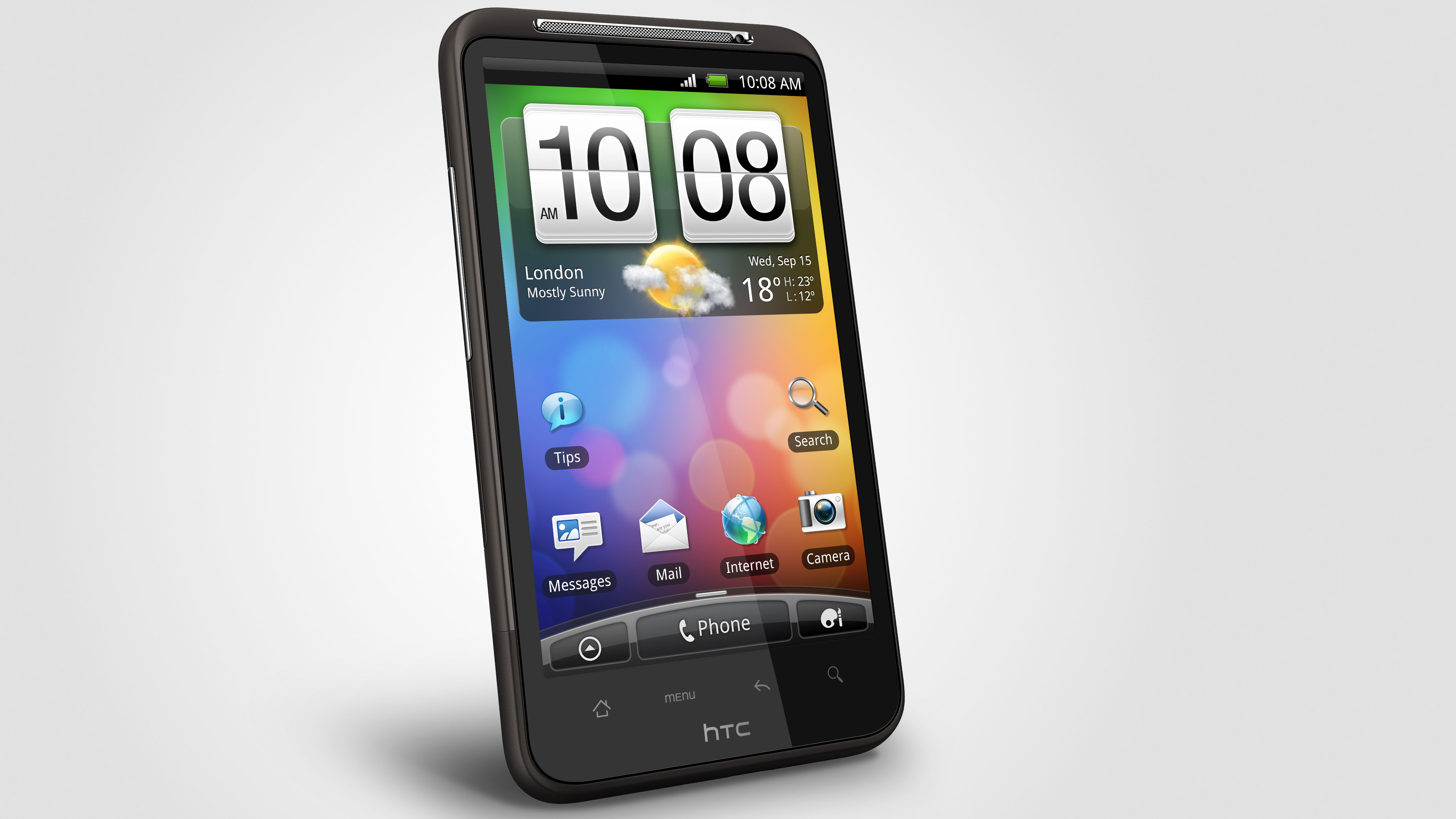
The HTC Desire HD is bringing a similar experience to the others in its top end Android line - namely, using its snazzy Sense UI to make the Google experience much better in addition to the new Android 2.2 OS it's rocking.
The Taiwanese firm has worked its magic again for the new Desire HD and Desire Z, offering up new widgets, layouts and ways to play with your phone on the train.
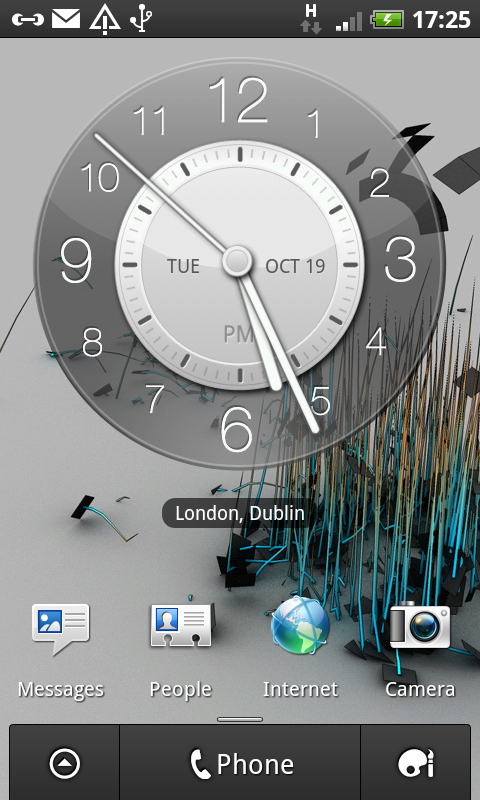
For the uninitiated, Sense UI is a skin that sits on top of the basic Android experience, offering new widgets and a greater number of home screens to play with.
If you want to access these quickly, simply pinch the screen in, and you'll see all the different pages showcased in an exploded view - really handy if you're at one end of the list and want to look at something you've stored at the other end.
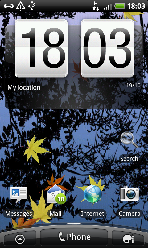
One feature of HTC's Android handsets has always been a fluid experience under the finger, and once again that's on show here with the HTC Desire HD.
It's simply mind blowing, much like the experience on the Samsung Galaxy S (when it's working) and the iPhone 4... there's not a hint of slowdown on show here, no matter how hard you push the phone.
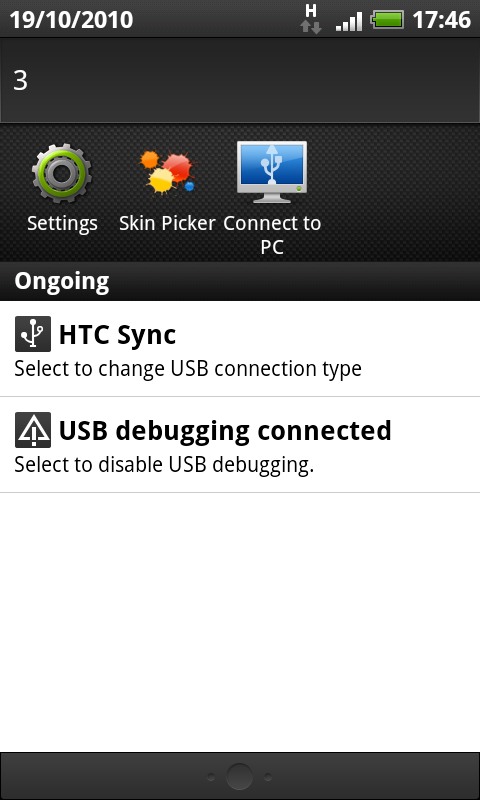
You can drag the notifications bar down from almost any application, and even if the phone is updating in the background you won't notice any juddering - in fact the only time we encountered a sniff of it was when we were downloading 10 applications at once.
The home screens are obviously large and clear with a 4.3-inch display, and the extra estate means HTC can offer up massively functional widgets or half sized versions of many of them so you can fit more onto your home screen set up.
It should be applauded that HTC has managed to overhaul the Sense UI without making any major changes - in fact, they're mostly nothing more than tweaks but still bring that level of user delight that we're so excited about.
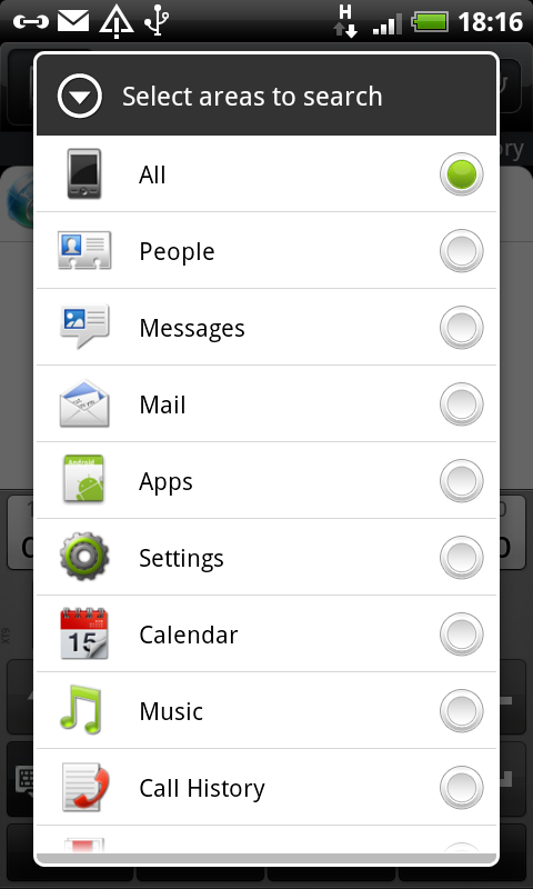
The first is the extra option at the bottom of the screen - rather than having to long press the display to edit it (although you still can) there's an icon of a palette to press, which achieves the same thing.
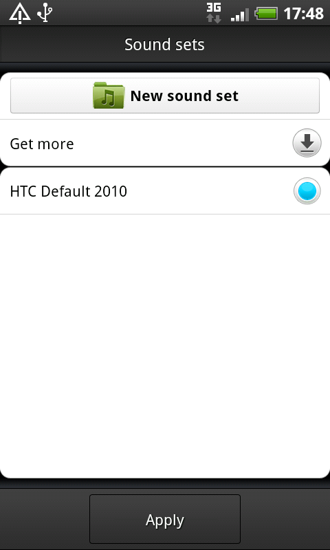
The editing screen has been overhauled too, with a load more options. Here you can do little things like alter your ringtone (or even the whole sound set, so all notifications will sound like harps or the sea or whatever you're into - we were sad 'Top sounds of the M4' didn't make the cut) or change all the icons and set up of your home screen using the new scenes offering.
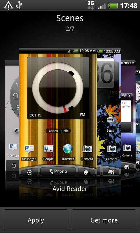
You can scroll through all the new scenes on offer, which are preloaded with different arrangements of widgets and wallpapers, or you can hit a button to quickly download more.
Not only is it testament to the new GPU on the HTC Desire HD that this process of scrolling through thumbnails suffers no slowdown, but the ease of which you can go online to download more shows that this really is a next generation smartphone.
Other things you can edit include skins (to change the way the phone's notification bars and menus are shaped and coloured) and wallpaper too, making it very easy and cool to personalise your Desire HD.
We're a little peeved you can't do timed screen changeovers - how cool would it have been to be able to suddenly see your phone enter party mode (even though that already sounds a bit sad) at 5.30 on a Friday evening?
Another tweak is the Edit button - before when users would hold an icon or widget, the Android interface would pop up with a 'remove' option that you could drop your selection into.
Now you also get an edit option (if applicable) which allows you to change certain elements - very cool and one of the things that show off the overall slick nature of the Desire HD.
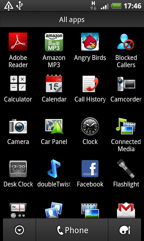
The menu layout is the same as ever - a scrollable list of icons you can mess around with and re-arrange as you see fit, or pop into folders to make it easier to use.
Another new feature on the Desire HD lives in the notifications bar, which you open by dragging your finger down from the top of the screen.
Here you'll see your most recently-used icons, making it mega easy to swipe along and see what you've been up to - and opening up oft-love options too.
The interface on the HTC Desire HD is simply phenomenal - you can sync up loads of accounts and have a fair few background processes and yet things still tick along wonderfully in the foreground.
And another thing – the fast booting process is sensational. It only works if you've turned the phone off and not pulled out the battery (as you might do on the plane) but turning it back on yielded a start screen that we could play with in less than 8 seconds, which is amazing and we had to check it three times to believe it.
Current page: HTC Desire HD: Interface
Prev Page HTC Desire HD: Overview, design and feel Next Page HTC Desire HD: Calling and contacts
Gareth has been part of the consumer technology world in a career spanning three decades. He started life as a staff writer on the fledgling TechRadar, and has grew with the site (primarily as phones, tablets and wearables editor) until becoming Global Editor in Chief in 2018. Gareth has written over 4,000 articles for TechRadar, has contributed expert insight to a number of other publications, chaired panels on zeitgeist technologies, presented at the Gadget Show Live as well as representing the brand on TV and radio for multiple channels including Sky, BBC, ITV and Al-Jazeera. Passionate about fitness, he can bore anyone rigid about stress management, sleep tracking, heart rate variance as well as bemoaning something about the latest iPhone, Galaxy or OLED TV.
