Why you can trust TechRadar
HTC Desire S review: Interface
If you read our Google Nexus S review, you'll have seen us say that Android 2.3 didn't prove to be too different as an upgrade. Then, if you read our HTC Incredible S review, you'll have seen us say that HTC Sense didn't prove to be too different.
But combine the two and… yeah, things aren't that different. But this is in the same way that a fudge sundae isn't that different every time you buy it – it's still delicious.
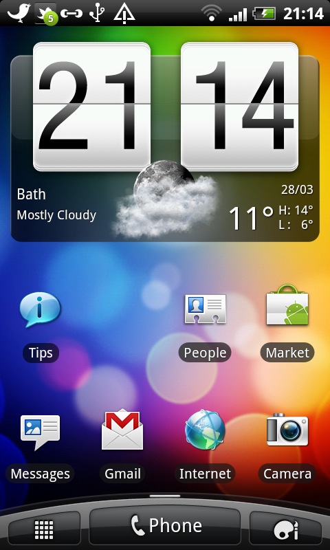
HTC Sense is the manufacturer's custom overlay for Android, using all the power of the operating system, but providing a more unified interface.
It's proven itself to be beautifully smooth in the past, and time was that only HTC phones could match the iPhone for smoothness of interaction. We'd suggest that Windows Phone 7 devices, such as the HTC HD7 and Samsung Omnia 7, have crashed that party now, but Sense/Android is still ahead when it comes to flexibility and features.
Once again, the general interface experience on the HTC Desire S is excellent, with one irritating exception. The notifications bar is frequently slow on the Desire S, with you swiping forlornly at the top of the screen, but nothing happening.
It will catch up eventually, but it's a flaw that stands out more because the interface is so slick otherwise.
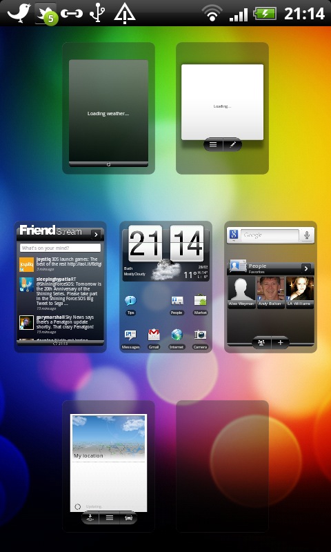
Being Android, you get multiple Home screens (seven in this case) on which to place widgets or shortcuts to apps. You can pinch in at any time to activate Leap View, which shows all the home screens at once.
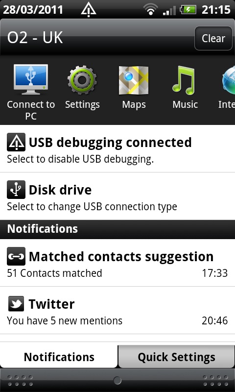
The notifications bar has your recently used apps at the top, for fast app switching. There's also a second tab to this menu, with lots of quick options, including turning Wi-Fi and Bluetooth on and off.
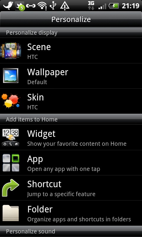
At the bottom of the Home screens are shortcuts to the full app menu, the Phone app or the menu to personalist the phone. You can choose between different wallpapers and Scenes (which are sort of like themes), add new widgets and folders for apps, and more.
Opening up the full apps list produces screens of icons that you flick through one by one (a bit like the iPhone, but flicking vertically instead of horizontally) instead of in one monstrous list.
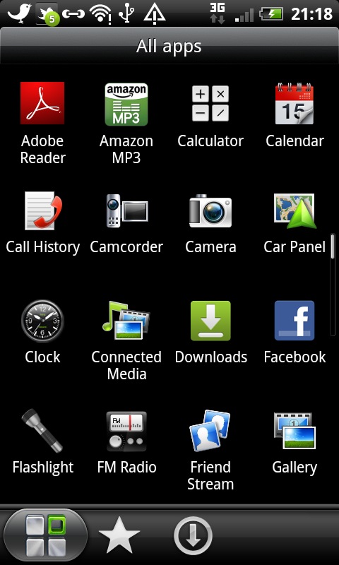
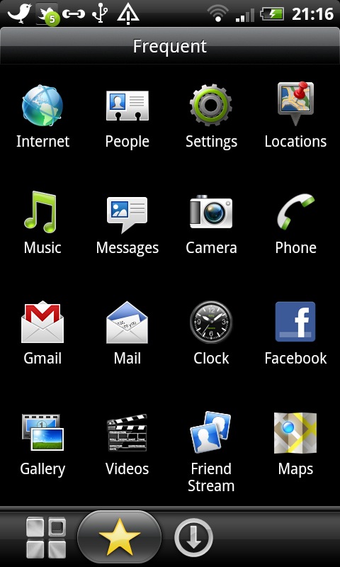
There are a couple of tabs here, for seeing your Frequent apps and Downloaded software.
There's the Android Market to pick up more apps, of course, and there are more customisation options in the HTC Hub app.
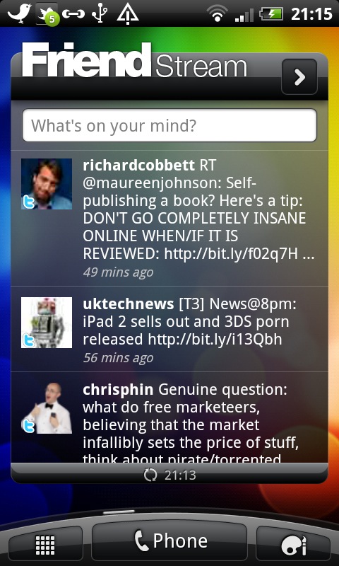
More recently, HTC Sense has become more cloud-focussed than ever before, and the real boon is simple and effective integration with Twitter and Facebook right out of the box.
Being Android, Google integration is great too, though you'll find more detail on this in the Contacts and Calling and Messaging sections.
Like the HTC Incredible S, the fast booting process is available, and it's amazing how quickly the phone gets up and running after being turned off.
The screen is very strong and clear indoors, but doesn't stand up well in the sun. As we already mentioned, it was actually slightly worse than the original Desire, and was significantly weaker than even the now-21-month-old iPhone 3GS.
Current page: HTC Desire S review: Interface
Prev Page HTC Desire S review: Overview Next Page HTC Desire S review: Calling and contacts