Why you can trust TechRadar
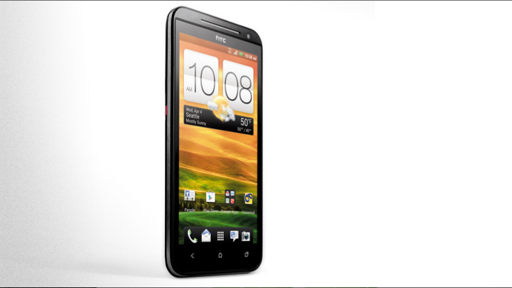
The HTC Evo 4G LTE has a near identical media experience to the One X - which is to say, great. It has a the same identical, gorgeous screen to watch movies on, has the same Beats integration, and plenty of widgets and downloadable media-playing apps - but where it really shines is the improvements it makes to the One X.
Perhaps, most importantly, the HTC Evo 4G LTE has expandable memory up to 32GB via microSD.

Then there's that kickstand - the gimmick of yesteryear is a welcome addition to the Evo 4G LTE, chiefly due to massive improvements.
Other than that, things are unsurprisingly similar to what you'll find on the HTC One X, so if you're looking for a detailed account of all things media, check out the HTC One X review.
Music
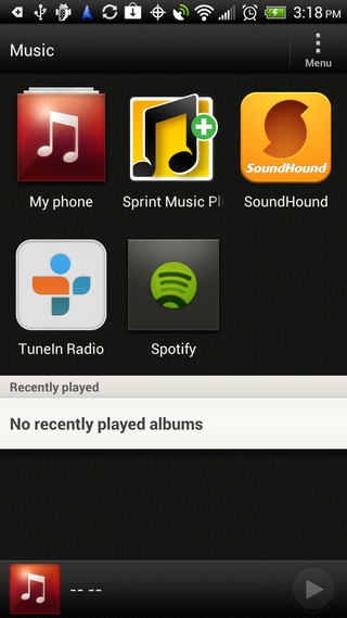
Opening the music app reveals four music apps (more if you've downloaded the likes of Spotify, Rdio, etc).
Those four apps are My Phone, Sprint Music Player, SoundHound, and TuneIn Radio. Except for "My Phone," each of these shortcuts can be removed with a simple long press (even Sprint's Music Player).
The SoundHound included is not a trial version - it's the real deal, and will help you find which song is playing over those loud speakers at the bar, or in the car, or on that TV show.
The HTC Evo 4G LTE has the same FM radio as the HTC One X, and while most people will fire up Spotify before a radio app these days, having the ability to listen to NPR's Fresh Air live from your phone is a treat.
Like the One X, you can't record or name stations, but the audio sounds fine. Obviously, this is more a novelty app for radio heads, but we're just happy to have it.
Video
Like all HTC phones, the Evo 4G LTE has opted to forego a videoplayer in favor of a photo and video integrated gallery. That's great for simplicity, but makes for a messy user experience that requires too many taps to get anything done.
This inevitably ends with too many similar-looking thumbnails. If you took four videos of a parade marching by, for instance, they'd inevitably look almost identical and with no real way of telling the difference between them, without actually watching them.
Nic is a former Online Editor at TechRadar in San Francisco. He started as a games journalist before becoming an editor at Mac|Life magazine. He holds a degree in English Literature and English Writing from Whitworth University.
