Why you can trust TechRadar
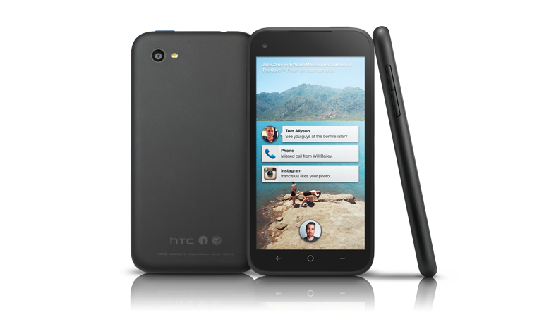
Nevermind what Zuck and friends have preached about a phone built around "people, not apps," withFacebook Home running, the HTC First is an Android phone built around Facebook, and not much else. At least until you "fix" it by disabling Home, that is.
Facebook Home, the software the First is first with, is essentially an Android launcher. If you're unfamiliar with the term, a launcher is a program that makes over the look and feel of your Android phone, while not changing the software that runs in the background.
Android enthusiasts have been using apps like Nova Launcher to get away from the manufacturer and carrier software on their phone, often for an experience closer to unaltered Android 4.1: Jelly Bean. This means you can have a Galaxy S3 without Samsung's TouchWiz, or a One X+ without HTC's Sense UI.
Facebook Home
Thanks to Facebook Home, the First hardly looks like an Android phone. Instead, it's Facebook from minute one. Wake the phone and the lock screen is a full screen, Flipboard-style news feed.
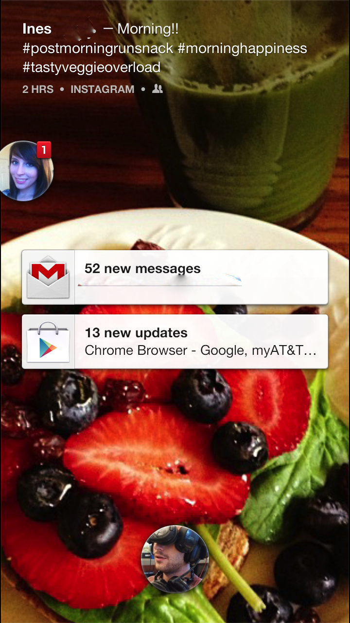
If a friend posts a picture, that image takes over the whole screen, with their caption laid over it. If it's just a status update, Facebook Home uses their cover photo as a background.
Without really even unlocking the First, you can like or comment on a post. There's a familiar thumbs up and speech icon in the lower left. Also, double tapping on a post screen will give the post a like, something that's a little too easy to do by accident.
On the HTC First, any and all notifications show up on the lock screen. If you use Home on an other Android phone, only Facebook notifications will appear. While we haven't tried Home on any other devices yet, this certainly seems like the most functional version of Home.
So notifications from apps as well as Facebook show up here, in a way that combines your typical lock screen with information from Androids pull down Notification Center. Your ongoing conversations, SMS and Facebook messages, also pop up here as round Chat Heads icons. More on those soon, and in the Messaging section of this review.
The basic problem with the Facebook Home lock screen is that it's about as good as whatever your friends are posting. Sometimes you unlock your phone to be greeted by a beautiful sunset or an inviting plate of food, other times it's a badly cropped shot or something weird or rude posted by an oddball you know.
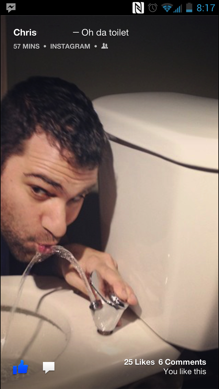
Often it was creepy to have Facebook Home - and therefore our friends - be the first thing on the First's screen. Locking eyes with an old friend we hadn't seen since college first thing in the morning was startling, so was being confronted by a really bizarre Ralph Steadman painting someone had as a cover photo.
Ok, so it's something of a glorified screensaver starring your friends, but we don't mean to trash it completely. Though it's not as good as Flipboard, it is a visually optimized feed, and like good old Facebook, it's fun to browse during idle moments.
It actually reminded us a lot of Blinkfeed, HTC's feed aggregator from the HTC One. Comparing the two, we prefer Blinkfeed, which integrates your Twitter account, as well as information that's actually useful, like calendar events and a weather report. It also doesn't hang out on the lock screen, so it's not nearly as in your face.
But as with Blinkfeed, it's insidiously easy to turn your brain off and "channel surf" this content. If you've ever felt ashamed at the time you waste robotically scrolling down News Feed into weeks old content, prepare for some cardinal sinning. Still, it's good presentation, and an excellent way to waste time on your phone, but we'd prefer to have it as a sort of "full screen" option for the Facebook app, rather than the welcome mat for our phone.
There is a Facebook Home Settings app, but it didn't offer any options for manually controlling who or what shows up on the lock screen. We're assuming it's managed by the same algorithm that determines News Feed content, so people who you interact with the most will dominate the feed, and people whose posts you hide or ignore will be rarer.
We're also wondering what the data use numbers from this thing are like. In the Facebook Home Options, there is a Data Use setting that defaults at medium, and can also be set to low and high. While we doubt that it sucks any more data from your plan than a typical Facebook check, the fact that it'll be constantly opening has us wondering.
We've reached out to AT&T and HTC for comment, and will update if they provide an estimate.
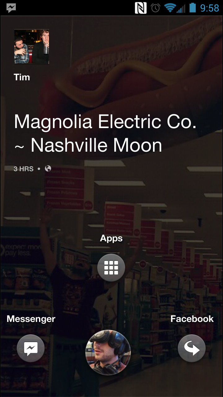
Alright, enough about the Home lock screen, lets dive into this thing. When you're ready to unlock the First, it's a typical slide to unlock. Touching the round icon of your profile pic, you can slide up for Apps, left for Messenger and right for your last app.
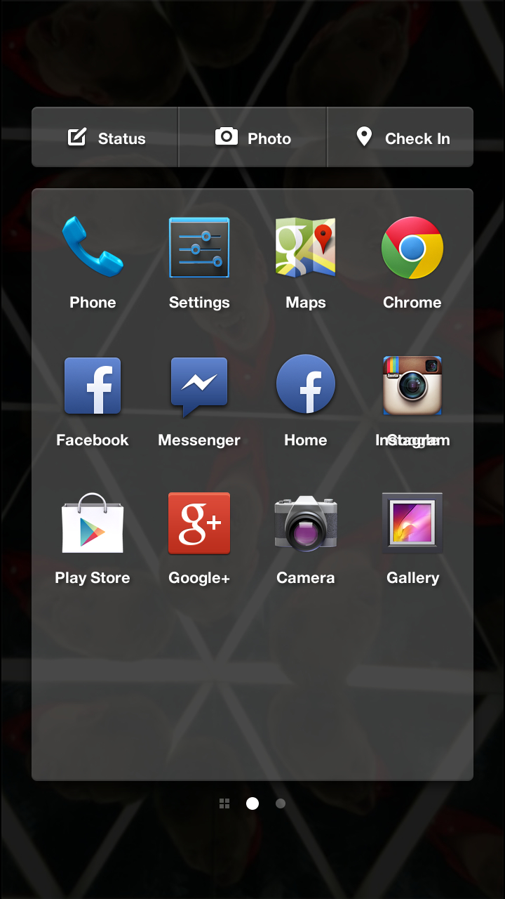
Go up for apps and you'll find a simple black tray that you can fill to your hearts content with icons. No widgets though, that's one thing Facebook Home does away with entirely. Apparently Facebook and HTC are in agreement that the smartphone experience is no longer about widgets.
So no widgets, but you can go crazy with the apps. There doesn't seem to be any limit on the number of trays you can have. We created eleven mostly blank trays before the phone started to stutter a little bit. That's even more than seven Jelly Bean typically provides.
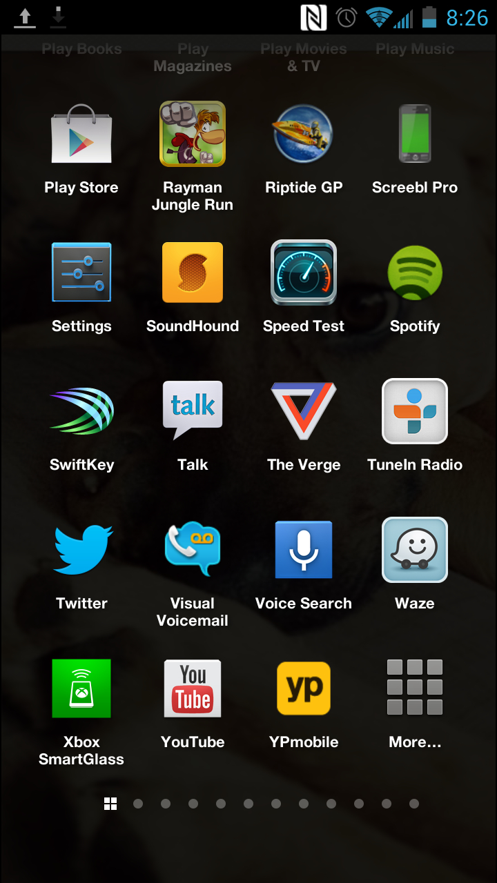
Spare trays form to the right, but a list of all your apps is to the left. This is a typical Android division Home leaves intact, making it easy to get into your most important apps, but not hard to get at the rest, either. There's also a Google search bar at the top of this list.
The closest thing these trays have to widgets would be a few social options at the top. You can easily update your status, post a pic or check in somewhere with these links.
Users of lock screen passwords should note that there's no security prompt on Facebook Home until you attempt to dive into an app. That means that someone can peruse your feed, comment on and like posts without hitting a password prompt.
This is best suited for someone who doesn't use any sort of security, since having the prompt appear one or two screens in is a bit disorienting. We started off using Facial Unlock, which we've grown to like from using the Nexus 4 and the HTC One. On quad-core devices such as those it's the fastest way to securely unlock your device. The dual-core First was just a tad slow on the uptake for this method, so we switched to a PIN, and eventually just settled for no security other than our own watchful eye.
This wasn't a deal breaker for us, as we find guarded lockscreens a bit superfluous anyway, but it's another thing that will have power users scoffing at Facebook Home.
Chat Heads
Although it's more for the Messaging section of this review, there's one last notable part of Facebook Home we need to touch on here, mainly because (unlike Home) we actually like it and plan to use it. It's Chat Heads, Facebook's fun, visual way of multitasking with conversations and whatever else you're doing on your phone.
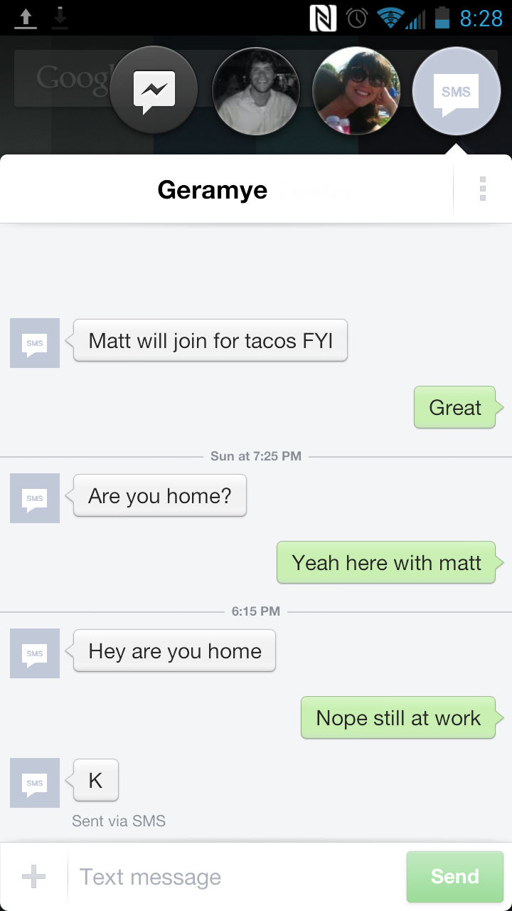
Basically, when you get a text or Facebook message, a little round icon appears on your screen. over whatever you're currently doing. This isn't the case with every app, Chat Heads won't pop in over Netflix or games like Cut the Rope. A good rule of thumb is that any time you can pull down the notification center, Chat Heads will show up.
If you have more than one chat going on, the icons stack, and fan out when selected. Chat heads can be moved around, but snap to the side of the screen. To be rid of them, you toss the icon towards the bottom of the screen, which brings a new level of satisfaction to actively ignoring a text.
It's a fun interface, a rare combination of both functional and cute, and the only aspect of the new Facebook Home we plan to use after this review. However, we had a few problems with it. SMS text conversations didn't pull profile pictures from our Google contacts. Instead they just had a bland gray SMS icon.
More on the fun, and the few failings, of this system in the Messaging portion of this review.
Android 4.1: Jelly Bean
Remember when we told you that underneath all this Facebook there was a crisp, clean version of Jelly Bean running on the HTC First? We'll it's the truth! It's not 4.2, the latest version you'd find on a Google-sanctioned Nexus device, but it's a darn sight better than the Android 4.1 you'll find on most phones, without all that manufacturer tweaking of the good old stock OS.
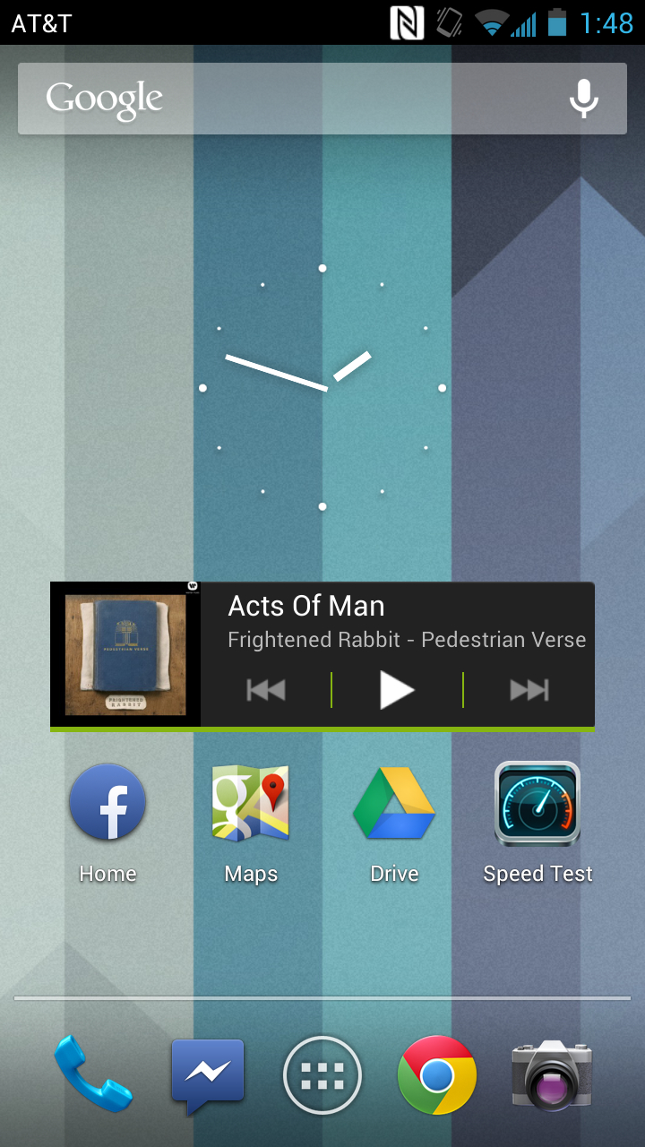
Yep, it's here, although it takes a bit of digging to get to. To find it the first time, enter Facebook Home, slide over to the left for that full list of apps. Scroll all the way down to where you'll find the More icon. Touch that and boom, you're on a familiar Android homescreen, widgets and all.
Kind of a funny place to hide your Android skeleton, eh Facebook? Almost as though you didn't want people to find it. Now, now, we're being harsh. You do give us the chance to use the Android launcher rather than home, in the form of a default app prompt that comes up. Make Android your choice and every time you hit that circular home button, you'll be back in Google country.
You can easily switch between the two by going into Settings>Apps and then hitting the options button (the rightmost Android button, the dash on the First) and changing your app defaults. You'll still have Facebook Home as a lock screen, and even that can be done away with by going into that Facebook Home Options app where there's an option to entirely disable the thing.
You can also access Google Now with a long press on the middle Android button. A double tap will give you recent apps, and a touch of the right option button brings up wallpaper, app management and system settings options. This is all works the same way whether you're on Facebook Home or the Jelly Bean homescreen.
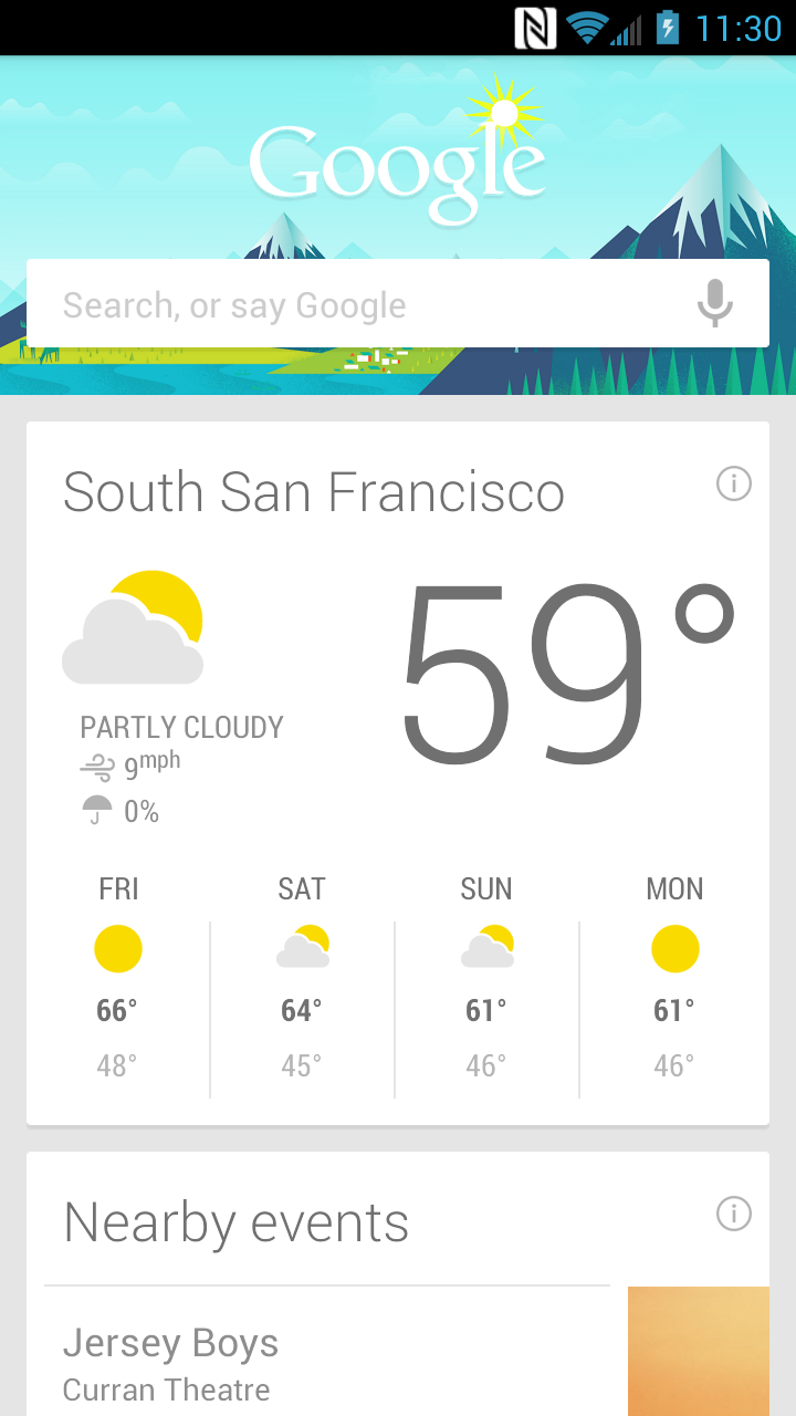
So once you strip out the extra Facebook fat, you've got pretty lean, mean Android 4.1: Jelly Bean machine here, and the only one that's a manageable 5-inches and LTE capable. Given that, we have a feeling the First may develop a sort of second life as the mid-range of choice among Google geeks. It could be the affordable alternative for those who find the S3 too big in build or price tag.
We actually do think the First is worth owning in this regard, at least until some other manufacturer releases a similar stock handset (not likely), or until the we see an LTE version of the Nexus 4 on more than just T-Mobile (also not likely), or until the rumored Google Nexus 5 shows up with LTE capabilities (a lot more likely). Until then, we could be looking at the next cult Android phone.
Performance
Full HTC First specifications:
- 1.4 GHz dual-core Qualcomm Snapdragon processor
- 1GB LPDDR2 memory
- 16GB internal storage (no SD support)
- LTE capable
- 2000 mAh battery
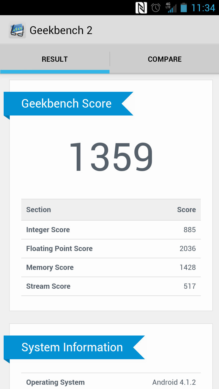
While we're mixed (and leaning towards "no") on whether or not anyone should actually use Facebook Home day-to-day, it runs quite well for being such recently released software. We've yet to try it on other devices, but it's all very snappy on the First. Whether you're coming in from the lock screen or diving into an app, it all moves just as quickly as a well optimized dual-core device should.
There were only occasional performance lags, mostly ones we'd chalk up to launch hiccups. A couple times we woke our phone up to find a loading icon rather than a fresh image from the Feed. A moment of slower data service is probably to blame there. We also had a few random stalls when launching apps, and the processor did bog down when we had a lot of app updates downloading, but that's to be expected.
Both the coders behind Facebook Home and the designers of the HTC First should be praised for building something so well optimized. There's raw talent and some clever thinking here. If only Home were more feature rich we could begin to approach an Apple level of hardware and software harmony.
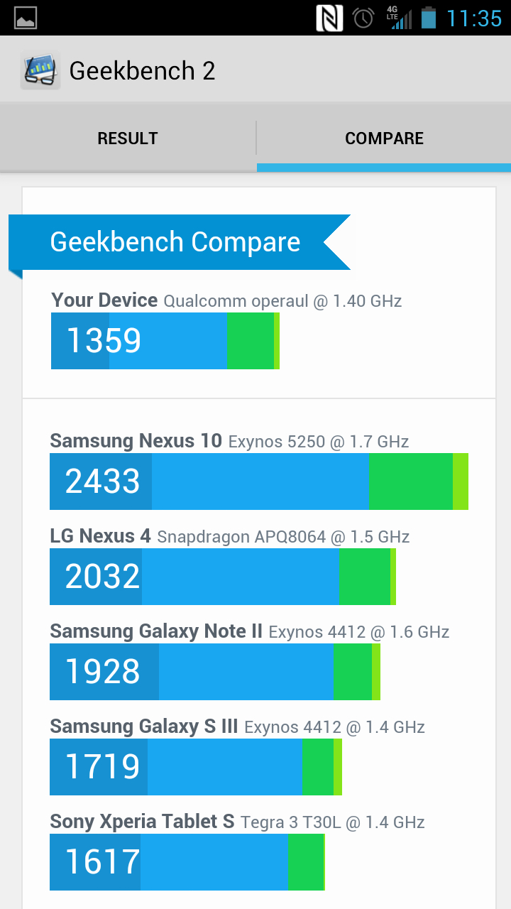
Pure Jelly Bean runs just as well on the First, because of course it does. It was always a big step up performance-wise from Android 4.0: Ice Cream Sandwich, landing at a crucial time when a lot manufacturers were leaping dual-core to quad-core builds.
At 1.4 Ghz, the First is just a smidgen faster than its mid-range ICS cousin, the HTC One VX. That phone is clocked at 1.2 Ghz, so it's slightly slower, but the First runs circles around in day-to-day use, and the smart money says Jelly Bean is the reason.
Overall, the HTC First is just a very good dual-core phone. If that appeals to you, or if you know someone who wants a phone "that's just a phone," and doesn't want to pay too much, or dislikes a device as big as an S3, steer them towards the First. Give them a hand disabling all that Facebook nonsense that they'll hate, but then they'll have a very functional little phone, and won't have paid too much for it.
Current page: Interface and performance
Prev Page Introduction and design Next Page Contacts and Calling