Why you can trust TechRadar
HTC Gratia review: Design
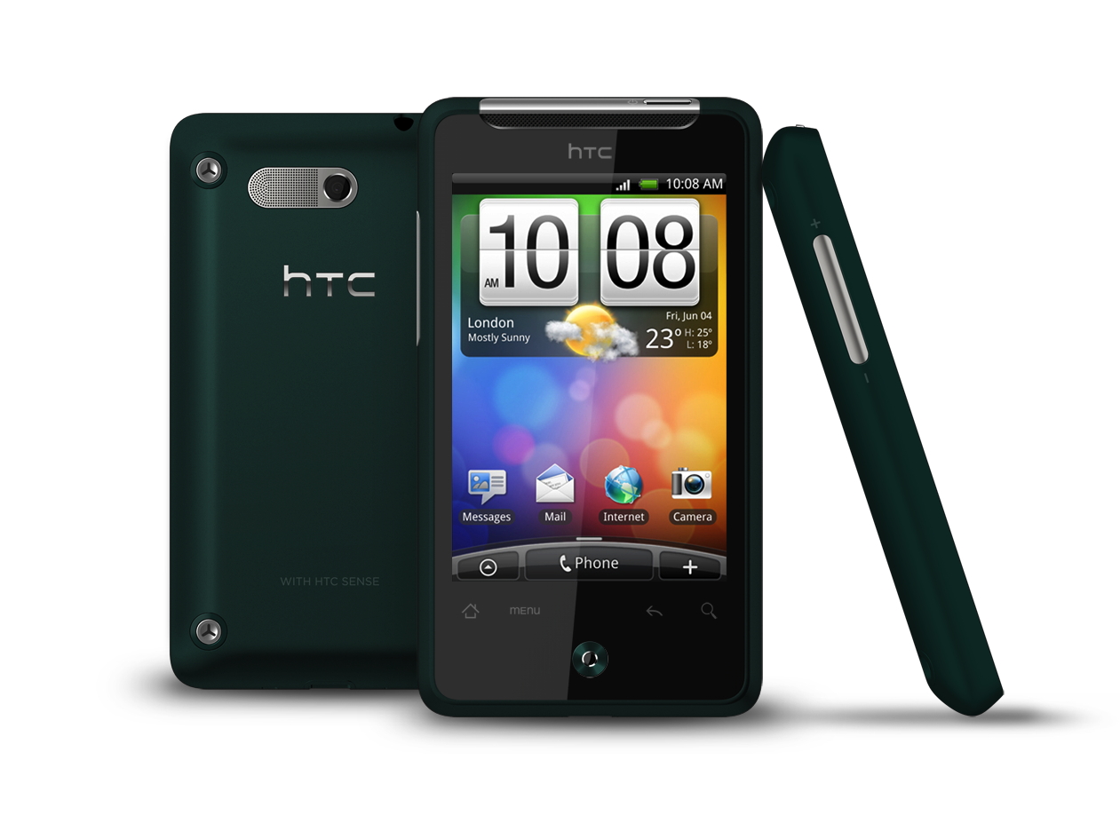
The design influences on the Gratia are pretty clear: its modernistic frame takes a healthy dose of HTC HD Mini chic, adds a dash of the HTC Wildfire and HTC Desire, and then throws a soupcon of iPhone 3GS gloss into the mix. The overall result is a pretty sleek looker that stands out in the often-tepid mid-price smartphone crowd.
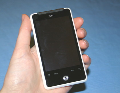
The matte plastic outer feels sturdy enough and is less plasticky than some of the phones we've held (Blackberry Curve, we're looking at you). Turn the phone over and you'll see the tidy camera/speaker unit and some hefty-looking screws.
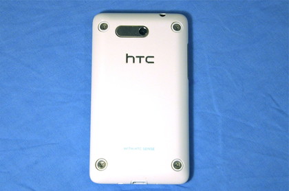
The latter are an odd touch, since they actually belong to the hardware beneath the shell, and so could be hidden away. We think they look curiously industrial compared to the rest of the phone, but we do like the rugged aesthetic they lend the phone's rear. We also know they won't be to everyone's taste.
Looks aren't everything, though – how does it feel in action? We found the Gratia's 115g weight sits nicely in the hand, nestling snugly between fingertips and the top of our palm. The edges, which come to a rounded-off peak, aid one-handed ergonomics, but means it's slightly less comfortable to hold with both mitts.
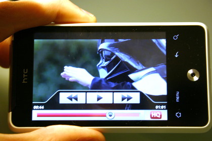
Still, it's more than good enough unless you're planning on doing heavy-duty landscape web browsing and typing for hours on end.
In terms of size, the Gratia's reasonably small compared to some of the big-screen titans on the market, measuring just 104 x 58 x 12mm. That means it's a comfortable fit in nearly any pocket and it's also just about light enough to be eminently portable.
115g is no featherweight for this segment of the market, though, so if you're after a mobile you'll barely notice carrying, you may want to look elsewhere.
Decent use is made of the phone's limited real estate too, with the predominant share going to the 3.2-inch touchscreen. This is pleasingly bright and vivid, with wide viewing angles.
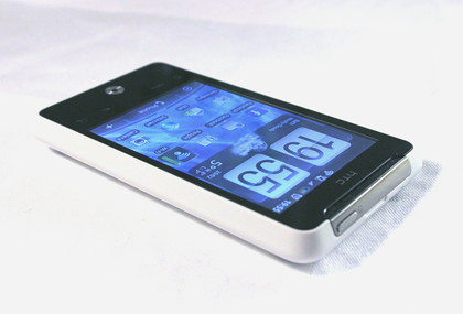
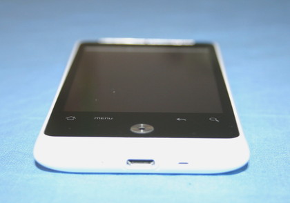
Below the screen are four touch-sensitive points used as Home, Menu, Back and Search buttons, which light up when the display's in service. If we could choose, we'd have these moved down a millimetre or two more, in order to cut down the times when a slightly misjudged jab at the lower edge of the screen results in striking one of these keys.
It wasn't something we often struggled with when standing still, but could be an issue while walking. Whether you feel the same will come down to the size of your digits and the care you tend to exercise.
There's also an optical trackpad located towards the lower edge of the face, which we're pretty blasé about. It's mostly there for scrolling through text to make corrections and for interacting with the camera, functioning as the shutter button.
While it does both of these tasks well enough, we'd certainly prefer a proper physical key for the latter in a more intuitive place.
Away from the main face, there's a bare minimum of buttons and ports. Along the left-hand side sits a lozenge-shaped volume switch, while the screen lock/power button is housed at the top. Bar the trackpad-cum-button mentioned above, that's it in terms of physical inputs.
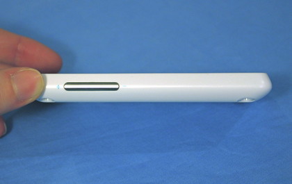
The lock leaves a little to be desired, since its position requires an awkward flex of the index finger to use when the phone's held in one hand. Still, this is a minor niggle and easily worked around.
Conversely, the large volume switch took a little getting used to, but once we learned where not to squeeze, became a real boon for tweaking volume on the fly.
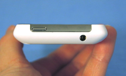
Rounding out the notable features, the bottom edge has a hole for the microphone, and a micro-USB port, while the top bears a 3.5mm headphone jack. Overall, it's a pleasing package, devoid of too much fluff. A few minor tweaks (such as making the edges more comfortable) and it'd be nigh-on perfect.
