Why you can trust TechRadar
HTC Gratia review: Interface
Click the on/lock switch and by default you'll be shown the most central of your seven HTC Sense-flavoured Android home screens. Out of the box, this contains a clock and weather widget at the top, plus icons for email, messaging, the internet and the camera app.
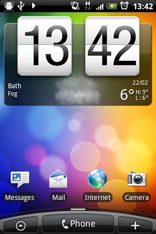
You may also see one of the Gratia's neat little visual tricks – showing you the current weather by rendering clouds, raindrops or the like on your screen for a few moments before clearing away the effect away to a more standard view.
At the bottom lies the consistent and curvaceous HTC Sense UI hub, displaying your current position within the span of home screens with a little light-grey bar on the sweeping mound of darker grey.
Underneath that, sitting dead centre and touching the bottom edge of the display, is all-important Phone nubbin, which is your centre for dialling out to the world.
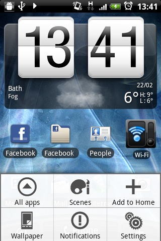
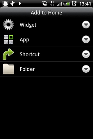
To its left is the app menu launcher, the triangle in a circle icon, which brings up a list of the phone's installed programs. To the right is a plus symbol, which allows you to add widgets, apps, shortcuts and folders of your choosing to your Home screens.
Swipe left and you'll see a new Home screen holding a widget for your email. Do it twice more and you'll see a widget for text messages and a page given over solely to telling you what the weather's doing. Going right from the central screen reveals a favourites pane, news feed and one empty space to stick whatever you fancy in.
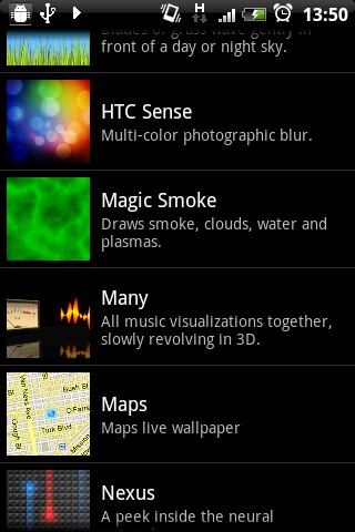
Scrolling back and forth like this will yield one more treat for careful observers – the colour-shifting HTC Sense Live wallpaper. The balance shifts from red on the far right to purple at the opposite end of the Home screen spectrum.
There's a range of such offerings on board, but we were particularly taken with the rippling Water wallpaper and the Polar clock background. Of course, there are also several standard wallpapers if you prefer to keep your experience more constant.
You're not confined to scrolling to navigate the Gratia, though – pinching on any Home screen shows your selection of screens in an exploded view, called Leap View, and from this you can simply tap to hop straight to whichever one you want.
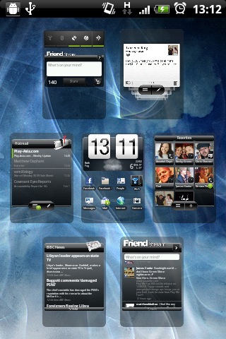
It's a handy way to find what you need in a jiffy. Meanwhile, pressing the Home key on any Home screen other than your central one will return you to it, and pressing the Home key there does the same job as pinching.
There's one final UI feature to account for: the notifications bar. This sits at the top of the screen, displaying essential information such as the time, your battery's current level of charge and your signal.
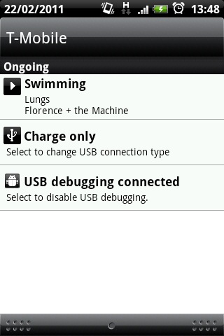
As the name implies, it also notifies you of events – such as messages you've received, or if the Gratia's connected to a PC – with little icons. You can pull the bar down with a finger, revealing more detailed information in a list. If this has whetted your appetite, you can poke the entry to whisk you to the relevant app.
While the Sense UI itself is constant, all the Home screen layouts we've mentioned here can be customised to your heart's content with apps and widgets of your choosing. Plus, if you crave any functionality not provided with the Gratia, there's always the Android Marketplace from which to obtain new apps to fill the void.
When you've made changes, you can save your custom layouts as scenes, meaning you can flick between profiles for work and weekend use, for example.
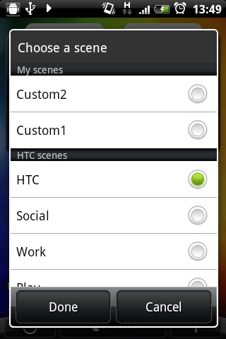
The context-sensitive Menu key is where your options for tweaking the Gratia and its apps live. Press it on any Home screen to alter wallpapers, scenes, app and widget layouts, and to access the Settings app, which is comprehensive. Similarly, touching it within an app will summon some appropriate options.
As we've noted before, such as in our HTC Desire HD review, HTC Sense tends to make for a pleasingly fluid experience in general use, and the Gratia's no exception, despite its below-average processor clockspeed.
It's snappy to respond to your touch, and quick to load into apps. So while on paper the processor is punching below its weight, there's little sign of that in standard navigation.
While all this may sound complicated, the Gratia's blend of Sense and Android is also pleasingly simple to get to grips with, even if it will take you a while to master all the settings. The default layout is a sensible place to start and will help get you on your feet quickly.
What's more, there's also a setup wizard for getting connected online and linking your phone to your social media accounts – just what you need when you're getting to grips with such multifaceted hardware.
Current page: HTC Gratia: Interface
Prev Page HTC Gratia: Design Next Page HTC Gratia: Contacts and calling