Why you can trust TechRadar
Let's not beat around the bush here, Windows Mobile, even in its latest 6.5.3 build, isn't the most user friendly mobile phone interface.
In fact, compared to Android, Palm's WebOS and, of course, the iPhone, it's positively archaic. To make matters worse, we've seen what the future holds in the form of Windows Phone 7, and it looks very good indeed.
Unfortunately all that proves is that even Microsoft realises how far behind the curve its mobile OS currently is.
However, as we've already mentioned, HTC has moved mountains to ensure that the HD Mini offers a good user experience, regardless of the underlying OS.
We've seen before that HTC Sense can improve an already good user interface, on the Desire, but what it does for the HD Mini is nothing short of a revelation.

The key to HTC Sense is that it tries to keep a buffer between the user and the Windows Mobile OS, and for the most part it achieves this goal with aplomb. But good as the HTC Sense wrapper is, it still can't make the HD Mini as slick as its Android-based brethren.
Compared to the HTC Legend or Apple iPhone, the HD Mini just feels slightly sticky and clunky.
That's not to say that the user experience is bad, because it's not, but you can just feel Windows Mobile grinding away underneath.
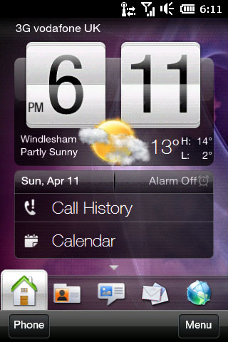
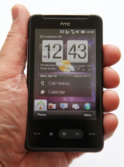
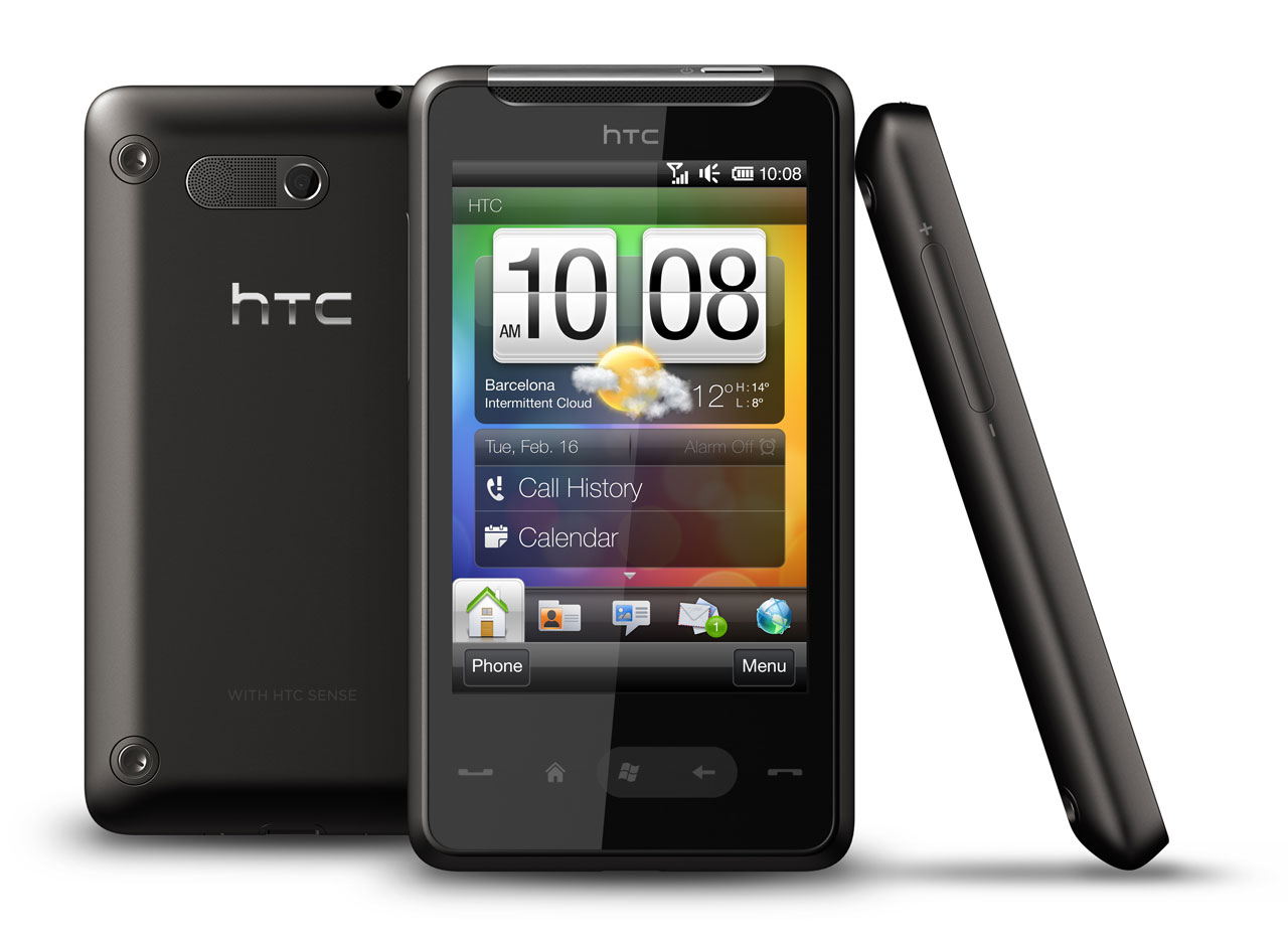
The home screen is typical HTC, with a large clock dominating proceedings. Integrated into the clock is the weather widget, which gives you an animated indication of the weather, along with temperature and your current location. Below this you'll find shortcuts to your call history and calendar.

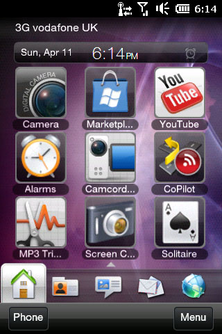
Although you don't get pages of app shortcuts to the left and right of the home screen, as you do with Android mobiles and the iPhone, you can swipe the home screen upwards to reveal a page of user-definable shortcuts. You can add programs, contacts or even browser bookmarks here – whatever you feel you may need quick access to regularly.
The main navigation is done horizontally though, via the home screen tabs that run along the bottom. Here you'll find essentials like SMS, email, contacts and calendar, along with less important fodder like stocks, music and weather.
The good news is that you can choose which home screen tabs you want, so you can streamline the interface to suit your personal needs.

Flicking through each home screen tab isn't quite as smooth as we'd like it to be, although if you set up your tabs so that what you need is generally on the horizontal list at the bottom of the screen, you won't need to do much swiping left or right.
Although the HD Mini is fully multi-touch enabled, the user interface doesn't always show this functionality off to best effect.
Current page: HTC HD Mini:Interface
Prev Page Overview, design and feel Next Page HTC HD Mini:Calling and contacts