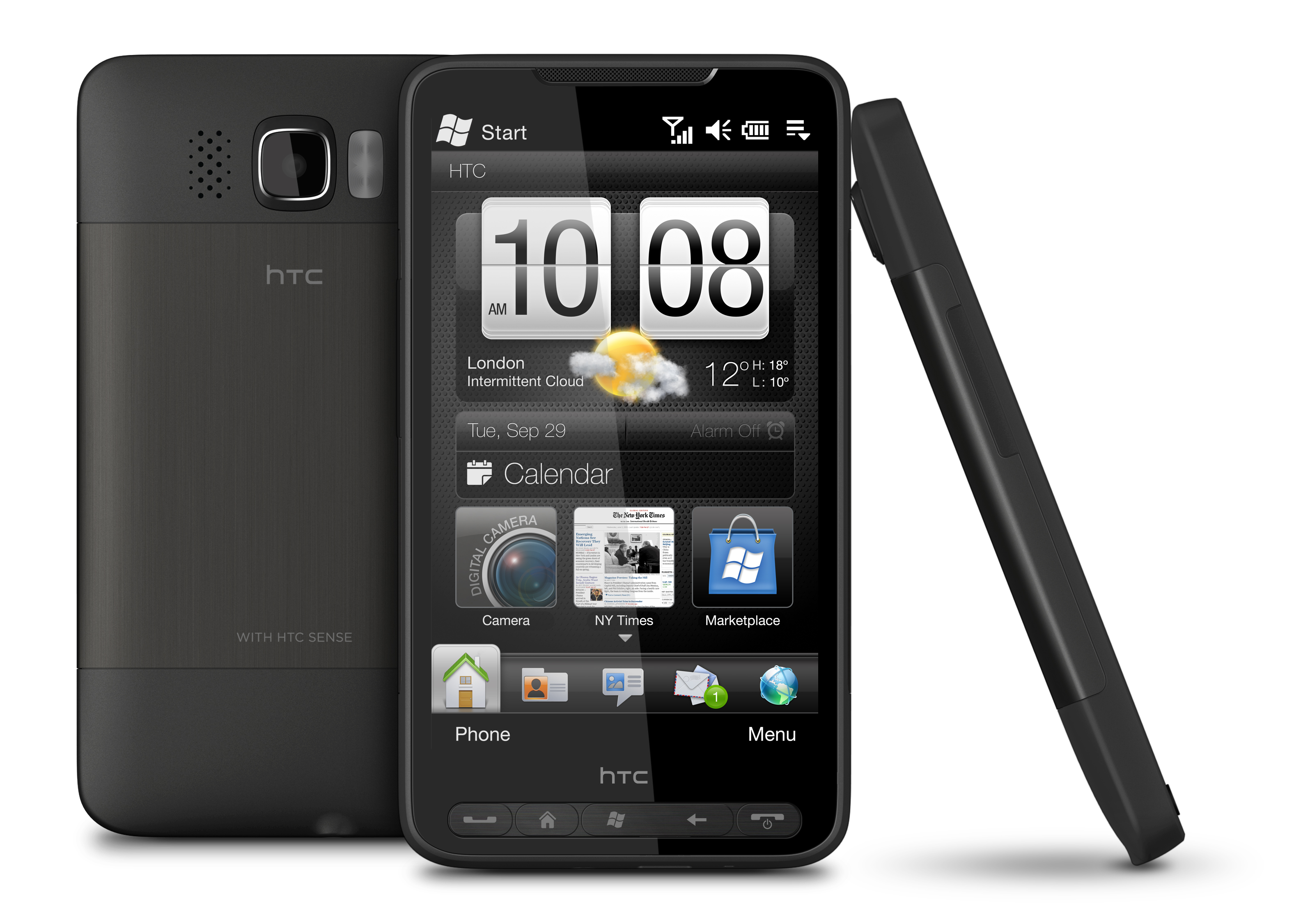
Why you can trust TechRadar
We're big fans of HTC's TouchFLO 3D interface on previous Windows Mobile 6.1 phones – we're also huge fans of the Sense UI used on the later HTC Android models.
So you can imagine why we're pretty excited about the new interface on the HTC HD2 – it may be dubbed as 'Sense' by the company, but it's really a fusion between that and TouchFLO.
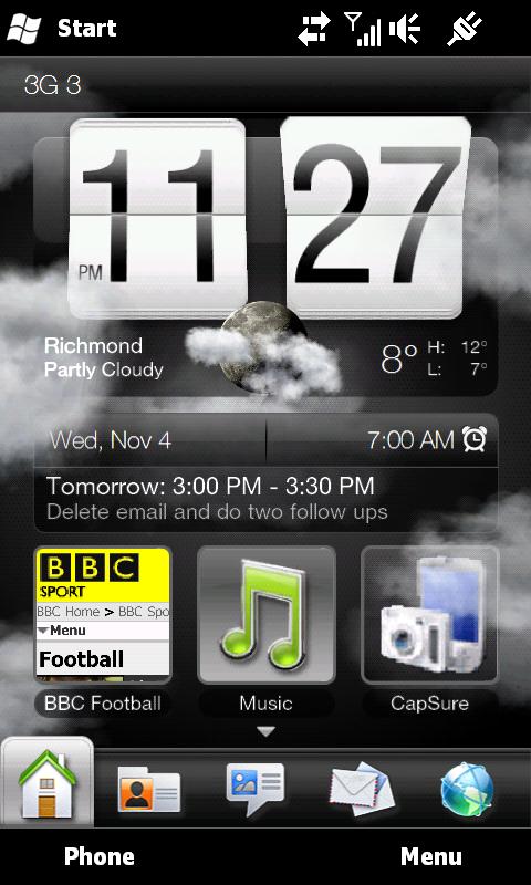
This means that we're getting the huge clock on the home screen, the slider bar at the bottom for different application widgets, as well as Facebook integration and Peep, the easy-to-use Twitter client that sits on the home screen.
It's not the same as the Android iteration, which offers more home screens with a greater degree of customisation, but there's a lot to love right out the box.
The main home screen also makes good use of the huge screen, offering not only the time and date, but also the weather in a smaller icon, any alarms and upcoming appointments, as well as three quick links to any contact, application or internet bookmark on the phone.
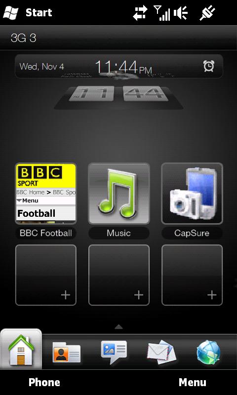
And if you want any more of these latter options, simply slide the clock upwards and it will disappear, giving you six more 'favourite' slots to play with.
And one of the cool things about the weather widget, both on the home screen and on its own little widget display, is it will update your location by aGPS and therefore tell you the weather where you are. While this was an option on previous phones, it now extends to full screen – if it's cloudy, the whole screen will fog up rather than just a small portion.
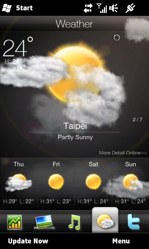
Other home screen widgets have been overhauled too – the likes of the music player has been given a more slick veneer with easier to hit buttons and easier to scroll through covers.
Weather is much more expansive visually as we've mentioned and, in keeping with the new Windows Mobile 6.5 upgrade, contacts are given their own 'favourite' slot on the People screen, complete with Facebook profile picture.
The addition of Twitter and Footprints to the widget bar is very much a new idea in keeping with the HTC Sense overlay, and offer nice options beyond what's been given on previous WinMo 6.1 versions of HTC's phones.
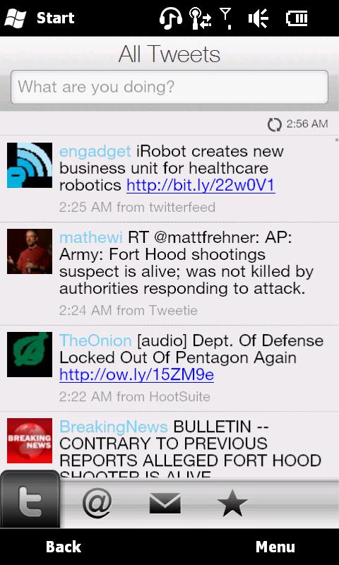
Of course, you can simply head through the menus to change which widgets you use each day – we got rid of the 'fun but pointless' Footprints and the Stocks option too – let's face it, if HTC's stock goes up and down, there's only so much interest we have on the subject.
As we mentioned earlier, the HTC HD2 is the first Windows Mobile phone to use a capacitive screen, and boy, does it make things better.
It's quickly noticeable that this is, by far, the best touchscreen on any Windows Mobile device thus far, with everything responding to touches in an iPhone-like manner, much as we've come to expect from HTC with its Android range.
This means that, coupled with the powerful Snapdragon processor, the phone just whips along under the touch, with barely any slow down.
You can scroll through the bottom widget bar of the HD2, accessing elements like the calendar, Twitter and the music/media player and get to where you want to quickly without judder. On previous HTC models the slowing down of the UI often meant that you would accidentally hit the wrong icon, but thankfully that's not the case here.
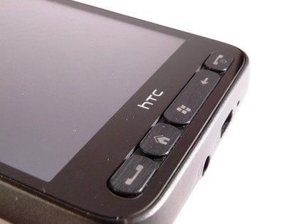
We're not saying the HD2 is completely devoid of all juddering, for instance when scrolling through messages the phone will start to slow down a little, but its miles better than most smartphones on the market.
Little touches like being able to flick through messages from the home screen or change tracks by looking through cover artwork have been present on WinMo HTC phones before, but trust us when we say that using the capacitive screen makes these much, much better than before.
The only gripe would be that the screen is perhaps too sensitive – flicking through anything often results in accidentally opening up that picture or message or whatever – and that's pretty annoying.
And the screen is not just a magnet for fingerprints – it seems to create them itself at times, with ugly smears appearing even when you could swear you haven't even looked at the phone in a while.
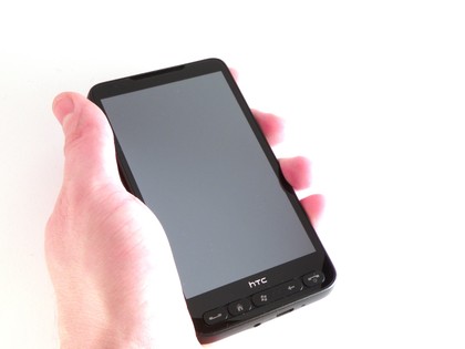
And while we're on gripes – we must never forget the HD2 is built on Windows Mobile, and while this is the most comprehensive skinning of that OS, it's still there, lurking in the background to jump up and annoy the hell out of us.
Before any Microsoft fans jump up and label us WinMo haters, we're very much not; but it's almost impossible to defend some elements of the OS.
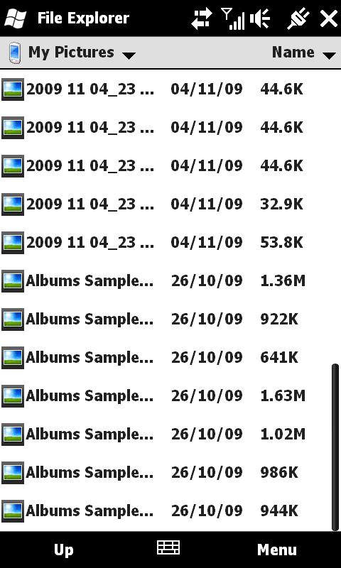
Things like the file explorer, which require the most minute of touches to navigate through the endless layers of stuff to get to the bit you want, all laid out in a horrid blocky style.
Messaging, with its stupidly over-sensitive keys and weird layout, coupled with the annoying method of inputting contacts' names – it's all irritating and still there (although HTC has managed to smooth it out, make the menus more rounded and easier to hit, thus removing the amount of times we wanted to throw the phone on the floor quite considerably).
But the pluses definitely outweigh the minuses - things like holding the screen to call up menus that open with a slick animation, copy and paste available from one finger, all of these elements make for a much more complete and intuitive experience.
Current page: HTC HD2: Interface
Prev Page HTC HD2: Overview, design and feel Next Page HTC HD2: Calling and contacts
Gareth has been part of the consumer technology world in a career spanning three decades. He started life as a staff writer on the fledgling TechRadar, and has grew with the site (primarily as phones, tablets and wearables editor) until becoming Global Editor in Chief in 2018. Gareth has written over 4,000 articles for TechRadar, has contributed expert insight to a number of other publications, chaired panels on zeitgeist technologies, presented at the Gadget Show Live as well as representing the brand on TV and radio for multiple channels including Sky, BBC, ITV and Al-Jazeera. Passionate about fitness, he can bore anyone rigid about stress management, sleep tracking, heart rate variance as well as bemoaning something about the latest iPhone, Galaxy or OLED TV.
