Why you can trust TechRadar
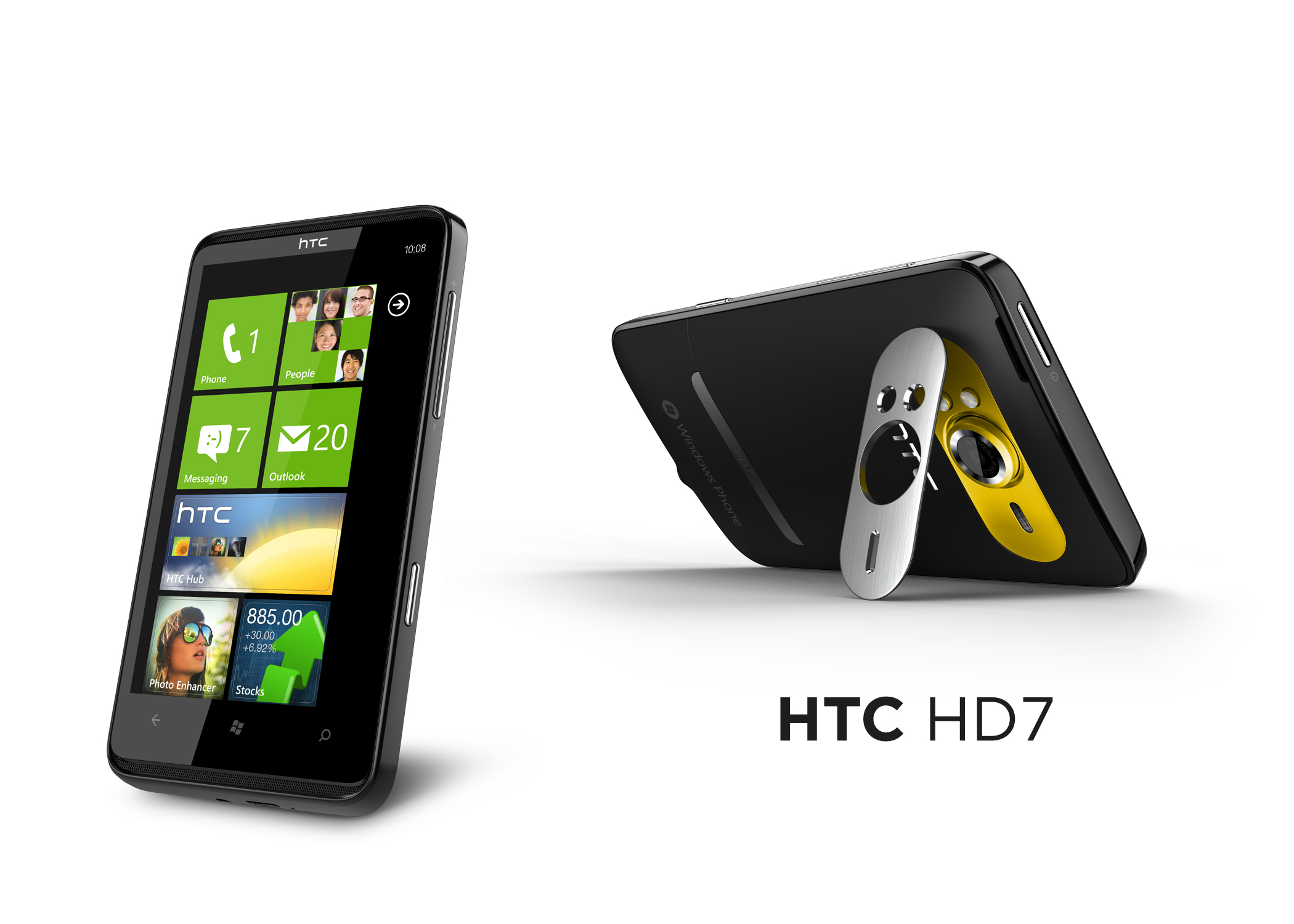
We're getting into some very familiar territory here, and if you're not familiar with it yet, then you soon will be. The Windows Phone 7 interface on the HTC HD7 is mimicked at Microsoft's behest across all the phones running the OS, so will quickly become as instantly recognisable as the iPhone's Home screen.
The first thing you'll notice on the HTC HD7 is the massive screen make sthe OS even more accessible than ever – the words and tiles just pop out, although when used in 'dark mode' the OS can seem slightly washed out compared to the Samsung Omnia 7.
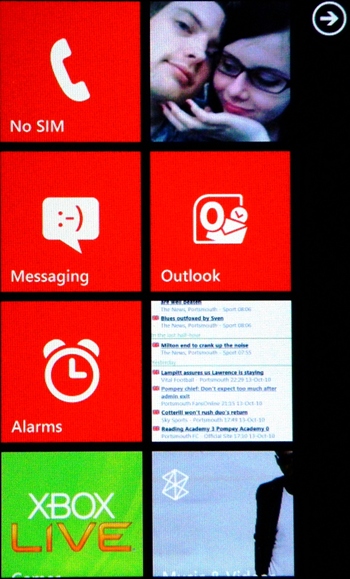
Large, easy to hit icons and a tactile feel make it a joy to swipe around the interface, and encourages you to play with your phone even when you don't really need to pick it up, which HTC must love.
The main area of interaction is the Home screen, activated by hitting the main Windows button. This takes you to a selection of tiles, most of which show constantly updating information such as pictures, songs listened to or emails unread.
You can manipulate these by long-pressing on one and moving it around the screen, or clicking the small 'unpin' icon in the corner to delete it.
You can pin pretty much anything to the start menu, from albums to contacts to bookmarks to applications, and there's seemingly no limit to the amount you can have.
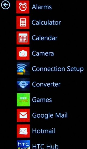
Swiping right from the Home screen throws up a full list of applications, which is where your downloaded items will appear. It could get annoying when you have loads of apps – we're going to need a folder option very soon, Microsoft – but the focus here is on simplicity and it's been achieved.
The nice thing about Windows Phone 7 is it's a pretty replicable experience across the phone – that is to say most things work in a similar way. For instance, long-pressing most items will call up a menu with options like deleting, editing or pinning to the start menu, and wherever there are option icons at the bottom of the screen you just swipe upwards to get more options.
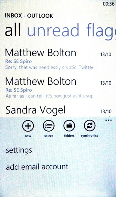
We'd prefer a contextual menu key at times, like on the Android interface, because there are instances where you have to drop out the main settings menu to perform easy functions such as altering the contacts you see in your phone book.
Other tweaks include landscape viewing of screens – you can enter something like the Zune media player and see a list of options such as Music, Video or Podcasts. But when the title fills more of the screen than can be seen, or more options are ever-so-slightly in view at the side, you can swipe along to see other lists.
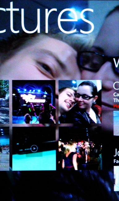
It can look a bit untidy to some people, to others it can be a neat way of alerting you to see more options. We're slightly in the former camp, but even with this system it sometimes took a while to notice more options to the right of the screen at times.
Another little tweak is the notifications pane at the top of the screen – tap the first centimetre of the phone from the top edge and the signal and battery meter will appear.
It's all part of Microsoft's attempt to keep the screen clear from clutter and we think it works – although it can be annoying when you just want to glance and see what's going on.
But overall the Windows Phone 7 interface on the HTC HD7 is excellent, the large display just makes it even more usable than ever before, and the responsiveness is what's making the likes of Stephen Fry crow with delight.
Current page: HTC HD7: Interface
Prev Page HTC HD7: Overview, design and feel Next Page HTC HD7: Contacts
Gareth has been part of the consumer technology world in a career spanning three decades. He started life as a staff writer on the fledgling TechRadar, and has grew with the site (primarily as phones, tablets and wearables editor) until becoming Global Editor in Chief in 2018. Gareth has written over 4,000 articles for TechRadar, has contributed expert insight to a number of other publications, chaired panels on zeitgeist technologies, presented at the Gadget Show Live as well as representing the brand on TV and radio for multiple channels including Sky, BBC, ITV and Al-Jazeera. Passionate about fitness, he can bore anyone rigid about stress management, sleep tracking, heart rate variance as well as bemoaning something about the latest iPhone, Galaxy or OLED TV.
