Why you can trust TechRadar
The new Sense UI is the thing HTC is crowing about with the new Hero/G2 Touch and for good reason too - it's brilliant. One problem with being the first to market with Android is you can only improve the hardware unless you have a crack at changing the OS too.
That idea might be OK for the iPhone (apart from the firmware upgrades), but HTC has brought out the G1, the Magic and the Hero in just over six months, so there needs to be an overhaul.
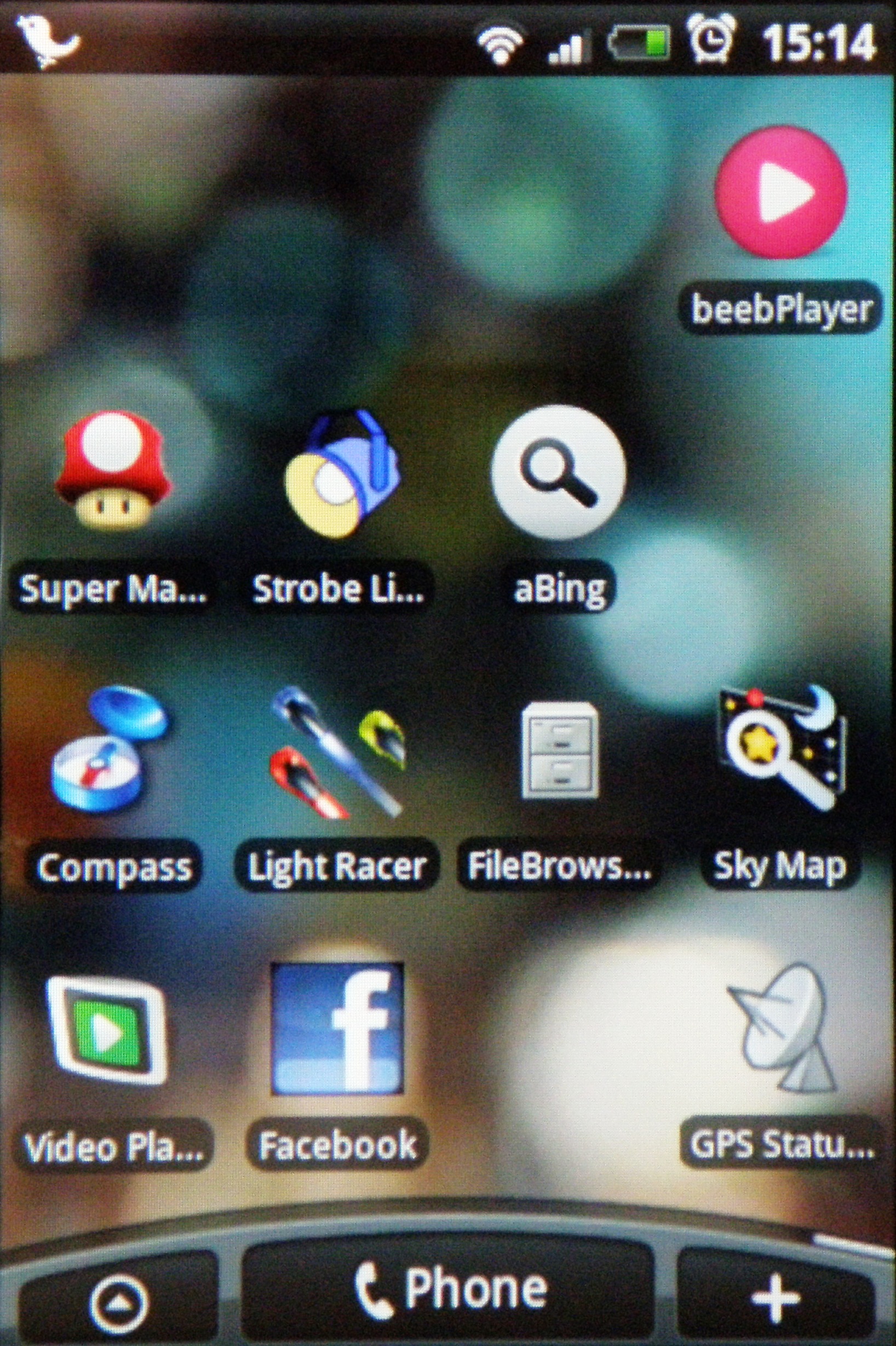
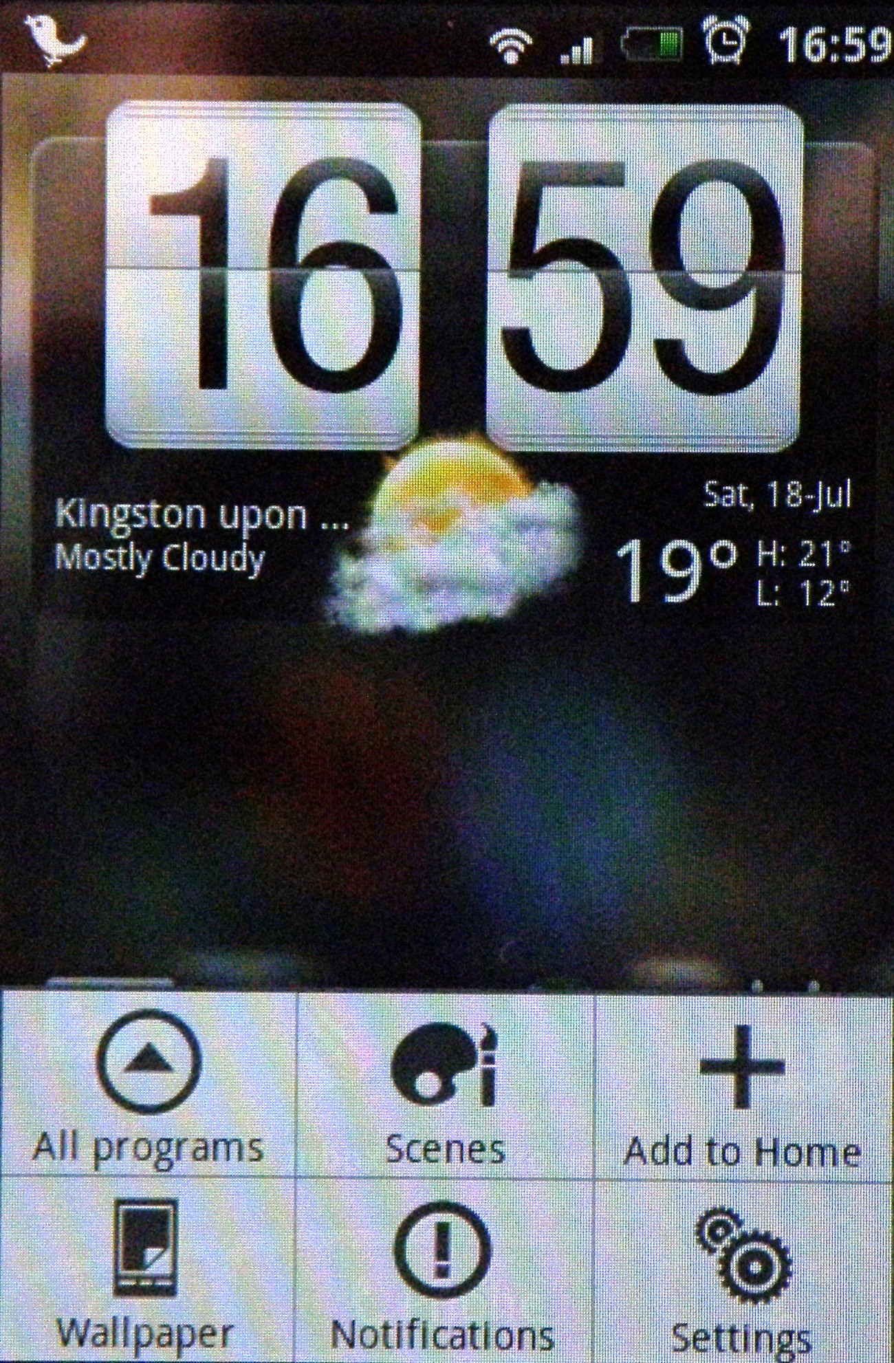
And where there were once only three home screens, you now get seven on the things with the Sense UI on the HTC Hero. These are divided into the main home screen, accessible from anywhere by pressing the home button, and three to the left and three more to the right.
HTC has decided on some default options for each of these, but essentially you can change them any way you want, making it into seven screens of icons if you so wish (and once again aping the iPhone). You simply hold the icon and the delete bin comes up, with you throwing it away to discard it from that particular screen.
But to do so would be to miss the point of this awesome new interface. HTC hasn't just added links to applications like Twitter - it's added real time updates via widgets plugged into the screen.
Be it weather, music, contacts or visual internet bookmarks, you can select the things you want, all within easy reach thanks to the left and right scroll-ability. You can also check out all your applications in the same easy way you could before by calling up the menu from the bottom left of the screen.
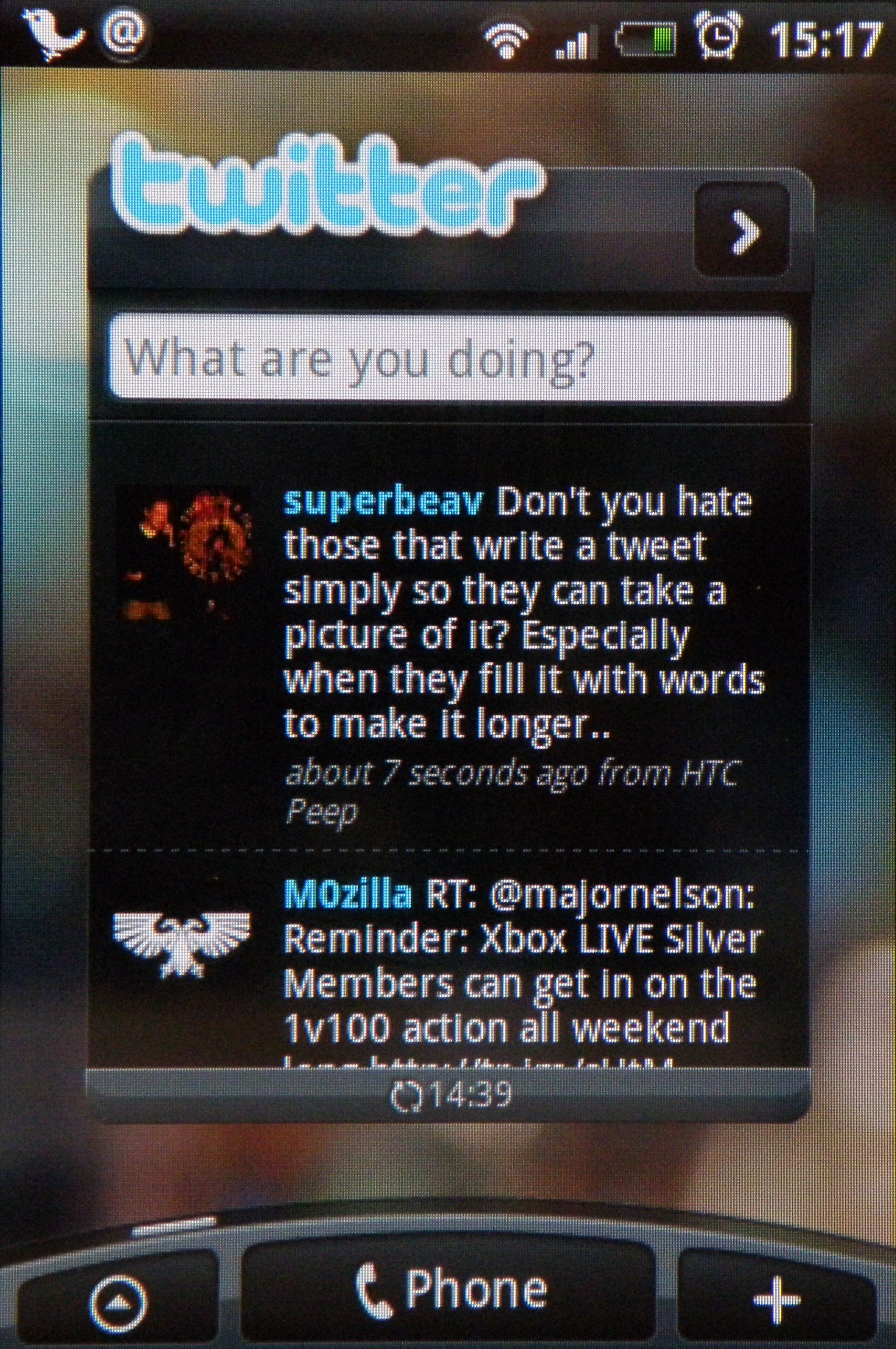
HTC has taken the successful TouchFLO 3D interface it uses to sneak Windows Mobile 6.1 (and now 6.5 as well) into the pockets of millions and based its new Sense UI on it. Basically this means not only multiple home screens, but also a sliding bar at the bottom of many applications, such as viewing contacts or Twitter, where you can easily access new information relating to said program.
Confusingly HTC has now decided that Sense is so good that it's using it on Windows Mobile devices too. While it looks the same as TouchFLO, it still integrates Facebook and the like, so it shows social networking is the way forward on the mobile.
Basically the whole thing is ultimately customisable, and is superbly backed up by a responsive and pin sharp touchscreen (although only HVGA, like its Magic sibling, and much lower resolution than its Touch cousins from the HTC family).
Not only that, but should you decide the seven home screens aren't enough for you (you're probably the kind of person who wishes McDonalds made a size larger than Supersize) then you can enter different 'Scenes', which are basically whole sets of widgets and applications that you can select at different times - ie work, play, travel etc. So essentially you've got nearly 50 home screens to play with... surely that's enough for you?
The only problem, and it's a big problem for now, is the whole system does lag quite comprehensively at times. It's at its worst when you take the phone out of the box for the first time, and although it does speed up to an acceptable level on the home screen, certain aspects (such as updating Twitter or the weather) can cause the whole system to slow down to a complete stop at times.
It's a real shame that this is the case, and could be something to do with the fact there's only a 528MHz processor under the hood, which could be a little underpowered when you're multi-tasking the level offered by the HTC Hero.
UPDATE: Good news - the firmware update fixes this problem no end. Start up is still a little bit slow to deal with, but once you've booted for the first time it's fine. The only problem we encountered was with the weather widget - it still juddered at times when scrolling through the updates.
We've heard anecdotal evidence that when the Hero fills up with texts and videos and the like it can slow down terribly - in our extended tests with the new firmware this doesn't appear to be the case.
Flicking the screen from portrait to landscape with the accelerometer is a simple experience - the whole thing going hazy then re-organising itself in the new orientation. Given the effort some phones have put into the process of simply flipping the screen lately (we're looking at you, Toshiba TG01) it's nice to see it done simply.
Either way, we're happy it's improved - elements, like starting up video, causing the whole thing to fall over completely are seemingly gone, and this will be a big help in the battle with the iPhone 3GS.
Current page: HTC Hero: Interface
Prev Page HTC Hero: Overview, design and feel Next Page HTC Hero: Calling and contacts
Gareth has been part of the consumer technology world in a career spanning three decades. He started life as a staff writer on the fledgling TechRadar, and has grew with the site (primarily as phones, tablets and wearables editor) until becoming Global Editor in Chief in 2018. Gareth has written over 4,000 articles for TechRadar, has contributed expert insight to a number of other publications, chaired panels on zeitgeist technologies, presented at the Gadget Show Live as well as representing the brand on TV and radio for multiple channels including Sky, BBC, ITV and Al-Jazeera. Passionate about fitness, he can bore anyone rigid about stress management, sleep tracking, heart rate variance as well as bemoaning something about the latest iPhone, Galaxy or OLED TV.
