Why you can trust TechRadar
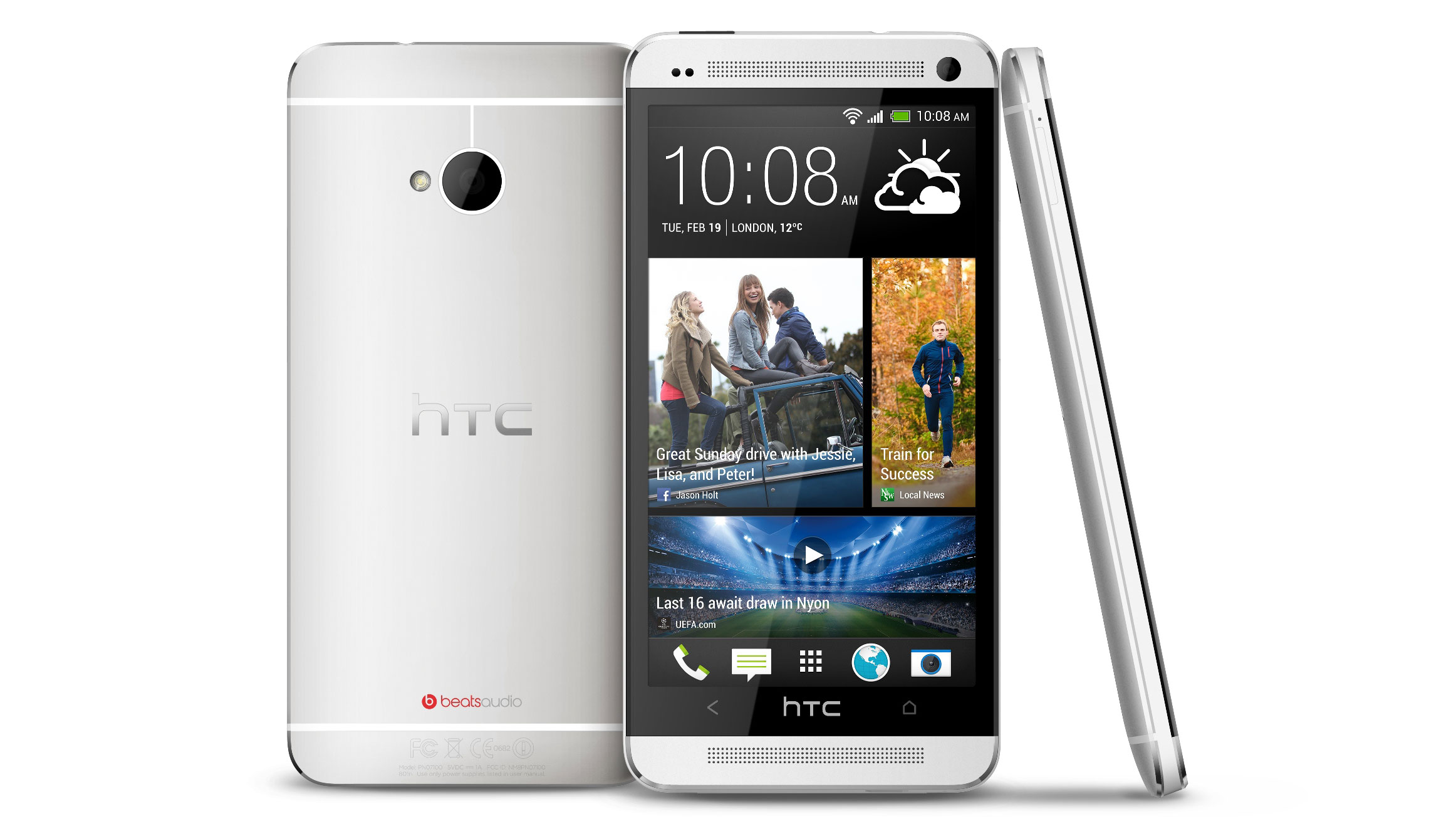
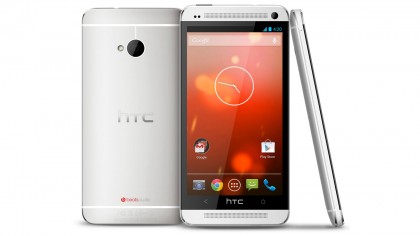
Only one 'One' can be The One; so which is the One that you want? Will you go for the standard issue HTC One or the Google edition HTC One?
Outwardly the two phones look head scratching-ly identical, as does the core nuts 'n' bolts specification when it comes to the camera, lens and sensor within each. What differs on a practical level once each is fired up is the user interface and the handling when used for photography and video, and for us, there is a clear 'One' winner.
But before we reveal that precious gem of info, let's explore how each handles as a handset, but moreover performs as a camera. We're looking to help you decide which you should buy or take out on contract if it's photography you're concerned with first and foremost.
The ultrapixel
As we noted when comparing the handsets with rivals, there's a 'USP' to the HTC One, it would be that it fudges the issue of pixel count, defying usual convention that suggests more is… well, more when it comes to image quality.
HTC refers to the resolution of the HTC's core/main camera in accompanying literature as 'ultrapixel' – a term which sounds zeitgeist-y but is basically meaningless.
At first then, this seems like an attempt to cover up an otherwise modest sounding 4MP camera. But in the world of dedicated cameras, pixel count isn't everything of course; sensor size also has a role to play and here it's a larger than most 1/3-inch, which has our former frown un-furrowing.
A chip with a larger surface area usually means more detail and less image noise, or grain, particularly if the pixel count is low – as here – to begin with. There's also a front facing camera too, offering a lower 2.1MP resolution, as opposed to the previous One X model's 1.3MP.
Give me more
Other features that will flick on a lightbulb in the head of photo enthusiasts are a back side illuminated sensor, plus HDR (High Dynamic Range) shooting. Further boxes are ticked thanks to 32GB internal memory and NFC as well as Wi-Fi connectivity.
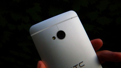
As outwardly both iterations of the HTC One are the same, many of the comments that follow apply to both phones. Namely that the HTC One boasts a gently curved or 'tapered' backplate rather than a completely flat design, the metal finish more obviously iPhone-like than before (namely the HTC One X).
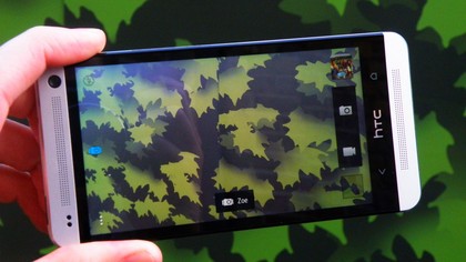
The screen here is a plentiful 4.7-inches in size; more than adequate for both framing and reviewing shots, as long as you don't that stills can only be captured in the same 16:9 widescreen format, whether you're using the phone held upright or turned on its side.
Despite quite different user interfaces from the outset, which becomes even more apparent when camera mode is selected, neither offers the alternative to shoot in the boxier, more conventional digital camera image ratio of 4:3, let alone 3:2 or 1:1.
So unlike the majority of rivals we're 'stuck' with the one shape. But of course if the photos you shoot on your phone stay on your phone it's no biggie.
In both versions of the HTC One the camera lens element is located at the top edge of the handset, when held upright, and ranged dead centre, giving it a pleasingly symmetrical look.
Also there's a slight practical advantage here, in that we found it slightly easier to avoid fingertips straying in front of the lens in the process of gripping the 'One' than when using rival handsets that had the lens located nearer to an edge.
The differences
And now, as we turn both handsets on and see wholly different welcome screens, we come to the differences.
Whereas once you've set the phone up from scratch the camera icon is immediately visible bottom left of screen on the HTC One Google version, on the regular HTC One it's presented instead bottom right, as part of a cleaning looking toolbar stretching its width.
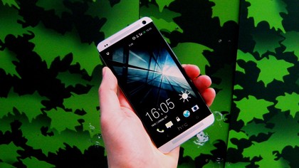
Whereas on the HTC One Google edition we just give this camera icon a tap and we're immediately presented with the scene before our lens, on the HTC One we need to drag this camera upwards to select it.
In both cases, once we're into camera mode we can witness the unit's auto focus (AF) mechanism automatically and visibly adjusting focus and exposure, as we pan with the handset around the room or scene.
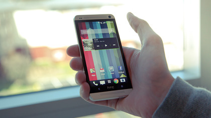
Like its predecessor in the HTC One X both versions of the (by now ironically named) 'One' feature a bright/fast aperture lens at f/2, with the lens itself offering a 28mm wide focal length. The bright f/2 lens serves the HTC One well when shooting indoors using natural light.
The HTC Zoe feature (detailed on a later page) is one of the only main changes on the One Google Play edition, so there's no mini movie creation on offer with the stripped-down version.
HTC One camera app
The HTC One is, thankfully, point-and-shoot simplistic. We get camera mode and video mode icons side by side, on the right of the screen.
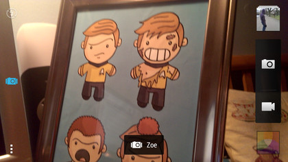
Pre-captured images are displayed as stacked thumbnails above these two 'buttons', whilst a comprehensive 16 strong array of built-in digital filters can be selected below.
Included here are the usual vivid colour or black and white or sepia options, along with a fish eye effect, film negative and toy camera looks. Rather than a virtual shutter release button being provided, we simply tap the camera icon to take a shot or the video one to begin recording. It's that intuitive.
Presented just to the left of the virtual buttons is an on-screen slider for controlling the digital zoom. Run a finger across to enable the smartphone to ape 'zooming' in or out, the response to your finger swipe pretty much in real time.
On the left are a means of selecting flash modes – either auto flash, flash off or flash on – activate HTC's 'Zoe' mode – plus, to the far left (or very bottom) a welcome shooting menu.
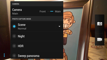
On the standard HTC One we get a series of straightforward still image capture choices: normal scene recognising auto mode (the default setting), a night shooting mode plus HDR and sweep panorama mode. Video capture options allow us meanwhile to select from slow motion, fast HD at 60 frames per second or Video HDR mode at Full HD (1920 x 1080) resolution.
Impressively, further image adjustments can be made using a row of +/- 2EV sliders for exposure, contrast, colour saturation and sharpness, which is more than most handsets offer 'smartphone photographers'. Face detection, smile capture and the ability to geo tag images with location data can also be activated at will from the same menu.
User selectable ISO settings for low light photography run from a standard ISO100 to ISO1600. On the HTC One Google version we can only shoot Auto ISO – there's somewhat inexplicably no manual ISO option.
Google Edition camera app
Whilst the user interface of the standard HTC One is pleasingly snapshot-like, we had a slight issue with the camera user interface of the HTC One Google edition as a whole, which comes across as pared back to the point of actually being fiddly at best, confusing at worst.
A shutter release button sits at a central position to the right of the screen; that much is obvious enough. A camera icon sits below it: this too is straightforward. An exploratory tap of this brings up a toolbar of four options that include the ability to swap to shooting video. A pan and capture panorama mode, plus a complete 360° 'wrap' mode, are the other two options.
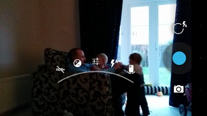
But it's how we drill into the camera settings and functions on the HTC One Google version that messes with the brain.
There's a further initially unmarked icon above the shutter release (when held in landscape) that must be the camera menu, but this is only discovered via a process of elimination.
Press this and we get another brief run down of options presented as a virtual 'arch' above the shutter release: the ability to access the camera's HDR (High Dynamic Range) mode, adjust exposure compensation (a basic +/- 2EV), select the brief flash options or swap between front and back cameras for that inevitable 'selfie'.
Press the row of three sliders in the centre of this arch and we get a second tier of further shooting options, including the ability to turn location tagging on or off, activate a self timer, adjust picture size – with the 4MP 16:9 ratio being the highest/finest option. The final top tier option lets the user adjust white balance.
Screen and effects
On a plus side the HTC One's screen – identical on whichever handset we're talking about – is much brighter and clearer than many dedicated digital cameras we've had the pleasure of using, and really picks up fine detail, which is a bonus, as is the fact that the image before the lens fills the whole of said screen in widescreen format, meaning it feels best suited to group portraits or landscape shots.
It's worth noting again however that we can only shoot in 16:9 ratio format on the HTC One; there is no standard digital camera sized 4:3 ratio option at full (or any other) resolution.
There are some digital effects accessible on the HTC One Google edition, but to be automatically applied post capture rather than at the point the shutter fires. Thus when playing back an image a menu allows us to add 'punch' (increased brightness and contrast) to an image, or to go for the cool looking 'vintage' (think faded Polaroid print) option.
Black and white, bleach and 'latte' options follow – the latter is best summed up as a browning black and white early 20th century era print, whilst a green and blue tinted cross process option further features.
Upping the fun factor still there is additionally a range of frames that can be added to the image, such as film strip style numbers at the edges, distressed or burnt corners and the like.
A certain amount of editing, such as cropping, straightening or rotating an image can also be usefully undertaken within the handset itself, which goes someway to making up for camera features being difficult to access and implement if users want to do any more than point and shoot.
We now turn our attention back to the standard HTC One, which offers 16 effects at the point of shooting as well as 13 that can be applied after the snap - including the no-brainer Auto-enhance function.
Upping the fun factor still there is additionally a range of frames that can be added to the image, such a distressed edge 'grunge' effect, or a montage of Polaroid style snaps.
A certain amount of editing, such as cropping, straightening or rotating an image can also be usefully undertaken within the handset itself on the standard One edition.
More impressively still there is a wide array of image retouching options offered, such as the ability to smooth skin or enhance the eyes in portraits; the sort of effects that once required a dedicated software package to achieve.
On the whole the HTC One appeared a lot less gimmicky than its Google enhanced twin.
Image quality
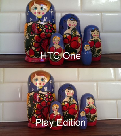
But what of the images both cameras produces? Well, again we're hard pressed to tell between them.
When viewed full size (100%) on a desktop images subject outlines begin to appear obviously pixellated, and colours are a little less saturated than the appear to the naked eye at the point of capture.
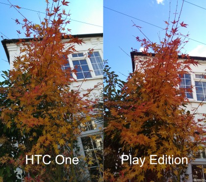
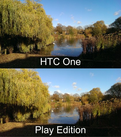
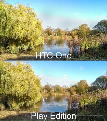
To our eyes though, the pictures from the regular HTC One do appear a tad sharper overall, which can be seen to best effect if comparing the hanging tree branches in our daylight landscape shot.
Click here for the full res version
The standard HTC One just appears to hold the detail that bit better in the area of the shot which, on its Google twin, by contrast comes across as slightly smudged.
Click here for the full res version
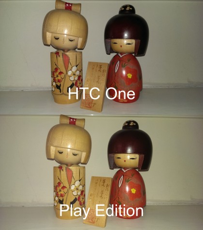
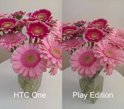
Our daylight images would benefit from a tad more brightness and contrast for example, as would our interior still life shot likewise benefit from an application of the HTC's built-in filter in the Google Play version.
Click here for the full res version
An application of the HDR option – if you can access it without too much faff-ing – helps to pull detail from what would otherwise be highlights in an image, whilst maintaining foreground interest, so is a feature worth having, even though results appear to lack the richness of colour in the 'straight' (non HDR) image.
Click here for the full res version
Click here for the full res version
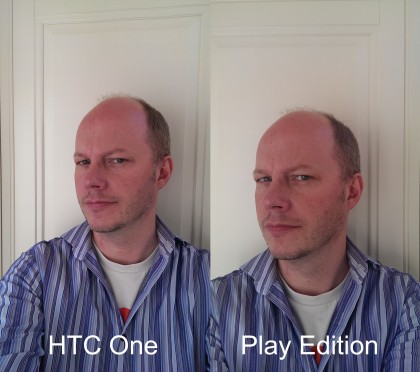
A slightly de-saturated look to pictures straight out of the phone does mean that skin tones look a little more subtle too. In short it is a fairly mixed bag in terms of the HTC's variable image quality when used across an expanded range of subjects though you probably wouldn't notice unless making such a direct comparison.
Click here for the full res version
Click here for the full res version
We also had fun using the panoramic modes of both cameras, which produced pleasingly consistent self-stitched results. But for us what puts the plain old and simple HTC One out in front of the Google edition, and helps it emerge victorious from this battle of the doppelgangers, is that it is simply a lot less of a faff to use when it comes to taking pictures and selecting camera functions.
And as a photographer you want to concentrate on your subject, not be fiddling around with your phone.
Verdict
The coolly curved shape and design of the phone (in either form) means it feels comfortable in the palm, handset screen resolution is razor sharp, so images displayed on screen look fantastic.
The user interface is less faffy on the standard One than that of the HTC One Google Play edition, making for a more pleasurable shooting experience plus slightly sharper images overall if compared side-by-side.
With the Play Edition, it's annoying that accessing camera features if you want to do anything other than point and shoot is, on reflection, much trickier than it should be.
As a result the user interface on this version either feels under- or over-cooked; in any event it's not quite on the money, plus results in softer still images overall.
Gareth has been part of the consumer technology world in a career spanning three decades. He started life as a staff writer on the fledgling TechRadar, and has grew with the site (primarily as phones, tablets and wearables editor) until becoming Global Editor in Chief in 2018. Gareth has written over 4,000 articles for TechRadar, has contributed expert insight to a number of other publications, chaired panels on zeitgeist technologies, presented at the Gadget Show Live as well as representing the brand on TV and radio for multiple channels including Sky, BBC, ITV and Al-Jazeera. Passionate about fitness, he can bore anyone rigid about stress management, sleep tracking, heart rate variance as well as bemoaning something about the latest iPhone, Galaxy or OLED TV.
