TechRadar Verdict
Pros
- +
Great design
- +
Sleek Sense
- +
Innovative camera
Cons
- -
No memory card slot
- -
Zoe fills up storage
- -
Alarm too simple
Why you can trust TechRadar
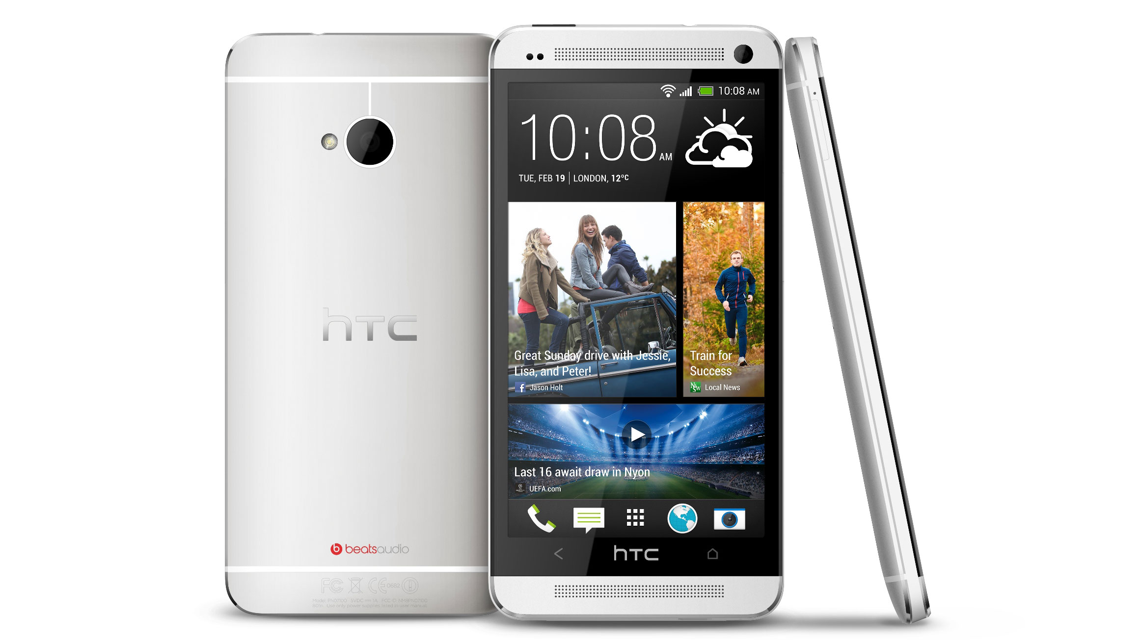
Samsung and Apple better beware – the HTC One combines stunning design, a supreme screen and explosive power to offer one of the best smartphones around.
It's got a full HD screen crammed into 4.7-inches, which brings a 468ppi – well above what's needed for the eye to discern, but it does definitely bring sumptuous sharpness throughout the use of the phone.
On top of that there's a CPU and RAM combo that is barely bettered, a more-than-enough 32GB of storage and top-end Bluetooth, Wi-Fi and 3G / 4G LTE connections, all topped off by a completely re-imagined version of HTC Sense. What's not to like?
AT&T, Sprint and T-Mobile have all secured the HTC One. Unlike past HTC releases, which tended to get worked over by carriers, the One is the same phone no matter which company you pay your monthly bill to. There's just one major discrepancy: as of now, only AT&T has a 64GB model. Other carriers are just stocking 32GB versions. Then there's always the matter of service, with AT&T leading the gang of three for 4G LTE coverage area.
The HTC One hits Sprint and AT&T stores April 19. Pre-orders are currently being taken. T-Mobile has not yet announced a release date, and has not yet put the phone up for pre-order. An alternate matte black model is also yet to be available from any carrier.
Currently, the phone is selling for $199 with two year contract ($299 for that 64GB AT&T model) and $599 without contract ($650).
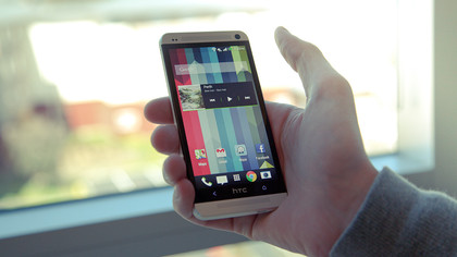
It's a good thing carriers haven't messed with it, because the design of the HTC One is something that you simply have to experience in the hand. Whereas those that pick up the Samsung Galaxy S4 will go "It's kind of plastic, isn't it? But ooh, it's so light" and those who encounter the iPhone 5 will say "Ooh, it's very light, isn't it? You don't expect it to be that light!" those that try the HTC One will simply say "Oh, that's really nice. Really, really nice."
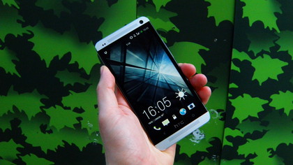
And do you know why? Simple: the HTC One is one of the best-designed phones on the planet. Not content with inventing a new machining process to allow the body to be all aluminum, the Taiwanese firm has extended the screen to the edges of the chassis further than ever before, meaning you're getting a 4.7-inch Full HD display without the additional heft you'd probably expect.
It's even thinner than its predecessor, the HTC One X (we know, that naming strategy leaves a lot to be desired) and as such slides nicely in the pocket. It's not light either, weighing more than most of the competition, but rather than feeling overweight, combined with the metallic chassis is oozes a premium build. Samsung is probably hoping not a lot of people hold this phone side-by-side with the new S4. Otherwise the buying choice is going to be a lot more of a worry for the Koreans.
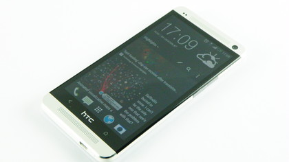
On top of that, there's a whole host of little design wins that delight when you first try the HTC One. For instance, the machined holes that allow sound to emanate from the dual front-facing speakers (can you say BOOMSOUND?) looks amazing, and the lines on the back of the phone give a nice textured movement to things, helping to break up the constant grayness of the aluminum.
You could argue that straight on it looks far too much like either an iPhone or a BlackBerry Z10, and you'd have a good point as this phone doesn't reinvent the rectangle-with-rounded-edges formula that we're so used to, but in the hand the curved back brings a whole new dimension to things.
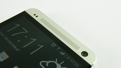
There's a zero-gap construction at work here as well, which means that you won't find any spaces, holes or light leakages to make you feel like you haven't spent your hard-earned cash on something wonderful.
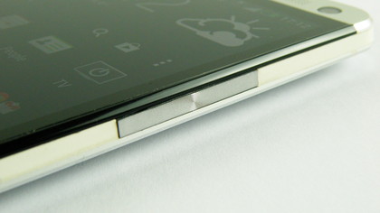
The volume control on the right-hand side of the phone is in the same dazzling metal, and contrasts nicely with the rubber/plastic that makes up the sides. Our sample actually showed a fair amount of wiggle in this area, and slightly detracted from the overall premium feel.
The power button resides on the top, and doubles as the infra-red blaster - however, this is one design decision we're not crazy about.
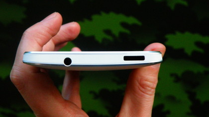
The placement of this button, even on a phone that's been shrunk down while accommodating a larger screen, is still a bit inconvenient. We had to shuffle the phone around in the palm to turn it on and off on many occasions, and a lot of the time we couldn't use our thumb to hit the whole of the screen without jiggling the phone up and down.
That's another problem with the design: it's pretty slippery thanks to the metallic chassis. We thankfully only ever suffered two serious drops when we were about a foot off the carpet (basically scrambling for it to turn off the alarm in the morning) but there have been a few near misses when trying to maneuver around the screen.
If only that power button was on the side, or a physical home button unlocked the phone, this whole issue would be negated for a large part.
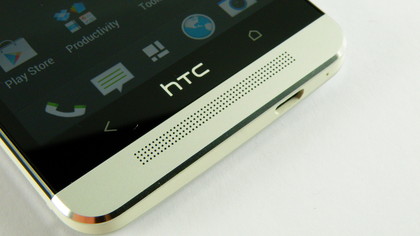
But as we mentioned, HTC has wandered away from the physical buttons - where once it put a trackpad in the Nexus One, now it's stripped the capacitive buttons down from three to two, with the multi-tasking option going the way of the dodo. You can still get the same functionality by double tapping the home button, but it's not the same.
Though overall, you can guess that we're impressed with the construction and design of the HTC One. We're not even looking at final hardware here - although we appear to have got lucky with our sample, as there are few design flaws in sight - so the chances of metallic chipping ("because that's just what it does...." OK, Apple) are slight to say the least.
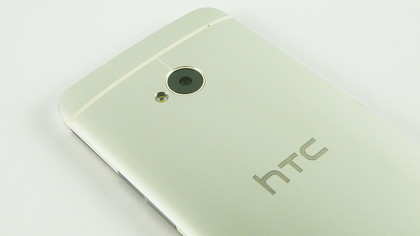
We thought we'd scuffed it so many times during our test, but each time it was simply a slight amount of dirt or dust that wiped right off. Tick from TechRadar on the design front, HTC.
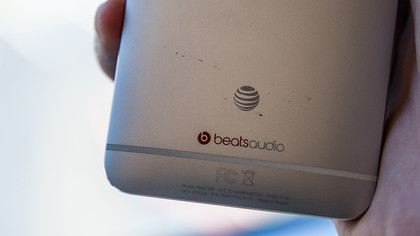
Update: Living with our AT&T model for a few days, we're sad to report that the One's metal rear has taken on a few scuffs from sharing pocket space with keys and change. Unfortunate, but the price you pay for such slick metal construction. As with the iPhone 5, we'd advise a slim, protective case. Perhaps the black version won't show dings so readily.

Gareth has been part of the consumer technology world in a career spanning three decades. He started life as a staff writer on the fledgling TechRadar, and has grew with the site (primarily as phones, tablets and wearables editor) until becoming Global Editor in Chief in 2018. Gareth has written over 4,000 articles for TechRadar, has contributed expert insight to a number of other publications, chaired panels on zeitgeist technologies, presented at the Gadget Show Live as well as representing the brand on TV and radio for multiple channels including Sky, BBC, ITV and Al-Jazeera. Passionate about fitness, he can bore anyone rigid about stress management, sleep tracking, heart rate variance as well as bemoaning something about the latest iPhone, Galaxy or OLED TV.
