Why you can trust TechRadar
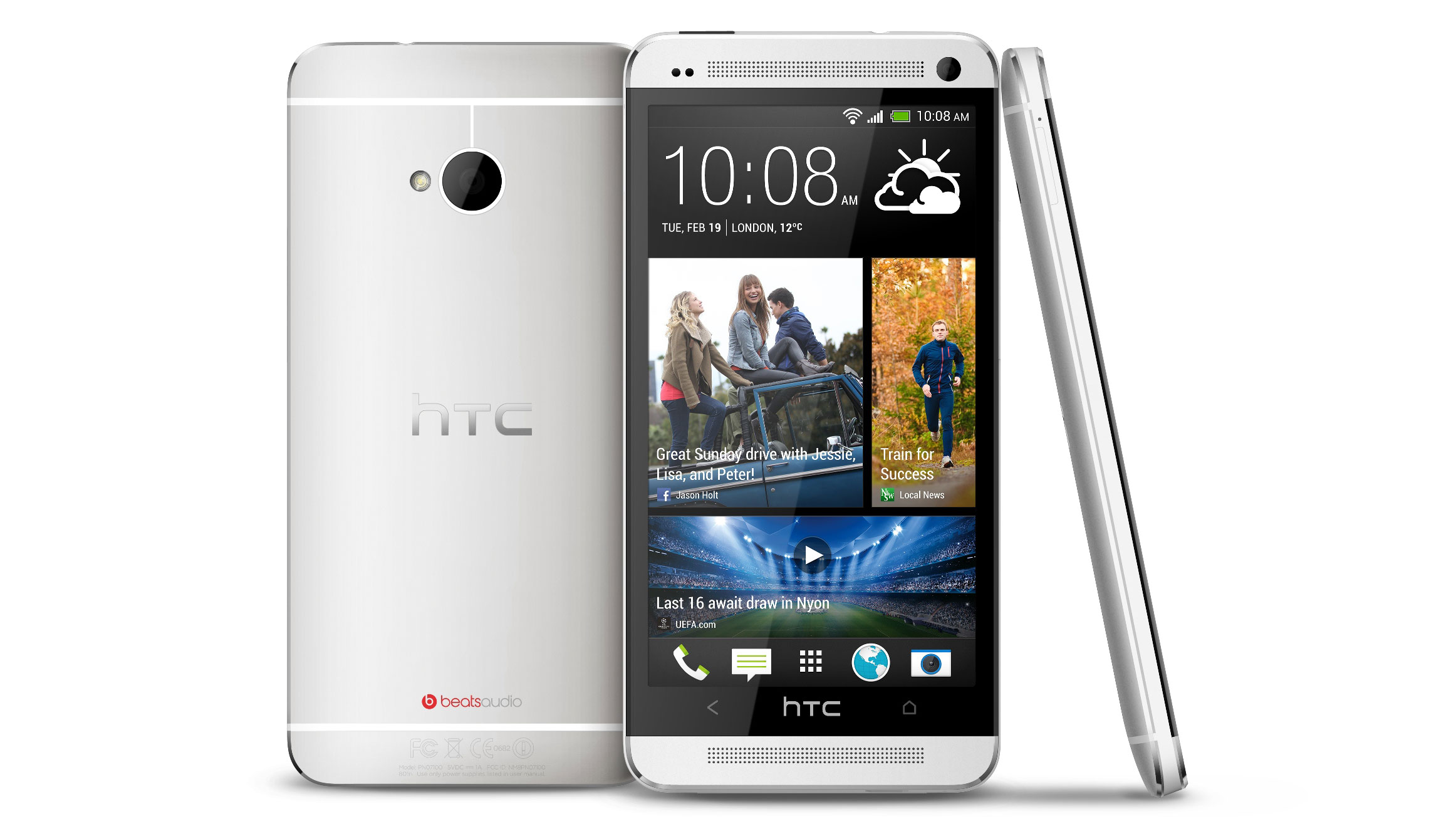
HTC has been hard at work redesigning Sense once more, and the HTC One is the first phone to bear the fruits of that labor. Sense 5 (as it's colloquially, if not officially, referred to) is another step forward in the Android overlay story, but we think this is the biggest yet from HTC.
We're talking a whole new button layout, a new grid for the menu icons, geometric patterns replacing the over-complicated widgets of old; in short, it's simple, stark and we really like it.

There's no doubt that it's still as heavy on the old processor as ever (a quick trip to the battery usage settings will confirm that) but what HTC has done is bring the notion of Android (4.1.2, if you're interested, which you totally are, we can tell) to a wider audience by, well, making it less Android-y.
The option to add widgets and such has been brushed to the side to some degree, with BlinkFeed taking center stage (and you can read our bigger rundown of BlinkFeed on its own, separate section). Instead of the home button taking you to your collection of homescreens, BlinkFeed will pop up, in all its Windows Phone-like glory.
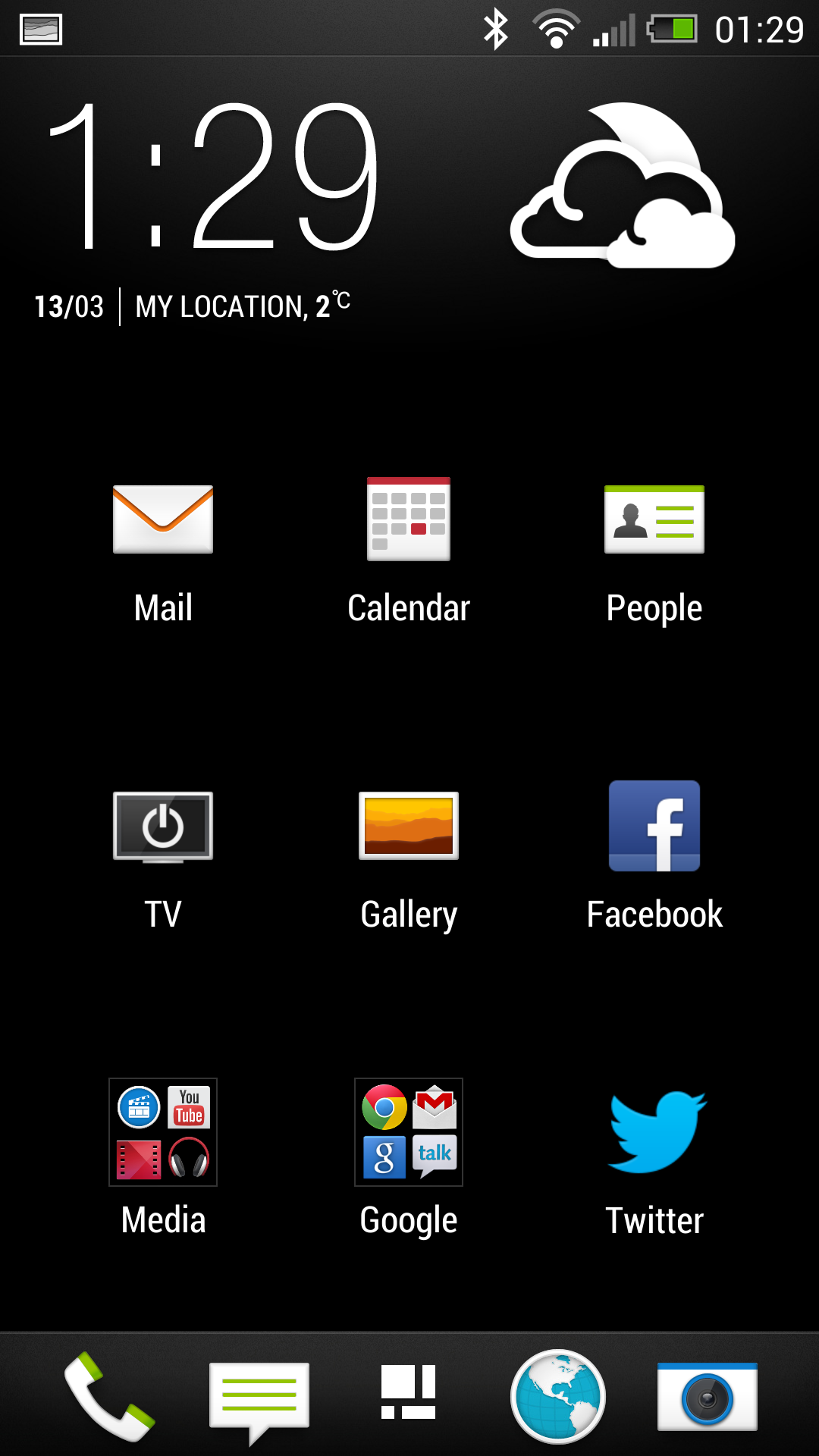
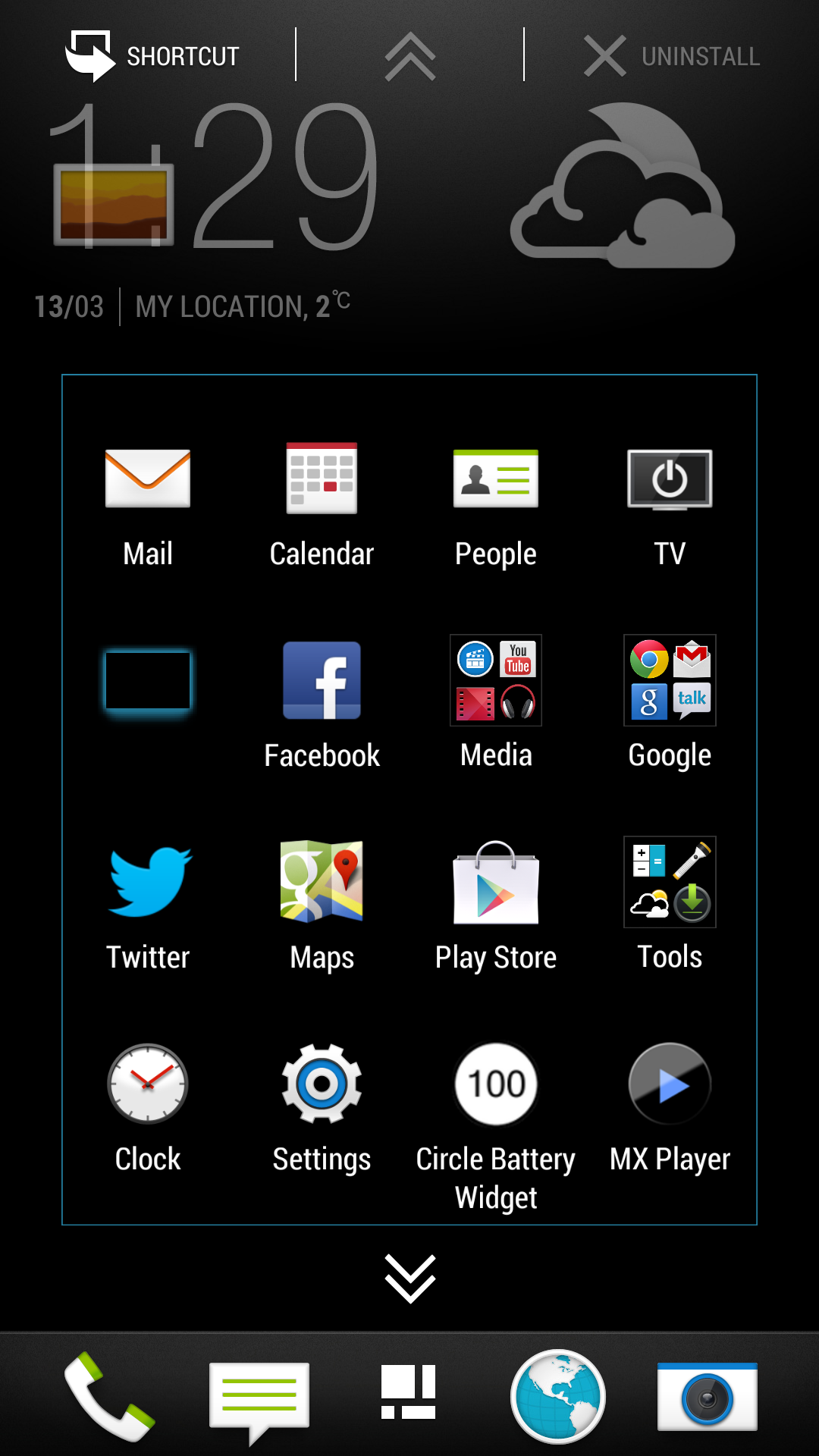
However, it only takes a swipe to the right to access the homescreens as you know them from Android of old, although you get a miserly five home screens to customize. And customizing them isn't easy - you either have to long press on the home screen and choose the apps that way, or drag them from the menu via the shortcut icon at the top. More convoluted than on other Android phones, that's for sure.
But enough of that - how does the interface work under the finger? In short, blazingly well, as you'd expect from a phone rocking a quad-core 1.7GHz Qualcomm Snapdragon S4 Pro processor. Add to that 2GB of RAM and you've got a phone that would be most fanatics' dream, and it really lives up to the promise.
From opening and closing apps to browsing multiple tabs on the internet, there's nothing that can slow down the HTC One, and you'll really appreciate that in day to day life.

You can also choose from a number of lockscreen types, be it productivity for emails, calendar entries or messages - and a swipe upwards while holding said message will launch it directly too. It's a little sad that we've lost the HTC ring that we grew to love so quickly, but the geometric simplicity of Sense 5 is enough to calm the urges to run back.
You can select a range of pictures to wander past your eyes, have some tunes on deck or simply have no lockscreen at all, if you're convinced nobody is in there trying to get at all your precious smartphone data stored on the HTC One - and we're fans of the latter, as lockscreens are annoying if you have no need for them.
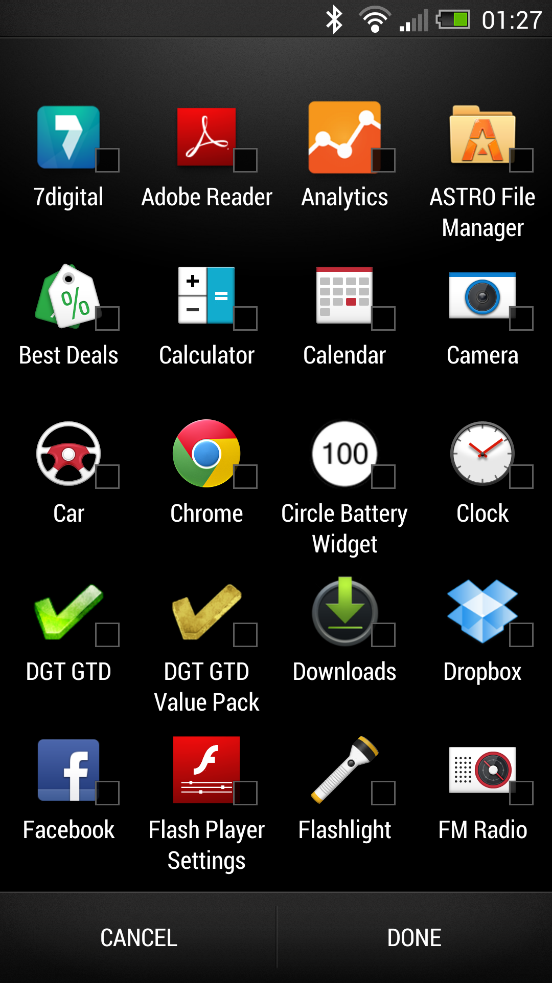
Once you're in and past BlinkFeed (which you should definitely check out) you can select whether to stick with the frankly under-selling 3x4 grid of apps ('People now want simplicity in an Android phone' say HTC rather unconvincingly). If you want to have the right amount of apps, edit that instantly to show 20 on the screen at once, and you can order them in a number of ways too.
Widgets aren't locked away in the menu like on many other Android phones either, as all it takes is a long-press on any home screen and you're greeted with all the widgets available by default - which is admittedly rather few.

The dock at the bottom of the phone pervades through the homescreen and menu options, which means you can always launch the camera or internet browser from anywhere on the main screens - you can customize this with a long press from within the app menu, so if you only want the entire range of Angry Birds games at your fingertips, you can make that happen.
Compared to something like the Samsung Galaxy S3 the HTC One is a little under-powered when it comes to the interface, but where Samsung is all about the functionality HTC is about style and minimalism. It doesn't put power options, connectivity settings and brightness adjustment in the notification bar (although we wish the option was there) so when you pull it down to look at a message, you do just that.
It's annoying that the power saver option DOES live there, but then again given the wavering battery performance of the HTC One, that's probably not a bad thing.
The interface on the HTC One is simple - really simple. It doesn't take a huge amount of peeking to see messages (BlackBerry, take note) nor does it do much more than telling you the time or the weather. But it does all this in a way that makes you feel like you'll never missing anything and getting a stylish experience to boot, one that isn't like anything else on the market.
The closest we can equate it to is the LG Prada 3.0 phone's interface - and given that was designed by a fashion house, we'll call that pretty high praise.

Gareth has been part of the consumer technology world in a career spanning three decades. He started life as a staff writer on the fledgling TechRadar, and has grew with the site (primarily as phones, tablets and wearables editor) until becoming Global Editor in Chief in 2018. Gareth has written over 4,000 articles for TechRadar, has contributed expert insight to a number of other publications, chaired panels on zeitgeist technologies, presented at the Gadget Show Live as well as representing the brand on TV and radio for multiple channels including Sky, BBC, ITV and Al-Jazeera. Passionate about fitness, he can bore anyone rigid about stress management, sleep tracking, heart rate variance as well as bemoaning something about the latest iPhone, Galaxy or OLED TV.
