Why you can trust TechRadar
Blinkfeed
When it comes to Blinkfeed, HTC thinks that it's got a decent upgrade in what it's brought to Sense 6 on the HTC One M8.
True, it's definitely improved over the previous iteration, and visually it's been updated too - now that you can pack themes onto the device, the colour coordination (by default a pseudo-mint green) at least gives the app some kind of identity.
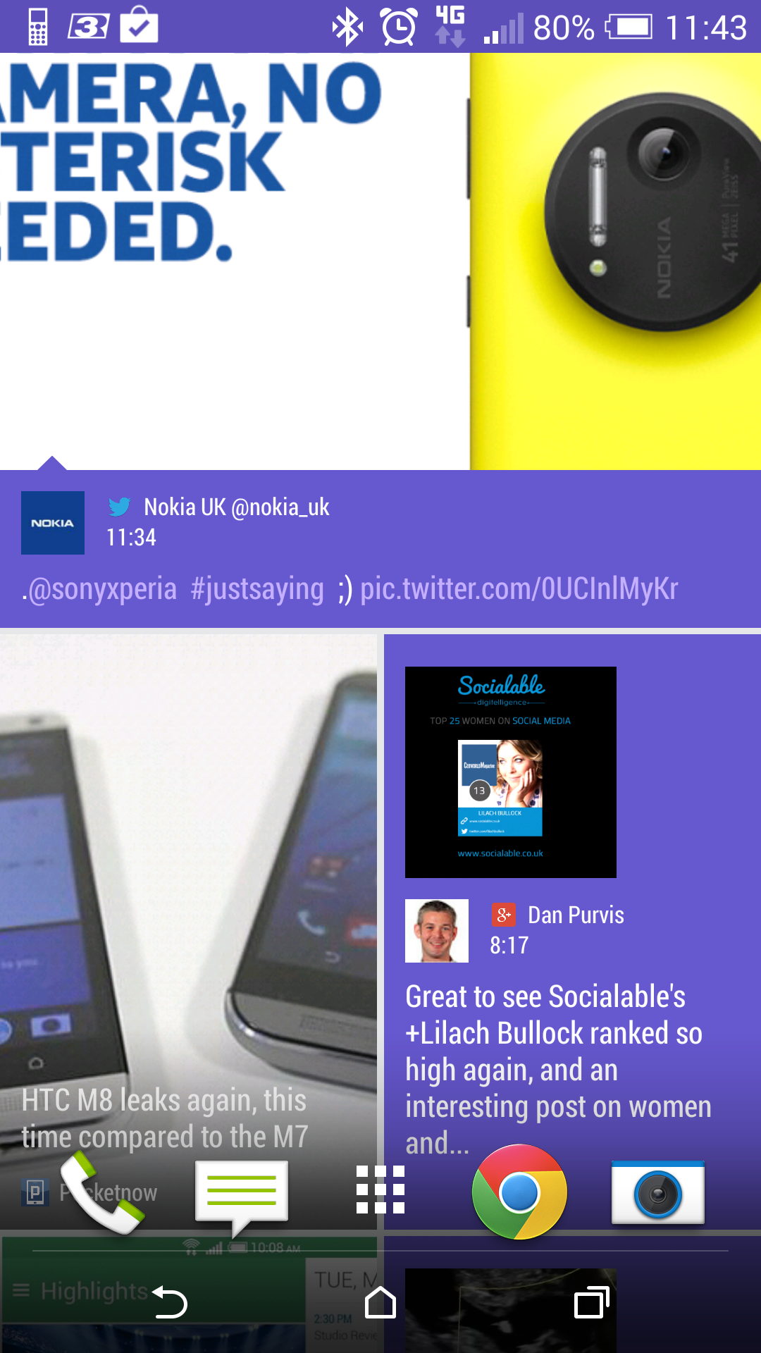
HTC was ahead of the curve with the creation of Blinkfeed too, as it knew that we were starting to 'snack' on content ever more readily in the increasingly smartphone obsessed times we live in.
However, it's still an app that needs work to be truly something that really scratches that itch. I say that having used the service on and off for over a year, and it sometimes delights and then equally disappoints.
Let's start with the good notes: there's a wealth of content out there, HTC has added more 'rich' feeds (those that play well with Blinkfeed, looking great and are regularly updated) to the mix that you can choose at launch, meaning there's something for everyone when using it for the first time.
The interface is much improved from the version that landed this time last year as well, with the side bar giving excellent access to your services and topics so you can choose something specific at any point.
I'm also so glad that HTC reneged on its decision to only allow the feeds it deigns into the mix, as now you can search for a keyword and have your own custom topics in the mix as well. Yes, they sometimes have oddly-sized pictures, but content is king and I can put up with the odd duff illustration here and there.
I'm also a big fan of being able to swipe through the news stories once you've opened one up, browsing for content I might be interested in. This is much better than scrolling down the list, which can truncate headlines and make the experience feel a bit choppy, even if it does look nice.

However, there are still too many gremlins in the system to properly call Blinkfeed a real strength. Choosing topics and services at first boot can be time consuming, and you'll find that you choose things with wild abandon that you think you might be into.
This leads to a lot of things you might not be interested in populating your feed, when to be truly successful it needs to grow over time to really be something tailored to the user. Yes, you can go in and uncheck some ideas, but most people won't bother as they don't know the root of the issue.
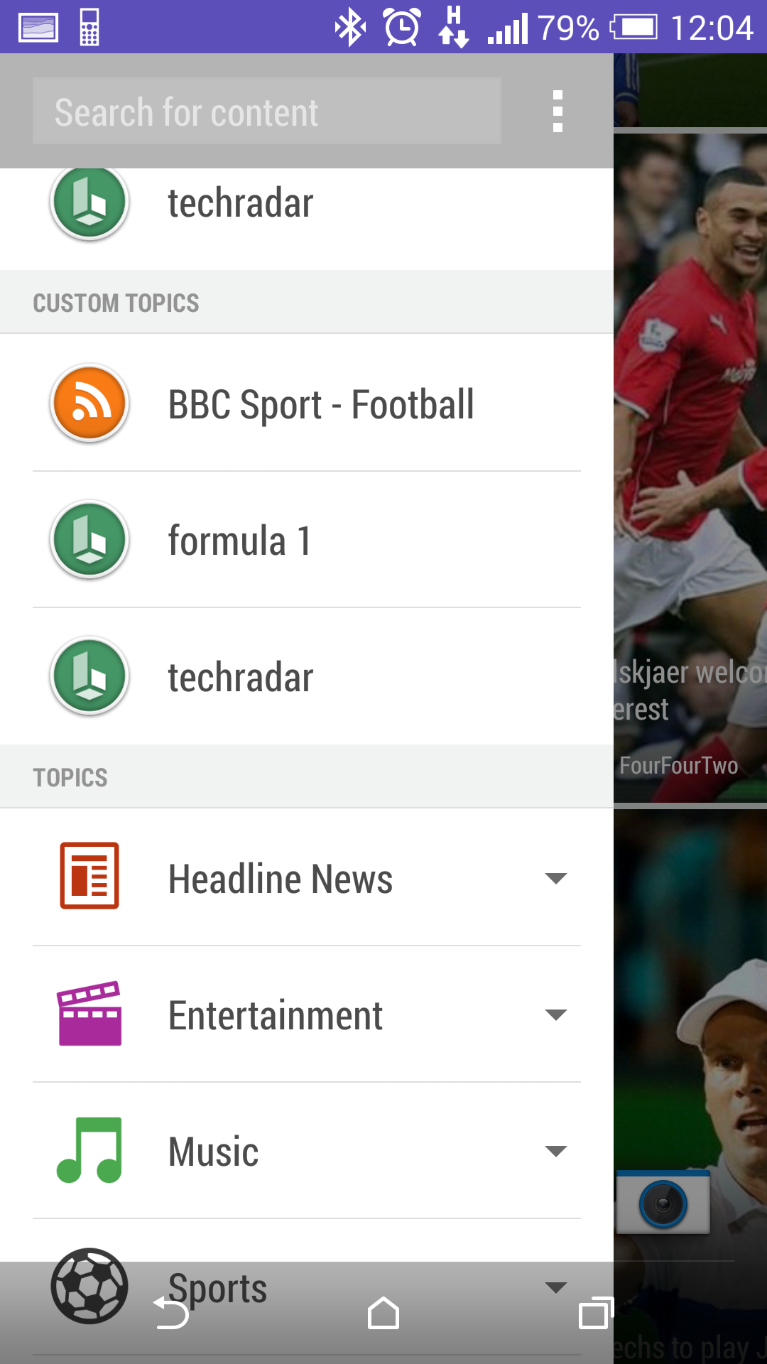
The keyword idea is also a weird one: you can add in a website using this method, but you'll have to put up with tweets and YouTube videos from the same brand. You can't just choose to have a feed of the news (unless HTC has pre-approved it) so you'll have to make do.
And weirder than that: the keyword Blinkfeed is a separate entity, not added into your main feed. So if you want to see info on a certain topic, you'll have to swipe from the left and select it. No idea why.
Here's the even weirder part: you CAN have the news feed, but you'll need to trawl the web, click the RSS icon on the site you want and then hope it will load up into Blinkfeed (which, it doesn't do as often as it should).
Why can't HTC allow this from within the app? Why can't there be some kind of rating system for stories within Blinkfeed that allows you to sculpt your interests over time, and would sporadically offer up new suggestions of sites and topics you might like?
It's a hard question to pose to HTC - I've reviewed countless apps trying to do the same trick of being smarter than the user in terms of finding them the content they would want, and it's a near-impossible task right now, it seems.
But this is the second go at Blinkfeed, and it's not quite good enough still... it's good enough to idly play with a few times a week, but it's not a real USP still.
Power pack
One of the main criticisms of the HTC One was the fact that it really managed to suck down battery when you actually used the phone heavily (I know, who does that, eh?).
It meant that if you left the phone in the pocket, quietly sipping data and not doing much else, you could get a decent day's use out of the device. Watch a movie or play a game for too long though and you'll be looking for a charger around 4PM.
That problem was rectified to a degree with software updates from HTC, but it was still one of the dicier devices on battery usage.
Well, good news: the HTC One M8 is a much, much better device at stretching your power out over the day (or even two) and that's because of the a) upgraded battery, now up to 2600mAh from 2300mAh but more importantly b) the Qualcomm Snapdragon 801 chipset at the heart.
You might not care much for the internal specs of a phone, but trust me here. Over 12 months Qualcomm's two chips of the period, the 800 and 801, have shown that phone efficiency can leap forward.
The likes of the LG G2 and Sony Xperia Z1 were both much improved on their battery when using the 800, and the top phones of early 2014 (the HTC One M8, the Samsung Galaxy S5 and the Sony Xperia Z2) are all using the 801 chip and look to run even longer on a single charge.
Of course now we're seeing phones emerge with the newer Snapdragon 810, but the Snapdragon 801 is still a great performer.
There are myriad improvements throughout the One M8 as well thanks to this new engine: the image processing of the snaps is much enhanced, data is collected and used more efficiently and pumping content out from the phone is a much more impressive experience.
You might not notice it, but the Snapdragon 801 (combined with 2GB of RAM) is one of the main jumps forward for the One M8 and I'm really relieved HTC managed to get the latest tech on board its latest flagship.
Duo camera and smart flash
Like the battery talk above, I'm not going to spoil the larger section later on where I discuss the camera power, but the new snapper on the back deserves highlighting here as it genuinely is the stand out feature (along with the design of the phone) that will mark out the HTC One M8 from the competition.
Yes, it's still the same Ultrapixel technology from last year, and it's not been bumped up much in the megapixel space. Actually, not at all. But the output is much enhanced, and not just in low light, leading to a more robust system.
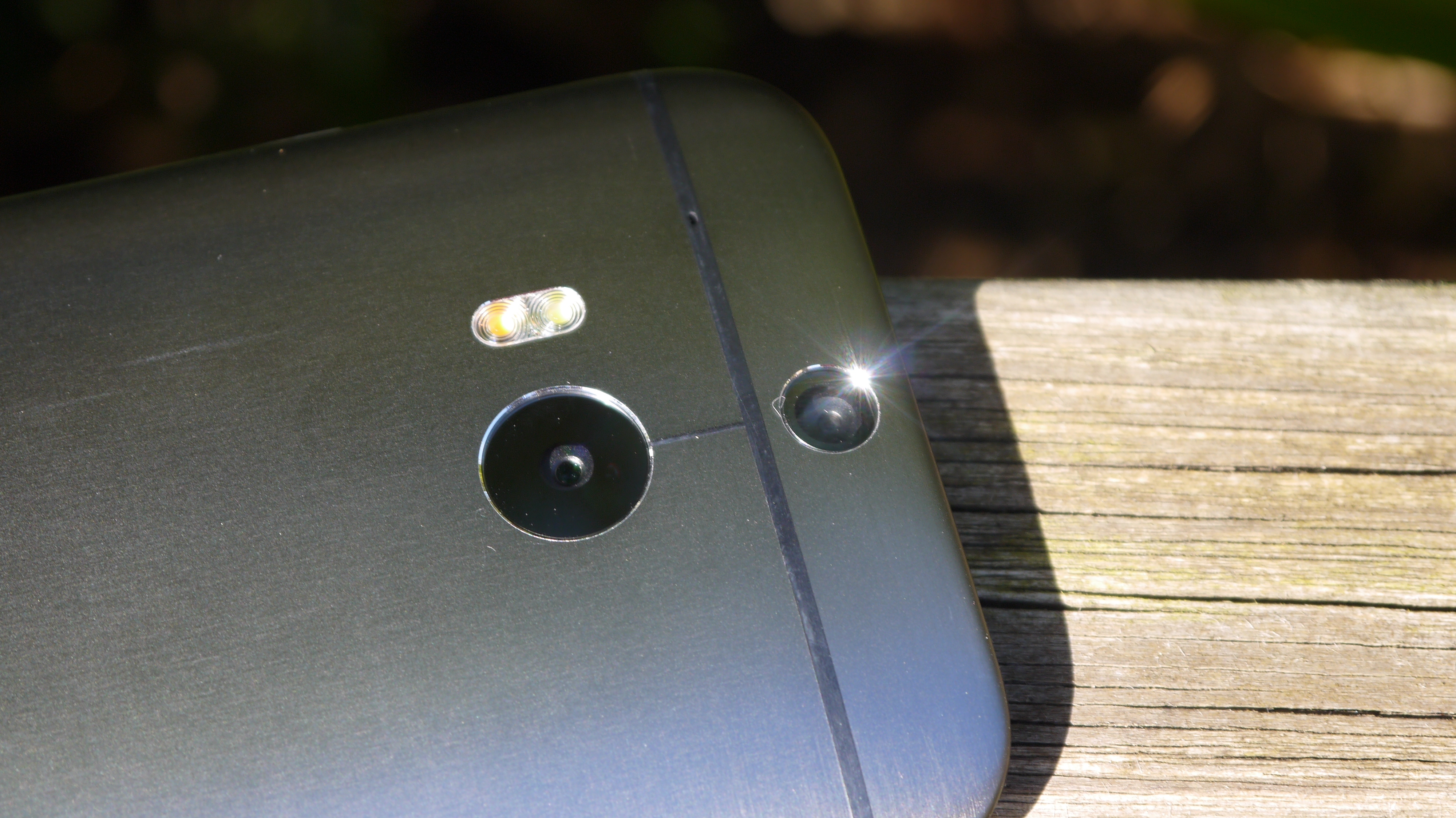
However, it's the depth sensor that HTC has plugged above the main camera that really makes the difference here, as it allows you to refocus images after you've taken them, which is a really cool feature.
It's one that all the main manufacturers are placing within their flagship devices, but HTC is the only one that does it with hardware instead of software, leading to really impressive speeds when taking pictures and still having this advanced functionality.
You can check out the tests with the new Ultrapixel Duo Camera later in the review - and I'd really recommend that you do if you're the sort of person that likes a really strong day to day snapper.
Better Boomsound
HTC has gone to great lengths to talk up its improved speakers on the front of the device, and it needs to, given its added so much size to the One M8 to accommodate them.
The good news is they're SO much better than before, and the original One's sound wasn't bad at all. However with the new speakers everything is so much clearer, meaning better clarity between the bass and the vocals when listening to music, or just a cleaner sound when pumping up the volume to the max.
HTC told me that this was because it had separated out the channels within the sound, allowing it to clip the likes of the bass when things got too much for the speakers without affecting the other elements. It's a system that certainly works and side by side the difference is marked.
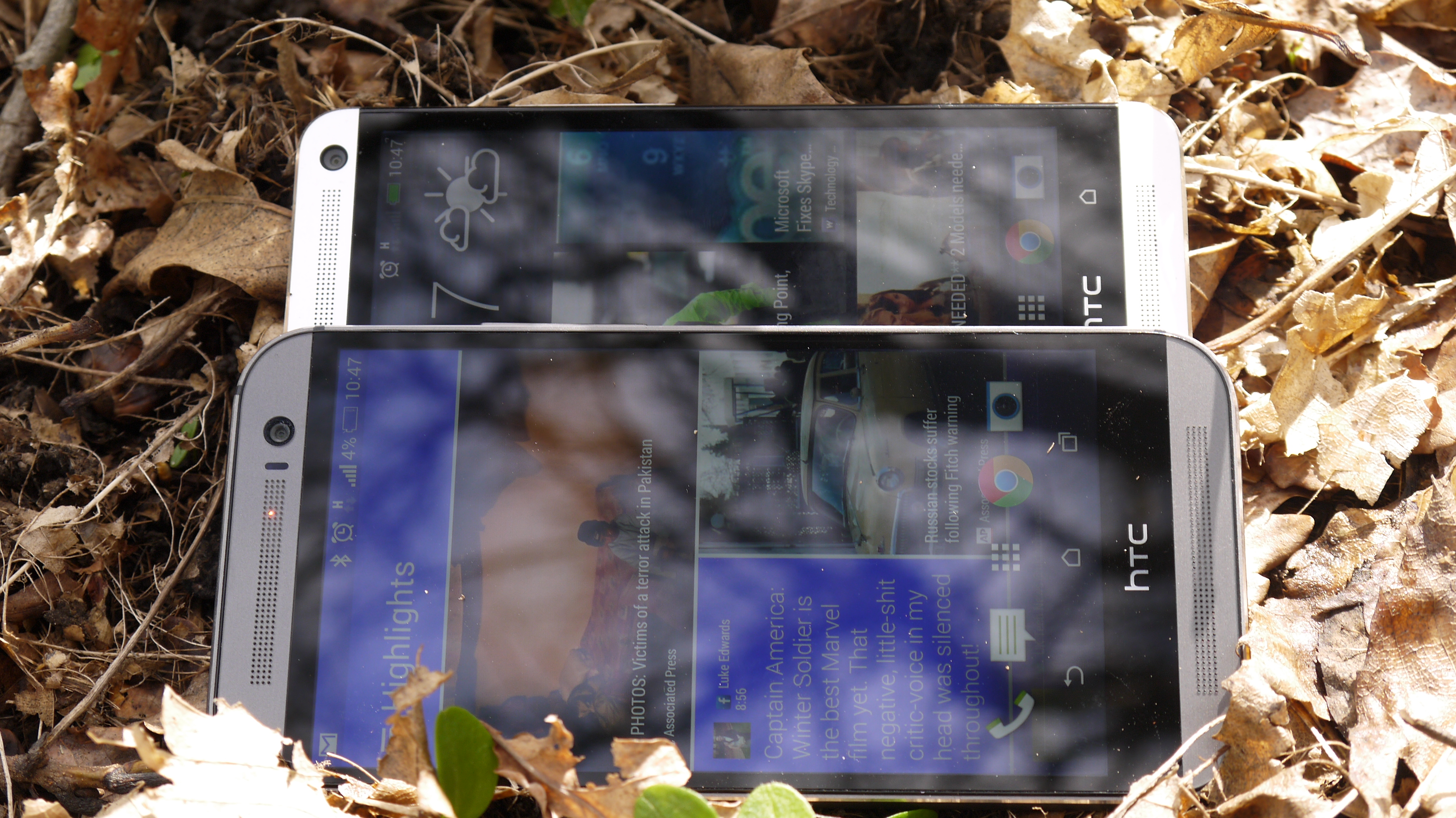
However, I'm still not convinced by Boomsound. Yes, it's brilliant when used, but the question is: when would you use it? I found that over the last year I was surprised how much the speakers came to the fore, be it showing off YouTube clips or having music in the background when decorating, but that wasn't regular.
I never found myself watching a full movie using the speakers when alone, as I still prefer the headphone experience for that.
The Boomsound speakers feel akin to a really nice bodywork set on a premium saloon car. They'll add a lot when it comes to cornering speeds and general performance, but you know that mostly you're using that car for getting to work and taking the family or friends to the beach.
The same here: the speakers are great, but they add a lot of height to the phone and I wonder how much use you'll get out of these premium features given modern smartphone use is still a very private thing.
But don't get confused - the sound that comes out from the speakers is really great, with crisp notes and deep bass for a smartphone.
Storage wars
And just briefly, let's have a 'hands in the air' moment for the fact HTC has caved in and brought a microSD expansion slot to the One M8. I thought such a thing was impossible for future HTC devices, assuming the company had bent to Google's apparent will to have more emphasis put to the cloud.
But HTC told me that it had listened to users, some of whom had said they wouldn't buy the One thanks to the lack of expandable storage, and so popped one into the One M8.
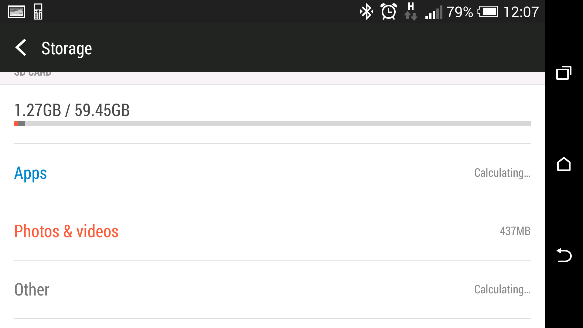
It's not easy to hot swap, given you need a little SIM tool to open the drawer, but it's much better than nothing and helps negate the fact that 6GB of the internal storage is taken up by OS requirements.
That's not the worst out there, but if you opt for the 16GB version and get really friendly with the Zoe feature on the One M8 as well as downloading some large apps, you would have run into trouble.
Now, all your media needs can be siphoned off and the internal space dedicated to apps instead, which is a big help, and it's good to see a brand backing down over a big issue.
Fitbit
HTC has tried to join the fitness game with the One M8 by bundling the Fitbit app with the phone from the outset.
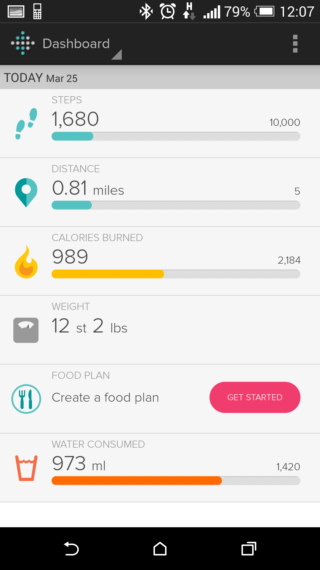
It's a strategy that you could consider two ways: on the one hand, given that smartphone fitness is still a burgeoning area, it doesn't seem worth spending millions to develop a real core fitness API that allows you to get fit with your smartphone in the way Samsung is doing with S Health.
At least there's no unnecessary heart rate monitor here.
On the other hand, having a phone acting as a pedometer is a poor substitute for an actual tracker as you'll spend large swathes of the day with the phone on a desk or a bedside table.
Add to that the fact that there's every chance that smartphone fitness will take off, especially as Apple and Samsung start ramming the message down users' throats, and HTC's half-hearted attempt to be in the fitness mix could come back to bite it.

Gareth has been part of the consumer technology world in a career spanning three decades. He started life as a staff writer on the fledgling TechRadar, and has grew with the site (primarily as phones, tablets and wearables editor) until becoming Global Editor in Chief in 2018. Gareth has written over 4,000 articles for TechRadar, has contributed expert insight to a number of other publications, chaired panels on zeitgeist technologies, presented at the Gadget Show Live as well as representing the brand on TV and radio for multiple channels including Sky, BBC, ITV and Al-Jazeera. Passionate about fitness, he can bore anyone rigid about stress management, sleep tracking, heart rate variance as well as bemoaning something about the latest iPhone, Galaxy or OLED TV.
