Why you can trust TechRadar
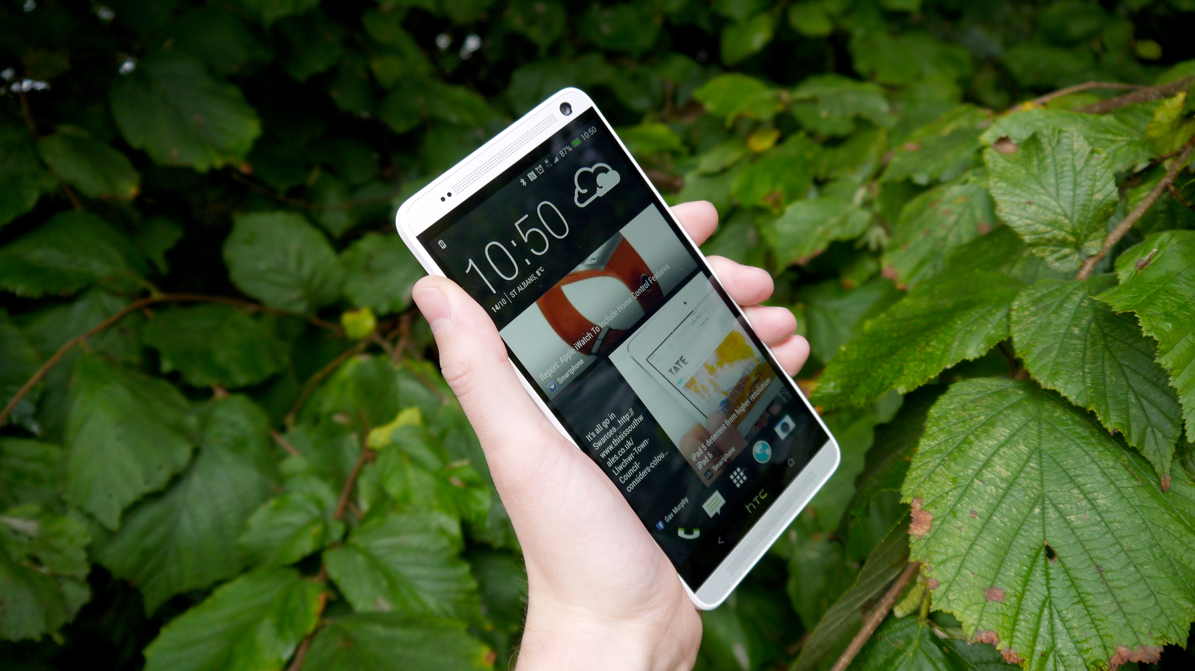
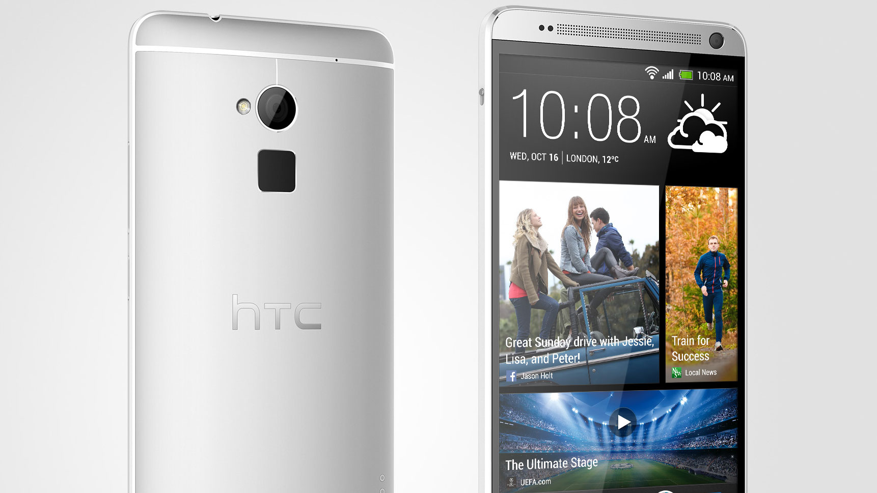
HTC has kept the same Sense UI design for the One Max as we saw on the One, but has upgraded things to Sense 5.5 to bring a number of intriguing tweaks. However, let's take a little run through the user interface for those that might not have seen it before, since HTC has brought one of the best Android skins to the market.
The HTC One Max comes running Android 4.3, which should please those who are desperate to have the latest software from Google. In reality, it only means that Bluetooth connections are improved, as most of the features Google brought to the party were already in HTC's platform.
The set up is very simple on the One Max, as you can not only import most of your content easily from other Android phones, BlackBerry, Windows Phone or even the iPhone, but you're also talked through the process simply. HTC is touting its ability to let you set up your phone before you even turn it on, but we've not seen much in the way of take up of this feature.

Once you've opened up the One, it's best to sign into your myriad accounts, as these will be displayed throughout various elements of the One Max. Two to particularly watch out for: Instagram is now included in BlinkFeed (more on that in a moment), and once you've signed into Google and opened the pre-installed Drive app you'll be given 50GB of online storage, which is particularly useful for storing snaps from your camera.
There are only two buttons to play with on the front of the One Max - both capacitive, they allow you to either go back or to the home screen.
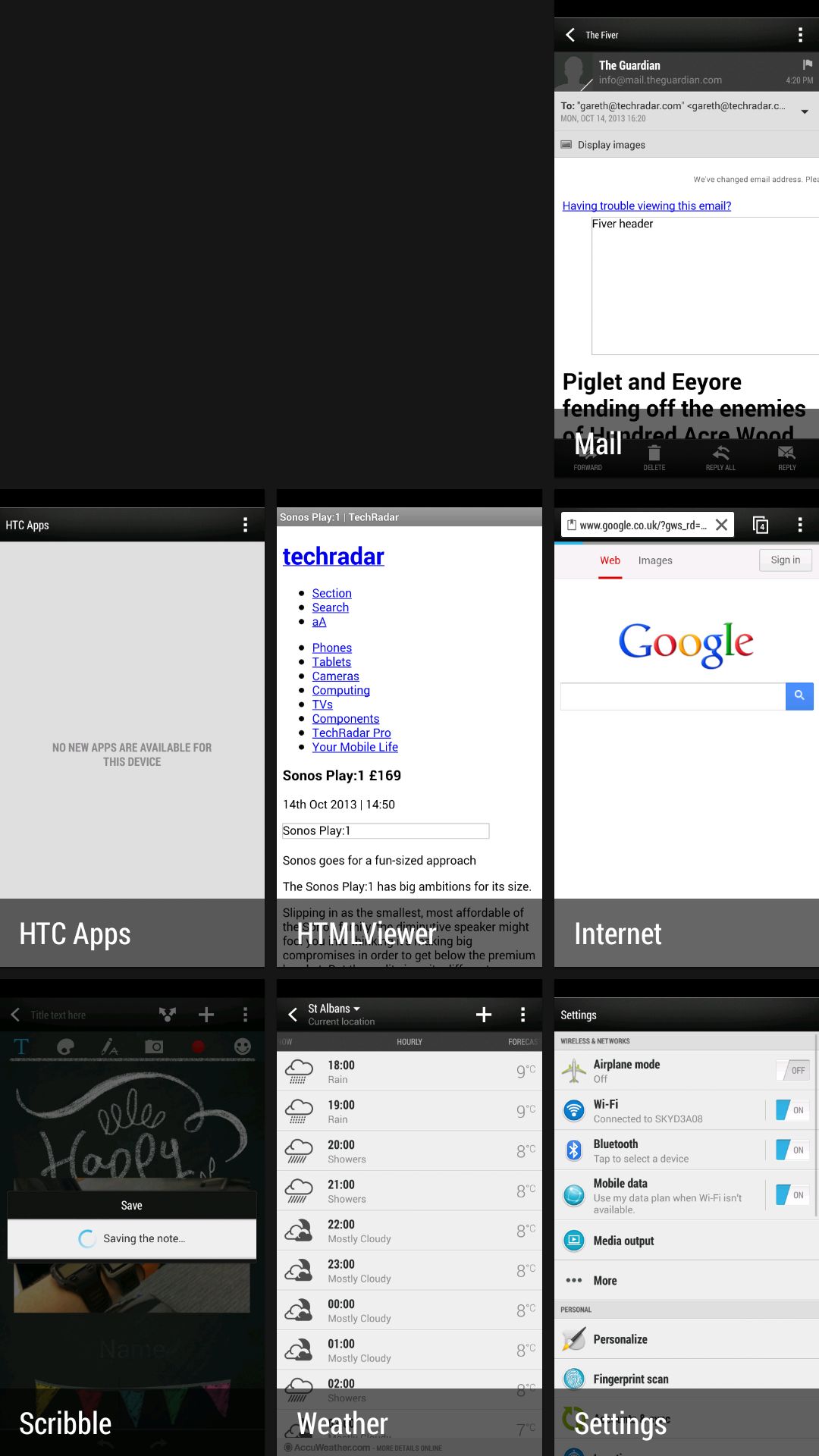
The home button actually has many functions: by default, a double tap will open up the more tile-based multi-tasker, and a long press will start Google Now. However, you can alter this to mean a swipe up will open Google Now, and a long press will act as a menu key, which will placate some that still love such an option.

The interface itself from HTC is very different from the rest of the market. For example, the Sony Xperia Z1 offers a more stripped back experience, while the Samsung Galaxy S4 and the LG G2 both come with vastly more complicated offerings, designed to reward the user that likes to have a dig around.
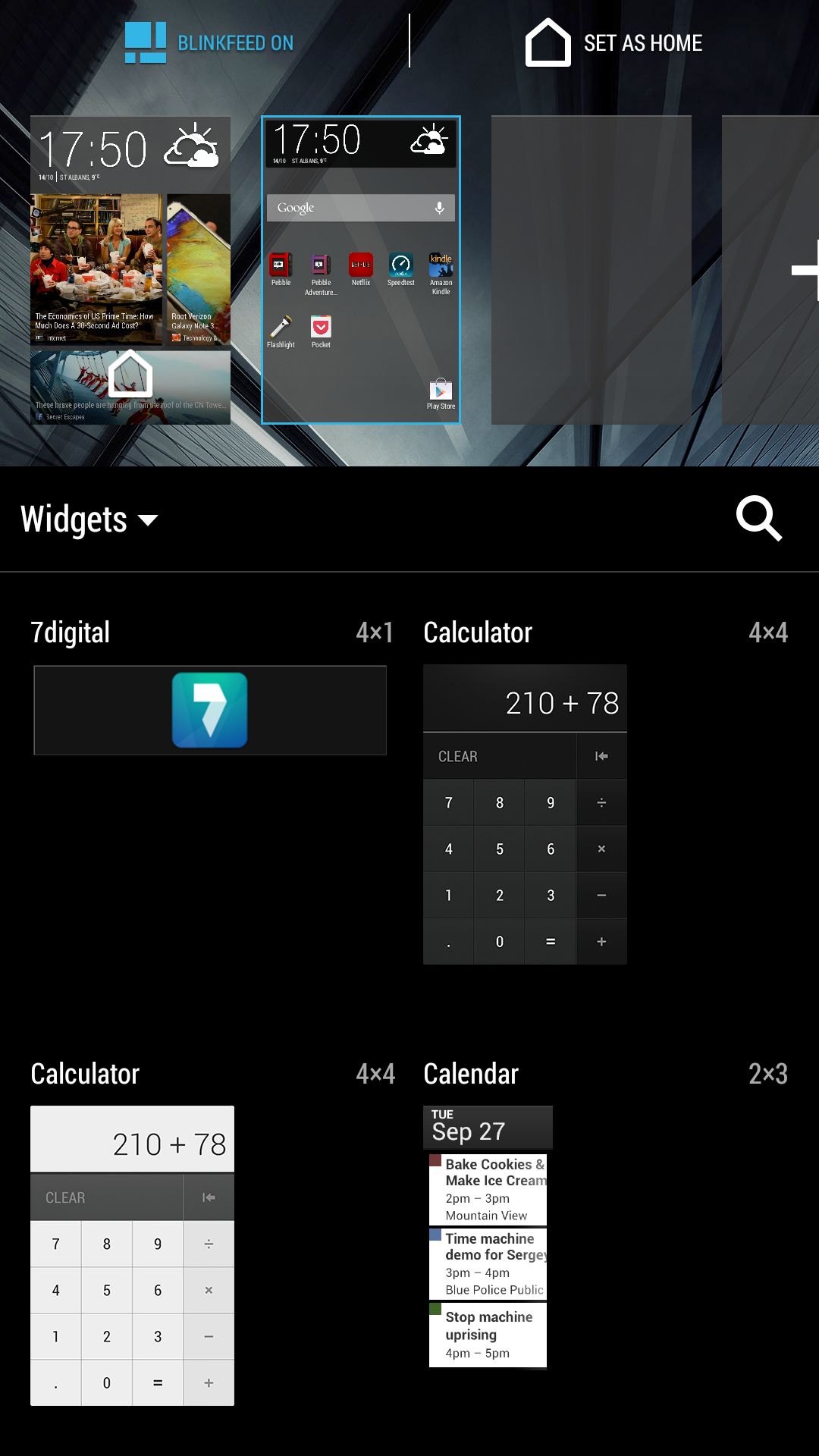
HTC's approach is also more inclusive. For instance, if you want to have fewer icons on the grid in the app menu, you can, or you can disable the BlinkFeed option altogether (by pinching inwards on any homescreen and clicking the checkbox at the top).
The idea is that those who are new to Android will be able to get on board simply, and it's a good ethos. However, if you're coming to the HTC One Max from a feature phone or similar, then we tip our caps to your bravery.
The rest of the interface is simple: The notification bar HTC uses is simple, yet elegant, which means you can easily see what's going on in your world.
We miss the quick toggles that allow you to easily turn off things like Wi-Fi and Bluetooth directly from this area (a common feature on most other phones), and HTC's decision to allow quick access to these using a two-finger downward swipe will be missed by many.
However, it's a simple method and it's nice to see that HTC is thinking here.

The app menu still annoys some, moving as it does vertically rather than horizontally as in many other handsets. It does mean that it's harder to scroll through using just one hand, and we hope HTC alters this in the future.
It's also not easy to add items from the menu to the home screen, as you'll need to long press, drag them to the top to the area market shortcut and then drop the icon on the home screen of your choice.
It's almost like HTC wants you to simply use the homescreen for Blinkfeed, and we'd hope for better, as it means widgets and the like (one of Android's strong points) are harder to use.
Another new feature for the HTC One Max is the ability to set widgets on the lock screen. You can now swipe right to get to a "+" icon, which allows you to choose elements like calendar or music player and have them accessible without unlocking the phone. It's a neat touch, but one we've been used to with Android 4.3 for a while now.

Gareth has been part of the consumer technology world in a career spanning three decades. He started life as a staff writer on the fledgling TechRadar, and has grew with the site (primarily as phones, tablets and wearables editor) until becoming Global Editor in Chief in 2018. Gareth has written over 4,000 articles for TechRadar, has contributed expert insight to a number of other publications, chaired panels on zeitgeist technologies, presented at the Gadget Show Live as well as representing the brand on TV and radio for multiple channels including Sky, BBC, ITV and Al-Jazeera. Passionate about fitness, he can bore anyone rigid about stress management, sleep tracking, heart rate variance as well as bemoaning something about the latest iPhone, Galaxy or OLED TV.
