Why you can trust TechRadar
HTC has happily decided to make sure the One Mini is coming with the latest version of its software, with Sense 5.0 plus and Android 4.2.2 on the phone from the outset.
This means a cutting edge version of Google (although sadly not Android 4.3, as you'd expect given that was announced after the phone went on sale) and gives a new level of technology to the handset.
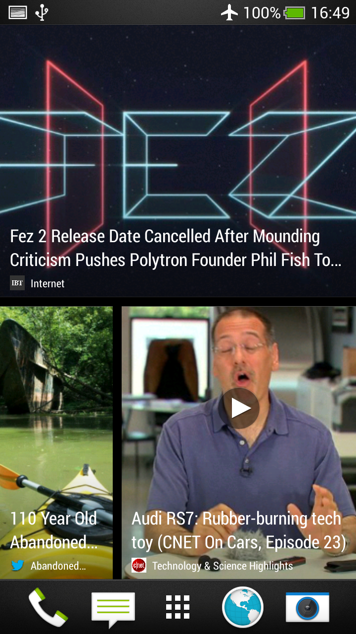
For the uninitiated, the HTC One Mini offers a very simple and intuitive way of getting the information you want in front of your eyeballs - a methodology that has pervaded throughout the company's phone history. BlinkFeed is the main thing most will see when turning the phone on, and this is a portal to get access to all of your news, social networking updates and calendar entries in a fun, tile-based interface.
Unlike other apps, Blinkfeed does require a bit of setting up, but we'd urge you to do such a thing as it gives loads of really nice information sources and does so in an original and offline way. At the start you're asked to choose your preferences, and once achieved the Windows Phone-esque interface will give a load of tiles with the right content in there.

Smattered into the mix are some well-curated updates from your Facebook feed, tweets and retweets from your Twitter account and even calendar entries to let you know when important meetings are scheduled.
It's a neat system, and one that has a pleasant 'snick' sound effect when you pull down to update it - plus it automatically will load in a mobile reader mode, instead of showing the full web page and giving loads of unnecessary information.
If you want to read a more in-depth look at Blinkfeed, check out our dedicated page
Beyond Blinkfeed, there's a lot that the novice and active Android user will enjoy, be it the design of HTC's Sense overlay on top of Android, or the pared down method of navigating through the phone.
For instance, you can choose to have a grid of icons in a 4x3 or 5x4 layout, in case you're worried about icon overload. The former seems a bit too boring for our eyes, but on the smaller 4.3-inch screen we can see that this has a lot more purpose, and a number of people we spoke to liked the smaller layout.
One thing many of you will love is the weather and clock widget, as it's pervasive whether you're in Blinkfeed, the app menu or just the homescreen (as a widget). It may sound confusing and annoyingly cluttered, but a) the weather widget is the best out there bar none in terms of a stock offering and b) it actually looks quite nice.
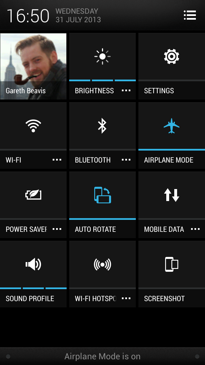
One big change with Android 4.2.2 is the addition of a settings tile icon in the notification area. This area can be accessed by swiping down from the top of the screen, and will give you updates on all manner of things, from messages to emails to app updates and more.
Android 4.2.2 allows you to manage this area more effectively than before, as you can now swipe down on many notifications and see more info; for instance, Gmail messages can now be viewed and instantly replied to, or dismissed by swiping left or right. It's a nice system which makes it easier to see the things you need better than anything else on the market. and destroys Apple's iOS for this functionality.
But back to the settings tile. It's a really nice implementation of an idea from Google, adding a lot of functionality into the mix. You can set the brightness level, turn Wi-Fi on and off, hit up power saver and loads more. On top of that you can choose to go deeper into the settings of each, which means it's a cinch to set up Bluetooth headphones without having to scrabble around the main settings menu.

It might sound like a lot of effort, but in actual practice this is a really neat way of changing things on your phone without having to have a really messy notifications bar, like you'll see on the Samsung Galaxy S4 mini.
The rest of the interface on the HTC One Mini is the kind of fare we're also used to from HTC - meaning all the things you'd be looking for are in logical places. Well, that's not strictly true, as there are some areas that get a little confusing.
For instance, the desire to get rid of as many buttons on the bottom of the phone mean that it's a little sparse on the old hardware front - so you've now only got a Home and Back button to play with, and these are both soft options.
HTC seemed to think this would be OK in the original One, and has sadly carried on the trick with the One Mini. On-screen menus are irritatingly hard to find (look for a group of three dots) and HTC seems to have worked this out, allowing you the option to long press the home button to call up any menu.
It's not ideal, and the Samsung Galaxy range does a much better job of just having the button on the phone. The long press option is a little fiddly, and still results in you scrabbling around, looking for the on-screen option.
But beyond that we're happy with the way HTC has done things. The lockscreen is a great place to control things like Spotify (not supported by all phones) or you can have a selection of widgets or photos scrolling past if you'd rather.

Gareth has been part of the consumer technology world in a career spanning three decades. He started life as a staff writer on the fledgling TechRadar, and has grew with the site (primarily as phones, tablets and wearables editor) until becoming Global Editor in Chief in 2018. Gareth has written over 4,000 articles for TechRadar, has contributed expert insight to a number of other publications, chaired panels on zeitgeist technologies, presented at the Gadget Show Live as well as representing the brand on TV and radio for multiple channels including Sky, BBC, ITV and Al-Jazeera. Passionate about fitness, he can bore anyone rigid about stress management, sleep tracking, heart rate variance as well as bemoaning something about the latest iPhone, Galaxy or OLED TV.
