Why you can trust TechRadar
A few months back, HTC's Chairwoman Cher Wang made a pretty frank admission regarding HTC Sense. She said it was too complicated. And legions of HTC fans would probably agree.
So, HTC has revamped it. There are lots of similarities to previous versions – but it just flows a lot better. Don't forget, we are running Sense 4.0 atop Android 4.0 Ice Cream Sandwich and hats off to HTC for getting such a stable bit of tech out the door so quickly whilst other manufacturers dither about.

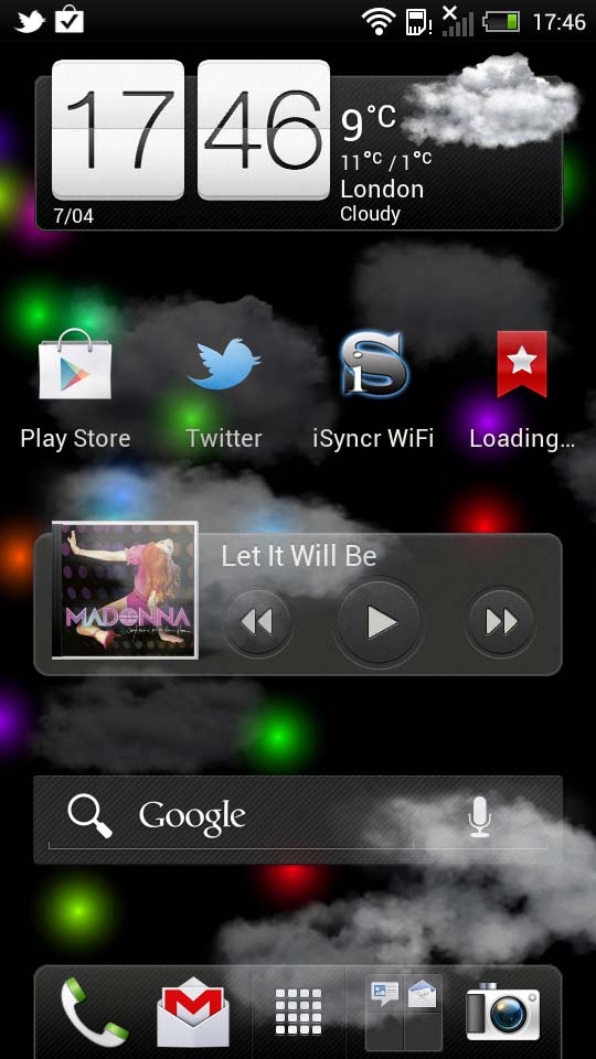
The Sense launcher gives you seven homescreens to play with – which can't be expanded. On prior handsets, there was the option of spinning to the last homescreen and it would go back to the beginning like a full circle but that's now gone for some reason.
You can quickly move to another by pinching the screen which gives a full overview. There's little lag here and despite having a dual-core 1.5GHz processor compared to the One X's quad-core job, there is no stutter with live wallpapers as you move through screens - which seems odd since you'd expect the one with less power to have the problem.
HTC gives you a plethora of widgets to pick from and we love the implementation of it. Tap the screen and rather than the Android menu of old, you're treated to a whole little interface with previews of said widgets.
Want to see how the One S stands up against the iPhone 4S? We compare camera shutter speed, web page loading and turn on time in the video below:
One thing we do love here is that you get a mini view at the top of the screen of your homescreens and as you tap on a widget, it pops up into that screen and then lets you continue to add more.

There's none of this adding a widget and then having to go through the whole process again to add a second one, bringing up menus and boxes etc. It just works simply and gracefully.
This being Android 4.0 Ice Cream Sandwich, there are some changes that'll take a bit of getting used to and others that stalwarts will hate. For example, HTC used to give you toggles for things like Wi-Fi and Bluetooth in the pulldown notification bar which was a great help. Now, you'll have to go through the
settings menu to do this (which has been moved into the notification bar itself) unless you install a dedicated widget.
We do like the Ice Cream Sandwich addition of contact pictures in the notification bar now when said person messages us.
Also, there's no search softkey anymore, which we found we used a lot. You'll have to have a Google widget on your homescreen instead which restricts your option slightly.
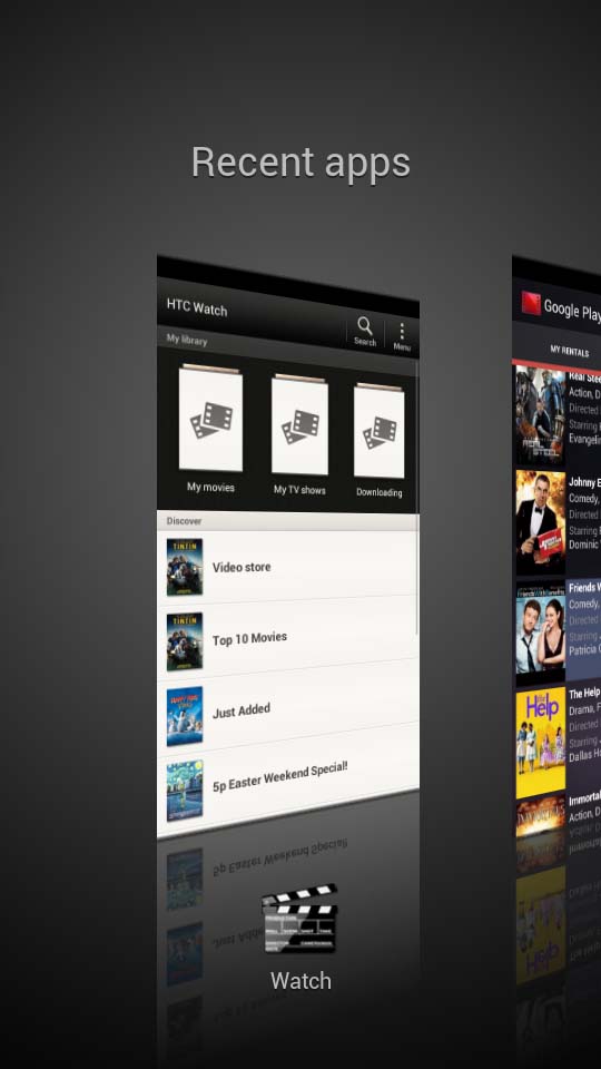
However, you do get a new multitasking button which brings up a very elegant view of running or recently used programmes and looks very nice indeed.
