Why you can trust TechRadar
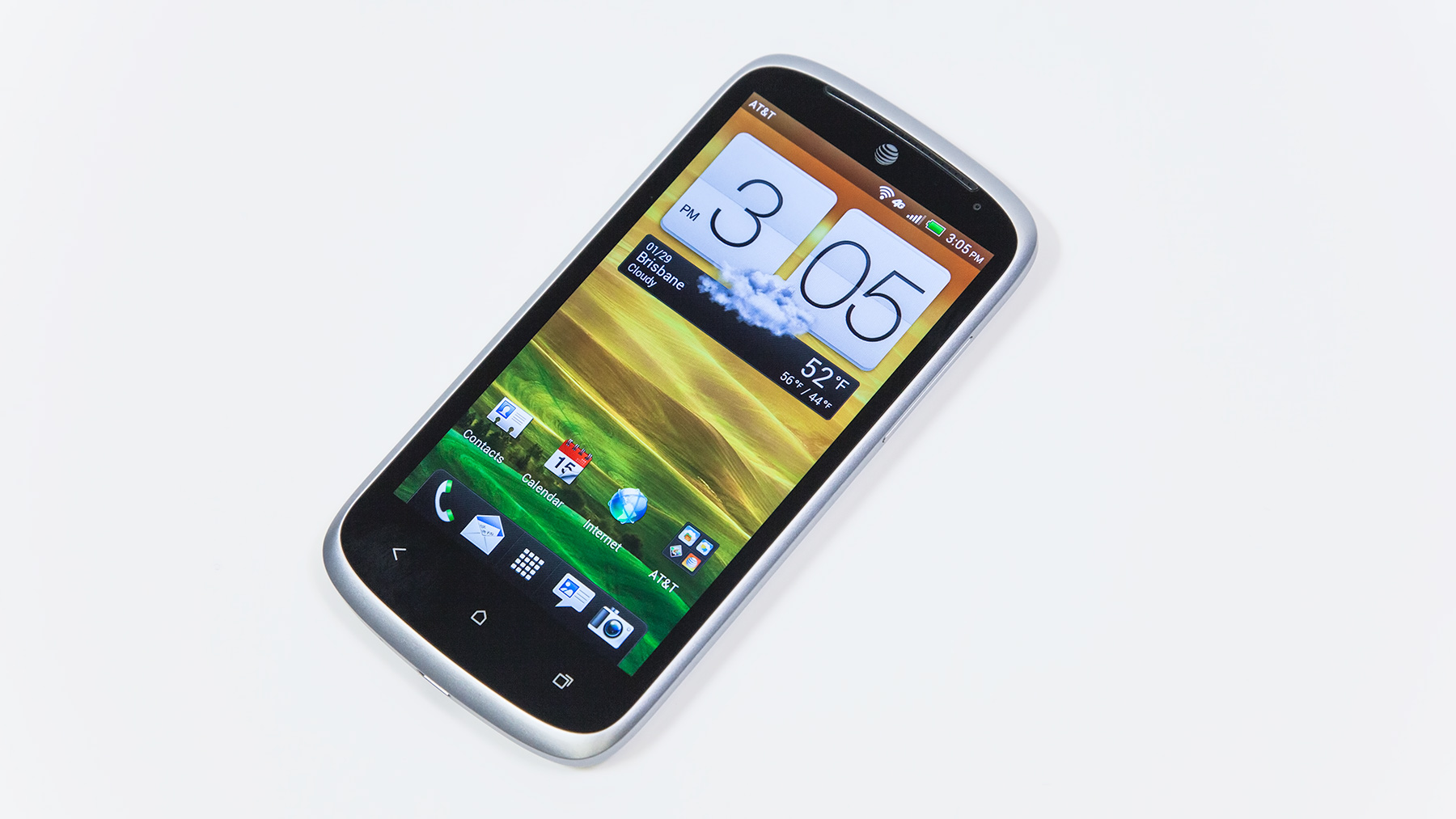
HTC phones like the HTC One X, HTC One X+ and HTC Droid DNA have become known for their stellar screens. While you won't get an HD display on the modestly priced HTC One VX, what you get isn't too bad either.
Display
The One VX packs a 4.5-inch screen, which is on the larger end for the mid-range price point. It clocks in at a resolution of 540 x 960, with a density of 245 pixels per inch. That's on par for its price tag, matching up with the similarly specced Droid Razr M over on Verizon.
Despite the relatively low resolution, streaming video comes through clearly, with little noticeable pixelation. The screen did justice to the surprisingly good trailer for "Fast & Furious 6." We could spot a sheen coming off Vin Diesel's immaculately hairless head, and it took a cargo plane erupting into a display-filling fireball to notice some lack-of-HD distortion.

The screen is clear and bright, but sometimes too bright. The auto-brightness features, which is supposed to keep the display from searing your retinas, doesn't do its job. In a dark bedroom or bar, the One VX is far too bright, it's genuinely painful on the eyes.
Manual brightness adjustment provides a fix, but it's an annoyance consumers shouldn't have to deal with.
Interface
The HTC One VX runs Android 4.0: Ice Cream Sandwich. Being a year or two behind OS versions is not unusual for a mid-range handset such as the One VX, but if you've experienced Android 4.1: Jelly Bean, it's going to feel a tad creaky.
While HTC has released two Jelly Bean devices, the HTC One X+ on AT&T and the Droid DNA on Verizon, none of its ICS devices have made the jump to JB, even the capable HTC One X.
The lack of support here is frankly ridiculous, the One X is quad-core, after all, and HTC devices in Canadian and Korean markets have all gotten the bump up. It's especially frustrating since AT&T keeps blowing its own deadlines.
That being said, don't expect to see a JB Update on your HTC One VX anytime soon.
Android 4.0: Ice Cream Sandwich
Ice Cream Sandwich has gotten slightly stale since its release in 2011, but it's still capable in all the basic functions we've come to expect from our smartphones.
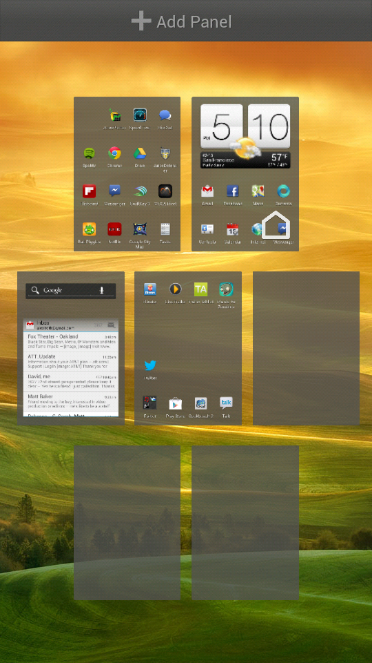
The experience is built around seven panels that can be decked out with the apps and widgets of your choosing. App icons can be combined to form space-saving folders, and some widgets, like a calendar or email inbox, can be resized to adjust the amount of information displayed.
- Learn more: Android 4.0: Ice Cream Sandwich review
A high number of active widgets and apps can have an adverse effect on battery life and performance, but we went about our days testing the One VX with more than 20 app icons and two widgets, a Gmail inbox and HTC's Weather Clock, without any noticeable hit to the phone's responsiveness. We also made through the day easily on a single charge. More information on this in the Performance and Battery Life sections of this review.
ICS also has voice commands that lets you order your One VX around. You can ask it to send texts, search Google Maps, make calls, browse the web, dictate text input and other basic functions.
To use voice commands you simply touch the microphone on the Google Search Bar. While most Android phones have a search bar on the home screen, HTC moved it one screen to the right to make room for its large Weather Clock, which defaults to the home screen. This can all be rearranged, of course.
The ICS voice commands are a nice effort saver for composing long messages, but pale in comparison to Siri on iOS 6 or Google Now on a JB phone. We had to speak slowly with clearer than ordinary enunciation to get it to understand. The One VX's microphone also had a hard time taking dictation anywhere that was moderately noisy.
HTC Sense 4.1
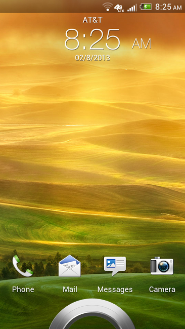
HTC routinely adds its own layer of flavor to ICS that it calls Sense 4.1. You'll notice it from the moment you first wake the phone. The lock screen features a metal ring, dragging it upwards unlocks the phone and sends you to the home screen.
From the lock screen, the four apps on the dock can be accessed directly by pulling them into the ring. For example, you can jump right into messaging or the camera to return a text or snap a quick pic.
The One VX limits you to four apps of your choice on the dock, and they'll each be accessible from the lock screen. The defaults are the dialer, email, messages and camera. You can also stack apps here to create folders, but that can be rather cumbersome for the dock, an area where you should be quickly accessing your most frequently used apps.
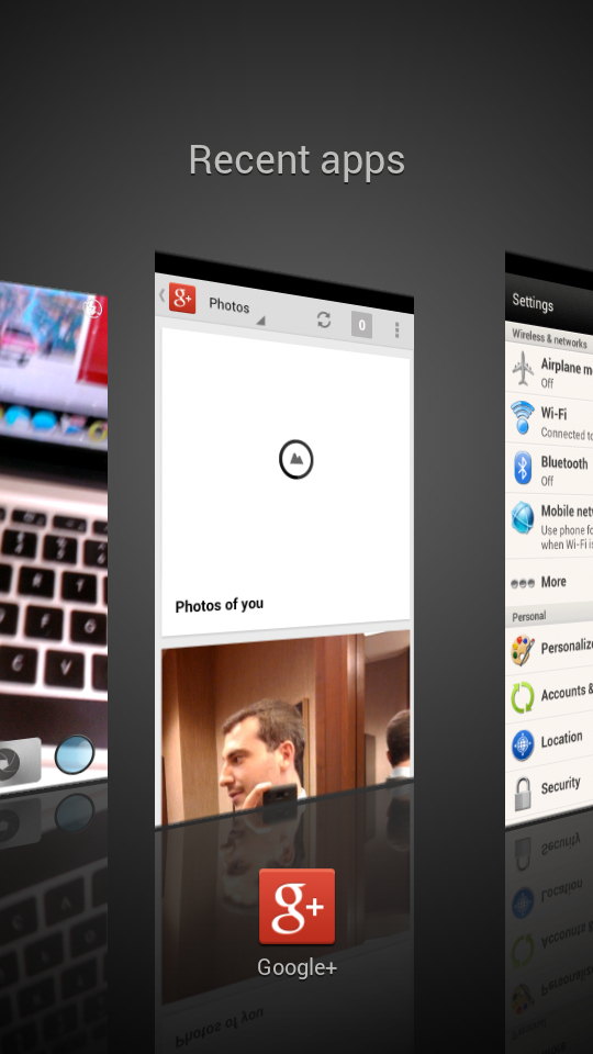
HTC's Sense UI also tweaks the look of the recent apps function. Activated with the rightmost capacitive button at the bottom of the handset, it shows all the programs you're currently running, allowing you to easily switch between.
This is a basic function of Android, but Sense changes the way they are displayed. It shows them as larger rectangular preview windows. You scroll through the side to side, rather than up and down, which is the ICS default. You can also shut down apps by flicking them up.
We're not big fans of this setup. It feels like a poor use of screen space, and sliding through the apps is a bit slippery, and less accurate than with pure ICS, or, say, Motorola's superior UI.
We also have a bone to pick with HTC's massive clocks. They're iconic and offer essential information, the time plus weather or social updates, but take up an awful lot of space to do so. We wouldn't blame you if you banished it from your One VX's home screen.
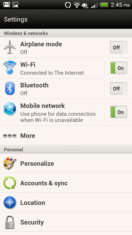
Overall, we're just not fans of Sense's aesthetic. It's rather cheesy to be honest. Maybe it's just the Airplane Mode icon, but some of the symbols just make us think airplane safety card. However, Sense does do great things with your address book, as we'll get into in the Contacts and Calling section.
Current page: Display and Interface
Prev Page Introduction and Design Next Page Performance and Battery Life