Why you can trust TechRadar
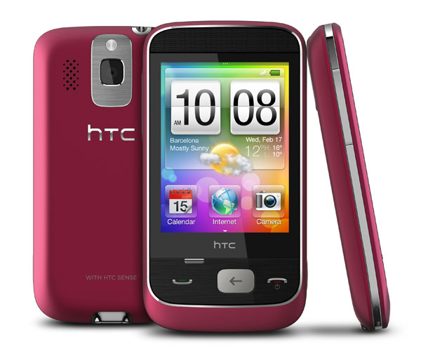
Using the Smart as a yardstick, it's hard to say just how good or bad Qualcomm's Brew platform is, because HTC has skinned the OS with its excellent Sense user interface. As such, the Smart will look and feel very familiar to anyone who's used another HTC device.
However, great as HTC Sense is, it can only do so much, and when using the Smart, its budget origins become all too clear.

To be fair, most of the issues with the user interface come as a result of the screen. Unfortunately, the 2.8-inch screen employs resistive, rather than capacitive, touch technology.
This means that it's simply not as finger-friendly as, say, the HTC Legend, Apple iPhone or the similarly-sized HTC HD Mini. Swiping feels a bit sticky, which is mainly down to the plastic screen and is pretty common with resistive technology.
Likewise, tapping isn't as responsive as we would have liked, but then compromises had to be made somewhere.
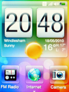
Screen technology aside, the Smart is pretty intuitive thanks, for the most part, to HTC Sense. The central Home screen looks like most HTC Sense enabled phones, with a large digital clock at the top, and your local weather integrated.
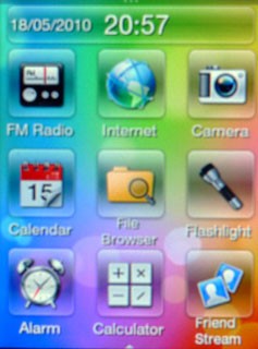
Below this you'll find three slots for shortcuts, and as with the HTC HD Mini, you can swipe the screen upwards to reveal a further six shortcut boxes.

You can also swipe left and right to reveal three Home screens on either side of the central one. As with all HTC Sense empowered phones, you can customise all the Home screens, but the Smart takes this approach a step further with the use of Scenes.
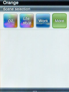
Swipe down from the top of any Home screen and you'll be presented with a selection of Scenes to choose from.
The concept behind Scenes is that they allow you to quickly change the layout of the phone in one fell swoop.
So, during work hours, you can highlight your emails, text messages and calendar, but at the weekend, you might want quick access to your Facebook and Twitter contacts, and have a shortcut to the camera handy.

When you first switch on the Smart, there are four Scenes to choose from – O2 (it's an O2 handset), Work, Lifestyle and Clean Slate.
Strangely, the O2 Scene is identical to the Lifestyle scene, which is something of a waste. If none of the preset scenes grabs you, you can create your own personalised scene using the Clean Slate option, then save it as a custom Scene.
On the whole the Scene functionality is a good addition for anyone who wishes they had different applications to hand at different times, or different days. That said, anyone who really needs to have a smartphone configured for work, would probably find the Smart a bit under-powered and under-featured.
Current page: HTC Smart: Interface
Prev Page HTC Smart: Overview Next Page HTC Smart: Calls, contacts and messaging