Why you can trust TechRadar
While the iOS and Android operating systems boast a lot of visual similarities, the current version of Windows Phone is truly a one-of-a-kind experience - and the large, bright tiles prove eye-catching, though perhaps not as practical for power users as rows of smaller icons.

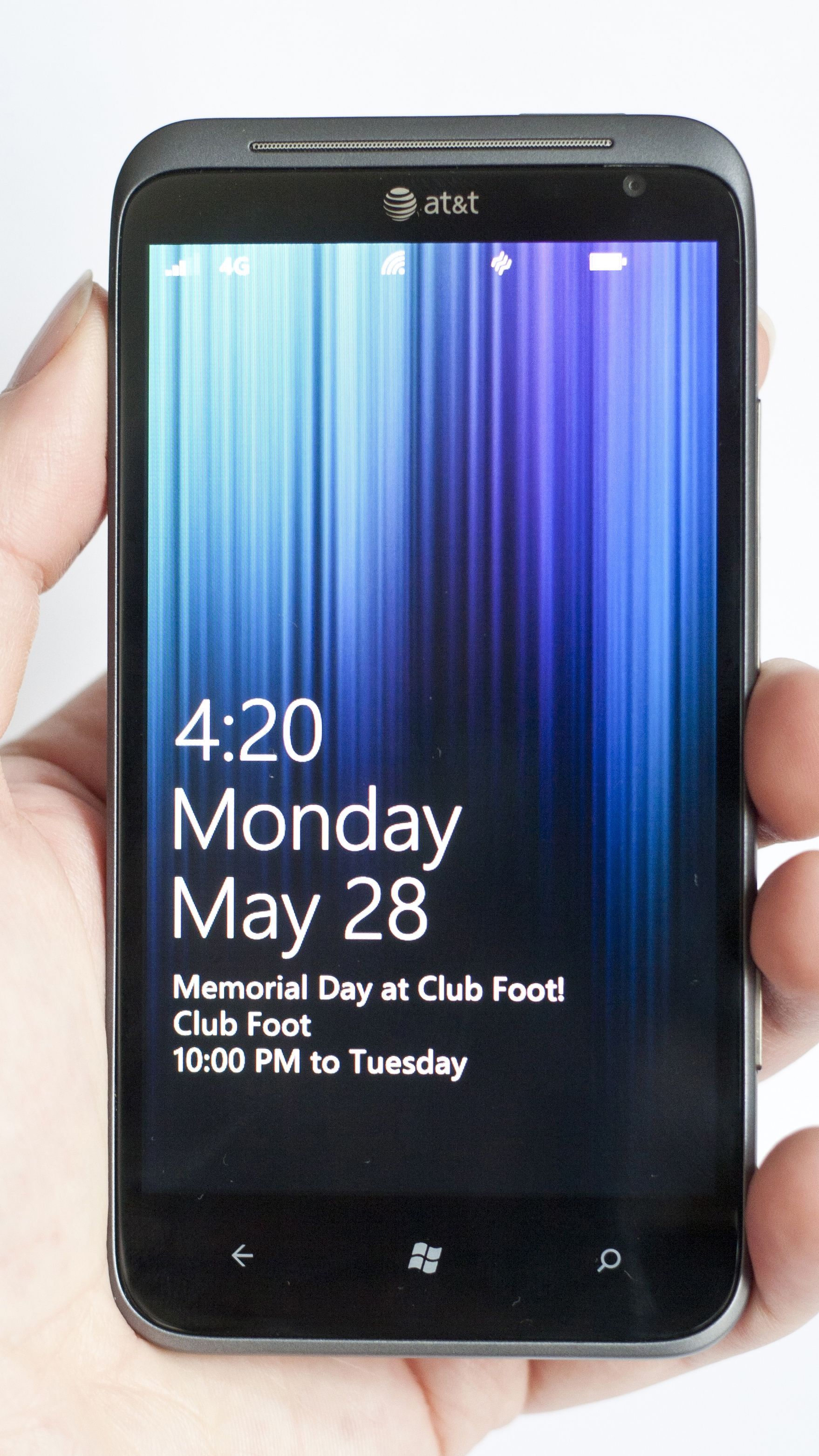
The lock screen displays the day, date, and time with large lettering, as well as a calendar notification below and simple icon notifications for new emails or text messages. While incoming text messages display a brief preview atop the lock screen, email text cannot be seen while the phone is locked.
Icons for battery life, cellular, and Wi-Fi connections are seen at the top of the lock screen, though swiping up on the display reveals the main menu, which is where the UI really comes to life.
Beautiful Tiles
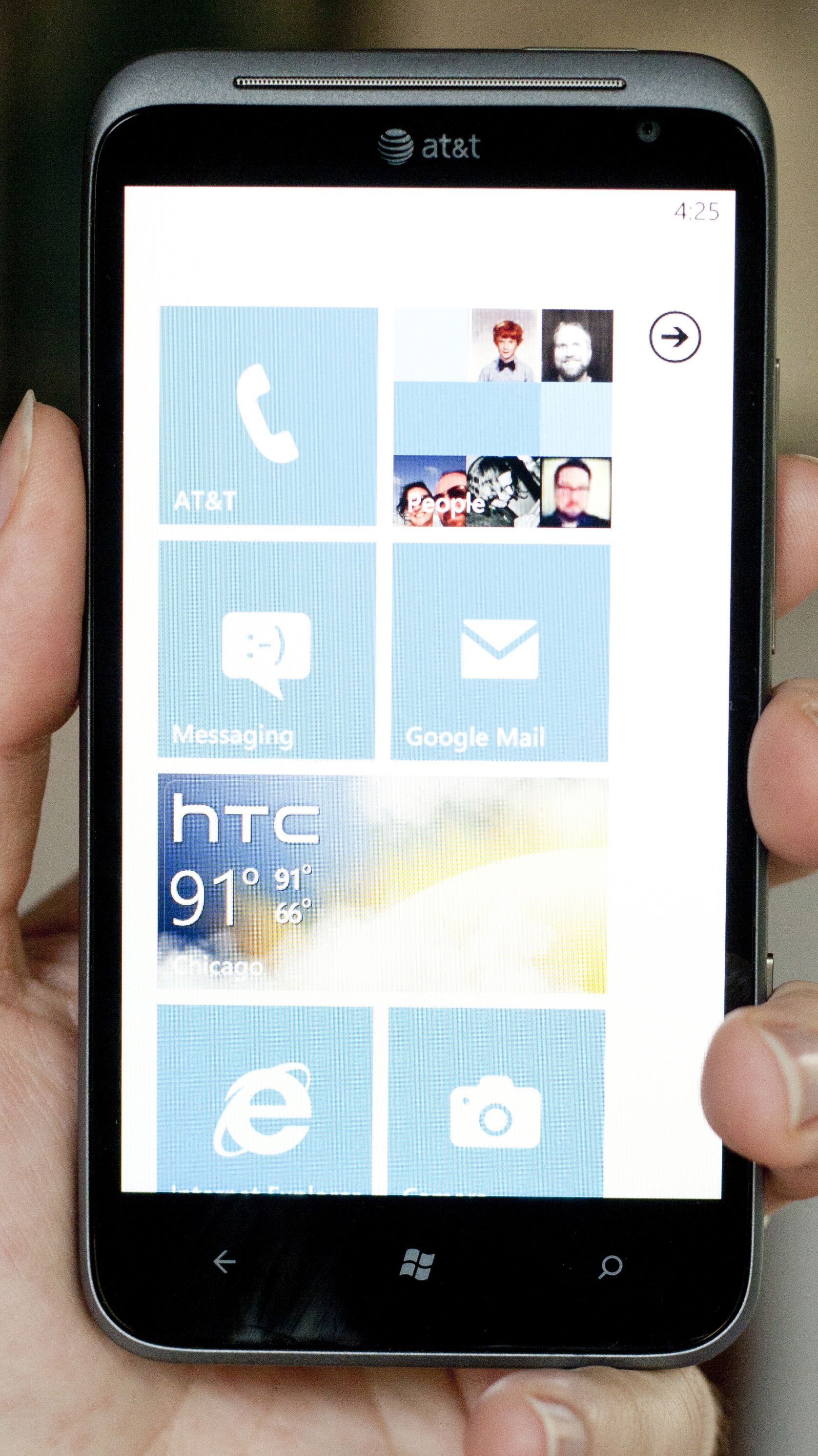
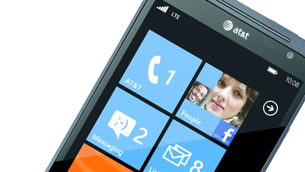
Large tiles are displayed in side-by-side columns, with the large squares used for everything from core functions – calling, text messages, email, camera, and more – to apps downloaded from the marketplace.

Most apps take up just one spot on the screen, though others – including the HTC Hub, which displays the local weather – fill both columns. These tiles can be pinned to the main screen and easily rearranged, and (refreshingly) even built-in apps can be cleared from the main screen.
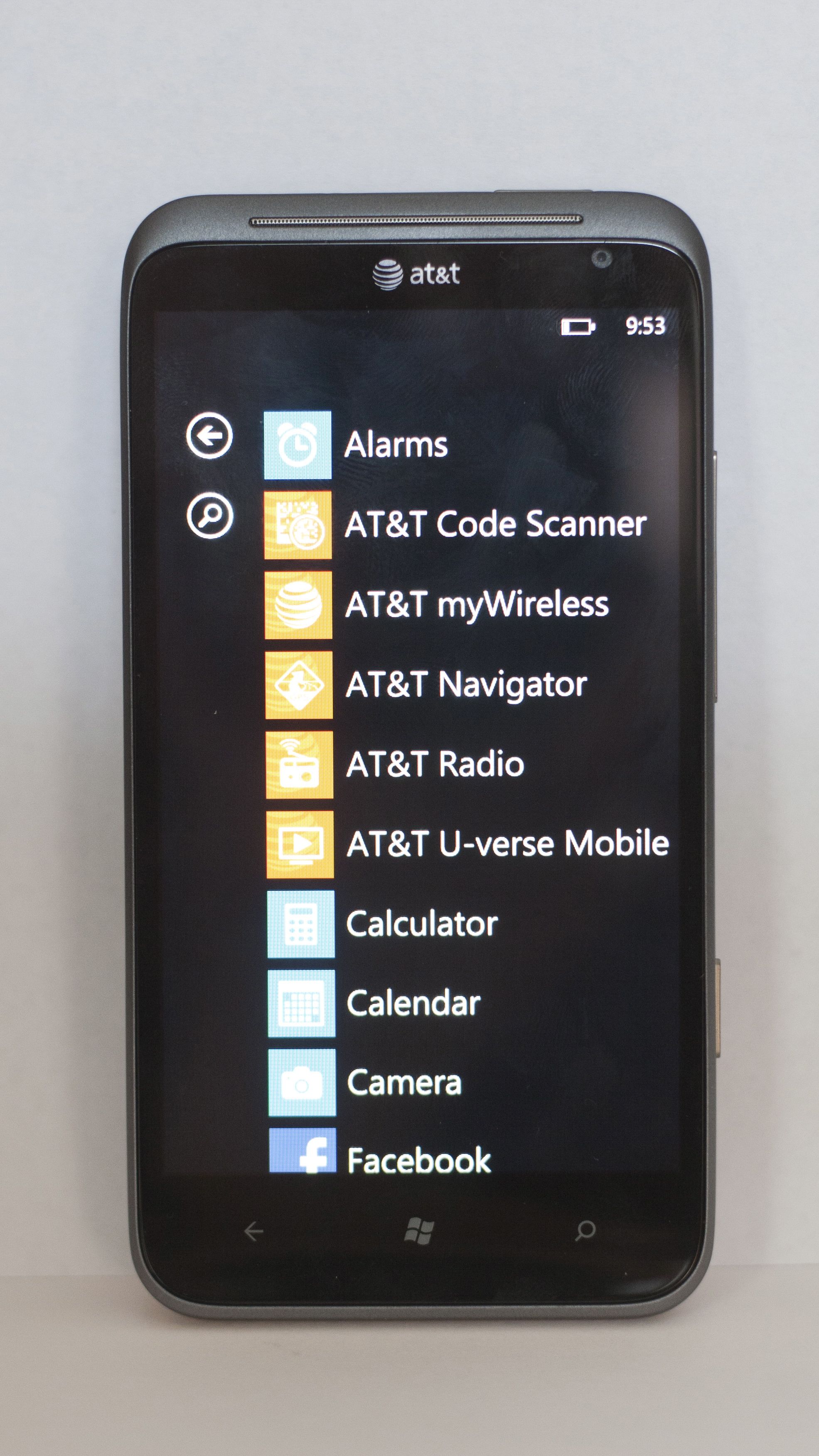
However, every installed app is available from the listing accessed by swiping left or tapping the arrow on the upper right.
Many tiles offer live information at your fingertips, such as the weather, a currently played album cover, or your Facebook cover photo, and are constantly updated. It's not only helpful, but the fluid icons make the interface even more attractive – especially the Pictures tile, which alternates through Camera Roll photos.
The interface's color scheme is nicely customizable to match your moods and preferences, letting you choose between white and black backdrops, as well as several different colors for the primary tiles (however, some have their own unchangeable tile colors).
Performance
The size of the tiles always remains the same, and while some tiles do offer live info bursts, you cannot install widgets or shrink down the tiles themselves. As such, those who want a load of options on screen at once may be disappointed at having to scroll down to see more than about eight tiles in one glance. Windows Phone is tuned more for form than function, but the form really is something special.

While many apps run in the background, with all open apps accessed by holding down the back button and swiping between them, others always display an intro or loading screen when opened and may reload information.
It's sad that not every app supports multitasking, but it's something that still pops up regularly on the OS.
Many other smartphones these days pack dual or quad-core processors, but while the HTC Titan II only offers a single-core 1.5Ghz Snapdragon processor with 512MB of RAM in tow, the relatively slim specs don't shine through in usage.
The phone performed admirably throughout, with screens flipping quickly and apps loading in a breeze. To borrow a phrase from a major competitor, the Windows Phone operating system "just works," and it does so quite well on the HTC Titan II.
