Why you can trust TechRadar
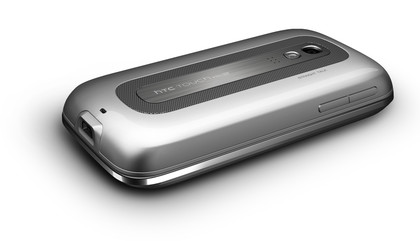
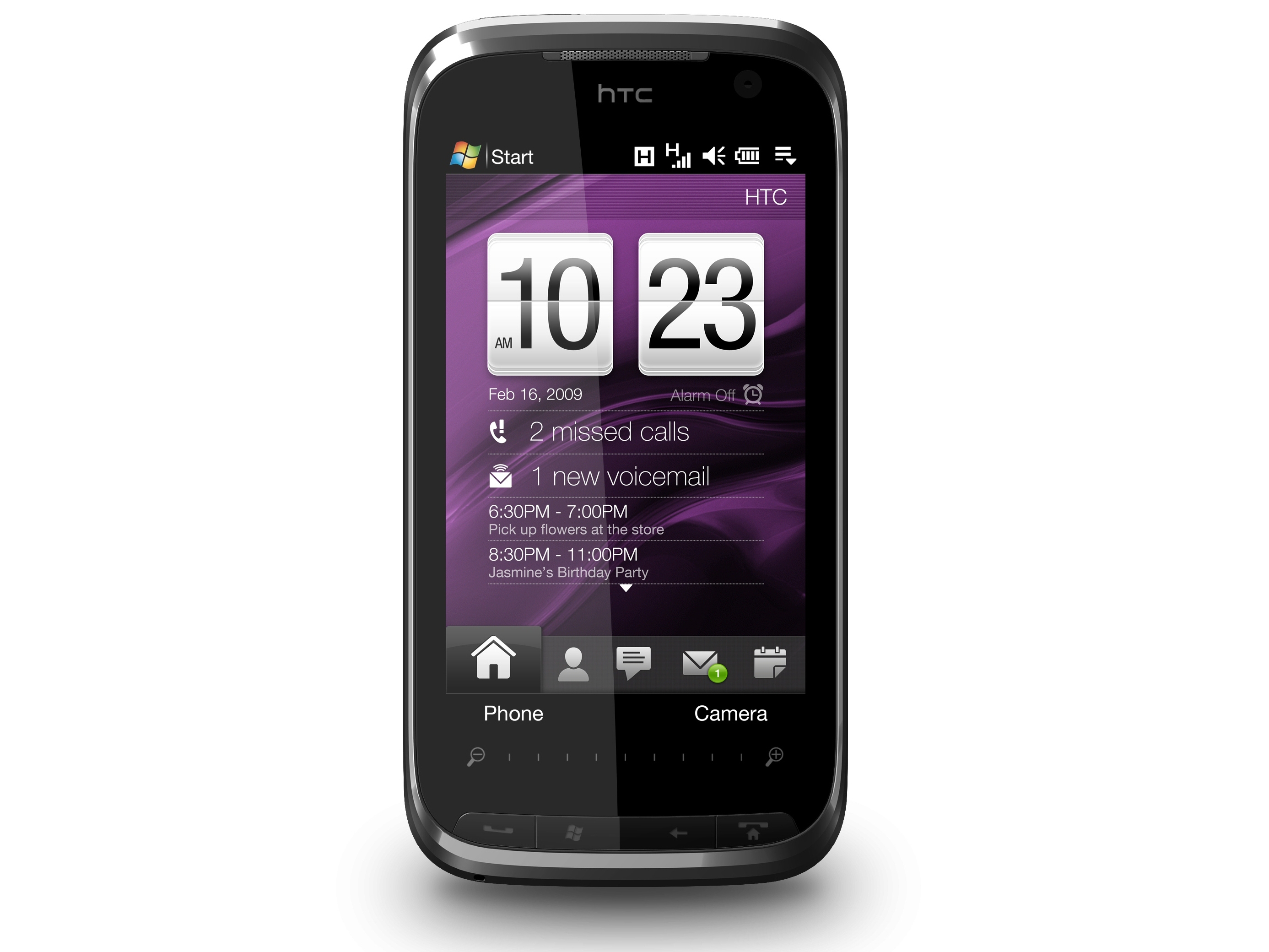
Make no mistake, this is a brick of a handset at 116x59x17mm and a whopping 179g.
Shy and retiring it is not, and if it's subtlety you're after, you'd be advised to look elsewhere. It has a more stylish look than its blocky predecessor though, with its silvered, bevelled sides, which makes the bulk a little easier to take.

WEIGHT: it's a heavy phone, and it's not the smallest, either
The screen sits flush with the casing, the smoothness of the front broken only by the only very slightly raised profiles of the four hard keys along the bottom of the screen: call start and stop/home, back and Windows.
The sides seem wilfully lacking in accoutrements with just a volume rocker on the left side, reset slot and stylus on the right, power button on top and USB 2.0 power/headphone socket on the bottom.
Around the back is the 3.2 megapixel camera lens, microphone and large Straight Talk speaker for conference calls, plus a mute button. The back panel feels a little flimsy incidentally, and didn't always click easily back into place after we'd opened it.
Keyboard
The Touch Pro2's QWERTY keyboard slides out to the left with a satisfying thunk to reveal a fully specified five lines of keys. It comes very close to what you'd get on a standard computer keyboard.

TYPING: they on-screen keyboard compliments one of the best slide-outs we've seen
The keys are well spaced, stand slightly proud of the base and they're backlit too. Each is slightly rounded and made of an extremely tactile rubberised plastic.
In practise it's very easy to use with the thumbs and it's even just about big enough to rest it on a desktop and use your fingers just like a proper grown-up keyboard.
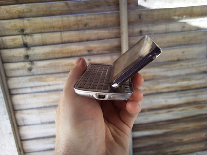
And if you do decide to use it this way, the Touch Pro2 has a little trick up its sleeve – you can lift up the screen to an angle of about 45 degrees, which makes it easier to view if you're not holding it in your hands

TILT: the screen tilts so you can put the phone on a desk and type on the keyboard
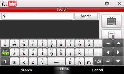
It's so good that you'll have little need to use the onscreen keyboard, which isn't too shabby either – a little snug in portrait mode perhaps, but still perfectly usable, though the extended landscape version is better, even though it's pretty much made redundant by the hard keyboard.
Calls
Call quality seemed good on the Touch Pro2; clear and crisp, plus you can get a fair level of volume out of it.
The phone interface is well laid out too, with big number buttons, and it will suggest alternative phone numbers as you tap, so if you've called a number before, you'll only ever need to tap in the first few digits in future.
It's designed with conference calls in mind and there's an easy interface option to set up multi-party calls from the phone layout. You'll need to set it up with your network first though.
Once your call is set up, you can put the phone face down on a desk to reveal the large, loud, noise-cancelling Straight Talk speaker on the back. There's also a useful mute button which glows red or green to indicate whether or not it's in use.
Current page: HTC Touch Pro2 - Design, keyboard & calls
Prev Page HTC Touch Pro2: overview Next Page HTC Touch Pro2 - Screen and interface