Why you can trust TechRadar
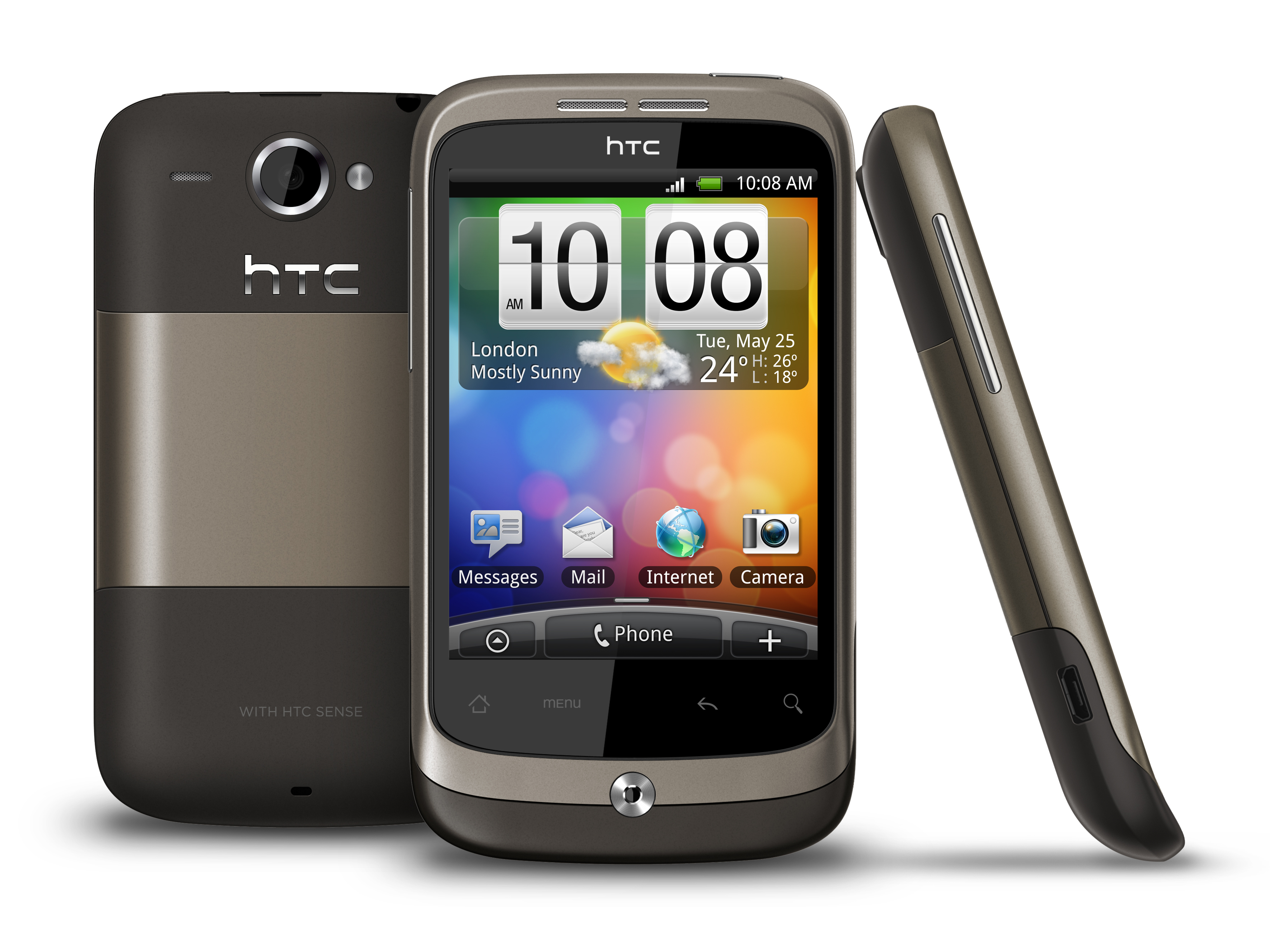
Despite being designed as a lower-cost Android handset, the HTC Wildfire still comes with the company's much-loved Sense UI. Although this may keep costs a touch higher than they could otherwise be, it's a joy to use.
From the moment you switch the phone on for the first time, you'll appreciate it easing you into smartphone-dom, with a smooth eight-step walk through getting you set up quickly and easily.
In a matter of minutes, you'll have your contacts imported, your social networking sites set up, your Google account activated, your Wi-Fi connected and your preferences set. Like we said, a joy.
Navigation around the HTC Wildfire is fairly straightforward – with seven home screens available for customising, you'll be able to save your most-used apps and widgets here and avoid the alphabetised menu altogether.
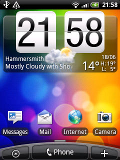
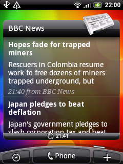
Popular widgets, like weather, news, favourite contacts and FriendStream (HTC's social network aggregator) come ready installed to home screens but moving and removing these is very simple.
Just holding down the icon you want to reorganise then dragging it to its new location (or the trashcan) does the trick.
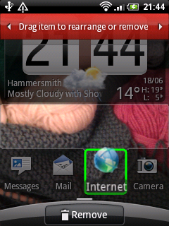
Silly little things like how few icons you can place on a screen started to grate – although with seven Home screens to play with, there's obviously plenty of space overall.
Swiping through them all is no big deal for the HTC Wildfire – you might think with the lower processing power and the lower-quality screen that there'd be some lag; there really isn't.
In fact, that processor is the same speed as the HTC Hero's (528Mhz), so it shouldn't be any great surprise that it can hold its own – although it's not going to offer Desire levels of speed, and juddering sometimes occurs when switching windows and applications.
If you don't fancy swiping, you can scroll between using the optical trackpad. HTC's lovely Leap View, introduced with Android 2.1 on the HTC Legend and HTC Desire earlier this year, is present and correct, giving you a quick overview of your home screens and a shortcut to moving between them.
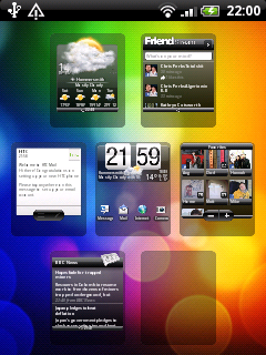
Although buttons aren't exactly in abundance on the Wildfire, it would be convenient to be able to use the trackpad as the screen unlock button as well as the power key. It's much more accessible when you're in a hurry.
Of course there's full access to the Android Market on the HTC Wildfire, so you can download apps to the handset. Download speeds over Wi-Fi were generally fine, although a little slower using 3G.
HTC has clearly given app sharing some thought, and come up with a system for sending links via email or text to friends without a fuss.

It's not the most elegant of systems, but it's a darn sight easier than them having to search for the app in the Marketplace.
As the handset is basically run in the same way as the Desire and Legend, this handset isn't aimed at the tech-phobic, more at the smartphone-literate on a budget.
That said, it's very easy to get the hang of – the set-up guide walks new users through setting up their various email and social networking accounts, while the menu system is also very straightforward.
The seven home screens may be a little more confusing, but so simple once you've customised them to your liking. The Wildfire also makes it easy to transfer everything from your old phone via Bluetooth using the onboard 'transfer data' app.
The HTC Wildfire comes with haptic feedback by default – we like the satisfying buzz as it registers our commands, but if you're not such a fan it's fairly easy to turn off in the settings menu.
PJ: I'm glad to see that the HTC interface is largely unchanged – it means it's really nice and easy to get to grips with from the first time you use it. Because I've used the Tattoo in the past, the software feels very intuitive and familiar.
Being able to view all the Home screens at once using the pinch gesture is very cool; you don't always remember where you've put certain applications so nice to be able to see them all at a glance.
Customising the Home screens so you have the widgets and apps you want at your fingertips is brilliant.
The optical trackpad isn't as precise as the D-pad I'm used to on the Tattoo. But it's usable and I reckon I'd get used to it.
Menus are well laid out and I love having the settings in collapsible panels so you can dig into them without going through masses of menus. There's just no need for an instruction manual.
DS: I thought it was going to be a similar situation to my first HTC when I first saw the interface, which upset me a little bit.
But thankfully it was a totally different experience – the screen (capacitive now) is so much more responsive and flicking between the home screens was much easier, as was customisation.
I liked the pinch method of seeing all your displays at once, but it was a little useless as I only played with it when it was there.
I was also told to try out the live wallpapers, which were cool but the Wildfire seemed to struggle to display them properly at times.
Current page: HTC Wildfire review: Interface
Prev Page HTC Wildfire review: Overview Next Page HTC Wildfire review: Calling and contacts