Why you can trust TechRadar
HTC Wildfire S review: Interface
You get Android 2.3 on the Wildfire S, with HTC's latest version of its Sense UI over the top. We like a bit of HTC Sense – it's a very comprehensive re-skin, and one that adds huge amounts of extra functionality to Google's popular mobile OS.
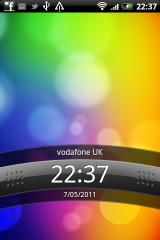
The lock screen is in the standard HTC style – swipe down to access the Home screens. Once there you have a choice of seven workspaces to flip through, each holding a selection of app shortcuts, widgets and folders.
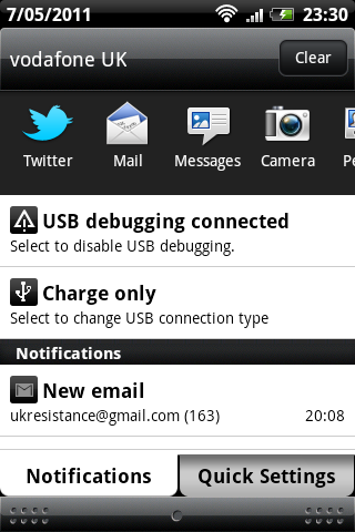
The standard pull-down Android Notifications window has been upgraded by HTC, now coming with a scrolling list of recently opened apps, plus a quick settings tab for toggling Wi-Fi, Bluetooth, GPS and more on or off.
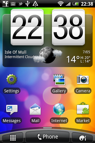
The Wildfire S does a pretty good job of keeping everything running smoothly. Some of the more complex apps, such as social network aggregator Friend Stream, can slow the scrolling down a little, but it's generally a solid experience.
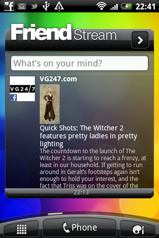
Friend Stream lets you pull in status updates from Twitter, Flickr and Facebook, presenting everything in one unified timeline. You can scroll up and down within this app, so it's all there right in front of you on a Home screen.

It can get a little messy, though. Web links in status updates very kindly open up the website in question, only your view of the page is restricted by having the original tweet at the top and a retweet bar at the bottom – leaving only a minuscule gap for the actual web content between.
While HTC's widgets offer great functionality, their white-on-black style is beginning to look a little dated.
Sign up for breaking news, reviews, opinion, top tech deals, and more.
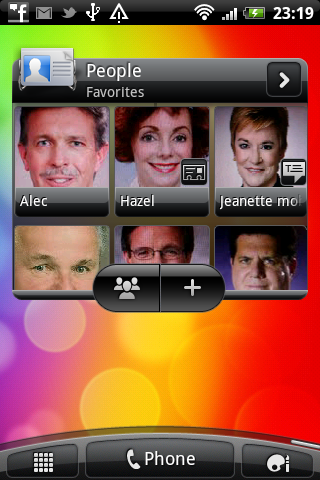
HTC has also provided Home screen widgets that create an icon-based list of Contacts you've added to your Favourites, a music player, its famous weather widget and one that streams in your latest text messages. It's all very user-friendly, and no doubt geared towards those who don't do a lot of tinkering.
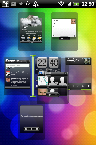
If you do like playing about, HTC's Sense interface has a lot beneath the bonnet. Home screens can be shuffled about, with a two-fingered pinch of the screen bringing up an overview of your workspace and long-pressing on a screen icon enabling you to change the order in which it appears.
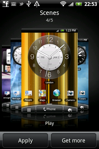
Enthusiasts will also enjoy HTC's many customisation options. The right-hand button on the curved dock brings up the Personalisation menu, from where users can change scene – a way to create and save Home screen setups – or select entire new skins for the phone's screens and menus.
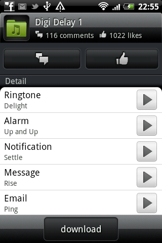
It's not just visual enhancements, either. Collections of Sound sets can be downloaded via this menu and the HTC Hub it links to, if you need a new collection of tones and alarms.
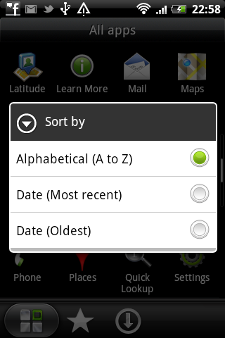
Back in the apps menu, HTC has again given us more options than are usually found in Android devices. Apps can be sorted alphabetically or by date, plus there are separate tabs for frequently used tools and those you've downloaded yourself.
One of the many tiny changes made to this latest version of HTC Sense is the scrolling of the app listing. It now flips down one whole screen at a time, so it's easy to keep your place if you have a heap of things loaded onto the phone.
Android 2.3 is a great, polished operating system. HTC Sense makes it a little better.
Current page: HTC Wildfire S: Interface
Prev Page HTC Wildfire S: Overview, design and feel Next Page HTC Wildfire S: Contacts and calling