Why you can trust TechRadar
There's one word that springs to mind when using Windows Phone 8 and that's "elegance."
Yep, if you've not used a Windows mobile product since the clunky, ugly old era, you'll think we're winding you up. But we can't stress it enough. Microsoft has rewritten its phone OS from the ground up and as of two years ago, we've been blessed with a third major player in the OS market that really is a pleasure to use.
In fact, at the risk of upsetting our iOS-loving friends, we'd go out on a limb here and say that we think Windows Phone is even more elegant than the Apple operating system. Just the look of it, the transitions and the sheer amount of gloss Microsoft has thrown at it makes all the difference.
If you've never used Windows Phone before, we'll not lie – it is a bit of a learning curve. But it's not a steep one.
There isn't an on-screen help guide like you get with BlackBerry handsets, some Android phones or even iOS to a certain extent so depending on your familiarity with technology, it could take a little while. But not so much you'll want to send hate mail to Steve Ballmer.
What you have to put out of your mind is homescreens. Homescreens are gone. Repeat after us: "Homescreens Bad!"
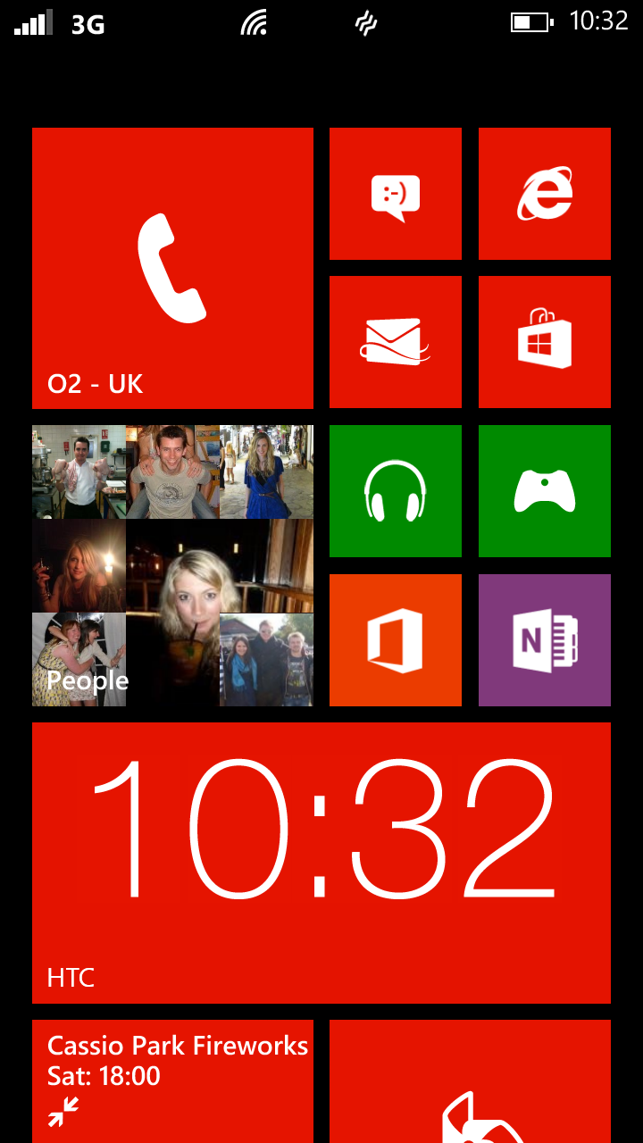
Yep, instead of pages and pages to swipe between, you just get one homescreen and one app drawer. The way Windows makes it work is that it all centres around live tiles which you put on your main screen.
Each tile represents a programme, or app – it's basically a shortcut to the app. But it also updates and carries real information.
So, for example, your mail live tile will show a picture of an envelope but when you have new email, a number will appear to reflect how many unread messages you have in your inbox.
Similarly with missed calls and SMS. The calendar live tile displays your appointments and updates as they change. Fairly straightforward, huh?
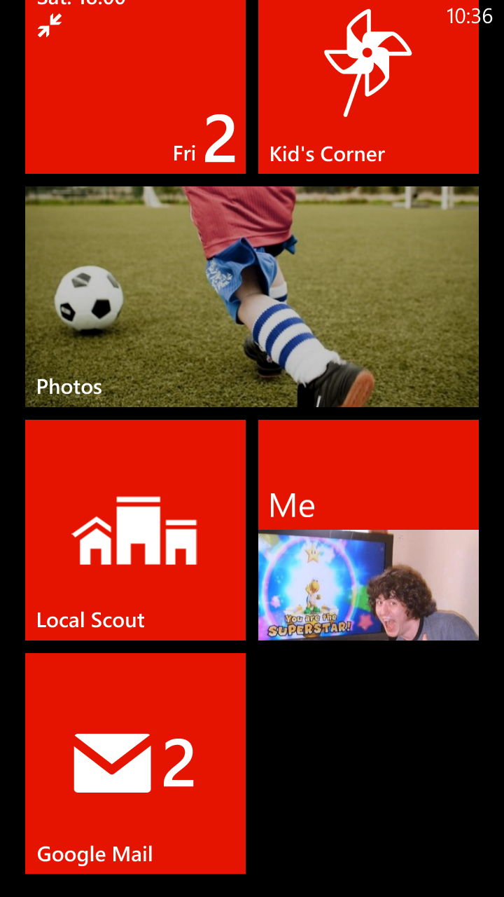
The thing is that these live tiles work across almost every app you download. And you can change their layout. Rearrange them whichever way you like. It's all very easy.
You can also change their size – so whereas before you were limited, on Windows Phone 8, you get the chance to resize them to fit more on and customise the look even more.
Not only that, you can create live tiles to more than just individual apps. For example, within the maps app, we were able to create a live tile to an individual place.
Which is handy if you're planning a journey. And you can do the same to groups of contacts.
But we couldn't figure out a way to pin a tile to an email conversation which was a bit of a pain. And the same with SMS messages to individuals.
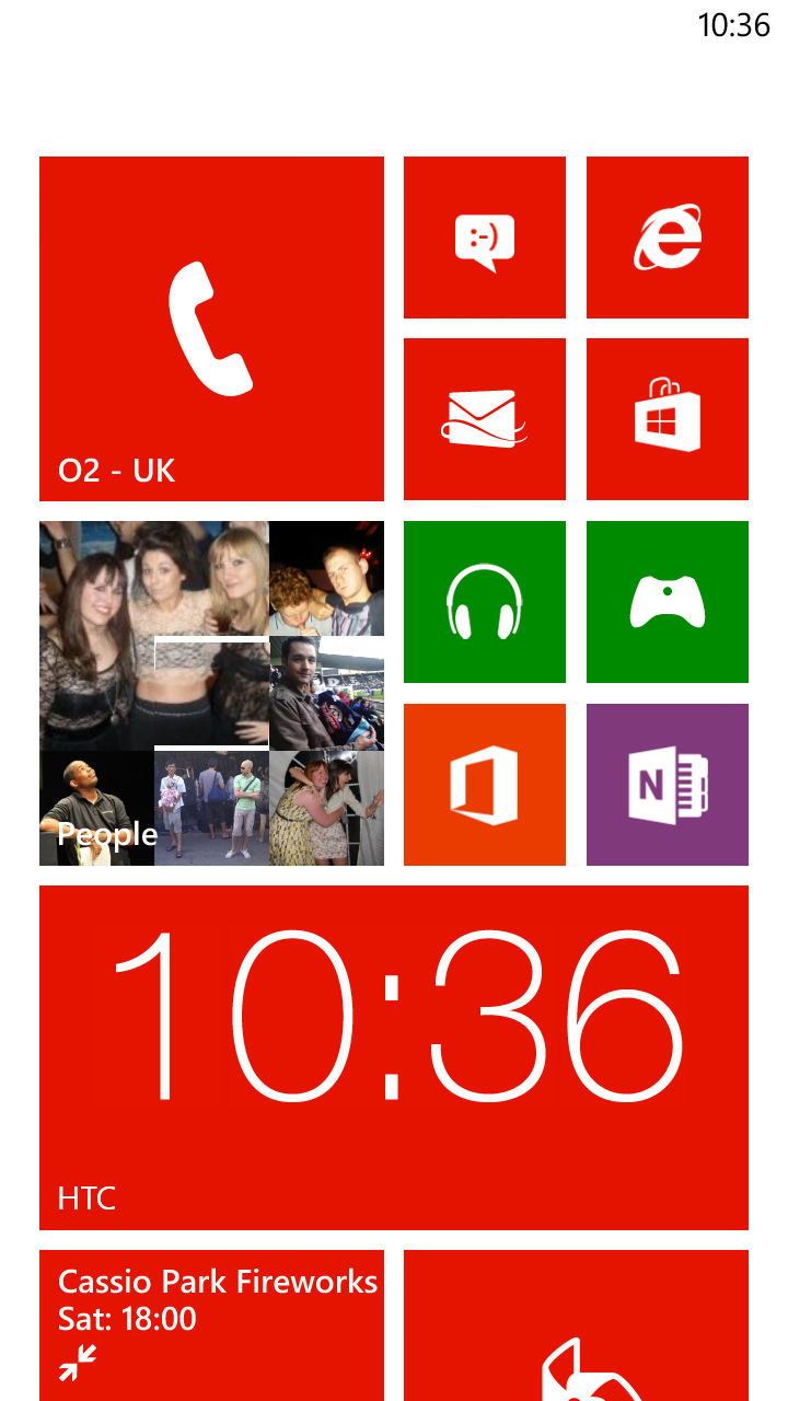
It's very much a mixed bag as to whether you'll be able to make a live tile for an individual app or process that you have in mind.
And that's really as far as your customisation options go. One of the beauties of Android is that the Google OS allows you to install animated wallpapers and widgets, so that your Galaxy S3 or HTC One X will look different to your mates'.
This isn't something you can do on iOS which only allows you to change the wallpaper and similarly, you can't even do that on the HTC WIndows Phone 8X because it doesn't use wallpapers.
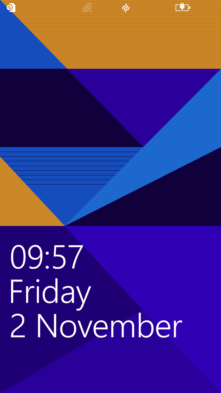
You can merely change the background from black to white and choose which colour you want your tiles to be. You can change the wallpaper of your lockscreen.
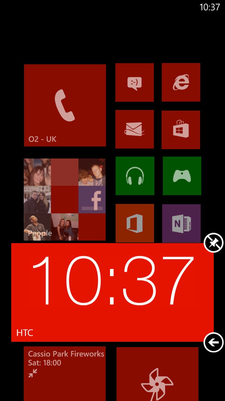
But then again, this won't bother many people who just want a shiny gadget that works.
For some reason, Microsoft has set the status bar up in such a way that it doesn't actually show up all the time. The clock does in the top right, but elements like your signal level etc are permanently hidden.
You have to put your finger at the top of the screen and pull an imaginary swipe down to get them to appear. We can see this confusing some people.
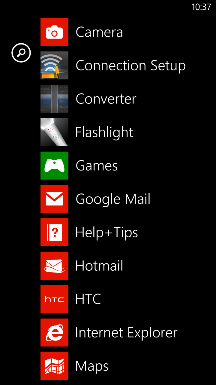
Apps are stored in a central app drawer which you access by swiping to the left from your homescreen. They're listed alphabetically and simply if you have a lot of apps, prepare for a lot of scrolling.
Having said that, you can also just tap the magnifying glass that appears to the left and perform a good old-fashioned search by typing in the name of your app.
Speaking of searching, you can do that at any point from anywhere in the phone using the soft key at the bottom of the HTC 8X.
Microsoft hasn't made this a contextual key (ie. It doesn't search within the app you're in at the time) and neither has it made something that searches your phone like Android offers. This is a cold, hard web search.
As soon as you tap that button – wherever you are – you're prompted to search the web. And by 'search the web', we mean 'search the web using Bing' because predictably, Microsoft has stuck to its own search engine here.
There's no way to change that as your default. Not that you would necessarily want to if you're using a Microsoft phone anyway.
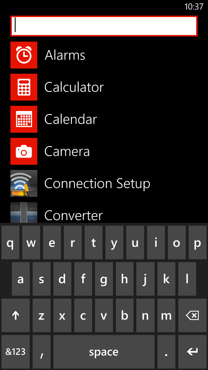
One thing we do have to criticise, though, is the lack of screenshot capture. This was shown off when WP8 was first announced, yet doesn't appear to have made it into the final build of the HTC 8X.
This is annoying – not just from a reviewer's perspective (hence why we've had to take photos of each screen which looks a lot rougher) but also from a user's point of view. How many of you regularly snapshot things we're doing and tweet or MMS them? We certainly do.
That aside, it's a glossy, intuitive, easy to use OS. Don't be put off by the old days. Microsoft has learned lessons and learned them very well indeed here for Windows Phone 8.
And it suffers no lag – which just goes to show that you can get away with a dual-core, rather than quad-core 1.5GHz processors, and not have to worry about a decrease in performance.
