Why you can trust TechRadar
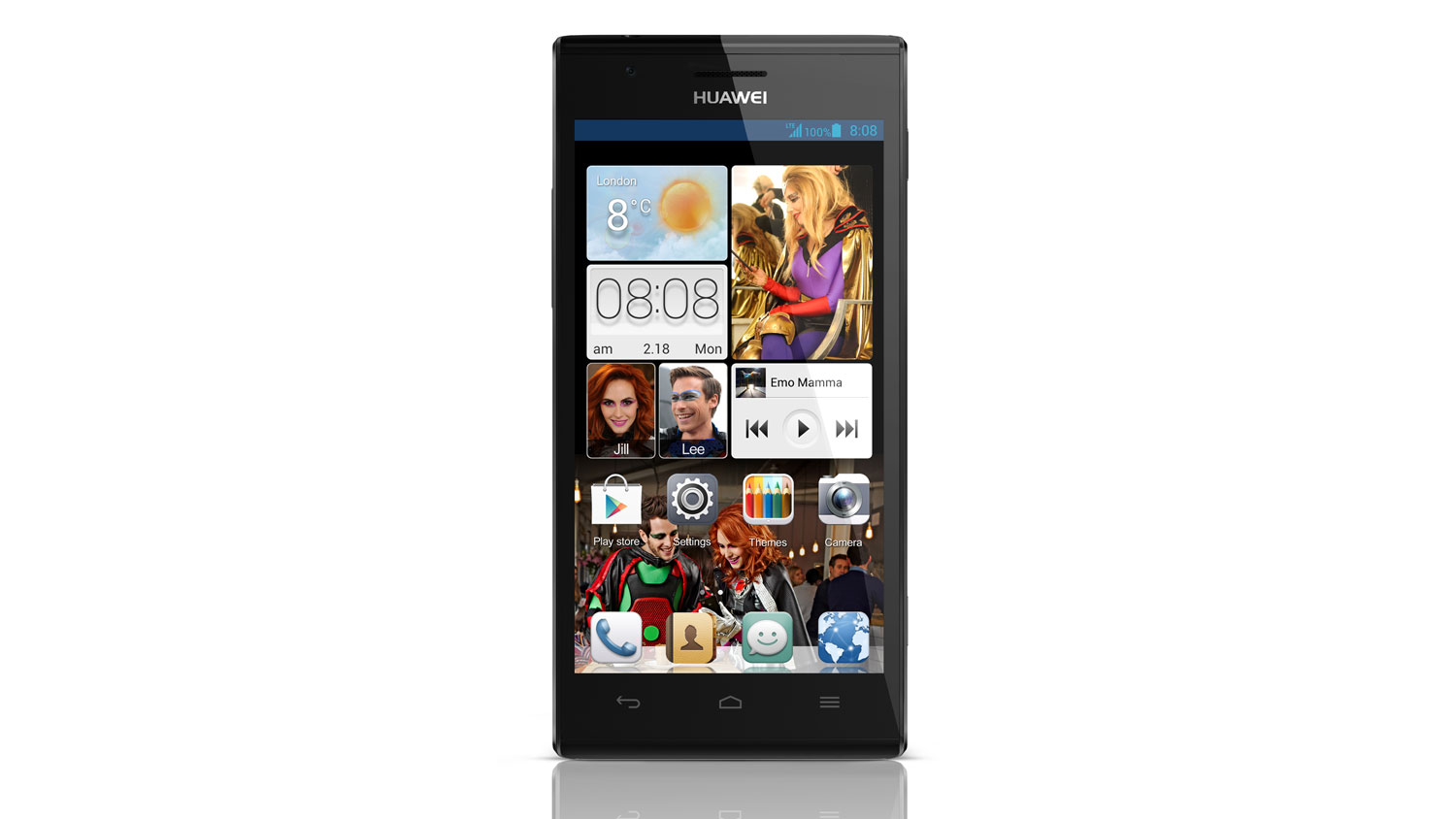
The Huawei Ascend P2 comes running Android 4.1.2 Jelly Bean and we'd expect it to get bumped up to Android 4.2 in due course.
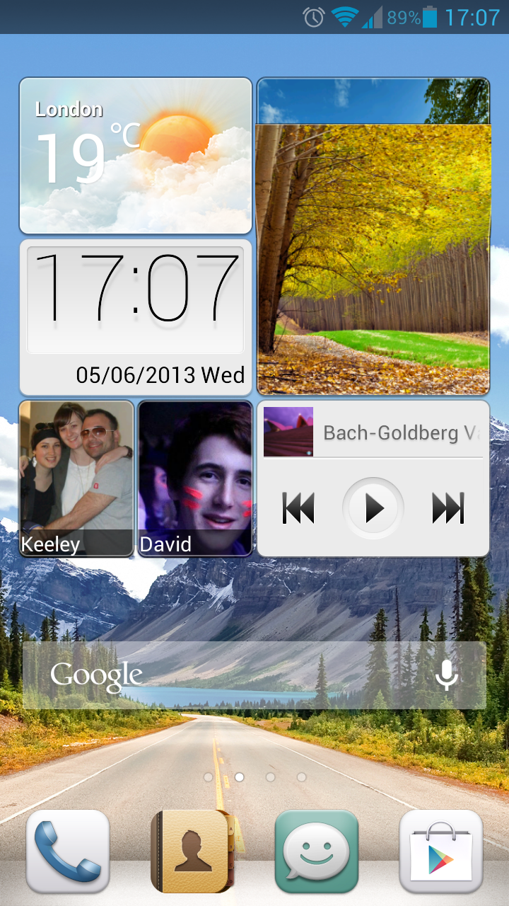
It's not just stock Android which adorns the P2 though, with Huawei sticking its own gloss over the Google-made system, known as Emotion UI 1.5, which we've already had an encounter with on the Ascend G510.
At first glance the Emtion UI on the Ascend P2 looks pretty standard, with a slightly tweaked lockscreen providing quick links to the phone, messaging and camera apps.
Unlock the handset and you're taken to one of up to nine homescreens - although you can tailor the number displayed to suit your personal needs by pinching the screen.
The first major difference you'll notice on the Emotion UI is the main widget which dominates the main homescreen.
It appears to be several widgets, but hold down on any one of them and you'll notice it's on big widget with various components.
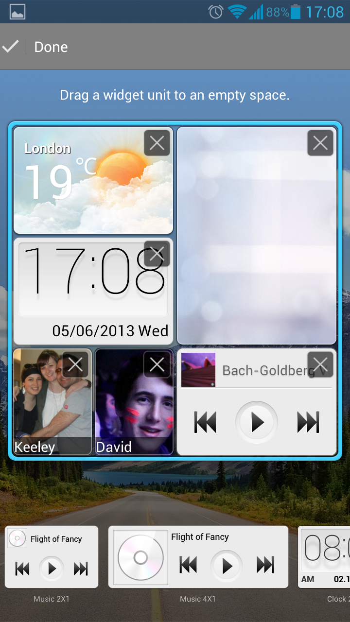
This multi-widget allows you to tailor its layout to suit you, with favourite contacts, weather, clock, music player and gallery options.
You can change the layout around and swap out some for different sized options - although you can't include any third party widgets in here, which makes it slightly limiting.
We also found this widget a little overpowering, taking up pretty much the whole screen and it seems like a bit of a waste of space. It's a nice idea but there's not enough options and the size is a real hindrance in our eyes.
Next up is the app draw, or more accurately, the lack of the app draw. Yep that's right, Huawei has completely removed the Android app draw from the Huawei Ascend P2, forcing you to have all your apps on your homescreens. It's all very iOS, don't you think?
Now we appreciate the reason why Huawei has done this. It's looking to simplify the Android experience and we're sure there's some people out there who get confused when they see the same app on a homescreen and in the app list - although this is confined to first time users.
For a seasoned Android user the Emotion UI is almost like using a totally new operating system as the normal functions of the app draw no longer exist - it's confusing, but we got used to it after a couple of days.
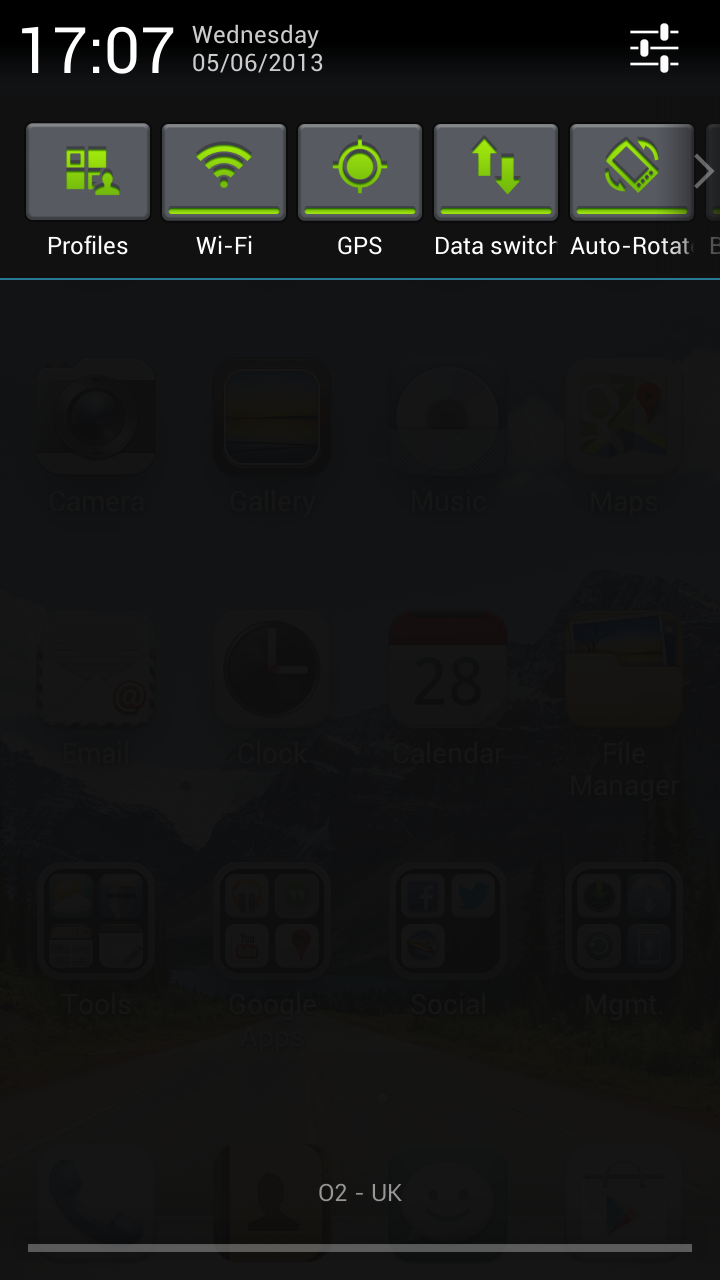
Thankfully things are a little more Android in others areas - take the notification bar for example. Drag your finger down and you'll be greeted with the standard Jelly Bean layout, although Huawei has added a row of welcome quick settings.
There's a decent selection of toggles here too, with the likes of Wi-Fi, Bluetooth and GPS lining up alongside rotation lock, brightness and airplane mode.
Scroll to the end of the line, hit more and you'll be able to re-order these settings to get your frequently used toggles at the front, plus there's a few more you can swap into the lineup.
Back to the homescreen and hold down on a clear area to pop up a menu which allows you to change the wallpaper, choose homescreen transitions and select a variety of widgets.
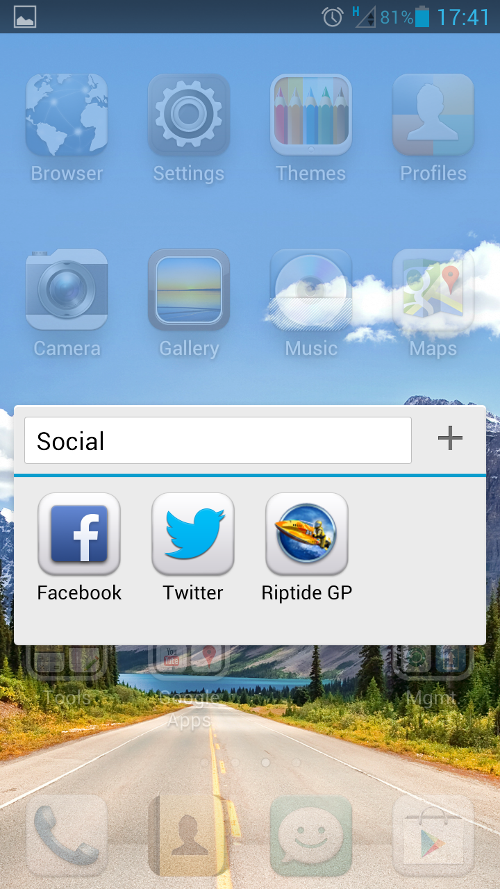
Because all your applications are stored on the homescreens you'll find they start to fill up - luckily a simple drag and drop of one app onto another will create a folder, allowing you to keep a tighter control on your downloads.
General operation on the Ascend P2 is pretty smooth, although it lacks the snappiness of other quad-core handsets such as the Galaxy S3.
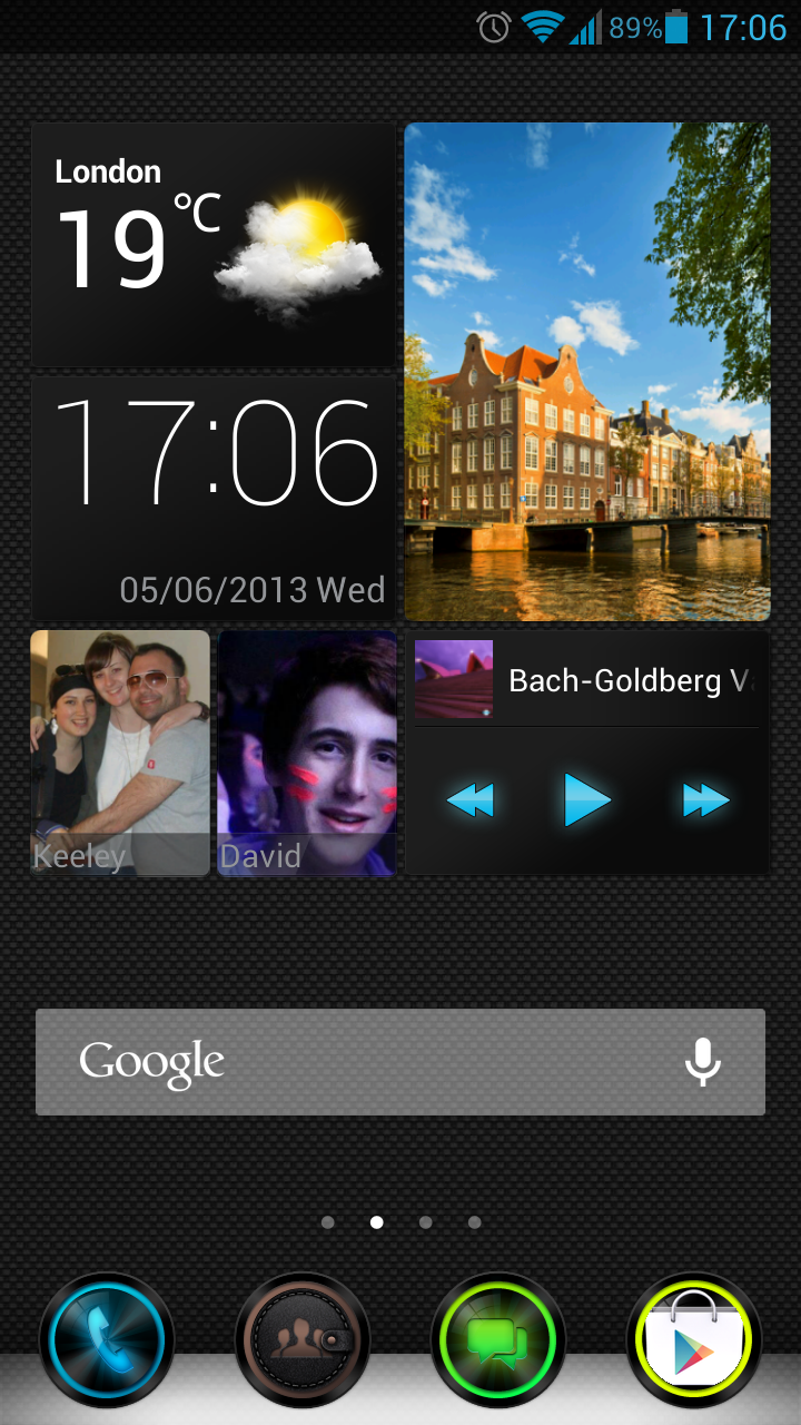
The 4.7-inch display is crisp, clear and responsive which aided our navigation around the Ascend P2, although we found the Emotion UI did make Android look a little childish.
You can change the "theme" of the operating system by selecting the Theme app to make things look a little more professional, although we would have still preferred the stock Android look over any of the options on offer.
Huawei has looked to make Android more intuitive in other places as well - a visit to the Settings menu will give you the choice of two tabs at the top of the screen, "general" and "all".
"All" shows you the standard Android settings menu, but tap on General and you'll find Huawei has hand picked some bits it thinks you'll be using most often including Wi-Fi, Bluetooth and screen brightness.
It does make finding what you want slightly easier, although we didn't have a big issue with the stock settings menu so this addition feels a little forced.
In short the Huawei Ascend P2 isn't going to blow you away with a super slick operating system and the Chinese firm's interpretation of Android is a little puzzling in places, but on the whole it's smooth and easy to use, if not a little babyish in style.

TechRadar's former Global Managing Editor, John has been a technology journalist for more than a decade, and over the years has built up a vast knowledge of the tech industry. He’s interviewed CEOs from some of the world’s biggest tech firms, visited their HQs, and appeared on live TV and radio, including Sky News, BBC News, BBC World News, Al Jazeera, LBC, and BBC Radio 4.
